what is a boxplot?
In this article, we’ll explore the boxplot: what it is, how to interpret it, common variations, and when to use it.
What is a boxplot?
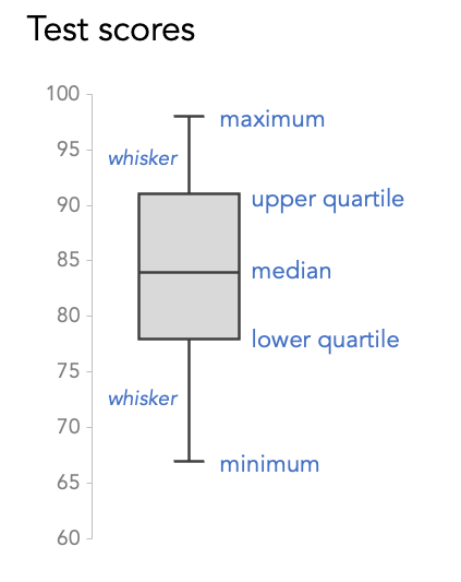
A boxplot—sometimes called a box and whisker plot—is a dense display that aims to provide lots of context for any given dataset. The chart visually represents several summary metrics in a single view:
minimum: the smallest value
maximum: the largest value
median: the middle value when the numbers are ordered (or the average of the two middle values if there are an even number of data points)—also known as the 50th percentile because half of the values are above (and below) the median
lower quartile: the median of the lower half (anything less than the median of the entire dataset)—also known as the 25th percentile
upper quartile: the median of the upper half (anything more than the median of the entire dataset)—also known as the 75th percentile
Let's illustrate these measures with a small dataset of test scores with the following values: 67, 76, 80, 82, 84, 85, 90, 92, and 98.

How do you analyze a boxplot?
The “box” part of a boxplot outlines the lower and upper quartiles. Inside the box is a line that indicates the median value. There are lines that extend outside the box—known as the whiskers—to depict a range of values in a given dataset. If there are outliers, then individual dots in line with the whiskers are plotted to denote the extreme values.
Below is a boxplot for the test score dataset above. Note that if there were outliers in our dataset, the whiskers would represent the “minimum” and “maximum” excluding any extreme values that would be plotted as dots. In this case, the axis does not start at zero because we are only focusing on the range of possible values.
Like bar charts, boxplots can be horizontal or vertical. A horizontal boxplot is a good option for long category names, while a vertical orientation can be a better choice if ordering the categories left to right is more logical. Being thoughtful about the chart orientation you choose can improve readability and understanding of the data.

When should you use a boxplot?
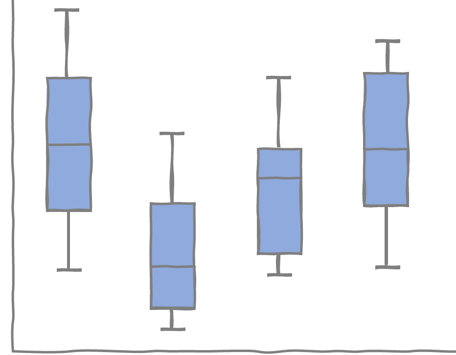
Boxplots offer a condensed display when evaluating the distributions of multiple datasets side by side. For example, the chart below compares test scores between subjects.

In this scenario, we can see that the range of scores is larger for English compared to Art. In general, Art scores are higher and more closely grouped together. The median Math score is lower than the other subjects, and none of the subjects have outliers or extreme test scores.
When should you not use a boxplot?
A boxplot may be a familiar visual if you evaluate dataset statistics regularly, but this chart type is unfamiliar to many people, and it could introduce a learning curve for them. Choosing a different display altogether may avoid confusion for audiences who do not know this graph or how to analyze the statistics it depicts.
If you are presenting a boxplot, consider the following to make interpreting it easier:
Narrate and build the chart piece-by-piece. A complex chart type such as this can be overwhelming when presented all at once. Instead, narrate and animate the building of a boxplot as you present, walking your audience through the graph’s structure and the meaning of each metric.
Include words. It’s always good to provide clarity and context through the thoughtful use of chart titles and annotations. If you are not presenting in a live setting, liberally annotating a boxplot (or iterating to a simpler chart type) can help viewers who might not otherwise understand how to interpret the graph.
Another thing to be aware of is that a boxplot does not display the distribution of data as precisely as a histogram or other distribution charts. In certain situations, boxplots can obscure important underlying information. For example, it can be hard to tell if your dataset is multimodal—meaning values cluster around more than one point—from a boxplot. In the illustration below, the majority of values are grouped in the 60s and 90s range, as shown in the histogram, but this is not as apparent from the boxplot representing the same dataset.

What are common variations of a boxplot?
Since the creation of the boxplot, other variations have been developed to display additional elements of a dataset’s distribution shape.
In a variable width boxplot, the width of the box is adjusted to represent the size of the data within each group. A larger dataset will be wider than a smaller one in this chart.

A notched boxplot narrows at the median value. The notches visualize a form of confidence interval around the median, which helps to compare different datasets. If the notches of the boxes from two different boxplots do not overlap, then there is a statistically significant difference between the medians.

A violin plot combines a boxplot with a distribution curve. The width of each curve corresponds with the approximate frequency of data points in each group. Since violin plots display more information, they are busier than a traditional boxplot.

Where can you practice and learn more about boxplots?
This video provides an overview of boxplots and alternatives to consider if your audience is not familiar with this type of chart. For related practice, take a stab at presenting a boxplot with this exercise in the SWD community.
Most graphing tools offer boxplots as a standard chart type. Links for commonly used tools are provided below.
To learn more about other charts, browse the full collection in the SWD Chart Guide, or for resources to teach younger audiences, check out DaphneDrawsData.com.
Master complex charts in our NEW! on-demand learning course
Learn in-depth techniques for creating, designing, and effectively presenting more novel views in PowerPoint. Through step-by-step video lessons, you'll master radar charts, box plots, scatterplots, horizon charts, and bubble graphs. With optional exercises to reinforce your learning and bonus materials covering additional graph types, this course will elevate your data presentation skills. Enroll today!