no more excuses for bad simple charts: here's a template
If you're using Excel to try to tell a story with data, plotting the data in this application should be the first step in your data visualization process, not your last. It takes time, iterations, and sometimes some brute force to get from the graphing application's defaults to a visual that you're proud to present.
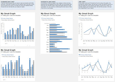
I've often given others the advice to create a template in Excel that has some of the obvious things done and use that as a starting point instead of starting from scratch each time. But to be honest, I've never followed this advice myself. Even though I think I probably should. There are those little things that I do every single time I use Excel: change the colors, remove the gridlines, move around and de-emphasize the axis labels, and so forth. None of these steps alone take much time, but when you put them all together and figure that I do them for every graph I make...this all sums up to a big time save to start from a place that is different than Excel's defaults.
So, to try to finally follow my own advice, I've put together a long overdue template with some sample graphs that you can find here (screenshot below if you want to get a sneak peak prior to downloading). Perhaps in addition to eliminating some of my personal Excel time-suck, this will help alleviate some pain for you as well? (Note: I created this in Excel for Mac 2011, but am hopeful the formatting will come across on a PC as well.) Give it a try and let me know what you think!