data viz challenge
A participant from a past workshop recently reached out to me hoping for help visualizing some data she wants to communicate about affiliate community foundations to members of those organizations and her board. Rather than keep all of the fun for myself, I thought I would put this challenge out to you.
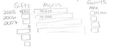
Here's the description of the problem faced: Basically, we serve as a host or parent organization for several smaller, local foundations throughout our service area. What we would like to show is how the money-in (gifts) compare to the total assets and money-out (grants) in a given year, and also allow the audience to compare their foundation to the other affiliates.
The data is contained in several separate tables (attached), and includes not only the values in $ but also the number of gifts, funds and grants. This information is not critical to the story, but if there's a way to include it (possibly by merging a table and graph, as I saw on your site) there are some specific cases where having this information will be useful. I can see where it will be hard to include it though, without being cluttered.
I'm open to whatever suggestions you have. I attached a pencil drawing of what I was picturing, but I'm not dead set on it being a certain way. I thought the format would be good because it allows you to visualize the relative size of the incoming to the outgoing for a given year, but also see how it changes over time, and how it compares to the other organizations, fairly easily. If there's a way to include the data labels in the bars or something, that would be good.
One major obstacle may be that the values vary so much (from something like $28 to almost $5 million). I don't know if this will make it impossible to do visually. It will be fine to drop the cents off the values.
[8/7 update: see comment below for additional context.]
Here's the sketch provided to start to get the creative juices flowing:
You can access the full data here.
Your challenge is this: come up with a straightforward way to visualize this data that will allow for the main desired comparisons outlined above by Wednesday, August 15th. When complete, you can leave a comment with a link to your visual, or email it to me directly (cole.nussbaumer@gmail.com) along with any comments you'd like me to post with it, and I'll put it into Dropbox and create a comment for you with the link.
What will you win? A chance to help a philanthropic organization better communicate with data. Eternal notoriety. Oh, and I'll invite the creator of my favorite to write a guest blog post. Ready... set... GO!