visualize your LinkedIn network
LinkedIn launched what I consider to be a very cool addition to their site last week: the ability to visualize your network. They call the tool InMaps, and once you log in and hit go, it cycles through your connections to build a striking visual. Each node represents a connection (mousing over will tell you who each is, or clicking on one will highlight their connections within your network). The bigger the node, the more connected the person is. Contacts are clustered into groups and color coded based on their associations with one another.
Let's see it in action - here is my network:
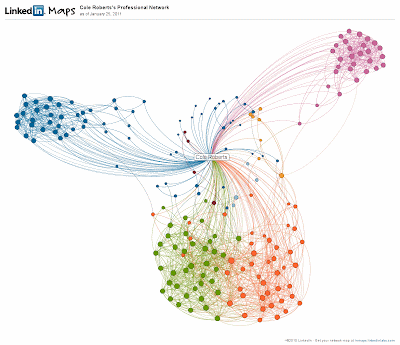
My network is divided into four main clusters (two of which are closely related). In blue are my Google colleagues. Pink represents my connections from business school (go Huskies!). The green and orange intersecting clusters at the bottom represent my contacts from Washington Mutual. I worked in a number of different roles when I was there, and by looking at the names it appears LinkedIn has grouped two of the main ones: the first (green) are connections I made while managing home equity fraud, and orange represents those made from my earlier various roles in credit risk management. It makes sense that this network is the largest - I worked there longer than I have anywhere else and was working there when LinkedIn was created and first started to become popular.
Visualize your network. See what insights you can draw. And if we aren't already connected, send me an invite! UPDATE: LinkedIn discontinued the InMaps product, which allowed users to easily do this, however a Google search can point you to some other ways to visualize your network, including these instructions.