accessible data viz is better data viz
Accessibility in data visualization goes well beyond considerations for color blindness. This is something I personally understand much better after my interactions with Amy Cesal in preparation for bringing you the following post. Back in April, we posted a short article here with some accessibility considerations in visual design and Amy sent me a private note basically expressing, “but wait…there’s more!” I love when content posted on the blog starts conversations like this—as I continue to learn, it means there’s more great content to share with you. Just be aware that if you reach out like this, I may talk you into doing some writing and sharing: that’s what has happened here when I invited Amy to pen a guest post and she graciously accepted!
I was already familiar with some of Amy’s work (if you haven’t seen it, be sure to check out her #DayDohViz, where she is in the process of creating 100 visualizations made out of PlayDoh, including a couple she’s shared via #SWDchallenge—you can view them all here). Amy first started being interested in accessibility for data visualization through her work in the federal government, where everything has to be up to 508 accessibility standards. At CFPB, she led the creation of the data visualization portion of the design manual, which is the first style guide for the federal government that includes accessibility for data visualization. Please join me in thanking Amy for writing and sharing the following expanded post on accessibility in data visualization!
accessibility matters
Often, when we are creating charts and graphs, we think of ourselves as the ideal user. This is not only a problem because we know more about the data than the target user, but because other users might have a different set of constraints than we do.
Inclusive design principles and accessibility (often posted about with the tag #a11y) are important to take into consideration when designing data visualization because they help a broader audience understand your graphic. Designing with accessibility in mind can even help make your visualizations easier to understand for people without disabilities.
To help you understand how other people experience the world, empathy prompts provide a variety of suggestions. The Microsoft guide to the principles of inclusive design, excepted below, suggests thinking about temporary and situational disabilities as well as permanent ones.
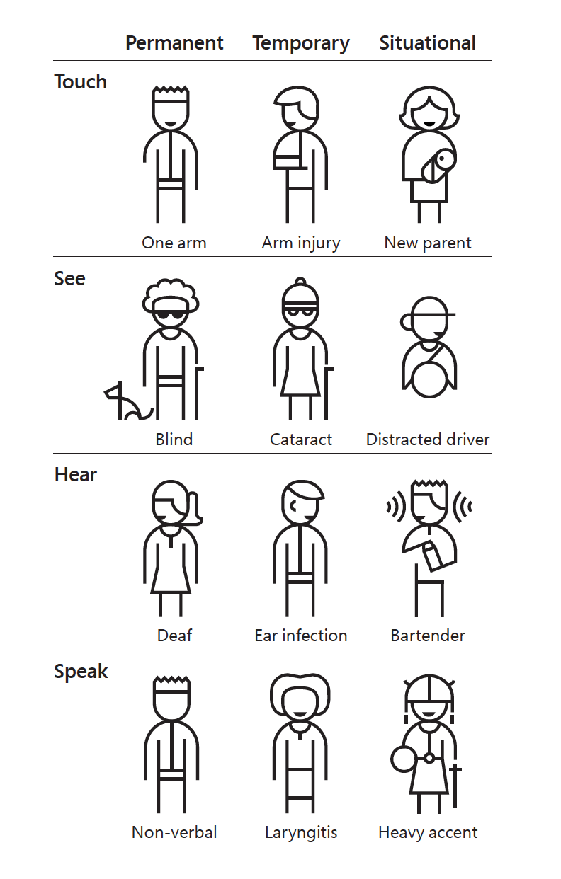
Excerpt from the Microsoft Inclusive Design Guide
Being clear with text, distinctive labeling, and adding multiple ways to identify the point to your visuals will make it easier for people with impairments and those without to interpret your graphs. There are easy ways to add the principles of accessibility into your visual communications. Here are five simple ones.
5 easy ways to make your data visualization more accessible
1. Add Alt text
Alternative text (referred to as Alt text) is displayed when the image cannot be. Screen readers, the assistive technology used by people who are visually impaired, read alt text out loud in place of people seeing the image. It’s important to have valuable alt text instead of “figure-13.jpg,” which doesn’t help a user understand the content they are missing. Screen readers speak alt text without allowing users to speed up or skip, so make sure the information is descriptive but succinct.
According to the CFPB data visualization guide, which I helped create, good alt text includes: one sentence of what the chart is, including the chart type for users with limited vision who may only see part of it. It should also include a link to a CSV or other machine-readable data format so people with impaired vision can tab through the chart data with a screen reader.
If you frequently use data visualizations in Microsoft products, this guide will help you learn how to add alt text to them.
2. Employ a takeaway title
Research suggests that users read the title of the graph first. People also tend to just rephrase the title of graph when asked to interpret the meaning of the visualization. When the graph title includes the point, the cognitive load of understanding the chart decreases. Recently, when writing about how to effectively use words in graphs, Cole advocated for what she called a takeaway title. People know what to look for in the data when they read the graph takeaway first as part of the title.
3. Label data directly
One way to reduce the cognitive burden on users it to directly label your data rather than using legends. This is especially useful for colorblind or visually impaired users who may have difficulty matching colors within the plot to those in the legend. It also decreases the work of scanning back and forth trying to match the legend with the data.
Notice the difference in the following visual example. Compare how quickly you understand them and the relative ease of processing the one that is labeled directly.

An example graph using legend vs. direct labeling
4. Check type and color contrast
In the data visualization community, we’ve started addressing how to design for red/green colorblindness. This is an issue for 8% of men and 0.5% of women with Northern European ancestry. However, we should also consider users with low vision and a variety of other conditions that affect vision. The W3 WCAG guidelines specify necessary contrast and text sizes for readability on screen. There are a number of tools to help you abide by these contrast and size standards. For example, in the following screenshot the top example passes color contrast standards, where the below version is too light and fails.

Example of the for the color palette contrast evaluation tool WCAG standards
Tools to help get you started:
Color blindness simulator for images or
5. Use white space
White space is your friend. When information is too densely packed, the graphic can feel overwhelming and unreadable. It can be helpful to leave a gap between sections of a chart. Judicious use of white space increases the legibility by helping to demarcate and distinguish between different sections without relying only on color. This can also supplement accessible color choices by helping users distinguish the difference between colors that identify separate sections.
In the following example, compare how easily you can distinguish the sections. Now imagine if you more difficulty distinguishing between the colors. The lines between them help you to visually identify each chunk.

Example graph with no line and with a white divider line between categories
These are just a few things you can do to help everyone easily comprehend the graphs you create. You should strive to make sure that everyone, not just you or your ideal user, understands the point of the visualization. When you consider accessibility, you create a better product for everyone.