#SWDchallenge: how would YOU makeover this graph?
Two months ago in July, our challenge to you was a makeover of your choice (with 45 of you rising to the occasion!). September's challenge is a slightly different flavor of the makeover theme: this time, we'll all use the same visual as a starting point. More on that momentarily.
Learning by practice: improving an existing graph sharpens your skills
I'll start with a few comments on the art of undertaking makeovers. Since joining the storytelling with data team last year, I've tackled nearly 100 makeovers of clients' graphs and recently started teaching our custom client workshops. The last section of our workshops is my very favorite: when we turn it over to participants for hands-on practice. We review & discuss their examples of visualizing data and how we might apply the best practices we've covered that day to make the selected examples even stronger. The benefits of hands-on practice are two-fold: participants get feedback on their own visuals AND learn how to thoughtfully critique others' work. For more insight on the feedback process, check out Episode 1 of the SWDpodcast: the art of feedback.
As someone who once participated in a storytelling with data workshop in my previous role at Bank of America Merchant Services, I can attest to how powerful it is to have this critique and feedback on your visuals. As we become so familiar with the data we analyze, it's difficult to take a step back and consider our work from the fresh eyes of our audience. Now as a workshop instructor, leading this discussion and thoughtful critique is a quite a shift from my previous roles (where I both analyzed and communicated with data) to now teaching others how to do it more effectively. To help you get started for this month's makeover challenge, I'll outline a few ways I approach evaluating graphs. Perhaps this will be helpful context as you undertake this month's challenge.
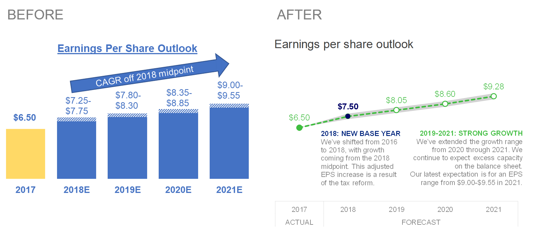
Start by noticing where your eyes are drawn first. What do you pay attention to in the graph? What works well in the existing visual? These initial notes will help create a plan of attack for embarking on your makeover. For example, before undertaking my makeover on the following "Before" graph, I noted that my eyes first went to the 2017 yellow bar so I assumed that was important context. However, after reading the original accompanying text (omitted here), it became clear that 2018 was key to the message, which is why the focus is on 2018 in the final view. I also took note of arrow above the blue bars appeared to signify growth and a positive outlook. Both of these initial impressions provided a starting point for what aspects to tackle in my makeover. View the full post with makeover and commentary for the "After" visual.
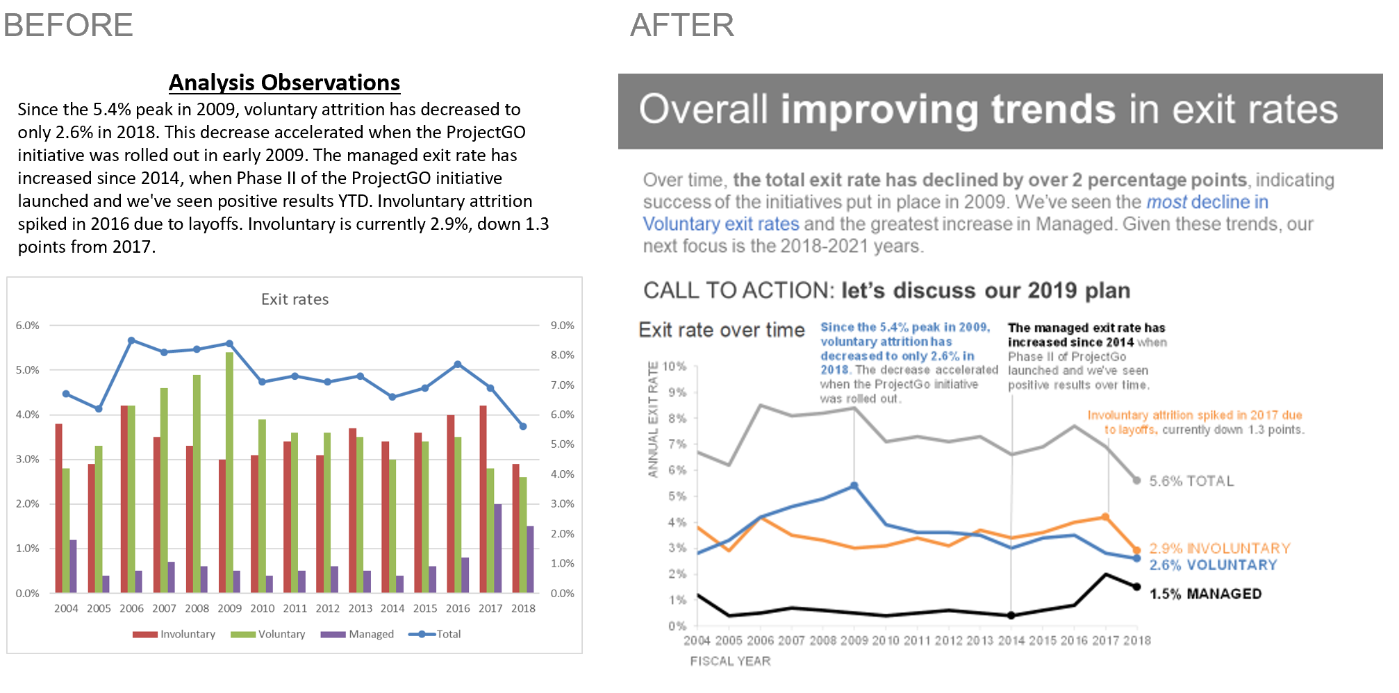
Identify clutter and make notes of anything that seems confusing or complicated. In the "Before" image below of this recent client makeover (I've de-identified the data to protect confidentiality), I noted my confusion of trying to figure out which series is graphed on the secondary y-axis, the imposed cognitive burden of visually processing unnecessary elements on the graph (chart border, gridlines, legend placement) and the amount of work it took to read the text at the top and try to find evidence of it in the graph below. The "After" image shows how I addressed each of these in my makeover.
Consider how you might graph the data differently. Does a different graph type allow you to see things that you otherwise might not have seen? For example, in the following makeover I reworked the client's initial treemap into a horizontal bar chart, which allowed us to better compare the size of the categories when they were aligned to a common baseline. If interested, here's more on my approach, thought process and general use case for treemaps. Also consider if the existing graph effectively visualizes the takeaway (if one is specified... if not, read on!)

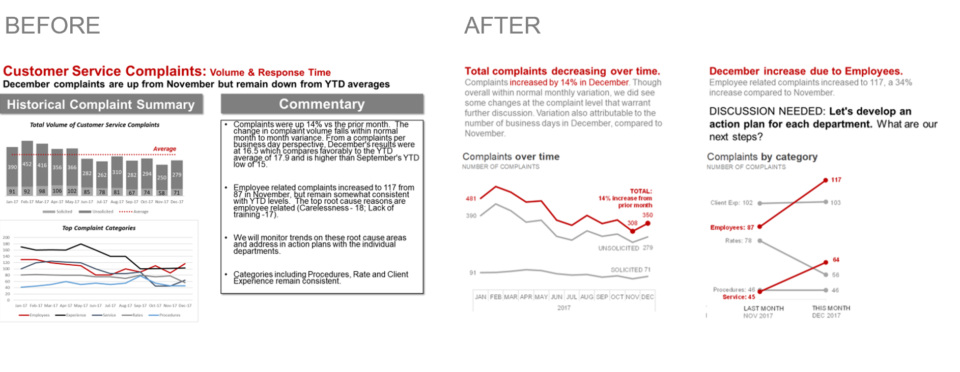
Evaluate if the takeaway and/or intended call to action is clear. How might you use color and other pre-attentive attributes to focus attention appropriately? If no takeaway or call to action is specified, what might one be? Check out the effect of focusing attention with color and adding a call to action in this makeover, which was a re-design of a slide from a client's recurring standard monthly deck. There's more context on why I added certain visual cues and words to make the takeaway clear in the full post.
With those thoughts in mind, now I'll turn it over to you!
September #SWDchallenge: makeover this graph
Consider the following visual: how does it strike you? Your challenge this month is to improve it utilizing data visualization and storytelling best practices. This is your chance to teach all of us something interesting: both from the makeover and your thought process behind it. You can download the data behind it here.

Here are a few aspects to consider as you assess and undertake your makeover:
Where are your eyes drawn? How might you use color strategically to focus the audience's attention?
How might you graph the data differently?
Is the takeaway clear? What might a potential call to action be? What broader story might this fit into? Feel free to make assumptions for the spirit of the exercise!
What additional data do you wish you had that might provide context?
Remember to be nice! When critiquing, we often have limited context on the constraints faced by the person who created the graph. The exercise is not to rip somebody else's work apart, but rather provide constructive feedback on what might be improved.
You have until September 12 (by midnight PST) to create and share your creation. Please follow the instructions below carefully—it helps us pull together and share all the submissions we receive!
SUBMISSION INSTRUCTIONS:
Make it. You can download the data here and use your preferred tool of choice to work your magic on it. This file also has the example makeover shown above for your reference.
Email it. Email your made-over graph (you only need to include the final "after" image) to SWDchallenge@storytellingwithdata.com by the deadline. Attach your image(s) as a .PNG. Put any commentary you’d like included in our follow up post in the body of the email (e.g. what tool you used, any notes on your methods or thought process you’d like to share); if there’s a social media profile or blog/site you’d like mentioned, please embed the links directly in your commentary (e.g. Blog | Twitter). If you’re going to write more than a paragraph or so, we encourage you to post it externally and provide a link or summary for inclusion. Feel free to also share on social media using #SWDchallenge.
The fine print. We reserve the right to post and potentially reuse examples shared.
We look forward to seeing your makeovers! Stay tuned for the recap post in the second half of September.