#SWDchallenge: emulate!

“Nobody is born with a style or a voice. We don't come out of the womb knowing who we are. In the beginning, we learn by pretending to be our heroes.” - Austin Kleon, author of Steal Like An Artist: 10 Things No One Told You About Being Creative
Think back to your imaginative play as a child. I’ll bet that you spent time dressing up and pretending to be someone else—a superhero, a firefighter, fictional character or maybe even a scary dinosaur! At our most basic level, we learn by copying others. This idea of emulating your sources of inspiration is the basis of this month’s #SWDchallenge.
When learning data visualization, we consider imitation to be a good thing. Practicing by copying others can help you further develop your skills. In Episode 14 of the SWDpodcast, twelve dataviz experts shared how they honed their data storytelling skills and several cited Steal Like An Artist as influencing their creative processes. In this book, Kleon writes that no one is completely original, rather we are a blend of our sources of inspiration plus our own style. He gives many examples of artists who developed their style by studying and emulating the masters in their field. Even Paul McCartney employed this principle, giving credit to Buddy Holly, Little Richard, Jerry Lee Lewis and Elvis as heavily influencing the Beatles’ evolution from cover band to the greatest rock group in history. Kleon’s principle is that by honorably copying others, we take on their style and refine our own at the same time.
Note that this is distinctly different from plagiarizing. Kleon illustrates via example:
“We're talking about practice here, not plagiarism—plagiarism is trying to pass someone else's work off as your own. Copying is about reverse-engineering. It's like a mechanic taking apart a car to see how it works."
Let me share an example illustrating how we can honorably copy in data visualization. I’m a fan of Nate Silver’s work. He’s the founder and Editor-in-Chief of FiveThirtyEight and has written an excellent book The Signal and the Noise on the value of thinking probabilistically. I read FiveThirtyEight for my daily dose of current events and to get inspiration for application of good data visualization principles.
I set out to emulate the chart below. This visual was referenced in this article, which examines the optimal intensity of exercise to reduce your chance of death.
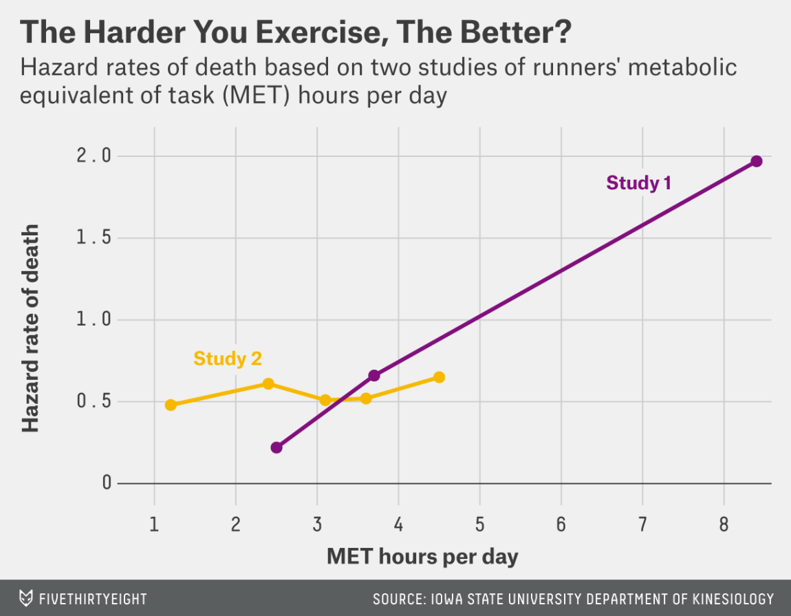
There are many things I like about this chart. The title sets my expectations for what I’ll see in the graph (the data suggests an inconclusive answer, thus why it’s posed as a question). I also like the choice of a connected scatterplot, which allows me to examine the relationship between the independent variable (intensity of exercise or MET hours per day) on the x-axis to the dependent variable (hazard rate of dying) on the y-axis.
In my process of emulating, my first step was to copy the visual as close as possible to the original. Even though I made some changes in my final version (I’ll address those momentarily), I was surprised how much value I found value in copying theirs exactly as is! I learned a few things in my tool (Excel) that I hadn’t tried before (namely, changing the gridline interval and axis ranges of the connected scatterplot).
For reference, here’s my first iteration in Excel. I’m visually estimating the numbers, so they won’t exactly match the original.

Step 1: I learned something new in my tool by copying the FiveThirtyEight original as closely as possible.
In moving from copying to emulating, I wanted to blend in my own style with a few design changes. Mostly, I wanted a visual that could stand on its own if it were removed from the article, which provided the relevant context that you’d need to interpret the data. I changed the subtitle to include the main takeaway and to elaborate on the question posed in the chart title. I added annotations about the two studies next to the data they describe. Finally, I wanted to emphasize Study 2, which backs up the main takeaway. I used the same color (purple) to create a visual connection between the subtitle and the line depicting Study 2.
Below is my final “honorable copy.” I’ve emulated, using the original FiveThirtyEight graph as a source of inspiration and adding my own style.

My final emulated copy (note: data visually estimated from FiveThirtyEight original).
Now it’s your turn.
the challenge
My challenge to you: find a visual you like and emulate it. This can be any visual from any source (please give credit to the source). We encourage you to peruse examples from the media, blogs, or dataviz experts to find sources of inspiration (over time, start a visual library that you can refer to and be inspired!). Don’t be hindered if you can’t find the underlying data—it’s fine to visually estimate for the purpose of this exercise (note clearly if you’ve done so).
DEADLINE: Wednesday, April 10th by midnight PST. We are back to normal protocol this month: submissions must be emailed to us for inclusion in our summary recap post—full details below.
SUBMISSION INSTRUCTIONS:
Make it. Create your emulated visual with the tool of your choice. If you need help finding data, check out this list of publicly available data sources. You're also welcome to use a real work example if you'd like, just please don't share anything confidential.
Share it. Email your entry to SWDchallenge@storytellingwithdata.com by the deadline. Attach an image of your submission as a .PNG. Feel free to include both the original and your honorable copy but please send as a single image. Put any commentary you’d like included in the follow up post in the body of the email (e.g. what tool you used, any notes on your methods or thought process you’d like to share); if there’s a social media profile or blog/site you’d like mentioned, please embed the links directly in your commentary (e.g. Blog | Twitter). If you’re going to write more than a paragraph or so, we encourage you to post it externally and provide a link or summary for inclusion. Feel free to also share on social media at any point using #SWDchallenge but for inclusion in the summary recap post, submissions must be emailed to us—we don’t have the time to scrape Twitter and other social media sites.
The fine print. We reserve the right to post and potentially reuse examples shared.
We look forward to seeing how you’re influenced by your sources of inspiration! Stay tuned for the recap post later this month, where we’ll share back with you all of the visuals created and shared as part of this challenge. Until then, check out the #SWDchallenge page for past challenge details and recaps.