start with a clean slate (template)
Hi, I'm Alex, and I'm super excited to share the following tip in my very first SWD blog post! I’ve struggled firsthand to find the time to create better graphs that drive change. Here’s a quick Excel tip I picked up after spending a ton of time formatting graphs—again and again. I hope you find it useful!
Sadly, there isn’t a magical solution for quickly creating an effective graph. Identifying the right chart to use, re-formatting all the default settings, iterating after receiving feedback—all of this takes time. In the past, I saved time by repurposing my existing graphs instead of starting from scratch—an unofficial template if you will. Nowadays, I’ve discovered a more elegant solution—Excel’s custom chart templates.
Custom chart templates aren't a new feature, but I'm not sure how widely known they are. In a guest post, Bill Dean briefly recommended using these to create a non-standard Excel chart, The Bullet Graph. Another use-case is to create what I call a “clean-slate-template.” This is a chart template that incorporates many best practices and allows you—the creator—to focus on the strategic use of color and words while saving time on formatting.
To illustrate this, let’s look at a makeover from Cole’s first book, storytelling with data.
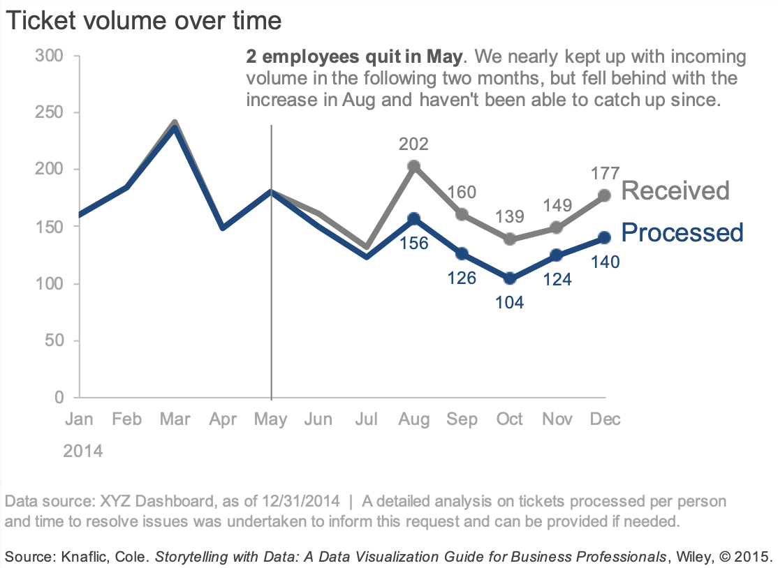
This graph was created in Excel, and it took a lot of formatting to go from a standard line chart to the final product. Built-in charts typically have borders, gridlines, and color-legends—things that you may avoid when decluttering your graph.
For example, here is a standard line chart created in Excel with the same data.
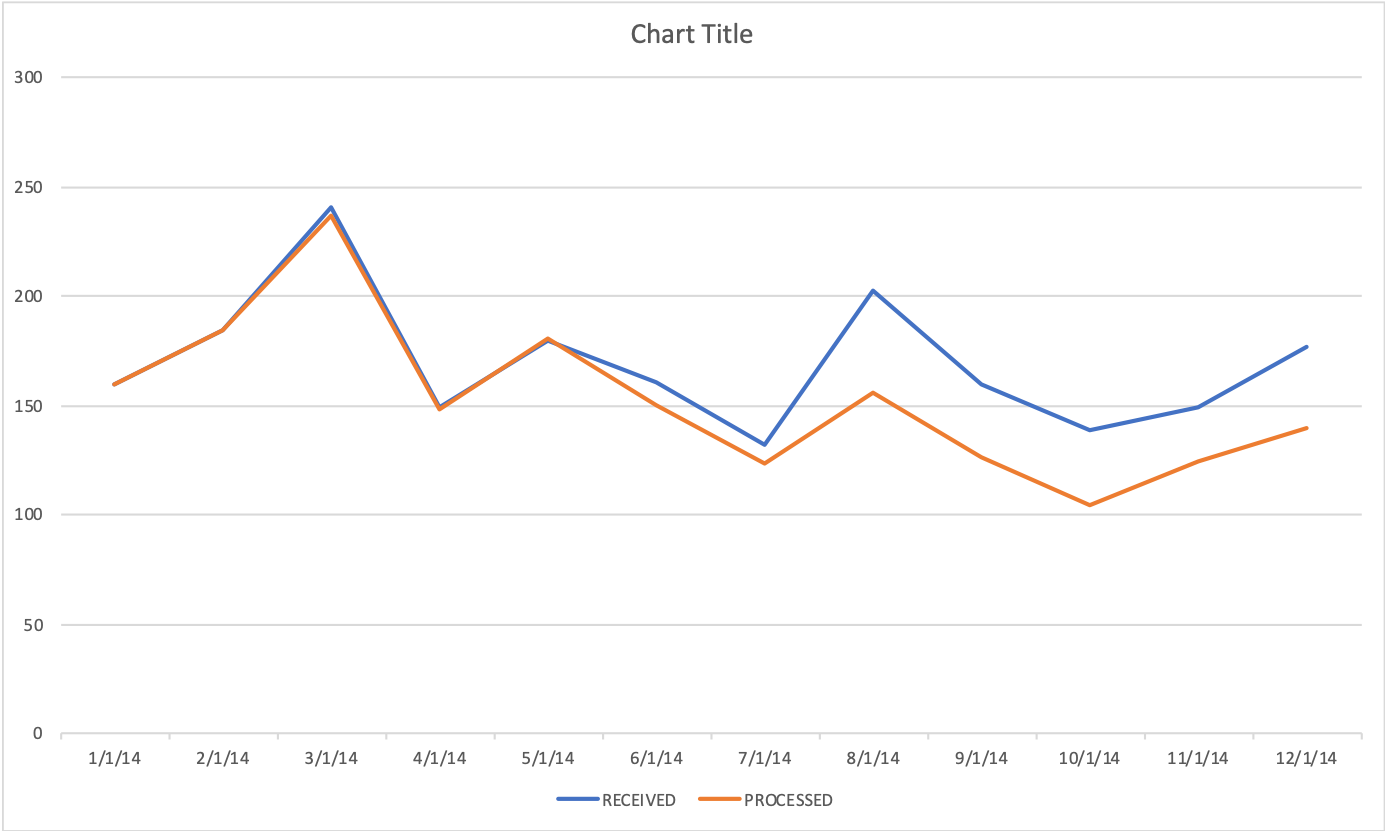
The above graph is less than ideal. This is where a clean-slate-template can come in handy. It can eliminate many formatting steps, so you have more time to bring your data to life. It also reminds us to incorporate best practices.
If I use a clean-slate-template, my new default line graph looks like the following.

This version is much cleaner and puts me several steps closer to emulating the makeover. Also designing in gray helps to reinforce that color should be used strategically rather than to categorize data.
Follow the steps below to create your clean-slate-template.
Create a new color theme. Set the first text color and all six accent colors to gray. A gray color theme can save you time by coloring both data and axes gray in one step.
Identify a dataset.
Insert your chart of choice. In the above example, I used a line chart because this is one of my most frequently used graphs. Before inserting the chart, make sure you are using the gray color theme.
Apply any common formatting. Everyone’s graphing style is different, so this list will likely differ. I changed all fonts and sizes, deleted legends, added labels, removed borders, and added a text box for footnotes. The layout and level of detail in your data always matters when graphing. I chose to build this template off of monthly data and I chose to display the months as “MMM”. If you typically graph monthly data, then this may be a good time-saving step, but if not then I’d suggest leaving the dates untouched in your template.
Save your template. Right-click on your chart and select the option to save as a template. Then give your template a name and select ok. Your template is available for immediate use in the templates folder under charts.
Chart templates save formatting, so if you want to apply your document’s current theme then right-click to select Reset to Match Style.
You can share your templates amongst your team to save everyone's time and ensure consistency. Click here to download my clean-slate line template created in mac-Excel 2016. (If using, you may need to expand the size of your graph for proper spacing.) Be sure to save the template in your machine’s template directory.
To find the directory, navigate to the Manage Templates folder under Insert>Chart. A pop-up window will open with your file path.
