search & filter
Have you ever thought to yourself, I wish I could see a bunch of examples of graphs showing _____; or wondered, How do people typically visualize _____? Given that you’re reading this on the storytelling with data blog, perhaps you’ve even asked yourself, I wonder how Cole and the team at SWD would graph _____?
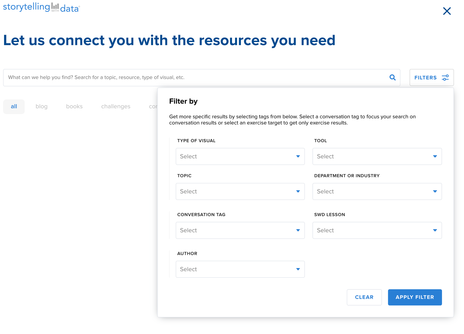
You can use our search and filter functionality to find a plethora of examples and answers to these questions. Simply navigate to the blue search button at the top right of any storytelling with data site or community pages (including this one, for those reading on storytellingwithdata.com) and click SEARCH.
To the right of the search bar that appears, you’ll see a button for FILTERS. Click that one, too. You’ll be presented with a menu you can use to filter in various ways. This will serve up visuals from galleries of all the members in the SWD community (including mine, where I’ve uploaded all of the graphs from both of my books). Also in the results you’ll see relevant blog posts, challenges, exercises, and more.
For example, let’s say you are looking for examples where a metric of interest is plotted against a goal, target, or average (recently, Ajay started a conversation in the community seeking precisely that). In the FILTERS menu, under TOPIC select "Comparison to plan/target/average." The following video depicts the quick process. Here's the link to the results—multiple pages of graphs!
This is just one topic example, the list is long. You could use the same process to see examples of attrition, cohort analysis, seasonality, or survey data, just to name a few (if you have ideas on tags that should be added, you can suggest those). You can also filter by graph type, tool, and department or industry.
More recently, Noushad started a conversation asking how to visualize NPS—Net Promoter Score, a common summary metric used in voice of customer analytics. Search and filter can be used a couple of ways to get examples in this case:
Similar to the prior example, in the drop down TOPIC, we could select "Net Promoter Score". Here are the results. This returns a more narrow set of examples.
We could also go broad, and in the drop down DEPARTMENT OR INDUSTRY, select "Customer Insights." Here are the results. This casts a wider net, so not all will be specific to NPS, but will likely include additional relevant examples that may inspire ideas.
Speaking of inspiring ideas, if you don’t have a specific question but want to look at a lot of different graphs, check out the discover tool in the SWD community. You can use it to shuffle through a ton of different visuals. You may find something you didn’t even know you were looking for.
Where do all these visuals come from? Each time someone uploads a graph to the SWD community (whether to their gallery, as part of a challenge, or feedback request; as I mentioned, in my gallery I've added the graphs from both of my books), they are asked to tag various things. While this can be a mild annoyance in the moment, it's exactly to meet these types of needs that we designed things this way. You can use these same fields to filter when you search within the community. This is amazingly powerful. And will become even more so as people continue to share their work and add datapoints (an expression of endorsement) to good examples.
Add visuals you’re proud of to your gallery (not yet a member? take 2 minutes and sign up for this great free resource), tag them appropriately and they will become search and discoverable by others. Let your great work inspire the community. And use the awesome work that’s there already to help answer your next question!