FlowingData challenge
I am a regular reader of Nathan Yau's FlowingData blog. Today, he posed a challenge: redesign the following graphic, which summarizes responses to Pew Research Center's polls on how people get their news. I was planning to wait until the weekend to tackle it, but once my work wound down today, couldn't help but spend some more time in front of the computer to take on the challenge.
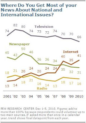
The graph isn't horrible. But there are a few things that bother me:
- There's simply too much going on. There's no need to label every point. Also the data series names look messy to me intermixed with the graphic.
- The color scheme is not colorblind friendly. Around 8% of men and 0.5% of women are color-blind, which most often means difficulty distinguishing between shades of red and shades of green. This means the Newspaper, Internet, and Radio trends (and corresponding data labels and series names) will all look grey to a portion of the audience. I imagine Internet was made red on purpose to stand out, but this will be lost on those who are colorblind.
- The graph is compressed horizontally. Yes, the proportion citing Internet as their primary news source has increased. But the compression seems to overemphasize this.
I played around with converting to % growth. Doing so shows the increase in Internet very clearly, but you miss an indication of the beginning baseline to really make sense of the numbers. Rather than do that, I left the chart mostly as it was but made some relatively minor changes to fix the things bothering me that are outlined above.
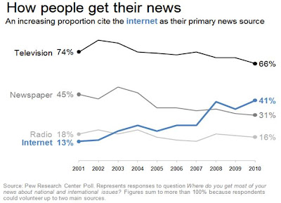
I was a little reticent to post this at first, as it is very similar to the makeover I posted last week. But one thing I often say in my Data Visualization course is that if you find something that works, use it again and again. From my perspective, this works.
Let me know what you think!