a new year's resolution: declutter your graphics
Happy 2011! One popular new year's resolution is to declutter: declutter your closet, declutter your life. I'd like you to consider decluttering of a different variety: declutter your data visuals.
Last month, I visited a Midwest retailer to run a workshop on communicating effectively with data. Leading up to the session, I asked participants to send me data visualizations on which they would like feedback. I decided I'd take it a step further from just providing feedback and do visual makeovers on a few of the submissions.
As I was revamping the graphs, I relished in the fun of teasing a story out of data. It never ceases to amaze me how relatively minor changes can take a visual from a mess of data to a clear message that pops. In this post, I'll walk you through one such transformation. (Note: I've changed the data so as not to give away any sensitive information.)
BEFORE:
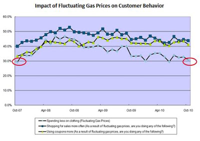
The intent of the graphic (discerned from the slide title, which is omitted above) is that, while spending less on clothing and using coupons more both have net increases over the time period considered, shopping sales more often is relatively flat at end of period compared to beginning of period. This is highlighted directly on the graphic via the red circles at the beginning and end points.
It takes a bit of time and patience to tease this story out with the above graphic. That's due to a couple of reasons:
- The sheer distance between the series and the legend means you have to refer back and forth a couple of times to understand what you're looking at and which series is which (the different colored shapes on the black lines aren't immediately visually very different from each other, which doesn't help).
- There are a lot of distractions that you have to sift to in order to figure out what's important to pay attention to. The background shading, gridlines, and borders don't add any informative value. But visually, they are as strong as the data, which means we have to take everything in to establish an order of priority in which to consider the information, because this isn't done visually for us.
Below is my remake, graphing the same data.
AFTER:
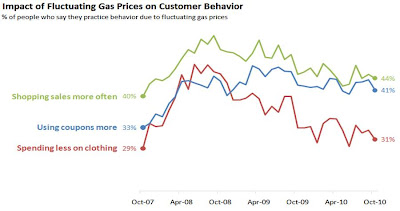
First, I changed the series colors to be strikingly visually different from one another. I eliminated the markers for the individual data points, which added unnecessary clutter. I left markers for only the beginning and end points (and labeled those directly, removing the y-axis altogether), since the story the author seemed to be trying to tell focused on those.
I eliminated the background shading, gridlines, and borders. Not only did these not add informative value in the original visual, but they actually make the data stand out less. If we want our data to tell the story, we need to make it stand out the most. In the resulting visual, there are few things competing for our attention, so we can relatively quickly and with little effort start to see what can be learned from the information that is being presented.
Note: One thing you don't get from my madeover version is a clear indication of the magnitude of the points in the middle of the graph (though you can get some sense of this from the relative positioning of the labels on either end). If this were important (I don't believe that it is here), you could add very thin, light horizontal gridlines at multiples of 10's to help make that more explicit.
Often, it is minor changes that will help you take a visual from good to great. Decluttering is a great place to start improving the effectiveness of your graphics. Ask yourself: does this need to be here? Is it adding any informative value? If the answer is no, then take it out!
Leave a comment to let me know what you think. Stay tuned for more makeovers!