guest post: designing for future data
Back in August, I ran a data visualization contest, challenging readers to remake some Economist visuals about the world population forecast. A dozen readers shared their ideas for reimagining the visuals and I invited a few of my faves to write a guest blog post here. Jeff Harrison is the first to take me up on this offer. The following is his post (thanks Jeff!).
Many thanks to Cole for the invitation to guest-blog! Storytelling With Data has been on my reading list for a few years now. Working as a consultant, I get to put together my share of presentations, and the conversations here have helped me communicate findings to clients more thoughtfully and effectively, and to frame up some good data visualization principles for others in my company.
Beyond using charts and graphs to make my own points, I often end up designing visualizations for data that doesn’t exist yet. It might be a dashboard or a specialized display, or just a simple graph within a user interface. Regardless, the goal is to support someone else’s analysis, rather than communicating my own.
Designing visualizations of this type can be tricky. When you are using data to support your own story you can annotate and emphasize to your heart’s content:

When you design for data that doesn’t yet exist, it feels more like this:

Are quarterly sales trends by region truly interesting to your audience? Is this comparison always interesting, or just in a given situation? What kinds of decisions might your audience make after looking at this graph? Answering these questions usually means talking to people who may someday end up using your design.
What Story Does This Tell You?
One-on-one conversations with real users can reveal differences in how designers and users think about data. I once worked with a company that had designed an online calculator for estimating retirement expenses. The idea was, you’d answer some questions about your situation and it would show you how much money you’d need over the course of your retirement. It also showed you a projection of your savings and retirement income, so you could estimate the gap and decide whether you needed to take action. In essence, it was this:
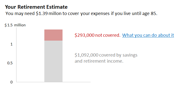
Unfortunately, people weren’t responding to it as expected. Few people clicked on the call to action. Many people were abandoning the session even before they got to the graph. To figure out what was happening, we found some people who looked like the intended users of this tool and listened to them while they walked us through the steps.
We did find a few usability issues, but a bigger concern was that the calculator was designed for the wrong task. The design was based on an overly rational view of how ordinary people go about financial planning. Users had to navigate through several screens, each of which asked them to predict the future: How much will your pay grow each year between now and your retirement? How will your investments do? How much do you expect to get from Social Security? How long are you going to live? Then, the graph displayed projections.
If you found out you were going to run out of money, the rational next step might be to create a plan to address the shortfall. The problem was, participants didn’t know whether to believe the story the chart was telling them. It suggested a degree of precision that wasn’t credible, given all the guesswork that went into getting it. There was no way to judge how sensitive it was to bad guesses on the preceding screens: How does the number change if you end up living five years longer, or if your investments do a little worse? Realizing that the numbers were rough estimates, some participants went through the entire flow multiple times in an effort to explore scenarios and better understand the overall equation. For that task, they might have been better served by a different design:
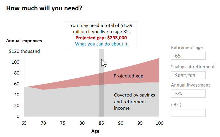
In this sketch, the chart shows you how your annual expenses will grow over time so you can see the effects of living longer without having to commit to a funeral date. For any given age, a callout shows the cumulative numbers (the values encoded in the original bar). You can explore scenarios by changing the assumptions in the form at right and watching what happens to the graph.
User research takes some time but the value is tremendous. Without talking to users it would have been difficult for us to figure out the subtle mismatch between “estimate retirement expenses” and “understand the factors that contribute to retirement expenses,” and what we learned gave us something to act on. If I were going to build something like the sketch above I’d first want to flesh out the details, put plausible data in it, and put it in front of some more users, but what we learned from talking to people would make me optimistic about the overall direction.
Imagining the world from another person’s point of view is hard. Even an understandable-sounding goal like estimating retirement expenses can mean different things to people in different contexts. You probably don’t have the luxury of taking a few weeks to put together a user study every time you need to make a chart, but the good news is that even a few informal conversations is probably better than relying on your assumptions. Talking to users about how they interpret what they see increases the odds you’re going to get it right.
Jeff Harrison is a senior user experience consultant and graph guy at Evantage Consulting in Minneapolis.