and the winner is...
Earlier this month, I ran a visualization challenge, inviting improvements upon a few world population visuals published by The Economist. BIG THANKS to everyone who participated and spent their precious time creating and sharing their visualizations, which I'll in turn share with you in the following post.
One of the things I love about data visualization is that it sits at the intersection between science and art. When it comes to the science side: there are absolutely guidelines and best practices to follow. But there is also an artistic component. This means that two people faced with the same data visualization challenge may approach it in totally different ways. Or, as we'll illustrate here, eleven different people might approach the same challenge in different ways. There's great room for diversity of perspective, which is awesome. That's one reason this space is so fun.
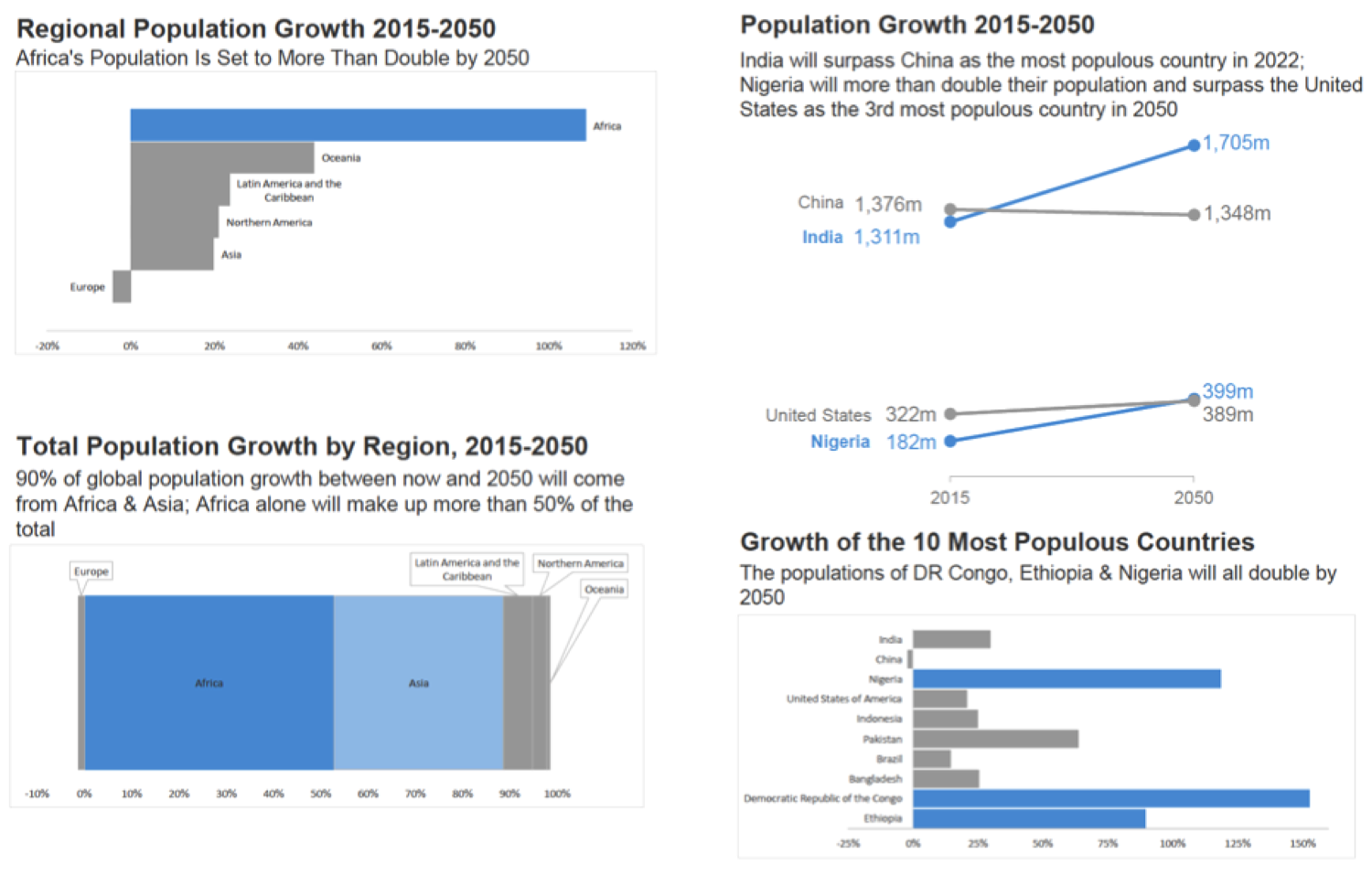
Before I highlight the awesome submissions (with some commentary on each), let's look at The Economist's visuals that inspired the challenge in the first place:

See original with accompanying text here.
The following submissions are shown in the order I received them. Make sure to scroll to the end, where I'll pick my personal fave!
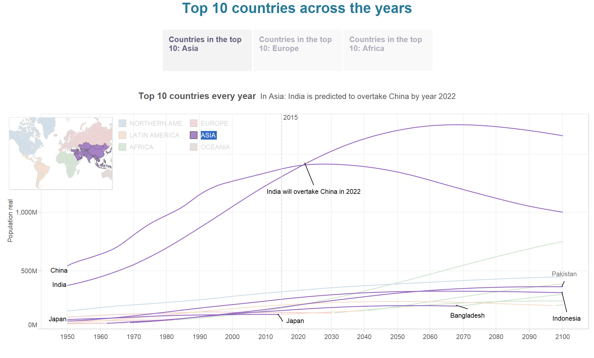
Submission 1: Amber Smart
Amber was an early entry, which meant she had time to take the feedback I shared with her and incorporate it. Here's the first Tableau visual that she shared:

This is a sharp looking visual. I like how the regional breakdown is shown at the top right visual so that it's possible to see the trends over time relative to each other as well as have the summary stat of the overall growth in the circles at the far right.
The question I posted to Amber was on the choice of colors in the slopegraph at the bottom. I'd be inclined to have all of the lines the same color unless I wanted to draw attention to one or a few and make those different. Also, it's interesting how the placement of the #1, #2, #3, etc. in the bottom graph could cause you to read the graph slightly differently - the way it is now with the labels at the left, I make observations like "China is currently #1, will move to #2" whereas if those labels were instead on the right to help draw attention there first, instead I'd start with observations like "India will be #1 in 2050, whereas it is #2 today." It is interesting how relatively minor design decisions like this can change how someone reads and interprets.
Here is Amber's slightly modified visual based on my comments (nicely done!):

Submission #2: Mitesh Parekh
Mitesh also created his visualization using Tableau, commenting that he is new to the world of data viz and that he's testing his skills with this submission. I gave him early feedback on making sure everything is clearly titled/labeled, which he updated in the version shown below. I like how some of the graphs are titled with the respective question that they answer. I also like the takeaways outlined along the right side of the visual, giving the reader some meta-points to focus on. One point of feedback would be on the use of color throughout the visual, as it isn't always clear to me what the difference in colors represent (or whether they represent anything at all). My advice in general when it comes to the use of color is to not use it to make something colorful, but rather to focus attention where you want your audience to pay it. Overall, good job!

Submission #3: Leonard Murphy
Leonard created his visuals in Excel, using some templates that I've previously shared (for example, this and this). I promise, I won't let that bias me! He also mentioned that this is the first time he's tried some of these techniques (a great low-risk place to test them out!).
Here are Leonard's comments: I took cues from the text of the Economist's short article to determine what points to make. My first chart is almost identical to the Economist's, but without the colour-coded regions. I converted their 2nd set of charts to a single chart to make a clear point about how much Africa & Asia contribute to total growth. In my 3rd chart I wanted to show how much faster India is growing compared to China (in real terms). Sadly it has the effect of making Nigeria's growth look lackluster. I didn't want to split the slope charts into 2, for fear that the scale (and therefore slope angles) would change misleadingly. My final chart is as much to show the top 10 most populous countries in 2050 as it is to show their growth.
Throughout I focused on 2015 > 2050 only. For consistency and for relevance. The world was very different in 1950, and by 2100 the forecasts are as much fiction as prediction. In fairness to the Economist, I suspect they're not using the charts to tell a story, but rather to fit a large amount of information into as small a space as possible.
Here are Leonard's visuals:
Leonard's original graphs were on two pages, so if anything is too small to read here, it's my fault, not his!
My take: the graphs are very clean and I like how Leonard not only showed the data, but also called out something interesting to focus on with the subtitles. As a point of feedback, if he wanted to take this a step further, he could make it even clearer why some of the data is highlighted (but not other) in blue by also making the subtitle text (or relevant portions of the subtitle text) the same blue. This would just be another visual connection showing that the text color and graph color are related. I also recommend adding axis titles (this is a point of feedback that is relevant for a number of the submissions - always title and label your axes!).
I like how the first graph is ordered by decreasing population. The final graph could benefit from this, too, which would make it more quickly clear that the countries expected to grow the most on a percentage basis are the ones that are highlighted (there should be logic in order!). Nice work!
Submission #4: Shobhana Thirumaran
Shobhana took a totally different approach to the population projections using a dot plot to illustrate the anticipated change by region (left graph below):

Hers was another early entry, and she iterated based on some feedback I shared with her. Overall, I think these visuals are nicely done. I found the graph on the left very interesting (I wouldn't have thought to show the data in this way). One minor adjustment would be to sort the geographic areas in order of decreasing size to help create a construct for the audience to use as they interpret the data. In the line graph, one approach would be to make all the overlapping countries at the bottom (and perhaps adding a single title for "Other" to make it clear that those are other countries shown for reference but not the focus). My final piece of feedback was to title the axes directly - you can figure out what each is from the graph title, but when you label directly your audience doesn't even have to think about it.
Here are the modified visuals from Shobhana (nicely done!):

Submission #5 - Geoffrey Felix
Geoffrey caught the blog post announcing the challenge when he returned from vacation, with less than a day left to create his visualization. He took a minimalist approach in Tableau, using lines and slopegraphs to summarize expected population growth in the various regions over time. Here are his visuals:

I like the callout in the first graph that points out when world population is expected to exceed 10 billion. I'd love to see similar callouts in the other graphs. I like how the change each region makes up of total is depicted via slopegraphs in the middle section and how he further details the absolute change in each area via the respective country breakouts at the bottom (I'd perhaps try to make this tie between the middle and final visuals even clearer). It's interesting to see that, in spite of anticipated huge numeric growth in India (final graph, left), the percent Asia makes up of total world population is expected to decrease (middle visual, left).
Note how we're able to make totally different observations with this view of the data than was possible with some of the other visuals. That's part of the power of having multiple people visualize the data in different ways. Great job!
Submission #6 - Eliza Sienko
Eliza's was another case where she came across the challenge without much time remaining, but she put in quite a bit of work, looking not only at the data that informed The Economist's visuals directly, but also much of the additional data included in the full report. Her three pages of visuals follow:


When it comes to Eliza's visuals, I love that she's called out the story and key takeaways via the text on the right. I also like how she combined tabular and graphical elements in a single visual in the second and third visuals, allowing there to be a lot of detail while still leveraging visual processing via the bars (related blog post).
In terms of constructive feedback, I was a little confused on the use of color. In some cases, the colored text ties directly to the color used in the accompanying graph (for example, green Africa in the first graph and green text describing Africa's big contribution to the population growth), but that doesn't seem to always be the case (for example, in the penultimate graph, the population getting older in text and Africa in the graph are both green). Being consistent in the use of color (and not using the same colors for different things) could help make the visual ties between the text and data clearer for the audience (though with so many data points, that's not always easy!). Overall, nice work!
Submission #7 - Chris Saden
Chris worked with a combination of tools to create his visualizations, ultimately refining everything in Inkscape, turning them into SVGs that scale well (as opposed to PNG and JPG that can become pixelated). He commented that he thought the more interesting part of the story was the comparison from what happened in the past to the projections. He pulled additional data from 1950-2015 for the first to graphics to show that comparison and to highlight that 2015-2080 are projections. Here are Chris' visuals (which he's also written about on his blog here):

I think Chris' visualizations are beautiful. The story is called out above each graph. Color is used sparingly, consistently, and strategically to emphasize and de-emphasize (I really like the way the forecast figures are set apart visually from the historical actuals). Everything is labeled, so there's never any question what the data represents. The thoughtful design fades to the background so you can easily focus on the story and the data. Awesome job!
The things I would do differently here are minor and more personal preference than best practice. Chris, though, clearly a perfectionist, was pointing out issues he sees with his own visuals (a cut off label, perhaps too much white space, the final visual being a little pixelated). We tend to be our own worse critics!
Submission #8 - Jeff Harrison
Jeff led his submission with the following commentary: It took maybe two minutes of exploration to figure out that Africa was the big story in the data, and a skim of the UN report summary told me that it was a story worth telling. The main problem with the original wasn't a bad choice of graph; it was the decision to present a laundry list of population facts rather than pointing out what such a rapid increase might mean for billions of people. The presentation needed a "so what," as we say in my office. There are other stories that I could have chosen, of course, but this was the most compelling to me.
Here is Jeff's visual:

This is another beautiful visual. I love the simple design, sparing and purposeful use of color, and the text that tells the story - any graph used to communicate data like this should have a "so what" as Jeff points out! I think it's clever how he titled the y-axes with the top data label - I haven't seen it done that way before. Jeff did a great job on the slopegraph, emphasizing just the increasing portions of the lines for the African countries but leaving the other data there for context. I'm not sure whether the country labels are needed both on the left and the right (could perhaps reduce to just on the right), but this is minor. The inclusion of the map is nice (and does well illustrating the point that not all of the growth is equal). I might have made the map shades of orange to make it clear it ties to the orange in the other graphs (and depending on how the countries in the slopegraph measure up, perhaps have them in the same shade of orange as each would be on the map - though this would be a bit more work!). Great job!
Submission #9 - Sanika Mokashi
Sanika created a full blog post detailing her approach to the challenge here, visualizing the data in the form of a Tableau story and focusing on a similar message as the original Economist article. She also found an earlier post from The Economist with the exact same visualizations based on predictions made by the UN two years ago. Here is Sanika's 3-panel Tableau story:


Overall, I think Sanika's visuals are beautiful. Everything is clearly titled. Key takeaways and stories are called out through a mix of subtitles and annotation directly on the graphs. I like the consistent use of color across each, with the map legend at the left (though I was still craving x-axis labels for the regions in the right hand side of the second set of visuals). I was a little uncertain on the inclusion of the far right graph in the first set of visuals (I think it's the same data that's plotted in the main graph in that section?). The separated waterfall chart in the second panel of graphs is an interesting approach for showing current population and also expected growth/decline by continent.
The images above are static, but in Sanika's blog post you can click the buttons at the top of the final visual to see the same graph for the top 10 countries in Europe and Africa as well (each with their own callouts of interesting things to note). Well done!
Submission #10 - Marie-Eve Vesel
Marie-Eve completed her visuals using Excel. Here are the comments she included with her submission: I decided to combine information from the first two original bar graphs into a single column graph. In my opinion, it’s a waste of space to use a graph only to show the regional % change when that same information can be effectively visualized in a graph also showing the actual population from 2015 to 2100. In this case, I think columns are easier to read than bars, especially to compare the size of each region over time, and also to see each region’s contribution to the total column for each year. I also emphasized the strong expected growth in Africa by using arrows larger than for the other regions (admittedly, I might have gone slightly overboard with the size…)
As for the most populous countries (on page 2), I opted for a slope chart split into three panels to avoid confusion from too many overlapping lines. Each panel focuses on a few countries, based on their 1950 ranking. I included the vertical axis to make the reader aware of differing scales for each panel. As opposed to drawing a straight line between the data points at 1950, 2015, 2050, and 2100, I used the actual underlying data to display the real population curve (yep, I’m an actuary and I like numbers, lots of numbers). I also differentiated between actual and forecasted values by using a solid line for actual, and a dotted line for forecasted. Finally, I included the ranks at the 2015 and 2050 marks so the reader can see how each country is placing over time. While I think the original graph was hard to read, I liked that they color-coded each country according to its region; so I kept that feature in my revamped version.


I really like the line graphs on the second page. They are well designed - great use of color and visual cues to set apart the forecast figures from the historical data. Marie-Eve packed in a lot of info without it feeling overwhelming. The one thing I struggle with is the difference in scale across the three graphs - I can totally understand why she did this to be able to actually see the details in the smaller countries in the second and third line graphs. Normally, I advise against changing the scale on similar graphs because it can be confusing for the audience, but the way everything is labeled clearly here and also with the graphs placed below each other (vs. side by side where there would be greater temptation to compare the heights of the lines across the three graphs, which the reader shouldn't do) - I actually think this works. In other words, I think Marie-Eve changed my mind. Nice work!
Submission #11 - Ned Haugton
The final submission was from Ned Haugton, who used this as an exercise in "colour scheme generation." Here are his comments: The colours are generated by assigning hues to each group (rainbow with 80% saturation and 80% value), and then using a sobol sequence to generate scale pseudo-random perturbations (±5% hue, ±10% saturation, ±10% value) that ensure that each country has a colour that is unique, and also very distinct from it's neighbours (by population). The code is available here.
I think this is an interesting approach (and thanks, Ned, for sharing your code!). You can see the expected growth in world population and get a sense of relative breakdown across continents, with big growth in Africa's population and slowing growth in Asia. Other observations are more difficult due to the stacked nature of the graph. I do like how this is totally different than anyone else came up with. Interesting approach!

and the winner is...
So I sat here with all of these beautiful visualizations trying to pick my personal fave. It is not an easy task!
When it comes to effective visualization, at a meta-level, I look for four things: 1) a sensible display, 2) absence of clutter, 3) affordance in design, and 4) a clear story (see related post with more detail). There were a number of submissions that I thought did a great job on all of these fronts.
Then I realized that this is my contest. Which means I can do whatever I want. More specifically, it means that I don't have to pick a single winner. Rather, I'm going to pick my favorite three that each do a great job of meeting the criteria outlined above.
The winners are (in no particular order):
Chris Saden | Jeff Harrison | Sanika Mokashi
Chris, Jeff, and Sanika, I'd like to invite you each to write a guest blog post for storytellingwithdata.com. I'll reach out to you to discuss specifics. Really great work!
Big thanks to EVERYONE who participated in this challenge. I'm honored to be able to feature everyone's entries here. I hope you enjoyed the challenge as much as I did!