how I storyboard
Storyboarding is one of the most important things you can do early on in the planning part of communicating with data to help ensure that your overall communication makes sense, meets the given need, and tells a story. A storyboard is a visual outline of the content you plan to create (ideally, before you actually spend time to creating content). I've written about it before here.
Rather than talk more about what storyboarding is and why it's important, in this post I'll share with you an example of some storyboarding I did this past year for my book and give you a sneak peek at one of the visuals that resulted from this process.
Chapter 2 of my forthcoming book focuses on choosing an effective visual display. In it, I cover different types of common displays of data and look at examples of and use cases for each. There are a plethora of different types of graphs and other visuals out there, and so I knew going in that I wouldn't be able to cover all of them. I went through several rounds of drawing different visuals I commonly use on Post-it notes and playing with the arrangement to come up with something that would make sense. But while I knew my approach wouldn't be entirely scientific, I realized as I was going through this process that it needed to be more scientific than that.
So I tried a more systematic approach. I went through every workshop presentation and all of my blog posts and consulting projects over the course of a year, categorized the various types of visuals I created, and tallied how many times I used each. I was surprised to learn that—out of the very many different visuals out there—there are exactly 12 that I find myself using over and over and over when it comes to communicating with data in a business setting. If interested, you can see the stats and relative rank ordering of my use of the various visuals and some related posts here.
Once I landed on the 12 types of visuals I on which I would focus, next came the question of how to organize these into a chapter in a way that would make sense to someone else. I turned back to my Post-it notes. I drew each visual on a Post-it and looked for similarities across them. I grouped them one way, then another way. I came up with categories. I got out a giant blank piece of paper and started arranging and rearranging my Post-its there. Eventually, I landed on a structure I was happy with and added some words and connections on the big paper directly to create my basic plan of attack for the chapter. Here's what it looked like:
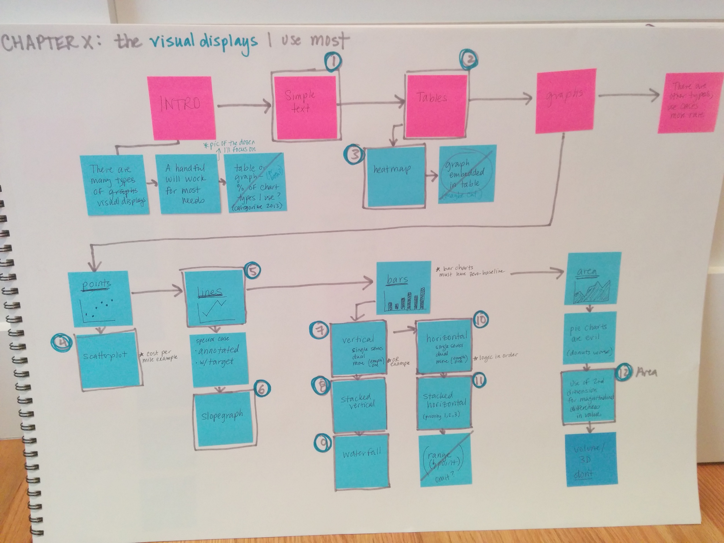
Storyboard for Chapter 2 of storytelling with data: a data visualization guide for business professionals (Wiley 2015).
The pink Post-its across the top are the main sections within the chapter. The blue Post-its show the subsections within each, along with the specific visuals I cover and some notes on other content to include. The eventual chapter ended up following this pretty closely. I did this sort of storyboarding to plan content for most of the chapters in the book.
My use of low tech pen-and-paper-planning didn't stop there. Next, I thought, wouldn't it be cool to kick this chapter off with a single visual showing all of the types of visuals I use most? I mocked up what this could look like on a blank piece of paper:

My mock-up of a comprehensive "visuals I use most" visual.
After mocking it up on paper, I turned to my tools to create the final version. The following is a facing 2-page spread at the beginning of Chapter 2 in storytelling with data: a data visualization guide for business professionals.

For a related example, recently, I came across this post on Ann Emery's blog, which details a similar process that she went through when creating her Essentials Chart Choosing Tool (using index card instead of my favored Post-its). If you aren't familiar, be sure to check out Ann's awesome Excel tutorials.
Meta-lesson: starting low tech—with simple tools like Post-it notes, pens, and paper—can be a great way to get your thoughts in order and give you a plan of attack for creating your narrative and visuals and reducing time and iterations when you do finally turn to your more sophisticated tools.