novel vs. the boring old bar chart
Often, to kick off a workshop we’ll do a quick round of introductions, where I ask participants to tell me something they are hoping to learn over the course of the day. It is not uncommon for someone to respond with something like, “I want to learn some new exciting ways to show data so I’m not just using boring old bar charts all the time.” I jot down a note, silently challenging myself to convince them otherwise over the course of the following hours.
This happened just last week, where a participant voiced a wish to learn novel ways to show data. I can understand this desire. But it’s not the graph that makes the data interesting. Rather, it's the story you build around it—the way you make it something your audience cares about, something that resonates with them—that’s what makes data interesting.
We circled back to this novel-ways-of-showing-data idea later in the workshop when looking at some of the team’s specific examples. I want to share with you the makeovers and discussion; it was another important reminder to me that simple often beats sexy. A “boring old bar chart” can get the job done—and even end up being people's preference.
The example: market research data
The team was looking at some market research data, wanting to compare their company to their main competitor across a few dimensions. They originally visualized this with a connected scatterplot. It didn’t work well. People found they were having conversations about how to correctly read the graph for too long before they were getting to the point where they could really look at the data and see what they might say with it. I won’t go through the work of fully recreating it here, but to give you a sense, I’ll do a quick sketch (all data has been changed and scenario generalized to preserve confidentiality):

There were two main points to make with this data:
1. The company was doing better than the competitor across all areas except ATTRIBUTE 1.
2. The company was beating their target across all areas except ATTRIBUTE 5.
This seems pretty straightforward, right? You can get to these takeaways through the above visual, but there are improvements we can make to it and other potential views that could also work. I originally thought we should look at two alternatives: (1) a dot plot and (2) a slopegraph. It was actually Elizabeth on my team who added a third option—the “boring old bar chart”—into the mix (I'm glad she did!). Let’s take a look at each of these.
Option 1: the dot plot
First, the dot plot. This was mainly an attempt to improve their original visual with a similar view and some slight modifications. I don't use these super often, but have found there are some good use cases. I thought this would be an appropriate scenario for it. The base visual looked like this:

Rather than connecting the dots downward, as in the original connected scatterplot, which makes the primary comparison how OUR COMPANY is doing across the various attributes, the horizontal lines here draw the eyes from left to right. This makes the primary comparison OUR COMPANY vs. the COMPETITOR, which seemed to be the main point here.
Next, let's apply the brand colors:

Now that I've incorporated color, I can vary intensity to emphasize certain points. For example, we could first draw attention to ATTRIBUTE 1, where OUR COMPANY scores lower than the COMPETITOR:

I could also add in a marker and text designating the target and use the same strategy to draw attention to ATTRIBUTE 5, where we score below TARGET:

I actually thought the dot plot worked well. But I wanted to show some alternatives.
Option 2: the slopechart
Slopegraphs (also called slopecharts) can sometimes be a good way to visualize group comparisons, like we have here. By putting the COMPETITOR at the left and OUR COMPANY at the right, the relative slopes of the lines give a sense of how we're doing across the various attributes compared to the competition. Where the line slopes upwards, OUR COMPANY is outperforming the COMPETITOR and vice versa. To see another example of a slopegraph, check out this makeover: going from bars to slopes.

I could emphasize just the ATTRIBUTE 1 line to draw attention to the one area where we score lower than the COMPETITOR. Note that with the slopegraph, since I already have the clear spatial separation between COMPETITOR at the left and OUR COMPANY at the right, I don't need to introduce color as a means of telling the groups apart (vs. in the dot plot, where OUR COMPANY was left of COMPETITOR for ATTRIBUTE 1, but right for all the others, so we need some other way to distinguish one from the other). Here, I can instead use color for emphasis, or simply keep everything grey and use intensity to draw attention to where I want my audience to look.
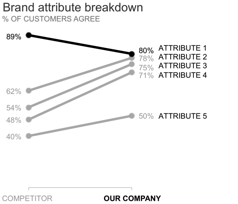
Similar to the dot plot, I can also add a symbol and text showing where the TARGET is and drawing attention to ATTRIBUTE 5, where we fall below it.

Dot plots and slopegraphs aren't anything crazy. But they aren't as popular or well-known as traditional lines bars, and pies, which means they sometimes carry that novel appeal that those wanting something fresh desire.
Option 3: the bar chart
Next, let's look at one more option to visualize this data: the bar chart.
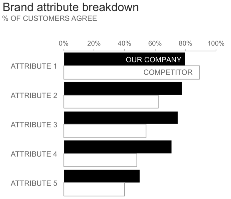
As with the slopegraph, position distinguishes for us OUR COMPANY vs. the COMPETITION (the former is always first, the latter second) so we don't necessarily have to introduce color here. Instead, we could use intensity—pushing some elements back by lowering intensity and drawing others forward via higher intensity—to focus our audience's attention. We might focus first on ATTRIBUTE 1:

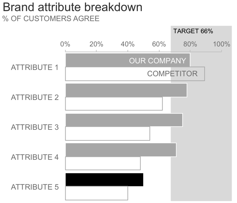
As in the other views, we can incorporate the TARGET into the visual and draw attention to ATTRIBUTE 5, where we missed it. Let's try a different view of the TARGET this time, using light background shading to illustrate the region where we are above target and emphasizing ATTRIBUTE 5, where we fall short:
Conclusion: which graph would you choose?
There's no "right" answer in terms of how one should display this data. Any of these visuals could work. The different views let us more or less easily see different things. Let's look at the base versions (without any emphasis) side by side:

I showed a similar side-by-side after we discussed each of the options during the workshop and asked people to vote which they liked best. Remember, this was the audience who said they were seeking novel approaches. Which did they choose? I'm sure you've guessed it—the "boring old bar chart."
To take the next step and put words around it so my audience knows why they are looking at this data and why they should care, we could do something like the following:

Meta-lesson: novelty may not be the best goal. Bars don't have to be boring when you've used them to help make the data accessible and made it clear to your audience why they should care.
What do you think? Which view of the data do you like best? Why? Leave a comment with your thoughts!
If interested, you can also download the Excel file with the above graphs, or to simply learn more about different charts, check out our comprehensive guides in the SWD chart guide.