numbers of different magnitudes
It can be challenging when you have numbers of very different magnitudes that you want to look at together. How do you make the small numbers visible? How do you provide a true sense of scale? I encountered this situation when reworking an example for a workshop recently and approached it in a new way. Here, I'll share with you how I tackled the challenge (note: details and numbers have been modified to preserve confidentiality).
First, let me set up the scenario: imagine you work in the credit risk organization at a bank (coincidentally, this was how my career started!). It's inevitable that some people will take out loans and default, or not pay them back. You need to estimate this amount so that you can reserve money against these expected losses. To do so, for a given portfolio of loans, you have a process for risk-rating each loan. For simplicity sake, let's assume a given loan can either Pass (negligible risk) or is classified as having some level of risk (Very Low, Low, Moderate, High, or Very High). You want to understand what the pass rate and risk profile for a given portfolio have looked like over time.
The original graph created to meet the above need looked similar to the following:
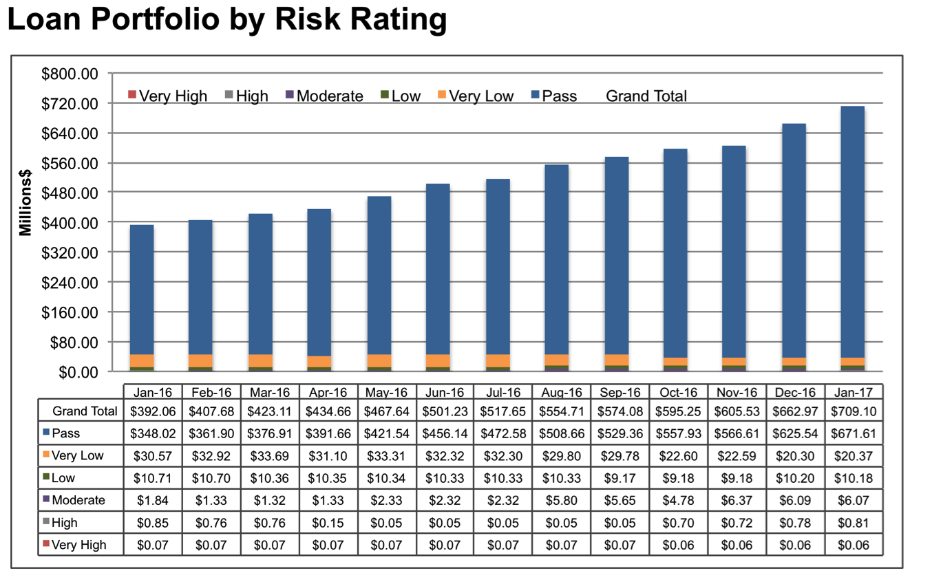
This is a lot to process. When I worked in banking, we used a ton of graphs with data tables like this. My initial reaction today is to get rid of the data table—my general guidance is that if the specific values are important, we should label them directly in the graph—but that doesn't work here. Many of the segments are very small, so there's no physical space to put them in the graph. We'll need to address this in another way.
In order to determine an effective approach for showing this data, first we need to figure out what we're trying to illustrate with it. When I look at the above graph and attempt to identify specific potential takeaways—and I should caveat that this domain is no longer my area of expertise, so I'm making a number of assumptions for illustration purposes—I come up with the following:
There's been marked growth in the overall portfolio. Total loan volume has increased 81% in the time period shown, from $392M in January 2016 to $709M in January 2017. This strikes me as impressive growth. There's probably some interesting context here.
Those classified as Pass have increased as a proportion of total. In January 2016, 89% of loans in this portfolio were classified as Pass (negligible risk); by January 2017, the proportion classified as Pass increased to 95% of total. This seems like good progress (note there could be a behind-the-scenes story of new loans added to the portfolio not having enough time to "go bad"—we'd want to understand the aging effect, but for the sake of illustration here let's not complicate our story with that).
In spite of portfolio growth, there has been a volume decrease in all risk classifications year over year except Moderate. This is actually really difficult to see in the current visual because the stacked graph doesn't show it clearly and the data table takes a ton of effort to process. This seems like a potential area of concern in an otherwise positive story, so I want to make sure this finding comes across clearly.
Now that I know the takeaways I want to highlight, I can figure out how to show this data in a way that helps me make these takeaways clear to my audience. It would be difficult to highlight all of these points in a single graph, so I'm not going to limit myself to a single graph. Rather, I'm going to spread them out across multiple views. This will let me focus on each of the above points more effectively and weave all of the data and takeaways I want to highlight together. Following are the visuals and narrative that I developed for this.

There's been an 81% increase in the dollar volume of our loan portfolio over the past 13 months, from $392M in January 2016 to $709M in January 2017. We see pretty consistent growth throughout the year. Next, I'm going to take this same data from this line graph and shift to a bar graph—I'm doing this because next I'll show you some component pieces of the overall portfolio. Here's the same data in a bar chart:

We're still going from $392M in January 2016 to $709M in January 2017. As you know, we risk rate all of the loans in our portfolio. A given loan is either classified as Pass—negligible risk—or with some level of risk, ranging from Very Low to Very High. Let's focus first on the Pass portion:

This is a positive story: the proportion of loans classified as Pass has increased from 89% of the portfolio in January 2016 to 95% in January 2017. This means the Non-pass loans have decreased from 11% of total portfolio in January 2016, to just 5% in January 2017:

Next, I'm going to focus on just the Non-pass loans, the orange portion of the following bars:

We classify Non-pass loans into one of five risk categories: Very Low, Low, Moderate, High, or Very High. Next, we'll look at this breakdown, piece-by-piece. There are large differences in the magnitudes of the numbers across the various risk ratings, so I'm going to layer these on and change the scale as needed as we go. Bear with me—this is perhaps a different way than you've seen data like this shown before—but we'll walk through it together step by step. Here's the basic graph:

Note that currently, the y-axis scale goes up to $0.1M, or $100,000. Let's start with the most severe level of risk: Very High. In the following graph, I'll plot the dollar volume of loans classified as Very High risk over time. As of January 2017, $0.06M—or $60K—in loan volume is classified as Very High.

Next, I'm going to do something a little different. I'm going to change the y-axis on the graph so that instead of going up to $0.1M ($100,000), it goes up to $1M. Notice how this visibly compresses the portion of the portfolio classified as Very High risk. That final point in January 2017 still represents $60K:

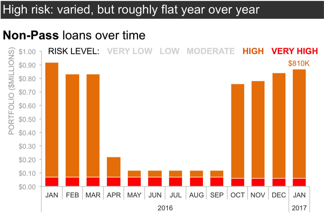
I've changed the scale of this graph so that I can add on the next layer of risk (one step less in severity than the Very High that we just considered): High risk loans. We've seen some big changes in High risk volume over the past year, with it starting out around $850K, then decreasing, but then increasing again. As of January 2017, loan volume classified as High risk amounts to $810K:
Next, I'm going to change the scale of the graph again so that we can continue to layer on more of the risk-rated portfolio. In this next iteration, my y-axis maximum has been increased from $1M to $10M.

As we saw before, expanding the scale visually compresses the data we've graphed so far. Note that the Very High risk loans are still there, but at only $60K, we can't really even see them now given the new scale of the graph. High risk loans are the dark orange bars. Next, I'll layer on the loan volume classified as Moderate risk. This has increased over the past year, from less than $2M in January 2016 to $6M in January 2017.

Next, I'll expand the scale again, increasing the y-axis maximum from $10M to $20M.

This provides space to layer on the next level of risk (continuing to decrease in risk severity): Low risk. This portion of the portfolio has been relatively flat over time, and totals $10M as of January 2017.

I'm going to change the scale of my graph one final time, increasing the y-axis maximum from $20M to $50M.

With this scale, now I can layer on the final level of risk (this is the lowest severity for those loans classified as Non-Pass). Very Low risk loans have decreased over time and as of January 2017, total $21M.

When we look at the overall heights of the bars in the preceding graph, we can see that total Non-Pass loans have decreased in volume year over year. However, when we stack data on top of other data like this, it can make it difficult to see the trend for each individual series. So let's look at one final view of this data, where we unstack the above bars and focus on the trend over time for each level of risk in a line graph:

In the line graph, we can see the marked decrease in Very Low risk loans over time as well as the relatively flat volume of Low risk loans. We can see that High and Very High loans are much lower in absolute volume than the other categories. Perhaps most interesting, however, is that Moderate loans have increased in volume over the past 13 months. Is this noteworthy? I'm not sure, but it seems like something we may want to draw attention to, better understand, and keep an eye on.
To overcome the challenge of visualizing numbers of very different magnitudes in a live setting, I might walk my audience through something like the preceding progression. Then if we're also in need of a static version to share—for those who missed the meeting or for a reminder for those who did attend of what was discussed, or if it really all needs to all fit on a single page (always question that assumption!)—I might do something like the following:

The Excel file with the preceding graphs can be downloaded here.
Continue learning about different ways to visualize data with our chart guide and flex your data storytelling muscles with hands-on practice exercises in the SWD community.