“how do I incorporate visual design into our monthly deck?”
After reading storytelling with data or participating in a workshop, people often ask how they can incorporate the lessons into a recurring (i.e. monthly, quarterly) report. These reports often materialize as a PowerPoint deck, which started sparsely, but over time has taken on a life of its own and now resembles the “slideument”: part presentation, part document but not exactly either at its best.
Consider the slide below, which is based on an actual slide from a recent client workshop. (I’ve anonymized the client’s data to preserve confidentiality.) Today’s post demonstrates how to apply data storytelling lessons to a visual from a monthly deck, illustrating the thought process to improve it.

This slide shows a monthly trend of customer service complaints: in total (top chart) and broken down by category (bottom chart). The commentary section tells us (the audience) what the important points of reference are: what happened this month compared to last month (complaints are up 14%), where it changed (Employees) and their proposed next steps. However, notice how much work takes to read through all this text and then find evidence of this in the graphs.
Imagine if you were given this slide to determine an action plan. If you were in a live meeting, would you be able to read all of this text and listen to the presenter at the same time? If you weren’t in the meeting and were reading through the deck, how much time would you realistically spend trying to digest the information presented? We can improve on this visual in both scenarios with a few design changes.
In both cases, I used the commentary as a guidepost for the important takeaways and re-designed the visuals accordingly.
First, let’s a closer look at the top chart. The commentary tells us that complaints were up 14% vs the prior month.

Where did your eyes go first in this graph? Mine went to the red Average line, which I visually estimated to be about 410 per month. In looking for evidence of the 14% increase in December, I had to do a lot of mental math (add the Solicited + Unsolicited for November and compare it to Solicited + Unsolicited for December) which took more time than someone would likely spend doing this.
If that 14% increase is what the audience should know, check out the difference between the original visual and this:

When applying the “where are your eyes drawn?” test, my eye went straight to the data markers & labels at the end of the total line, where I could see both the absolute numbers and annotations telling me it’s a 14% increase. Since we’re visualizing time, I changed the graph type from a bar chart to a line chart, unstacked the data series, and added a series for the total. This was intentional based on the commentary, which only referenced the total trend. I chose to de-emphasize the subcomponent pieces (Unsolicited and Solicited) by using grey.
Side note: what about the Average line? If the monthly deviation from average was really important, one option would be to keep it in the graph for reference with the tradeoff that adding a fourth data series could create clutter. Another option is an entirely different choice of visual, depicting the monthly change (from average), with a visual cue to indicate that December’s data is acceptable. Both are choices the information designer would make knowing the audience and what context is relevant. In this case, I didn’t feel that this additional point added anything to the overarching story, so I chose to eliminate it altogether.
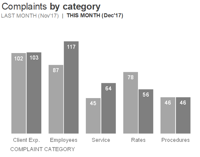
Let’s take another look at the second visual now. The commentary tells us that complaints were up in a specific category: Employees. Not only did they increase, but they increased from 87 to 117. Apply the “where are your eyes drawn?” test again with the original visual.

If I took an informal poll of readers here, some might have gone to the black line, others might have noticed the blue list first and others (like me) went to the red line. Regardless of which line you focused on first, I’d likely bet that you didn’t focus first on the November to December increase in the Operations line (red). In fact, it’s difficult to discern the absolute numbers (87 and 117) here because of the general clutter: overlapping data series, gridlines, color, heavy chart border and legend at the bottom requiring some visual work to figure out which line goes with which complaint category.
When setting out to improve a visual, there’s not necessarily a right or wrong answer in choosing a visual type: it often takes looking at the same data several different ways to find which view is going to create that magical “lightbulb” moment. Let's look at a few different variations of this visual.
First let’s keep the existing line chart, remove some of the clutter and focus attention on the November to December change in Employees.

This view gives the audience the full context of the 12 month trend, while focusing attention strategically on a specific point. However, if the emphasis is really about the November to December change, we could also visualize only those two data points. Let’s look at a few different ways of displaying this.
First, this horizontal bar chart compares this month (December) to last month (November). Horizontal bar charts are useful when your category names are long and therefore can be displayed horizontally from left to right on the y-axis without having to rotate or shorten them.

Another option is a vertical bar chart, if you’re more inclined to preserve the left-to-right construct of displaying time.
As a third option, we could use a slopegraph. Slopegraphs can work well in making change visually apparent across categories. Check out how clear it is that some of these categories changed more drastically than others. In fact, looking at the data this way, we see that there was also a marked increase in service-related complaints, something that didn't stand out as much in the other views of the data. You can read more about slopegraphs, including design considerations, in this previous post.
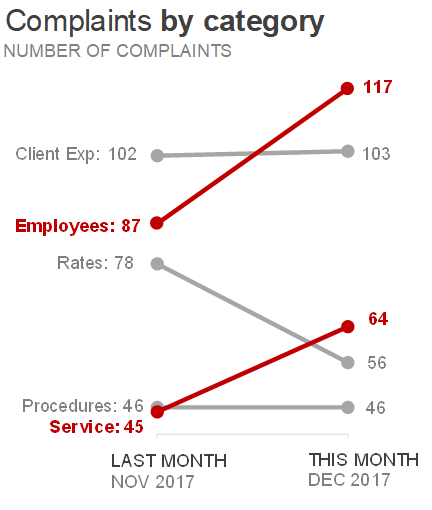
Any of these three visuals could work for depicting this data, I chose the slopegraph for the final version to keep the emphasis on the change in the two data points.
Here's what it could look like if all of this needed to be on a single slide:

In the remade version, I’ve moved the text to be closer to the data it describes and used color strategically to create a visual link between the text and where to look in the graphs for evidence. I’ve also made the call to action more visible—remember when communicating with data for explanatory purposes, we should always want our audience to do something with the data we’re showing them!
Check out the difference between the original and the remade version:


This single view works well as a remake of the original, but not as well in a live presentation. There’s still too much text to read and process, while listening to a presenter at the same time. For a live setting we can still use the same visuals, but build piece by piece (using animation), which forces the audience to listen to the presenter describing the data. For example, consider the Complaints over time visual again:

Now imagine if each of these images were its own slide. Sparse slides lead to better presentations because a person is there to narrate what’s happening.

One final note on the choice of red as the emphasis color. Some readers may be surprised to see something different from our usual blue & orange as emphasis colors (and readers who are Michigan fans are probably having heart palpitations!). In this case, red was the client’s brand color so we chose to stay consistent with the rest of their visuals. If that weren’t the case, we might avoid red because it could a negative connotation, even though this is a somewhat positive story (complaints declining over time).
In conclusion, we can indeed incorporate visual cues such as strategic use of color and words into a monthly recurring presentation so that our audience clearly knows 1) what’s important and 2) what action to take. You can download the Excel file with accompanying visuals here.