an alternative to treemaps
In a recent custom workshop, we encountered an organization using treemaps in many of their visuals and questioned how effective they are. Today’s post illustrates some pros and cons of using treemaps, plus possible alternatives.
Treemaps are increasingly being included in most data visualization tools. The treemap was originally designed to visualize a very large amount of data in a hierarchical, tree-structured diagram where the size of the rectangles organized from largest to smallest. Color is used to encode a second dimension. Today, they’re often used generally for categorical data. For further reading on treemaps, check out the SWD Chart Guide.
appropriate use cases for treemaps
Treemaps can work well if your data falls into this scenario:
You want to visualize a part-to-whole relationship amongst a large number of categories.
Precise comparisons between categories is not important.
The data is hierarchical.
Steve Wexler provides a nice example of why a treemap was more effective than a bar chart when visualizing the Electoral College votes from the 2012 election in this post.
the challenge with treemaps
While treemaps may seem like a sexy choice for visualizing data, they’re often used when another chart type would serve the data better. The limitation is that when we’re encoding data with area and intensity of color, our eyes aren’t great a detecting relatively minor differences in either of these dimensions. If our data is such that our audience needs to make precise comparisons between categories, it’s even more cumbersome when the categories aren’t aligned to a common baseline. We should never make our audience do more work than necessary to understand a graph!
Bottom line: treemaps do have a use case —however consider reaching for something else when your audience needs to be able to make specific comparisons. Andy Kriebel provides a great litmus test for the effectiveness of a treemap in this this post: if it takes longer than 2 seconds to compare categories, go with a simpler design.
a real-world makeover
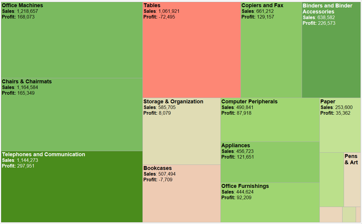
Back to our client: their treemap looked similar to the one below (I’ve anonymized the data to protect confidentiality). The intent was to compare returns activity (measured by volume of dollars claimed and number of returns) for their customer base where % of returns is encoded by the size of the rectangles while % of dollars is encoded by color - both in differences in hue and intensity.

I can make a few general conclusions from this visual: three customers (A, B, and C) are roughly half of the return activity (visually estimated based on the size of the rectangles) and these same three are also pretty drastically different in terms of dollars claimed (judged by the intensity of color—although without a color legend it’s difficult to discern much more than that).
I’d argue that this visual might work well in an exploratory phase of analysis, where the analyst is sorting through the data to find what might be interesting to stakeholders. However, it doesn’t work so well when communicating what’s interesting in this data.
What if I asked you which are the top 10 customers by dollars claimed? Or what’s the exact difference between Customer A and B’s % of returns? We can see how easily a treemap breaks down when trying to make these comparisons.
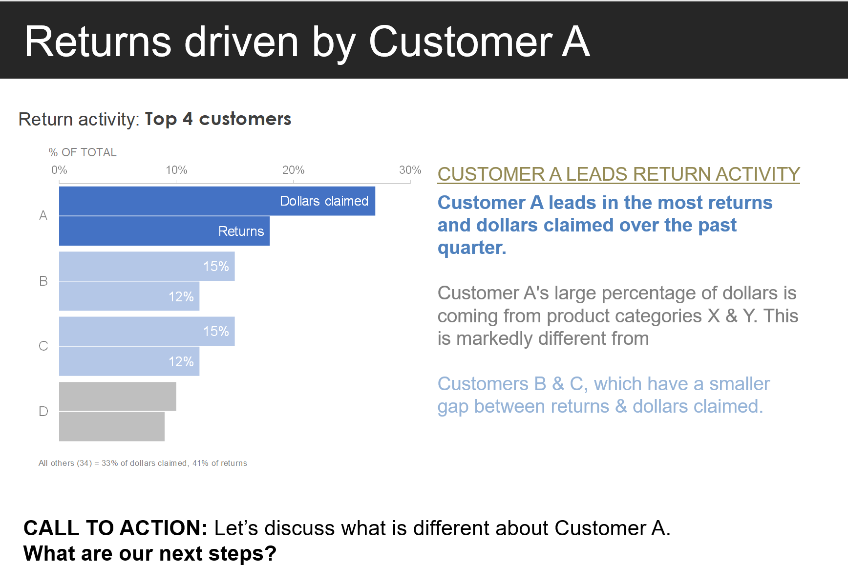
One possible solution is a bar chart. Below, I’ve displayed all customers’ returns and dollars claimed horizontally. This lends itself well to comparing across categories and we can easily see that four customers comprise the majority of return activity.

When communicating this data, we can help our audience understand what’s important by focusing only on the top four customers. This condensed view could lend itself well to a discussion towards action on these top four customers.

To address the remaining customers, I could provide the entire bar chart for additional detail if the audience needs it. I might also choose to add the other customers with a footnote (as shown) or group them into an “All other” category. The decision point here would be determined by the level of detail my audience needs.
Taking this a step further, we can introduce color strategically as visual cue, paired with some explanatory text, to prompt our audience to act on what this data may suggest.
For a deeper look at the graphs, you can download the accompanying Excel file. Continue learning about different ways to visualize data with our Chart Guide and flex your data storytelling muscles with hands-on practice exercises in the SWD community.