new year, new tools!
Happy new year! To kick things off in 2019, we challenged you to step outside your comfort zone and try something new: a tool you haven’t previously used to visualize data. The intent was two-fold: 1) for participants, try something new and 2) for the community, share with us what you learned through the process. Three dozen readers rose to the occasion, employing a wide variety of graphing instruments, which we’ll share back with you here. We encourage you to scroll through the entire post to see examples of tools that may be new to you and possibly worth exploring in your own adventures in data visualization.
First, a few observations on the submissions received:
We’re excited to see the variety of tools exemplified here. These range from the familiar go-to’s (Tableau, Excel, PowerBI) and also some that may be less widely known throughout the broader community (Datawrapper, Flourish, RAWGraphs). Interested in seeing a specific tool? We’ve organized the submissions alphabetically by tool and encourage you to scroll through the entire post to familiarize yourself with the wide array available for visualizing data. The most popular new-to-the-user tools were (by number of submissions received):
Tableau & Datawrapper
Flourish
R & Python
Others included Adobe After Effects, Charticulator, Chartify, Excel, Google Data Studio, Infogram, Orange, PowerBI, RAWGraphs and Tinkercad
The second benefit of this challenge is receiving participants’ thoughtful commentary from their learning process. Standout entries included Dennis’s recap learning Charticulator to visualize his FitBit data, Mitchell and Joanna tout the data import process (both good and bad) with Flourish, and Vidya gives a nice comparison of a chart she creates in Datawrapper that she’d originally made in Excel. I also tried out Datawrapper and share my thoughts, while Cole provides an update on her experience with Flourish. Regis writes a balanced review of Infogram using federal debt to GDP ratios. On the fun topics side, check out Adina’s classic rock data and Jay’s longitudinal analysis of diaper changes—certainly something to which all parents can relate!
To everyone who submitted examples: THANK YOU for taking the time to create and share your work! The examples are posted below in alphabetical order by tool. If you tweeted or thought you submitted one but but don't see it here, email your submission (including your visual attached as .png) to SWDchallenge@storytellingwithdata.com and we’ll work to include any additional entries this week.
The next monthly challenge will be announced on February 1st. Until then, check out the #SWDchallenge page for the archives of previous months' challenges and submissions.
Adobe After Effects
Kate
For this month's challenge and my first SWD challenge ever, I went to a totally new-to-me program: Adobe After Effects. I visualized several cities' average temperatures by attaching a JSON file to my composition and wrote a few short expressions. My first data-driven motion graphic! I closely followed along to this tutorial by Daniel Walter Scott. Lessons learned: This new-ish option in AE (of bringing data files in, JSON in this case) is great, but still seems cumbersome. My biggest challenge was replicating my composition for other cities without losing connection to my data and incurring a lot of expression errors, but I found a workaround. I write about this challenge in my blog.

Charticulator
Dennis
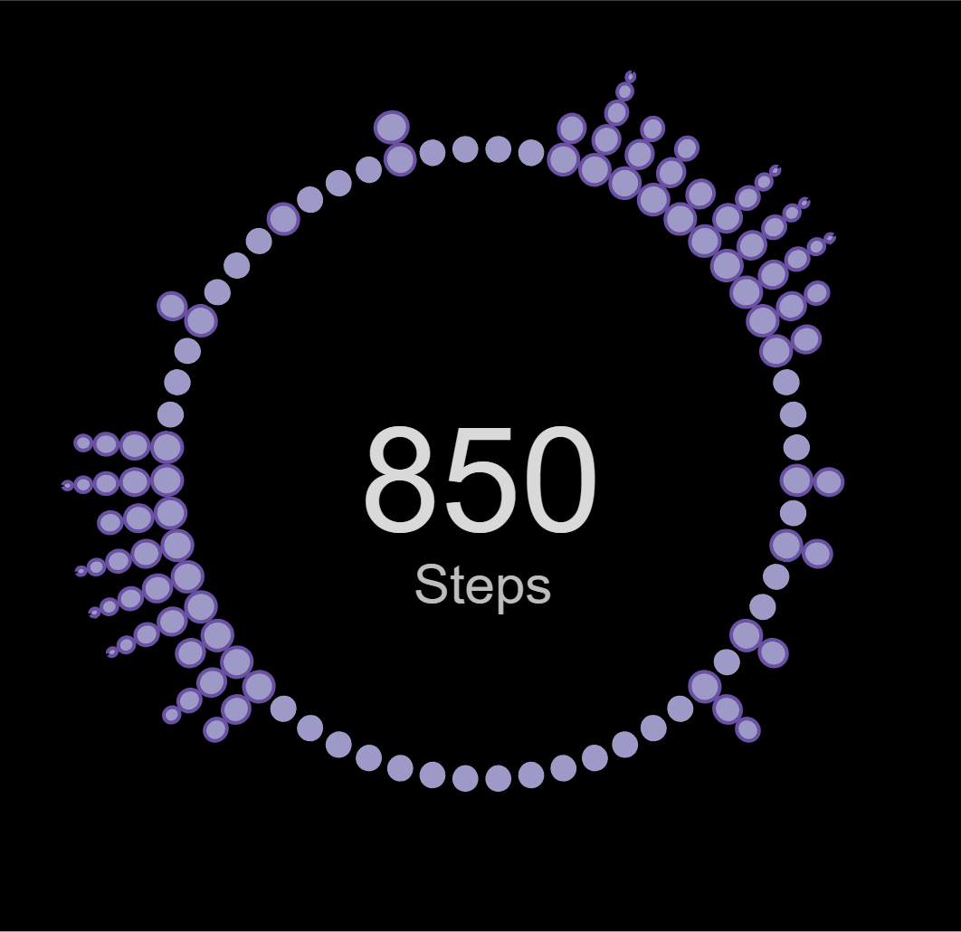
This months’ #SWDchallenge was a great chance for me to finally start using Charticulator for the first time. I must say I am rather pleased with the result. As you can see there is a circle for every minute of the hour. Depending on the amount of steps there is a new circle for every 10 steps. In case there aren't any steps the circle is missing it's pink border. To get to this result I first watched a couple of short tutorials available for Charticulator and then I uploaden my data. At that point I immediately found one of the cons of Charticulator as your data must be perfectly prepared before you start. When this isn't the case, you aren't able to add any calculations afterwards within Charticulator or upload a new data-file as you have to start over again. But it is rather easy to get to this result once you know what you want, with the data ready I think it only took me around 15 minutes to get to this final result. So the easy way of working with Charticulator is definitely one of it's pro's.
Wendy
I decided to try Charticulator as part of the challenge. I tried to reproduce a graph I created in Tableau. it did take me some time to get my graph to look almost the same as Tableau. Charticulator is designed to give the user the freedom to design their own unique data viz without the coding skills. However, I found that there were some inherent assumptions in the functionality of the software that took sometime to understand. For example, I had no idea what a “Glyph” was and how the glyph working grid related back to the main graph. I watched the same training videos about 10 times until I managed to work out the “patterns” in the functionality. There are a few other assumptions regarding navigation that took some time to work out. However, these challenges had more to do with the user than the software :) The main benefit with Charticulator is the fact that the user can produce something unique and not be governed by a fixed set of charts as in Tableau or Excel. It’s also completely free to use. It doesn’t have the same data prep functionality as say Tableau. To edit the data, (I think) it can only be done externally and imported again. I’m not experienced enough in this space to give the software an overall rating.

Chartify
Adina
I decided to use this opportunity to try the Chartify library created by Spotify. I used the classic rock data from FiveThirtyEight to chart the most popular songs played on classic rock stations by decade. I chose to include only the top 5 songs per decade to make the chart readable. I used the chartify example notebook to create the lollipop chart. The basic chart creation was very simple. However, I ran into several configuration issues (e.g. font size, axis labels) that required accessing the underlying Bokeh figure, as demonstrated in the chartify tutorial. The only difficulty I found was sorting the y-axis. If I chose to sort the categories by 'values' then the decades were out of order and if I chose to sort by 'labels' the decades were ordered, but the songs within each decade were sorted alphabetically and not by number of plays. I had to create an ordered list of (decade, song) tuples to pass to the 'categorical_order_by' parameter to get the order I wanted.


Datawrapper
Elizabeth
I tried out Datawrapper to reproduce a graph I created in Excel. I created a basic free account and budgeted one hour to familiarize myself with the interface and design options. The finished product is the chart on the right, which I created in about 20 minutes. Datawrapper also includes a neat color blind simulator for testing your visual’s accessibility. I found Datawrapper’s interface extremely easy to use and I’m happy with the final result, from the perspective of having limited time. You’ll notice there are several details I was not able to recreate in Datawrapper (either because the free version is limited in flexibility or I missed something that I might have discovered with more time—Datawrapper enthusiasts please let me know which is the case!). I found the text/annotation feature limited in the amount of control I had to place the text exactly where I wanted it. I couldn’t figure out how to change the color of the labels (subtitle, data labels and x-axis labels). Overall, I’d give the free version of Datawrapper a 8/10 for ease of use and clean design options.

Kat
Adobe Illustrator is my preferred tool for data visualization and experimenting with different tools is not something I do often. Datawrapper has been on my radar to try for a while but it's not something I've given myself time to try out. So thanks Storytelling with Data, for finally making myself sit down and gave it a go.
Liz
I used Datawrapper for this challenge. I found that it was an easy tool, especially for someone who does not have access to more advanced tools, or for someone who just starting out. I did find there was a lack of control over some of the elements of the graph I made, and I couldn't really "play around" the way I would in something like Tableau or PowerBI.

Sanne & Michiel
For the SWDChallenge “let's try something new” we used Datawrapper to visualize a Brexit related table we found on twitter. We allowed ourselves to play around for an hour, after that we created the final chart from scratch in 30 minutes. We have never used Datawrapper before. Blog writeup
Vidya
I make most of my visualizations using R, Excel or Tableau. For this challenge I decided to try Datawrapper. I signed up for a free account and remade this chart that I had originally created for a SWD challenge back in September 2018 with Excel. It is very simple to learn and use. It took me less than 30 minutes to sign up and create this chart. Multiple options to import data—one can copy and paste the data, upload xls or csv file, import a google spreadsheet or link to an external dataset. The tool gave a range of chart types to choose from: tables, bars, dot plots, arrow plots, lines, area charts, pies and donuts. Nice interface to edit colors, title, data source. The tool also provides different chart sizes to suit various devices. The colorblind check feature is inbuilt and is very useful to see how the chart looks like for different color blindness. I appreciated this feature the most. There were some frustrations. It took me a bit of time to figure out how to get the number formatting to show percentages. The one thing I couldn't do was vary the color saturation for the bars as I had done in Excel or add color emphasis to the title. I think Datawrapper is very intuitive and can help create insightful visualizations in just a few minutes. BLOG

Excel
Katharine
To start, I downloaded Oyster data from the Transport for London website. In this particular data set, we are given the number of commuters during 6 different travel periods at each London Oyster/Tube stop. I chose to stick with the stops that started with “K” because the list contains over 200 stops and I didn’t want to get overwhelmed. Once I selected the stops, I wanted to illustrate the percentage of commuters the stop receives during each travel period. After looking at the first chart, it became clear that almost all stations received the most travelers during the AM Peak time. I wanted to highlight the AM Peak time slot for each Oyster station to illustrate the largest percentage in a stacked bar chart.

Flourish
Cole
I tried out Flourish to launch this month’s #SWDchallenge, remaking a graph I’d previously created in Excel.
To recap benefits, they offer a nice sized library of templates from which to choose, it’s easy to import data, and the process from start to decent-looking visual was fast. There were a few design aspects I couldn’t figure out how to emulate, so I sent a couple chats to Flourish’s tech support. They are based in London, which meant by the time I awoke the following morning, the answered questions were waiting for me in my inbox. One benefit of the graph being published online is that they could see which template I was using. This meant they were both able to advise on how I could tweak my current visual to make a couple of the changes I was struggling with and they were able to recommend a different template that would allow me to more closely achieve all that I was hoping (this latter is the visual I’ve included below, right). One con is that you would need to get to know the templates well enough to know this going in, but I think a bit more time creating standard graphs with the tool would likely lead to that. You’ll notice in the before-and-after below that there remain a few formatting differences. Perhaps it’s worth noting for developers out there, you can also code your own templates. Maybe a set of storytelling with data templates is in order?!?
Flourish also has a story feature. In my correspondence with CEO Duncan Clark, he said “…in a sense the whole (very incompletely executed!) idea of Flourish is to be able to tell stories sequentially step by step so the audience only needs to take in one concept at a time.” He took the additional step of creating a quick and dirty example of this based on my chart, which you can view here (thank you!). I plan to further explore this functionality. Overall, I enjoyed the process of working in a new tool in general and with Flourish specifically.

Original graph in Excel

Remade graph in Flourish
David
Created using Flourish. BLOG

Joanna
I decided to try out Flourish since it did not require any software installation. The page of templates was extensive. At first, I was intrigued by the maps and 3D visuals and I wanted to map out data for different provinces in Canada. However, that pre-set geographic map was not available; a little research taught me that I’d either have to pull data with coordinates or select another dataset/template for my experiment. As an experienced Tableau user, I found this to be a limitation coming from mapping in Tableau where coordinates are not required. Importing the dataset was very intuitive but large datasets were problematic and led to the window freezing - I’m guessing this is because the real-time preview of the data import is too demanding for a browser-based app? I decided to go with a smaller dataset and focus on the breakdown of goods-producing industries in Ontario Gross Domestic Product (GDP), which is publicly available at Ontario.ca. What caught my eye initially was how fast Flourish could process visualizations while switching from one template to another e.g. grouped column chart to line chart; thumbs up for the engaging animations which are pre-loaded on the app. I also used their “How to use this template” feature; I found the quick tutorial very comprehensive. However, I find that the “selection of columns” to visualize per labels and values very restrictive. This implies that your data must be very clean with formatted columns to be read easily in Flourish. This was definitely a big limitation compared to calculated fields and variables in Tableau. With more time, it’s possible there are additional features to mirror data changes which I have not explored. In terms of other limitations, I find that it was quite indirect to get my changes on the visual. For example, I changed my labels name on the data but the old names kept showing on my x-axis (I brute forced this by uploading an updated Excel sheet later on); plus the default x-axis with angled labels should have been more direct to flatten out. On the plus side, I did find the filter to select the year much more natural than other visualization tools I’ve used. I was also positively surprised by the range of color combinations that were available. I really wanted to focus on the seeing the trends within each industry group and I think Flourish has beautifully displayed that.

Mitchell
Like yourself I was unfamiliar with Flourish and while I am not able to upload, let alone share work data, I have spent the past 40 mins or so seeing what I could do with some personal projects. Firstly, I love the spread of options available from the Sankey flows, the cartography, Hans Rosling template and the UK House of Parliament, all of which I’ve adapted in other software to varying and usually not good effect. I took the output runs from a Monte Carlo model I have which simulates the rest of the English Premier League in Excel. I have a grid with conditional formatting (before.PNG) which shows the models verdict on where each team will finish and their proportions. I’ve not been happy with it for anything other than a summary so wanted to see what I could do in 40 odd minutes in Flourish (After.PMG). While I do have a few issues I’m quite pleased with the outcome. The software was intuitive to import data and getting to an output that worked for me was easy to both spot and then get there. I have struggled with a couple of elements. I’d prefer to reverse the y-axis so 1st is at the top rather than the bottom. I couldn’t find the perfect combination of labels, font sizes and axis sizes in the time available, I was going around in circles for a while. I had to manually select the colours for each finishing position despite adding a column that I hoped to use for this. I also wanted to include data labels for the non-zero values, but this didn’t seem to be possible. Overall, as an introduction to Flourish in the self-imposed time limit it was useful. It is likely to be a tool that I use when I know it can do something better than alternatives like Excel, PowerBI and Tableau.

Sonia
I was testing Flourish with a very simple graph. The intention was to visualize where are the majority of the resources (attached to a specific job, per country). Of course this version is not the best.. there are for sure a lot of potentials to develop here. The tool makes me to think in a different way.

Google Data Studio
Dorian
I created the following dashboard in Google Data Studio without any experience with this tool.
It aims to analyze website speed indicators of a certain website based on Google Analytics data.
You can interact with the viz here. I wrote a blog post that goes along with it on Canonicalized.

Ryan
I used Google Data Studio for this months challenge to visualize the dataset from Makeover Monday week 3. I've pretty much only used Tableau for data visualization thus far, so it was great to learn another tool. Data studio is easy to navigate and I quite liked how the interface looked. In particular, I liked the grid layout which helped with formatting and how easy it was to create smooth lines. I also enjoyed the ability to copy and paste text boxes which isn't possible in Tableau. Some formatting that is easy in Tableau, such as labeling start/end of lines or hiding one axis, I wasn't able to figure out in Data Studio. Although this is a simple chart, I like the interactivity with the highlighted marks and tooltips. I look forward to seeing how Data Studio improves in the future!
Blog | Twitter | Tableau Public

Infogram
Regis
I chose Infogram since I hadn't heard of it before. It seems to be truly designed to make it easy for casual users with perfect data and little data science skills to quickly visualize data. Installation of the free version was very easy, and the intro screens visually inspiring. I especially love the user friendly organization by project type—infographic, dashboards, charts, reports, etc. There are also several themes to choose from within each of these categories that have defined fonts & color schemes. My chart came together quickly once the data was in order. This leads me to the low points.The data must be squeaky clean and in final format—at least in the free version. There was no flexibility for creating calculations or excluding any data. Also, it seems like there is a limit to the size of the data. I ran into errors when I started with an xlsx file with 60K rows. Also, when I made mistakes there was no undo arrow so I had to start over. Finally, getting this image of the chart was fussy—I had to grab a screen shot, put it into PowerPoint and then save as png. Only the paid version had the download option.

Orange
Patrick
Orange is a data mining tool but it has some nice features for visualizing data and model results. The canvas behaves sort of like an ETL tool (similar to Knime or Alteryx) with specific nodes for data mining and visualizing. The canvas itself is very fluid and nice to use. Try adding a few flows and see how nice it is even just to drag a few connected nodes about the canvas. I like some of the features for the visuals. For example – my submission attached is a simple density plot of one variable – with 5 levels within the associated dimension – say 5 countries. This particular option has a lovely feature which is a slider representing precision of the bins – so you can seamlessly slide over and back depending on how smooth or precise you want your plot. The smoothest end of the slider will give you perfect Gaussian curves whereas the most precise end will give you very spikey data pretty much at the granularity of the data received. Typically, you want somewhere in between but it can be time consuming and subjective choosing the optimal precision. The slider allows you to zoom over and back very quickly allowing you to achieve the right level of smoothness for whatever you’re trying to convey in the first place.

PowerBI
Marc
I decided to use Microsoft Power BI for this SWDchallenge. It was easy to get started with Power BI Desktop, which has a built-in connector to data.world. After getting the data imported, it took only a few clicks to create my first chart. The Power BI interface is intuitive, adopting the same ribbon menu as Microsoft Office products. The “visualizations” and “fields” configuration panes are also similar to the data and style panels in Google Data Studio. I found the chart formatting options sufficiently flexible. It was easy to set the axis ranges and hide the axes. I appreciated the built-in title field for every chart. Arranging charts on the canvas was a bit frustrating; although there is a snap to grid feature, it doesn’t apply when multiple objects are selected. Overall, I succeeded in creating the viz that I envisioned, without any significant hurdles. However, I have only scratched the surface of what Power BI can do. Perhaps I will return to Power BI for some future viz.
View the interactive viz in Power BI here | Blog | Twitter

Zak
With the latest #SWDChallenge, we were tasked with using a tool that we weren’t familiar with. I decided to use Power BI and yes, it was indeed a challenge! My data set, which included a Twitter export of every tweet ever from Donald Trump included many interesting trends and keywords that I was excited to show. However, not being comfortable in my preferred Tableau, I struggled with every step of the design. From dates, to axis’s, to formatting and publishing, every step was a challenge. Although I feel Power BI excels at something, user inutility is not it’s strength. With that said, I settled on a very simple summary viz that included actions to drill into the date levels.

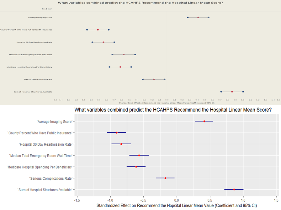
R
Crystal
I took the opportunity to try to duplicate a simple coefficient plot in both RStudio and Tableau. It was a good learning experience!
Jay
My wife and I have been using a mobile app to track diapers and feedings since our daughter was born on May 1. I have some charts I've built in Tableau, but decided to take a stab at animating that work. Layered animations are something Tableau can't do, so I enlisted R and some Adobe tools. R is also not completely new to me, but this was easily the most difficult visualizations I've created in ggplot. Tableau is usually my go-to for quick charts. Initially I'd planned to use gganimate in R, but got stuck and couldn't get exactly the animations I wanted. I have a basic understanding of AfterEffects from a course I took a long time ago in college, but this was the first time I've used it to animate layers of a data visualization.

Josephine
For January's SWD challenge, I wanted to revisit a data viz package in R that I used a lot, ggplot2, but in new ways. My data viz looks at tweets using the hashtag #goldenglobes during and after the Golden Globes (from 7 p.m. to 10:30 p.m. CST). To collect the data, I used the awesome rtweet package. While ggplot2 is one of my favorite packages of all time, I wanted to take it up a knotch by learning to use the melt() function in the reshape2 library. This was super useful for organizing the multiple lines in my graph. To make an interactive visualization (link below), I used plotly (which is also relatively new to me). The interactive plot (and more information about the method and analysis) can be found here.
Website | Twitter

RAWGraphs
Frans
I used RAWGraphs to make a very quick sankey diagram on hotel guests in the Netherlands. I really love RAW graph. It´s quick and intuitive. I finished it a little in Adobe Illustrator.

Lisa
For this month's challenge, I used RAWGraphs, an easy to use open source data visualization tool that allows you to load your data directly into the workspace and then visualize it. Choose a chart and then use the drag and drop feature to map dimensions. If you don't like your first chart choice, it's simple to switch to another option until you find the chart that works best for you. The next step is customizing your visualization (size and colors) and then exporting it as an image or copying the SVG code to embed the visualization. I created an alluvial diagram showing the magnitude of the flow of refugees in 2016.

Python
Benjamin
This is my first time using Plotly in Python and my first time making visualizations with something this customizable. The plot shows three statistics over line, offensive ratings, points per game, and pace of play starting from the 1980-81 NBA season. I was trying to get across the point that this current season is obviously and may be the pinnacle of modern NBA basketball. The bigger message I hope to get across is that this may signal to rule makers that this may be time to reign in offenses. Defenses need some better mechanics to limit points.
Interactive | Code

Charles
For this month's Challenge, I have decided to do something with Spyder, a Python IDE. Even though it is not my first time using Python, it is one of the first times I build something entirely in a Python IDE without incorporating a script or preparing a dataset in SQL, Tableau or Power BI first. I wanted to test how much control I could get on the graphs, but also on the accompanying text. I will admit the graphs below probably showcase the limitations of my Python abilities. For the first section, I wanted to highlight the regional differences in the tweets focus areas with small multiples. For the second, even though I am not usually fond of Wordclouds, I find that in this occurrence, it gives an idea of what word combinations most often come up. It looks as if "stop" and "make time" are the focus of many of the dataset's tweets. I also reversed all text to Consola, since I could not force the raw text editor to a "nicer" font. It kinda gives the whole thing a retro look (the 80's are in again, right??

Haley
I've been trying to learn Python, so I decided to use it for this challenge. The graph is pretty simple because this is my first time visualizing data with Python. I used the matplotlib library to chart population growth in North America since 1960. I found it difficult to customize the formatting beyond what I did here, but that is probably due to my inexperience. I'd like to keep going with Python and hopefully I'll learn enough to make something more interesting next time!

Tableau
Anthony
As part of my very first ever SWDchallenge, I've created and published a Tableau workbook to a Tableau Public Profile I just setup examining publicly available data sets from the U.S. Census Bureau about Travel Times to Work. This is my first Tableau workbook ever! Klipfolio is normally the tool I would use for constructing a dashboard since my emphasis tends to be connecting multiple data sources via API which the tool is great for but less optimized for storytelling and annotations directly to charts (as you'll notice in my submission). I have live, interactive versions of my submission which can be found here for Tableau and here for Klipfolio. A more detailed blog post to follow with more detail will be published to my blog here. I can be found primarily on Twitter and LinkedIn.

Johanie
That was my first time ever with Tableau. So I started by downloading the app and watch a short video. I figured out quickly how Tableau works (data and sheet). Bases graphs are pretty clean from the start so not much work need here. But I have trouble finding more advance feature like changing names or titles axis and add comments on the graph. It's also take me a while to understand how to save an image of my graph. Tableau seems to be a great tool for viz but as any new tool, it take time to know them well…Blog | twitter | Linkedin

Princess
For my challenge, I decided to use Tableau. I was working with a dataset that was a survey of how birth control options were used among women. Previously, I had been working with this dataset in R. I wrote code that cleaned and analyzed the data—removing nulls, duplicate user-entered responses and typos, and adding in geolocation of each user by response IP address. I made graphs and charts from the data in R, but I wanted to do something more. Since I had the latitude and longitude already from the geolocation, I decided to use Tableau to map it. At first when I selected the map function, Tableau generated its own data points on the map, but a few were missing. Since I'm not familiar with how this automated generation of points works, I removed the Tableau-generated latitude and longitude from the map and instead used the latitude and longitude columns I'd generated myself during the geolocation process. This made sure that all of the points were on the map. I then added in some tooltips and found that process fairly straightforward. I'd used Tableau a bit before but I surprised myself that I actually didn't like how "drag-and-drop" it is. Maybe it's that I'm more used to hand-coding things more in R, but the missing data points example seems to show that it would be easy to get into trouble if you weren't really watching! But its ease of use makes a lot of sense for making a quick graphic without a lot of fuss. The latitude and longitude of each survey respondent was generated with the aforementioned R code. Each point represents one survey respondent, color-coded by the age at which they first thought about using birth control. The tooltips display the respondent's current age, city, and birth control method.
Interactive viz

Sara
I enjoyed this challenge because I am currently teaching myself how to use Tableau, so this was a great excuse to practice. Here is brief write up I did about this challenge on my blog. Here are some of my thoughts on the process:
This graph took me about 4 hours and 45 minutes to complete with lots of trial and error and googling.
There are still many things I don't know how to do in Tableau, but do know how to do in Excel, so sometimes I would do a step in Excel to simplify my process. For example, I don't understand how to edit/reformat my tables yet in Tableau, so I did that step in Excel and then imported it into Tableau.
I also had to figure out how to get all the lines into one chart, instead of five different charts stacked. That took a fair amount of googling, but now I understand it for future charts!
I also struggled with formatting and reformatting the table, so that Tableau would read my dates to create a line graph. This took a fair amount of trial and error.
One step that took me the longest to figure out was how to get each line to be a different color. The answer was dragging "Measure Names" onto the color marks card. After lots of unhelpful googling, I figured this one out purely by accident.
Another step I am still learning in Tableau is direct labeling of my lines, so I did that manually with text boxes on the dashboard, however I recognize this strategy wouldn't work in the future if I had data points that were going to move based on filtering. Definitely something to learn.

Tinkercad
Amy
The new tool I used was Tinkercad, a free web application for 3D design, to create a 3D area chart. The roof line of the library is the number of libraries in the USA since 1992. I honestly expected a downward sloped line, but I'm happy to see libraries are keeping their place in society and even slightly growing in numbers. According to a 2016 Pew survey, half of Americans think libraries should definitely invest in digital technologies like 3D printers. Which is why I wanted to visualize the number of libraries over time and ultimately 3D print it. I first made an area chart of the data in google sheets to create the shape, before importing it into Tinkercad to give it dimension. I'm quite comfortable with vector objects in 2d spaces like Adobe Illustrator, but moving things in 3 dimensions means I make a lot more mistakes. This is a simple start and a continuation in my exploration of visualizing data in 3D, but something I want to play with more and refine.

Click ♥ if you've made it to the bottom—this helps us know that the time it takes to pull this together is worthwhile! Check out the #SWDchallenge page for more, including details on the next challenge. Thanks for reading!