five ways to anonymize your data
Seeking feedback and refining are essential to honing skills and creating effective graphs. We take this iterative practice seriously at storytelling with data, which is why we’ve expanded our resources to help you share your graphs with others. We’ve moved our monthly challenges into the community so that members can comment, give praise, and offer alternative solutions. Similarly, there is dedicated space within the community to request feedback. Most recently, we’ve launched data storyteller office hours, so you can get real-time access and brainstorm approaches with Elizabeth, Mike, and me directly (the latter is a premium offering). While we are excited to bring you these options, we do realize that not everyone can share their data as is. If you work primarily with confidential and sensitive data, seeking feedback within these forums can be a challenge. Fortunately, you can overcome this with a few simple steps.
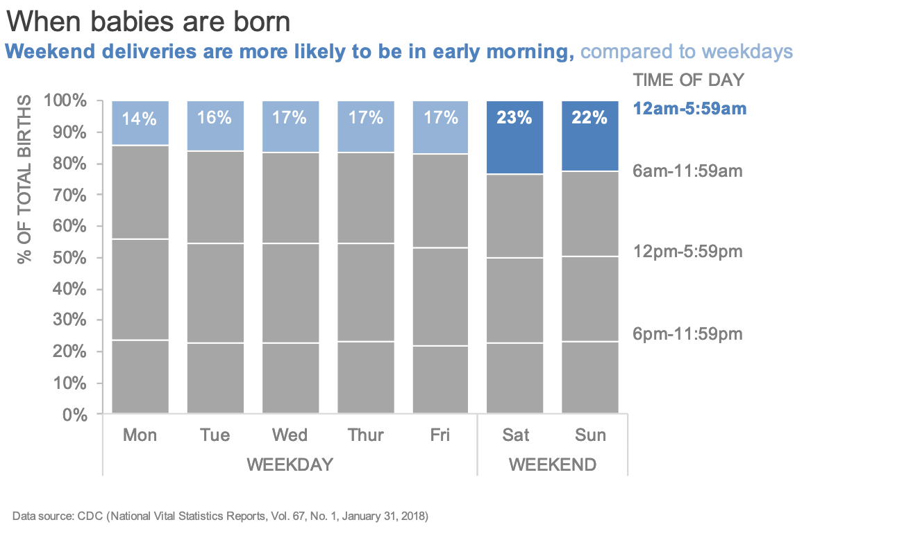
In this post, I’ll outline five ways you can quickly and safely anonymize your data so that you can share and receive useful feedback. I’ll illustrate each of these approaches using a makeover from this previous article, which shows the percentage of births by day and time. Here is the final graph from that post for reference:
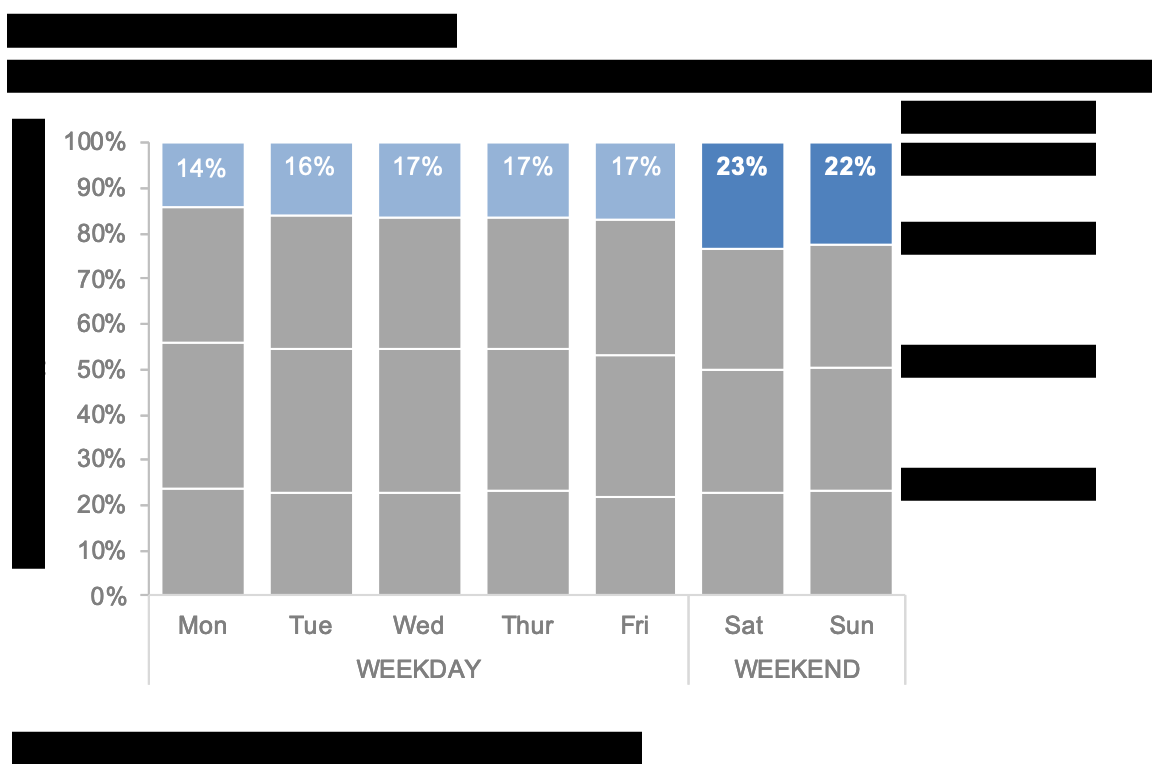
1. Redact the text. This is a brute-force method to desensitize information. While it’s not the most polished solution, it’s a quick option if you don’t have access to the underlying data or graphs. To blackout the incriminating text, I used an online pdf editor, but you could also go old-school: print out your chart and cross out anything sensitive with a sharpie. I realize this may make some people cringe, but remember if the goal is to share an idea for feedback, this works! We’ll shift to more elegant options next.
2. Swap the industry or topic. If there is something important about the shape of your data or the specific numbers, preserve them and alter the industry or topic to anonymize. In my example I can still show the same data, but rather than talk about births, I could use breakfast foods or any other subject: pet food brands, my favorite Game of Thrones characters, or even Jolly Rancher flavors. The point is to disguise your data, why not insert a little personality as you do it!?

3. Alter the dimension. This step can take many forms depending on the underlying data type. If your original data is categorical, modify the total number of categories. For instance, if I started with four breakfast foods, I might add a fifth (shown below) or take one away. If your data is continuous, play with the unit of measure or the range. Annual data could easily become monthly data, or a time period from 2015 to 2020 could shift back five years. This may seem like a lot of work, but if you amend the labels in your dataset, your graph should update automatically.

4. Change the style. If the original graph includes brand colors, a distinguishable font, or any other recognizable elements, take steps to implement a different design. Color and font carry both tone and meaning, so even a simple stylistic change can substantially differentiate your data.

5. Reshape or adjust the numbers. If you are still concerned about protecting your data, I’d recommend taking additional steps to alter the numbers and overall shape. Start by changing the values within each dimension by a given quantity (multiplying by or adding a value) and then randomly change a subset of numbers. This is the most time-consuming option, but also the most effective, especially if you simply want feedback on your general approach and design.

You can use any one of the above options or a combination of approaches, as I’ve done in the illustrative example. On a related note, if you happen to use R’s ggplot2 to visualize data, then you likely won’t need the above steps—Emil’s gganonymize will adjust the text and labels for you. Are you aware of other techniques and ideas; please leave a comment below.
Remember: sharing your creations with others and iterating accordingly is a beneficial part of the process; don’t miss out on this valuable step. If you have confidential information all it takes is a little formatting and creativity on the back-end and you’re ready to participate in the community or join our office hours—hope to see you there!