the most important dataviz decision you make
Welcome back to our journey of five questions to ask yourself when designing a graph for explanatory purposes. In yesterday’s post, we saw the importance of stripping away non-essential elements so that the data takes center stage.

Today we’ll further improve by evaluating...
QUESTION 2: Am I using color intentionally?
To create more impactful explanatory visuals, develop the habit of using color in a purposeful way. When applied thoughtfully, color is arguably the most important decision you make when focusing your audience’s attention where you want it.
One way to start is by overriding the default color palette of your data viz tool and start with nothing emphasized. In the example we’ve been discussing, I’ll accomplish this by making the entire graph grey:
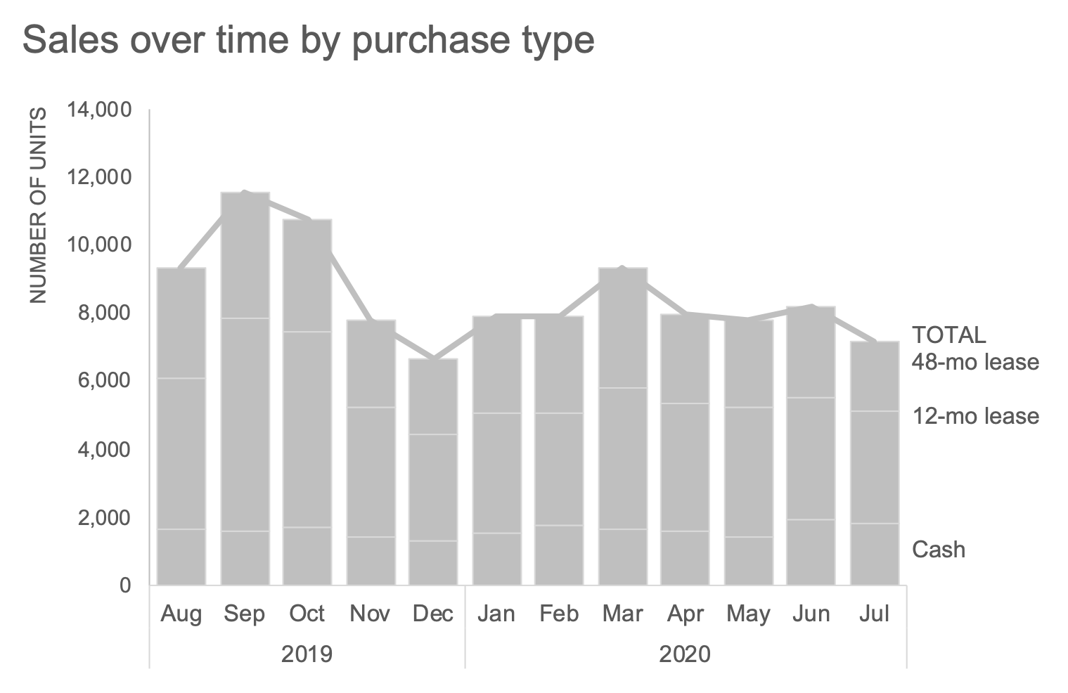
I mentioned yesterday that we’d revisit why I initially preserved the Total line. When I eliminate color, notice how this line nearly blends into the top of the bars—evidence that we can indeed remove it, since the height of the bars also encodes the total.
Before I strip it away entirely, however, let’s assume my audience is used to seeing it there, and if I make too many changes all at once, it might be jarring to them. In that case, I could introduce color sparingly to draw attention to the total decline over time. Let’s assume our brand color is yellow, so I’ll employ it to illustrate intentional, yet sparing, use of color within the required template constraints.
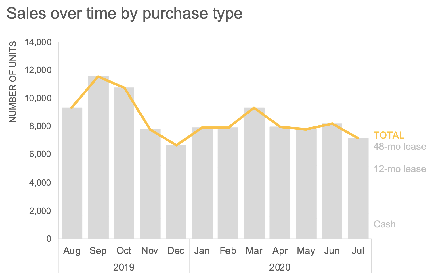
However, if I don’t have a good reason to maintain the total line line, I can remove it entirely to avoid redundancy. We’ll look at another way to visually display the total soon.
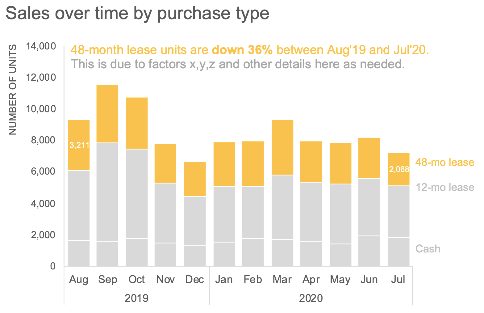
Next, let’s explore other ways we can use color. The original graph (shown again below) had a couple takeaways outlined at the bottom. One point called out is that the volume of 48-month lease units decreased 36%.

I could elect to focus my audience’s attention on the takeaway by moving it to the beginning of my annotation while using sparing emphasis in the graph and consistent color to tie the text and data together visually.
Perhaps we would like our audience to have a more general understanding of relative increases and decreases across purchase types. I could use color to distinguish between the two:

I could even play with intensity to draw more emphasize on the first and last months:

Check out the difference when color is applied intentionally. However, are there further improvements we can make? Absolutely—this certainly isn’t the only way to emphasize the takeaways—move onto the next post, where we explore our third question and different ways to visualize the data.

For more data storytelling inspiration, take a spin around our newly launched makeover page. If these are skills you need to build within your organization, learn more about our custom workshops and how the SWD can teach and transform using your own internal examples.