create effective executive summary slides

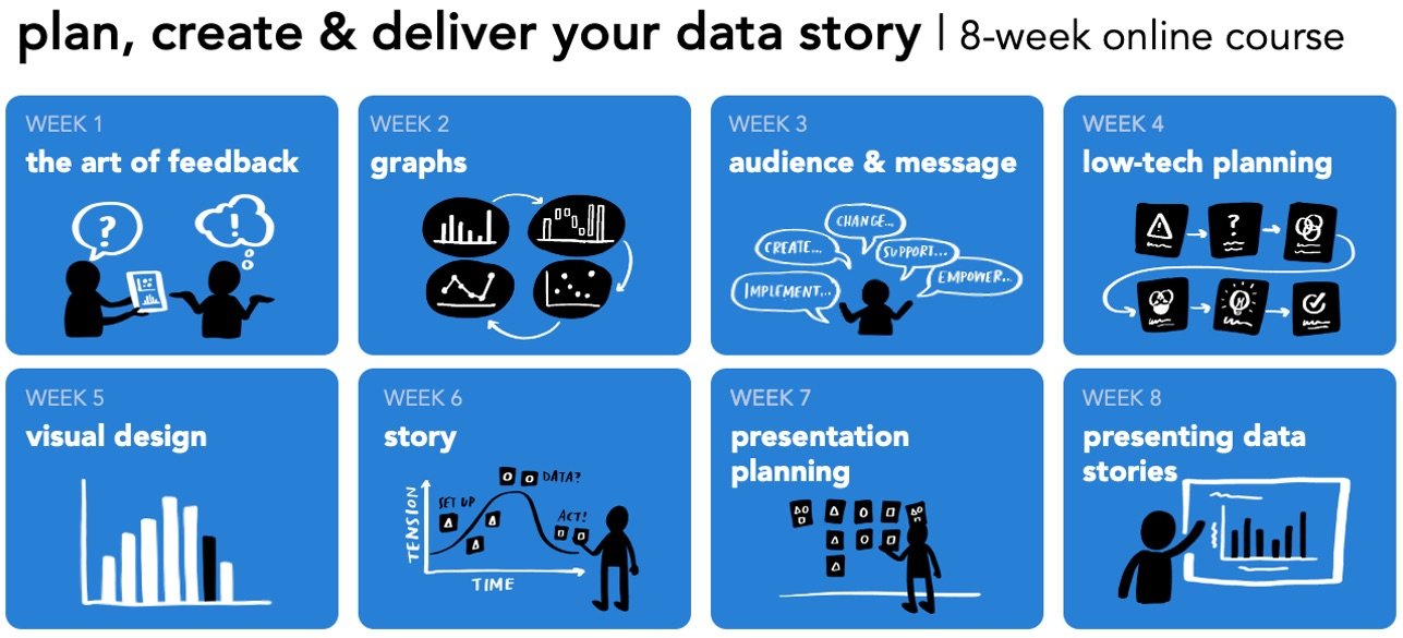
Do you want to learn to create and communicate a powerful data story? Join our upcoming 8-week online course: plan, create, and deliver your data story. Data storytellers Amy and Simon will guide you through the world of storytelling with data, teaching a repeatable process to plan in helpful ways (articulating a clear message and distilling critical content to support it), create effective materials (graphs, slides, and presentations), and communicate it all in a way that gets your audience’s attention, builds your credibility, and drives action. Learn more and register today.
Business communications often require a brief, at-a-glance overview. This is commonly referred to as an executive summary (although many audiences beyond executives will benefit from one). Despite their ubiquitous presence in business settings, summary documents that are clear and concise can be challenging to design. In this article, I’ll aim to ease some of that pain by exploring executive summary slides through an example, sharing best practices, and offering alternative layouts so that the next time you need to build a one-page, data-driven recap, you are set up for success!
What is an executive summary slide?
An executive summary slide is a one- or two-page overview of a much longer presentation added to the start of a deck. The goal is to provide a reader with the main messages, so they don’t have to read the entire communication. Executive summary slides often retain the horizontal orientation of the rest of the slide deck. Since they are meant to be read, rather than presented, they generally include more text than a traditional slide. (Important reminder: the slides you present to audiences live should not contain a lot of text!)
Any time you are planning to circulate your presentation, consider creating a summary view. Or better yet, only send a recap page.
Let’s look at an example.
An executive summary example & makeover
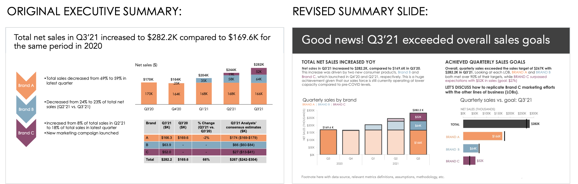
Here’s a genericized executive summary slide based on material provided by a recent client. This recap was created to give the VP of Sales a comprehensive overview of last quarter’s sales performance across all three company brands (A, B, and C). The full presentation deck contained about 30 slides, with detailed sections for each brand. The distinct brand colors were used throughout the deck to make the presentation and summary cohesive and easy to navigate.
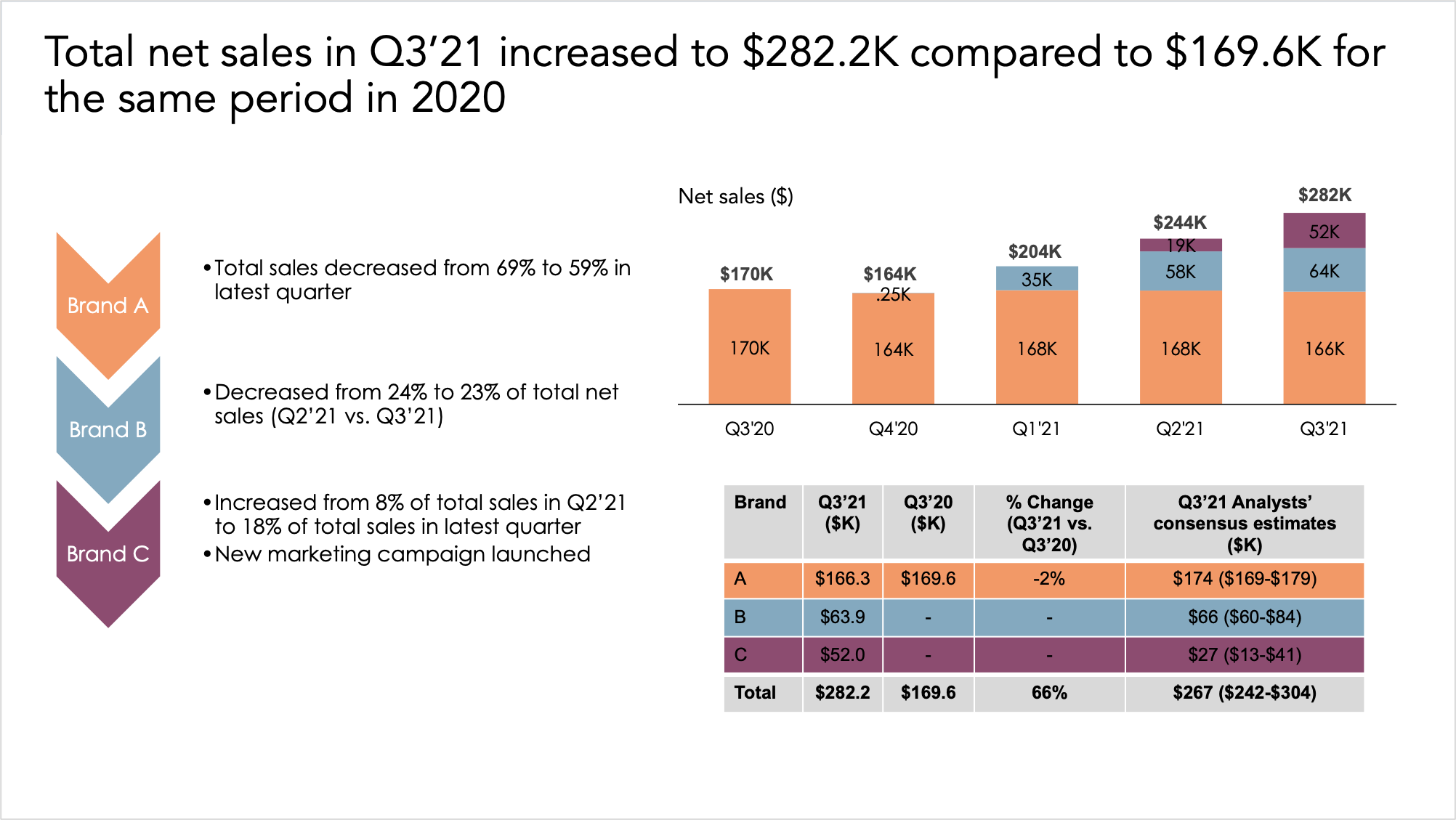
As in any makeover, it’s helpful to start by assessing both what’s working and what could be improved. Starting with the positives, I appreciate the use of color. Typically I’d argue against this much color in a single view; however, the three colors have sufficient contrast and make it easy to navigate through the larger presentation by searching for a distinct brand color. Also, it may not be immediately apparent, but the stacked bar chart is a solid choice and works well to explain sales performance over time by each contributing brand.
That said, there are some opportunities to transform this executive summary into a cohesive, comprehensive, and concise data-driven overview. Let’s step through each of the changes I’d make, along with the reasoning behind them.
Craft an engaging slide title
The title of any document is often the first place an audience will look. Use this precious real estate wisely! When constructing a summary—or any slide for that matter—make sure the title states the main takeaway and sets the tone for the rest of the page. You can learn more about crafting strong slide titles in the linked article.
In the original example, it’s clear that sales increased year over year (YOY) based on the title, but was the increase enough? Should the focus be on the quarterly performance? Let’s modify the slide title to refocus our message, and use more concise language so it fits on a single line.
Use basic story structure
A summary should be a complete overview of the entire communication, with an obvious beginning, middle, and end. Many summaries tend to only focus on the insights or data without a clear introduction or conclusion, and this example is no exception.
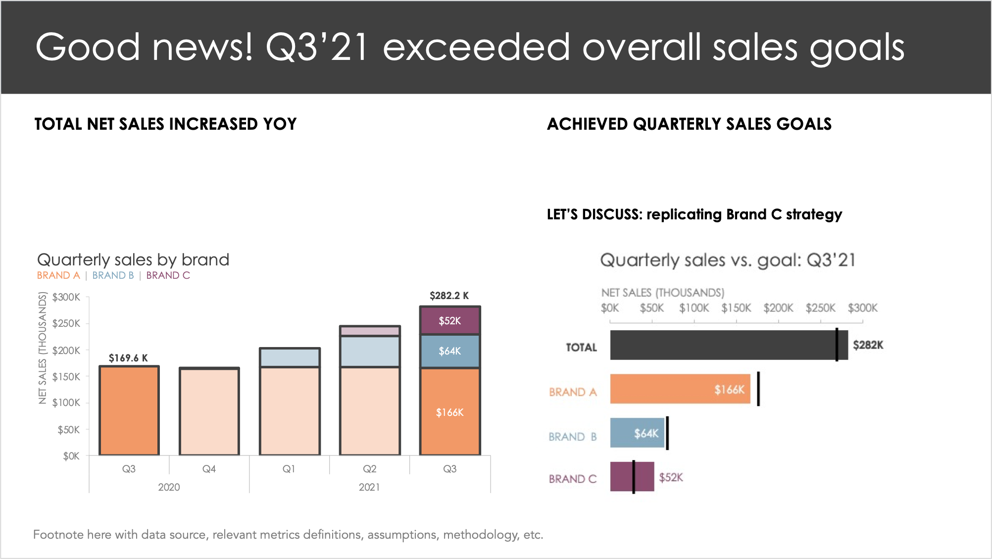
Given that this is a quarterly update, let’s ease into the Q3’21 analysis by first sharing the big picture (the beginning of the story). How are sales doing overall on an annual basis? I could also include some essential background information, like the fact that only three brands contribute to sales—two of which launched recently—before jumping into quarterly performance. Only after level setting the audience, then I can dive deeper into how each brand performed compared to its quarterly sales goal (the middle). And finally, the conclusion should be a strong takeway: Brand C markedly exceeded its quarterly sales goal, so let’s replicate the same sales strategy for some of the other lines of business (the ending).
Notice the distinct sections of the story. Having a clear narrative in mind will help further improve the design of the summary slide.
Design for scannability
Recap slides contain large volumes of information, which can make them complex to navigate. Help your audience digest a dense document by creating easily-discernible sections. Think about grouping related text and graphs. It’s also a good idea to include text headers for each section so that someone scanning for just a few seconds will still understand the main points.
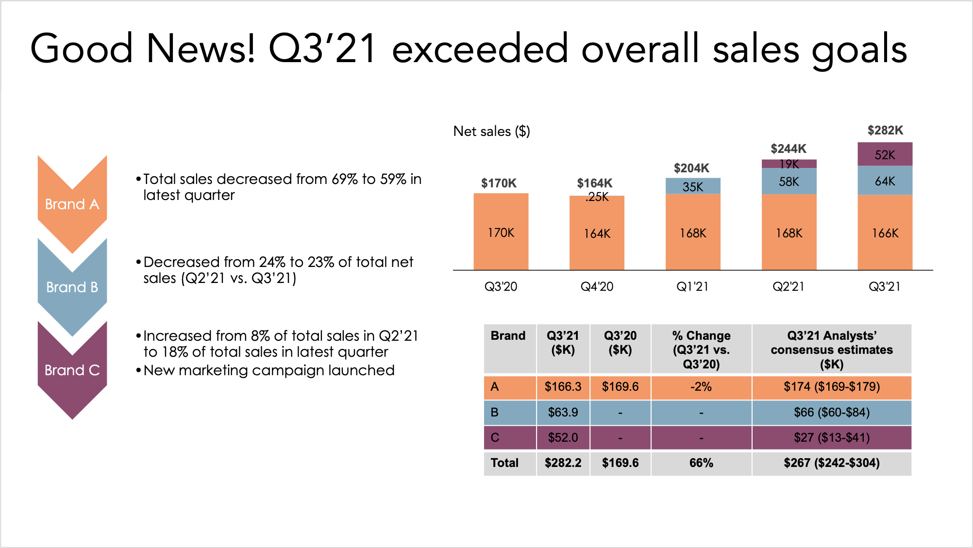
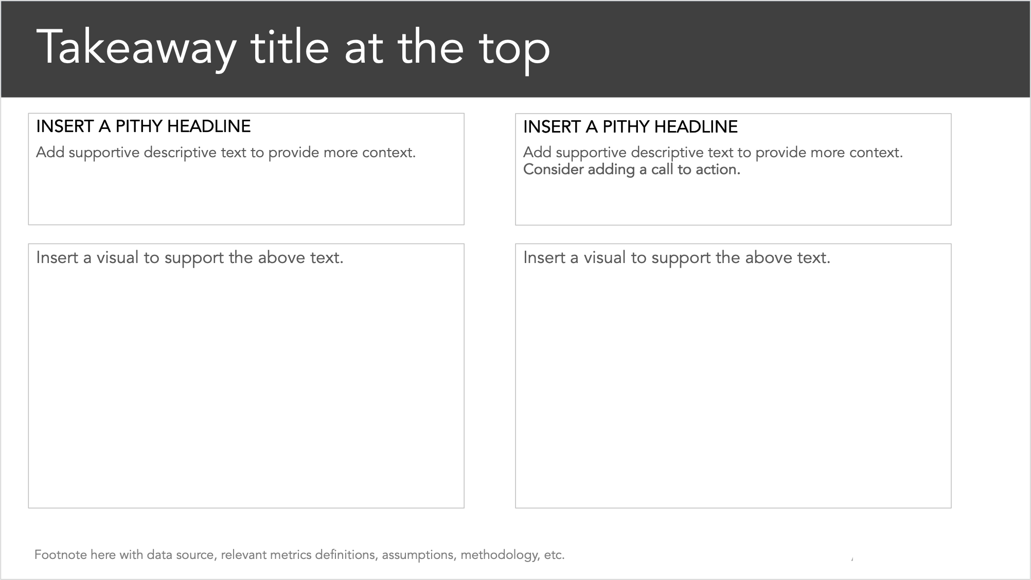
We can use the three sections we defined in our story—annual performance (beginning), quarterly performance (middle), next steps (ending)—to segment the slide. I’ve crafted pithy headlines and created two main columns which group the data and supporting text. For now, I’ve left placeholders for some descriptive insights.
In addition to focusing on the scannability of the document, I also want to ensure that the visuals are easy to skim. I can improve the stacked bars on the left by emphasizing the first and last bars so that a busy executive can quickly find evidence of the YOY increase. Tables don’t generally make for quick reads, so I’ll opt to visualize the data table on the right-hand side for faster processing. The results look like the following.
Write in complete sentences
Try to avoid using bullets in a summary view unless you are listing elements. With bulleted text, your audience has to spend mental energy connecting the distinct points. In an executive summary, the goal is to inform and persuade an audience, and a few well-constructed sentences will accomplish this better than disjointed thoughts.
Taking the original bulleted points and elaborating further on the story, I’ll create mini-paragraphs above each graph.
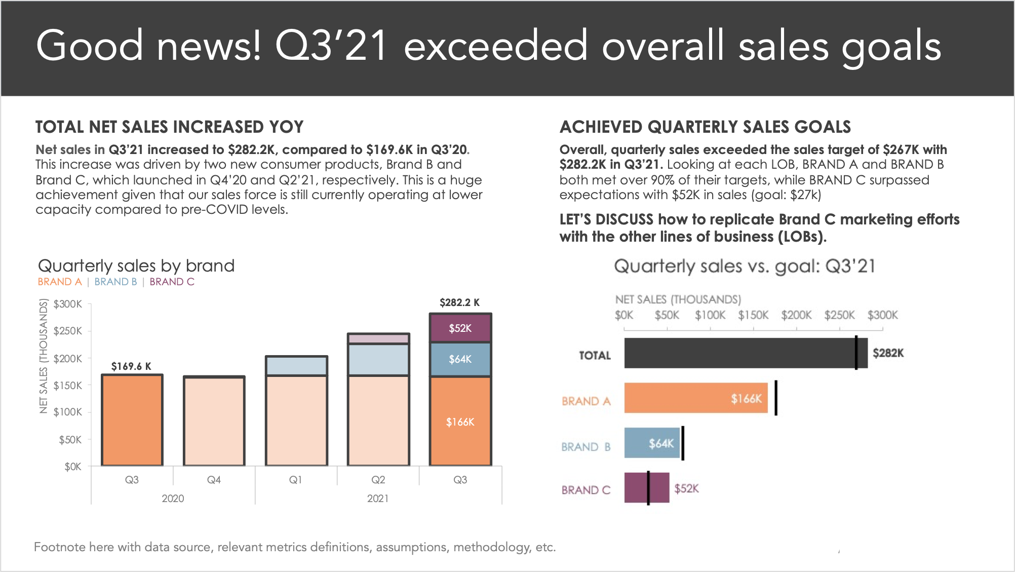
The summary slide is starting to take shape! As a final check, I’ll want to ensure that all of the text and visuals work to reinforce each other. If there is any unrelated information, that’s an indication that I need to expand my narrative or exclude these details from the overview. This is a concept is known as vertical logic.
I also want to ensure that it’s easy to navigate between reading and scanning the visuals. The clear sections certainly help with this, but let’s take things a step further by using similar colors in the written text.
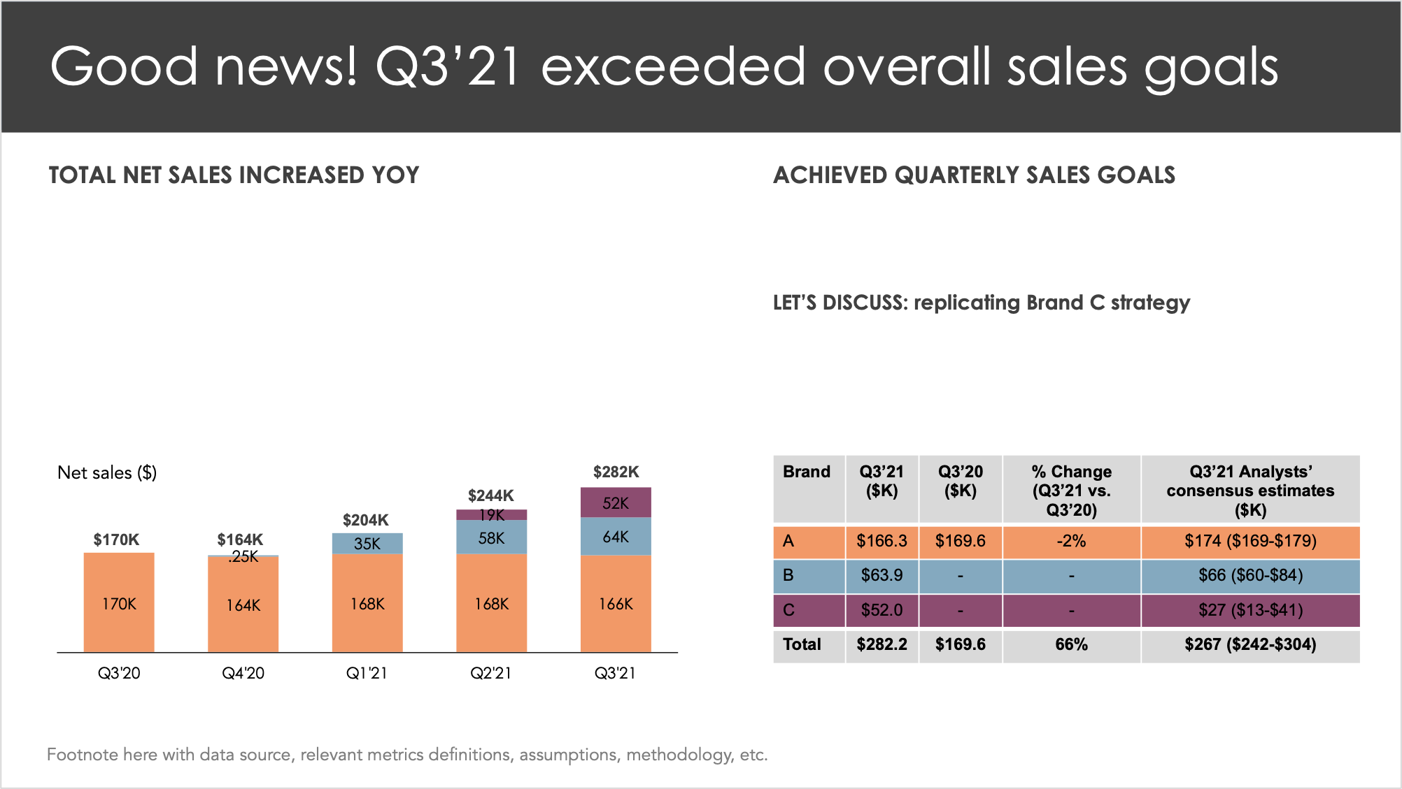
My final revised executive summary could look like the following.
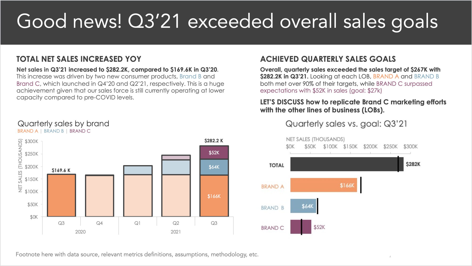
Comparing the before and after, notice how much easier it is to interact and skim the view on the right, despite the fact that the revised version is denser! Moreover, the key takeaways are now unmistakable, giving an audience a much fuller understanding of the latest sales performance.
While these changes did take a considerable amount of effort, especially when energy was already spent on the presentation slides, I’d argue it’s worth it. An executive summary is often created for a high-stakes communication to senior staff—hence the name. Moreover, this summary may be the only thing your audience ever looks at!
So far, we’ve explored best practices when it comes to a summary slide via an example. In the next section, I’ll share some alternative samples and layouts that cover a wider variety of content.
Executive summary slide templates & layouts
Since many audiences crave something to reference either before or after a meeting, I make it a habit to build summary slides for every presentation. Over time, I’ve found that two distinct layouts meet most of my needs.
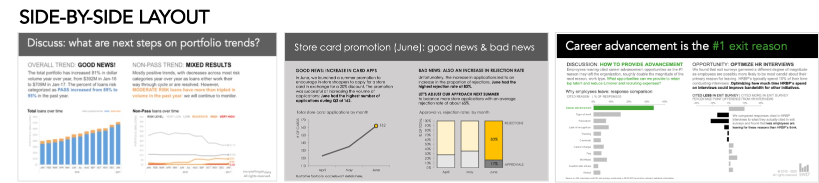
Side-by-side layout
The most common design is similar to the makeover I shared above, where there are two side-by-side graphs or sections.
This template works well anytime you want to communicate a big picture understanding (section on the left) and then get into more granular details (area on the right). Or, if there are two graphs you want to share, it’s nice to split the slide in half so there is balance in the design. Here are a few additional examples.
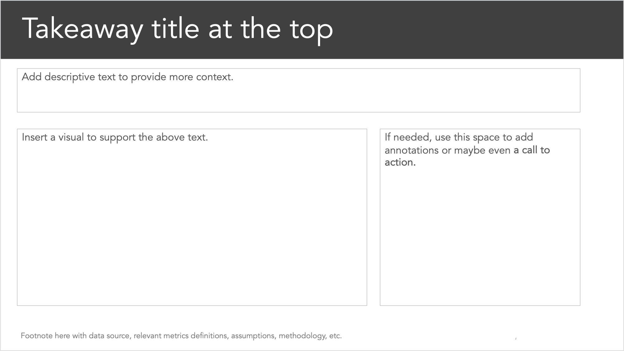
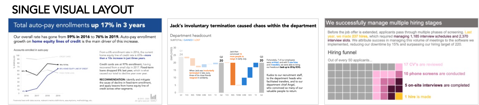
Single visual layout
The second layout contains a single graph with more descriptive text. This works well when you need to set a deeper amount of contextual information as there is extra white space to use.
Here are a few samples of how this layout could look with data and supporting text.
These certainly aren’t the only possible layouts, but two that I rely on most frequently despite the presentation. You’ll encounter scenarios where you don’t have a visual or maybe you have more than one or two charts. It’s still important to craft a strong title, leverage story structure, write in complete thoughts, and focus on scannability.
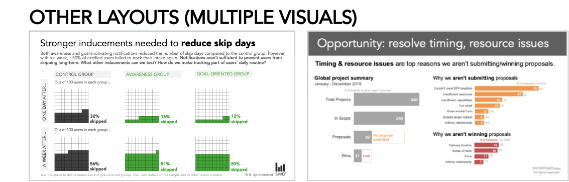
Below are a few executive summary slides that required multiple visuals.
Final thoughts
Creating a single-page summary is not an easy feat, but it can help your audience gain a deeper understanding of your presentation when done well.
If you have other approaches and thoughts on executive summary slides, please share them in the related community conversation.