5 slide slip-ups to avoid
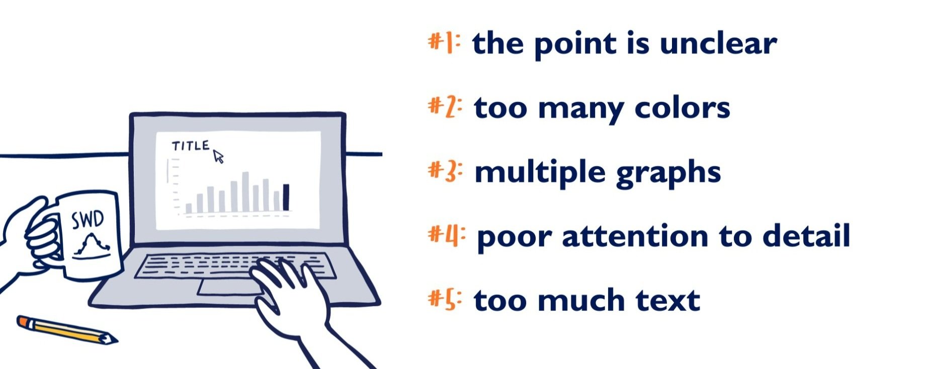
People generally don't set out to make subpar slides. Yet, sometimes, our best intentions work against us. We don't want to forget anything, so we include all the details. The graph we’ve included feels plain, so we add some color. There is empty space on the slide, so we add another chart.
When we add in the real-world constraints of time, tools, and audience demands, it becomes surprisingly easy to make slides that work against us, rather than for us.
We see a great many graphs and slides in the course of our work, and it seems no sector has reached immunity to slide snafus. There are common issues that cross industries, lines of business, and job functions, which I’ve enumerated at the top of this post.
Simply being aware of these pitfalls can help you better navigate them. In the following video, I take things a step further—not only exploring the issues, but also illustrating how to actively avoid them. Take a few minutes to watch and learn how to improve your next slide!
For more on presenting powerfully, check out the storytelling with Cole video series and/or order your copy of our latest book, storytelling with you: plan, create and deliver a stellar presentation.
If you’re ready to put lessons into practice but don’t need to create a slide in the near term, I invite you to tackle the February SWD challenge and partner up to improve a provided slide.