a quick presentation makeover
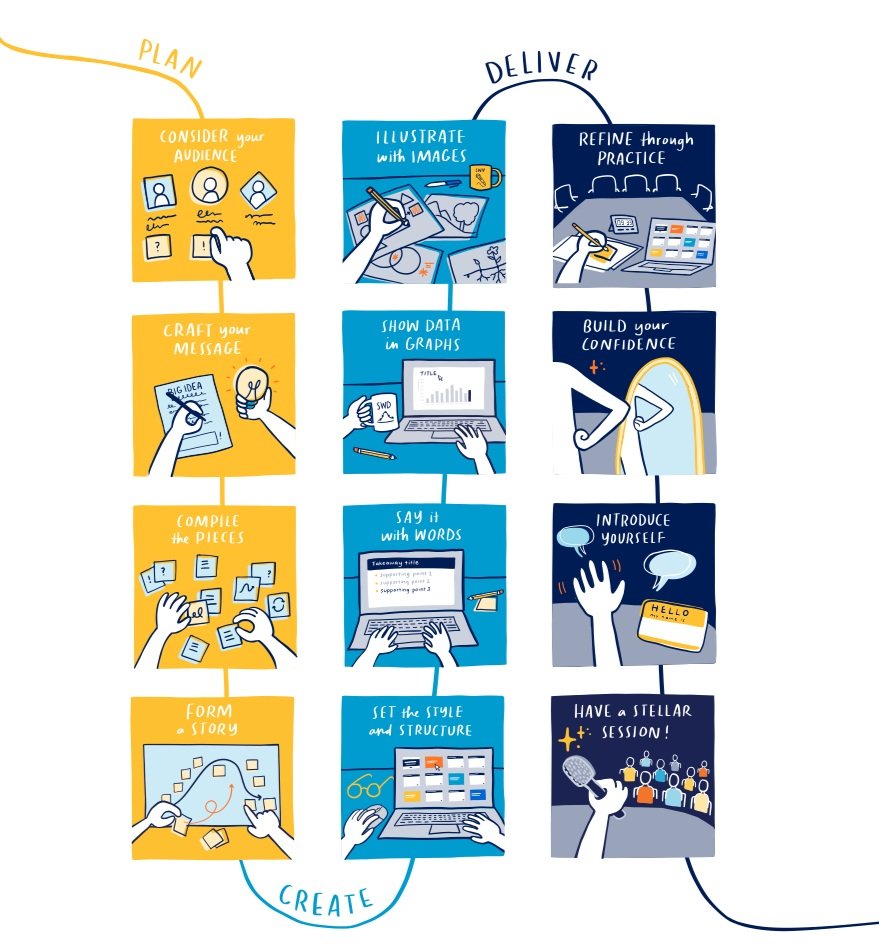
In a previous post, I made a case for why the analytical process should include multiple steps not only for exploratory analysis but also for explanatory analysis. At a high level, explanatory analysis consists of three stages:
plan a clear message
create effective materials
deliver with confidence
Our latest book, storytelling with you, breaks each stage down further into four detailed steps (12 steps in total). Below is a visual representation of the full explanatory process directly from the book.
Personally, I’ve built many data-driven stories this way over the past few years, and the stellar outcomes make the investment of time well worth the effort. (Here is a sample presentation based on this 12-step process from our CEO and founder, Cole Nussbaumer Knaflic.)
Unfortunately, time is never guaranteed when we’re asked to put together a few slides for an upcoming meeting. What typically happens in these scenarios? The explanatory process is triaged. A slide is thrown together with an existing graph or two, along with a bit of text to explain the findings.
For instance, consider this scenario: imagine I volunteer at a local charity organization that delivers free dinner kits to families in need for a given community. I did some research and discovered that the nearby ZIP codes with the lowest household income (and thus with an implied greater need) were consuming a smaller amount of dinner kits than expected. I want to inform the charity leaders of these findings and persuade them to increase awareness of this program in those select communities.
A few years ago, the slide I would have pulled together while pressed for time would look like this:

The above slide is problematic for many reasons. Fortunately, storytelling is not an all-or-nothing effort. If you lack the time or your scenario doesn’t call for a formal presentation or maybe you just started your storytelling journey, know that there are smart ways to scale back the full-blown process from storytelling with you, while still dramatically improving your final communication.
I’ll use a modified version of the full explanatory process to transform the above slide into a progression that builds understanding and prompts action. Rather than complete all twelve steps from the three key stages (plan a clear message, create effective materials and deliver with confidence), I’ll apply just one or two steps from each stage, so that the entire explanatory process takes me an hour.
This condensed storytelling process now looks more like:

Let me walk you through how I approached each of these stages.
Plan a clear message: 20 minutes
It’s totally understandable to think that when you are limited on time you should immediately begin creating content (slides, graphs, images). Resist this urge. I firmly believe that all well-constructed communications start with proper planning. Taking a small amount of time to consider your audience and form your story will make the rest of the explanatory process both easier and faster to complete.

CONSIDER YOUR AUDIENCE. It’s not enough for me to simply name my audience. I’ll go a step further to consider their preferences, background knowledge of the topic, and motivations. I give myself 10 minutes to answer the following questions.
Who is my primary audience?
Leonie and Gus, the cofounders of the charityWhat background knowledge do they have of my topic?
They have always known that certain neighborhoods need more help, but they never have the time to investigate. They don’t know that I looked into this theory with data.What do I want them to do with this information?
Brainstorm ideas for how we can increase awareness in these communities. Do we create flyers, meet with community leaders, knock on doors, set up a table? Leonie and Gus have more experience with promoting the charity, so they will have ideas for how to proceed.What do they care about most (related to the charity)?
Feeding as many people as possible!Why might they resist my recommendation?
I don’t see a reason why they will be against having a discussion to increase awareness. It may come down to our lack of resources (volunteers and time). Thinking about this more, my immediate goal for this meeting is to raise the problem and start the conversation, not take a specific action.How formal does my presentation need to be?
Not formal! All volunteers will meet next week. I want to have a few slides to show the data and sound confident. This is a local charity, not a board presentation.(Because I’m using data.) How familiar are they with the graph I’m using?
Historically we haven’t looked at data. I expect I will need to tell them how to read the scatterplot.

FORM A STORY. I’m ready to start planning my overall message. I’ll keep things simple. My storyline will be straightforward, with a clear beginning, middle, and end (sometimes called plot, twist, and ending). Fortunately for me, my above notes already contain the plot and ending. And the middle (aka twist) is my main takeaway from the data analysis.
Plot: I’m concerned we aren’t helping those with the greatest need, so I used data to investigate.
Twist: Four ZIP codes with the lowest income have the lowest utilization rate.
Ending: Let’s discuss how we can increase awareness in select communities.
I know I can’t just share the above statements with my audience and expect them to understand. I also know my audience will likely be uncomfortable with a scatterplot, so I need to explain how to read the graph and where to look. To explain my chart, I’ll define the axes, add the data points, introduce helpful reference lines, and emphasize the main takeaway. My story outline now looks like the following.
Plot: I’m concerned we aren’t helping those with the greatest need, so I used data to investigate.
Explain the vertical axis (% utilization)
Explain the horizontal axis (household income)
Add the data (10 nearby ZIP codes)
Add reference lines to the scatterplot to create high-level categories
Share my expected relationship between utilization and income
Share the actual relationship between utilization and income
Twist: Four ZIP codes with the lowest income have the lowest utilization rate.
Ending: Let’s discuss how we can increase awareness in select communities.
It took me another 10 minutes to outline the structure of my story (20 minutes total to plan).
Create effective materials: 25 minutes
It may seem like a giant leap from the above planning notes to well-designed slides, but the hard part is done. Let’s break the creation stage into two steps: words and data.

SAY IT WITH WORDS. This step feels most productive because the final slides begin to take shape. I map each line in the above story outline to an individual slide. More specifically, I wordsmith each thought into a pithy slide title that fits on a single line. As I go, I like to bold the key phrases. My resulting slides look like the following.

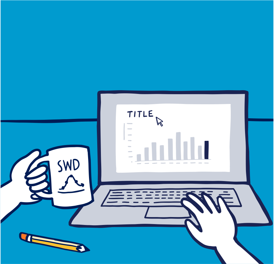
SHOW DATA IN GRAPHS. Given my limited time, I won’t iterate through different chart types; instead, I’ll work with the existing scatterplot from my initial exploratory analysis. I’m confident that the scatterplot will make sense to my audience as long as I tell them how to read the graph and incorporate smart formatting.

Once I've finalized the graph, I'm ready to complete the slides.
Referring to my initial planning materials, I'll only reveal one piece of the scatterplot at a time (outlined in the slide titles). To accomplish this, l copy the chart onto each slide and either delete irrelevant objects or cover them with a white text box, so they are hidden from view. This time-saving hack, also known as brute-force animation, allows me to build my graph without using complicated animation features.
In total, these two steps ("say it with words" and "show data in graphs") take me about 25 minutes to complete. This step can be as short or long as it needs to be. You decide what's 'good enough' based on your audience's needs.
Deliver with confidence: 15 minutes
You may believe that if you created the content, you already know how to talk through it. That said, don't let the first time you talk through your work be in front of your audience. Even a single practice run goes a long way in building confidence and spotting minor mistakes.

REFINE THROUGH PRACTICE. This specific presentation doesn't need to be overly polished, but I still allocate 15 minutes to practice (i.e., 2–3 test runs since the progression is about 5 minutes of content) before the meeting to smooth out my talking points on each slide.
The final slide progression looks like this.

This is a huge improvement compared to the original slide with the single scatterplot. It’s not perfect. I realize I forgot to add currency symbols along the x-axis and some of my labels aren’t aligned. Sometimes minor oversights happen when moving quickly.

You can take meaningful steps to communicate effectively even when you are limited on time. Whether you have an hour, a few hours, or multiple days to prepare for an explanatory presentation, start from the full-blown process as found in storytelling with you and modify accordingly.
Here are additional ways to further develop your presentation skills.
Check out the storytelling with you book for a self-guided yet robust explanation of the process. On the dedicated book website you can download free sample content.
Watch the storytelling with you video series. Author and CEO of storytelling with data, Cole Nussbaumer Knaflic, shares practical tips and snippets from the book.
Join members of the SWD team at an upcoming storytelling with you workshop. You’ll be guided through hands-on exercises to hone your presentation skills.