tactical tip for virtual engagement

As virtual meetings become the new work norm, a question we’ve been hearing frequently is “How do I share data effectively over video?” Most of us have all experienced a massive transition from in-person meetings—where dimensions such as the physical space and how we move around within it are in our control—to being reduced to a tiny box in the corner of someone’s screen. This means we have to do a few different things in our delivery to keep people’s attention.
Today’s post is a tactical tip for keeping your audience engaged when presenting data virtually. I’ll illustrate how using white text boxes can keep your audience engaged—by only showing one or a few elements at a time. This effect can keep your audience tuned in so they don’t miss what comes next.
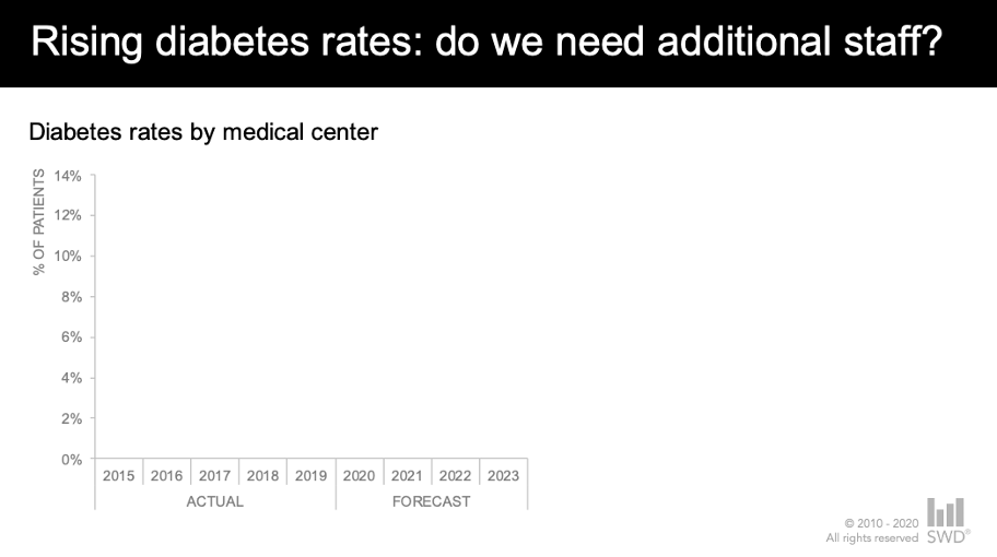
To illustrate, let’s build on the diabetes trend example from my previous post. Imagine that you work as an analyst for a large healthcare system. Your analysis of the patient base has uncovered an alarming trend: diabetes rates are on the rise and the latest forecast suggests additional resources may be needed to provide an appropriate standard of care. You’ve summarized your main findings in the single slide shown below.

As discussed previously, while the number of words on my summary slide might be fine for an audience to consume on their own, this is entirely too much text for sharing data live. When we attempt to use visuals like this in our virtual presentations, many people will quickly scan it and then tune out as they start to multi-task or attend to other competing demands in home offices.
To reduce the likelihood of this scenario, here’s a step-by-step overview of how to leverage white text boxes to show only a few elements at a time. You can download the PowerPoint file to follow along.
I might start my presentation by setting expectations verbally that I’ll talk through the data piece by piece. Then, I’ll orient my audience to what metric we’ll be discussing by showing an empty graph with just the chart title and axes. This allows me briefly to explain these pieces before moving into the data.
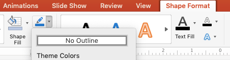
To achieve this effect, I added two text boxes over the data and the annotations. Then I formatted the text boxes to white fill by right-clicking, choosing Format Shape, Shape Options, expanding Fill, and selecting the Solid fill and choosing White in the color options.

Finally, I removed the default outline by selecting Shape Format on the ribbon, choosing Outline then selecting No Outline in the dropdown.
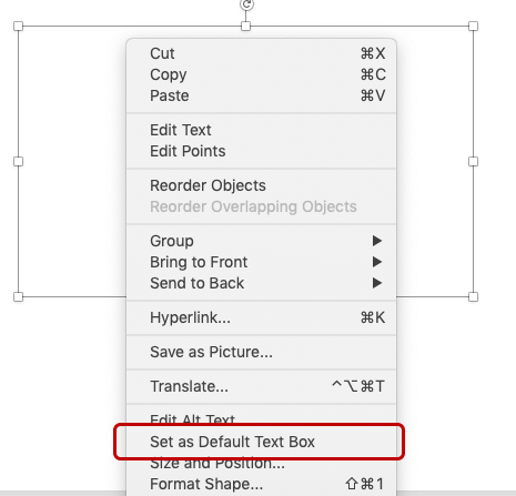
You can carry through this formatting (saving you a few clicks the next time you insert a text box) by right-clicking on the shape, then choosing Set as Default Text Box.
You can see where I’ve positioned the two text boxes here:

Next, I’ll talk the audience through the overall rate by only showing that piece of the graph. This would be important if I anticipated my audience might have questions about the methodology behind the forecast: would I need to convince them that my methodology was sound? If so, having fewer elements on the screen would more likely allow for my audience’s full attention as I answer questions related to this.

Due to the nature where the data series are within the graph, I accomplished this effect by inserting new white text boxes, then rotating them (click the shape, then use the curved arrow at the top to manually rotate until they hide the parts of the graph). You can see how I positioned them below:

Next, I might choose to emphasize that we’re seeing an increase in all medical centers that are above the overall rate.

In this step, I removed the first rotated white box so that only one remained—still covering the centers below average.

Finally, I can speak to the centers below the overall rate by removing the remaining rotated white box:

Now that we’ve gone through things a few elements at a time, I can end with my fully annotated slide. This summary can serve as the leave behind for those who might have missed the meeting or as a reminder to those who attended.

If you’re following along in my PowerPoint file, you’ll notice that I elected to have separate slides for each piece in the progression shown above. You may instead choose to reduce the number of slides and instead leverage animation to make the white boxes appear and disappear on a single slide. If that’s the case, be sure to prompt your audience to open the presentation in presenter mode (or save it as a .ppsx type, which will open automatically in slideshow mode) so they can experience the progression.

While this is not the only way to achieve this piece-by-piece build effect, this approach can work if you don’t have a ton of time and need a quick hack to improve engagement in your virtual presentations.
For more on presenting data virtually, check out these resources:
Listen to Cole’s recent conversation with Tableau evangelist Andy Cotgreave in the SWD podcast episode presenting virtually.
Register for our next virtual public workshop on September 15 and experience how the SWD team tailors their presentation style to virtual delivery.
Watch the replay from last month’s live event mode & method and don’t miss Cole’s tactics for powerfully presenting data (and viewer Q&A) during this month’s live event on September 29 (open to premium subscribers).