
using AI without giving up control
Like many professionals right now, I’m part of the real-world experiment with AI in the workplace. Almost every day, I’m figuring out where it helps and where it gets in the way. As I experiment, one question keeps coming up: when do I actually want to use AI?
There are tedious parts of the data storytelling process that I genuinely enjoy, like tinkering with alignment and color, and sketching ideas before committing. While these steps might feel unnecessary, they almost always result in new ideas and better output. By contrast, building each chart from scratch or manipulating Excel data to produce a non-standard chart rarely improves my thinking. This is the part I’d happily hand off, as long as it doesn’t cost me control over the final design. Every minute I don't spend manually creating charts is another minute I can spend thinking about the underlying story and design.
I'm not looking for AI to redesign the slide for me, but I am open to using it to produce a starting point that I can refine and polish. I recently put this collaborative approach to the test, and the results are shifting how I work.
One chart that is doing too much
A client project gave me the perfect testing ground. Below is the original slide. (The data and scenario were altered to protect confidentiality.)
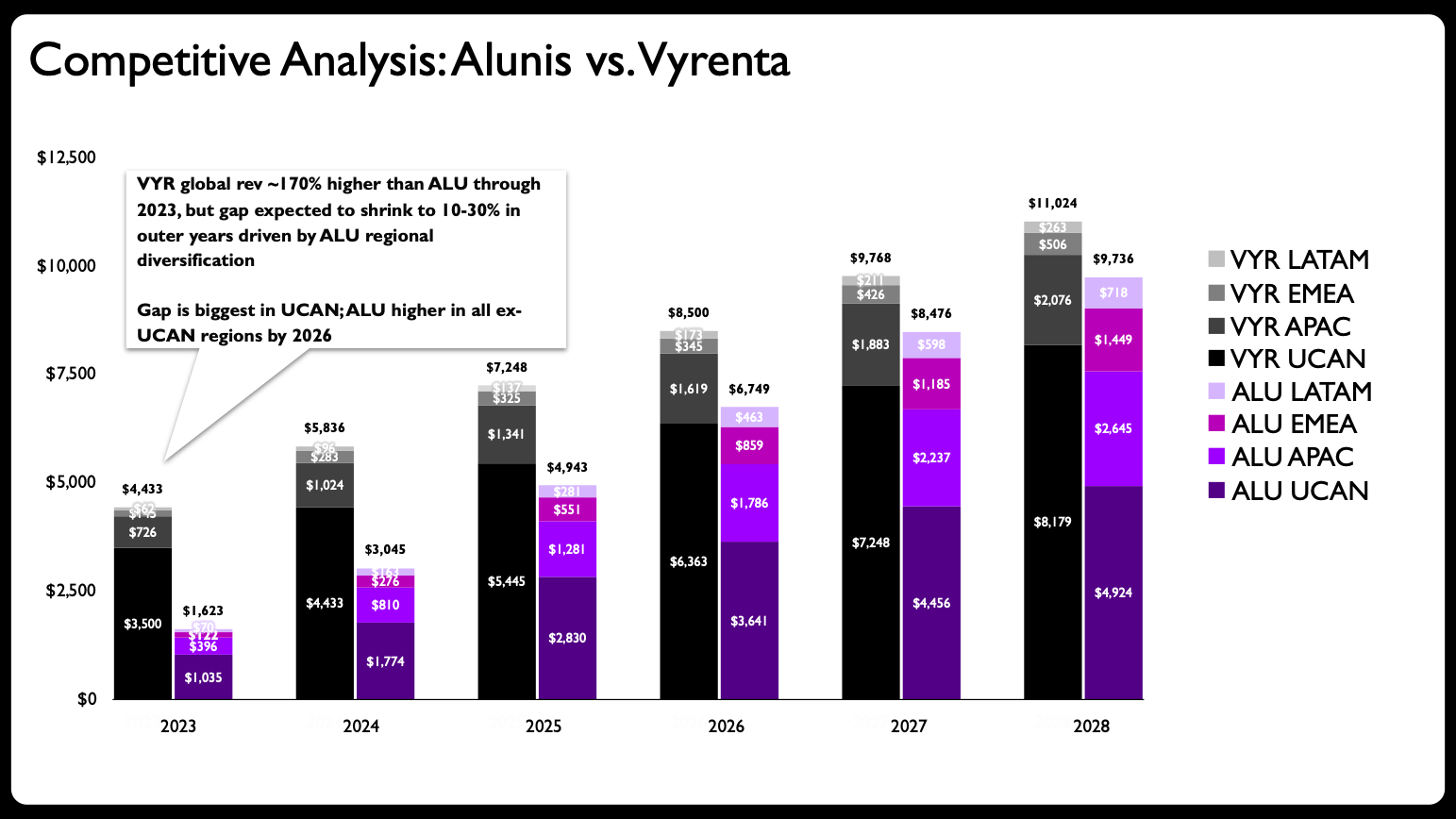
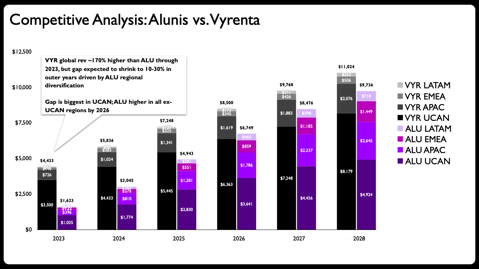
Vyrenta's early revenue lead narrows by 2028 as Alunis expands outside UCAN. Figures in USD bn. Sample data, not actual financials.
My initial thought: this stacked bar chart is trying to do too much. The goal is to show how the company, Alunis, will close the revenue gap with a top competitor, Vyrenta, by focusing on regional expansion over time. This chart needs to communicate change over time, compare two companies, and show each company's regional composition. That’s a lot of heavy lifting for one visual!
Side note: if you’ve checked out our latest book, before & after: practical makeovers for powerful data stories, you may recall the chapter on five common data visualization mistakes to avoid. The first most common mistake: adding too much to one graph.
Step one for this makeover is to avoid the mistake by splitting the graph into multiple charts. Here’s where things start to get interesting.
Partnering with Claude
Since I like to sketch to iterate on my ideas, I made a rough draft of how I thought this redesign of multiple charts could look.
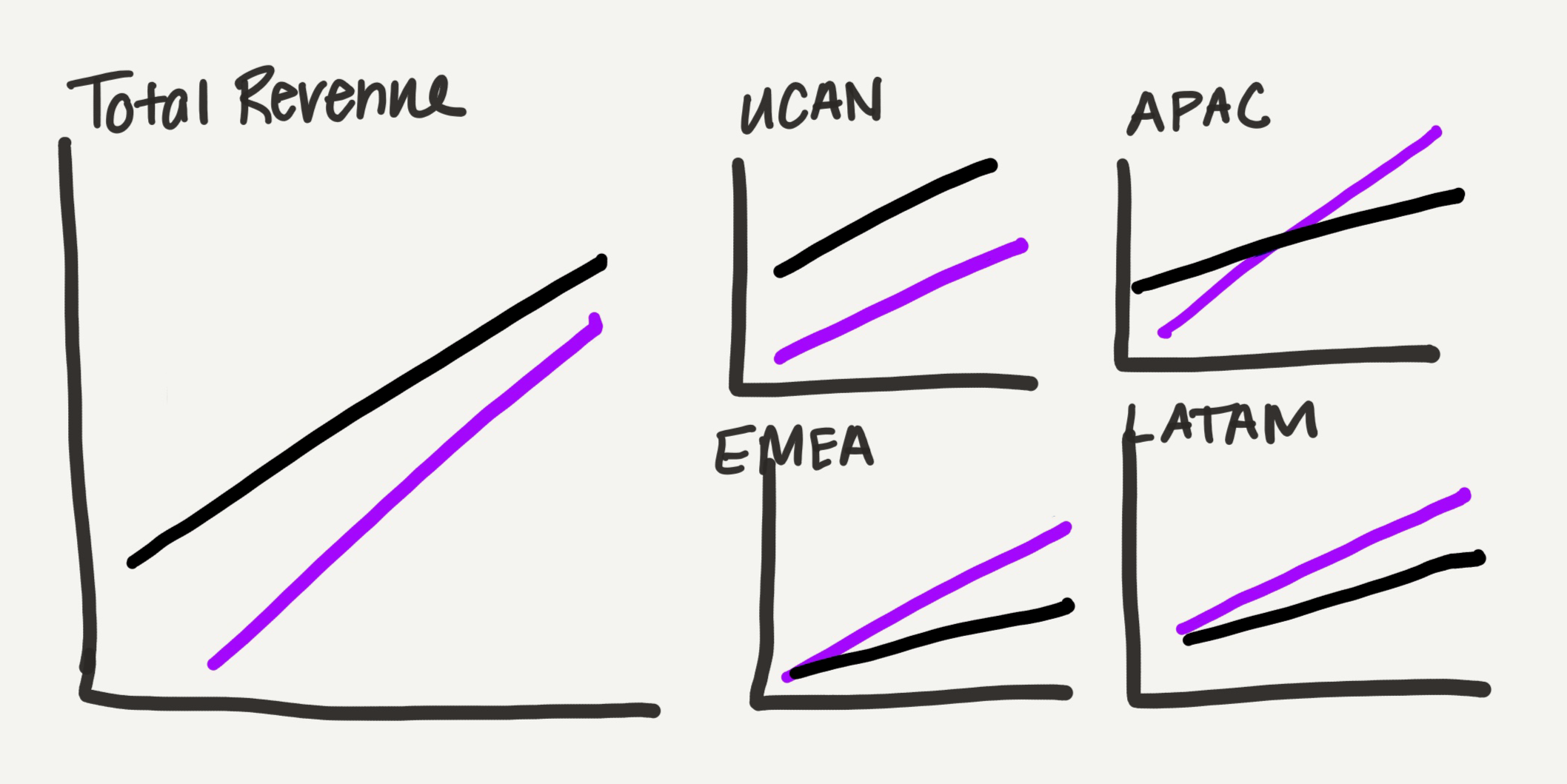
Hand-drawn sketch of the chart layout showing Vyrenta leads on total revenue and in UCAN, while Alunis grows faster and pulls ahead across APAC, EMEA, and LATAM.
I shifted from bars to lines, which have a lighter visual footprint—an advantage for a slide with so much data. I divided the graphs by location: one graph for total revenue and one for each region. Instead of sizing them consistently, I made the total view larger, and arranged the four regional charts into a small grid occupying the same amount of space as the total chart. This is my subtle way of visualizing the data’s part-to-whole nature.
Pre-AI, I would have created each one of these graphs in PowerPoint. This creation step would take a lot of time, patience, and mental energy.
This time around, I shared my sketch with Claude. For a few months, I’ve been testing Claude for PowerPoint, an add-in that was released earlier this year. While I’m not attached to any specific AI tool, this PowerPoint add-in has been the most useful for my workflow because it creates editable charts directly in PowerPoint, my preferred slide software.
That editability is what makes this collaborative experiment possible. It’s worth mentioning that CoPilot and ChatGPT also create editable charts. (I’ve had less success with the output—specifically CoPilot.) I’ve also learned that Gemini offers a similar capability for Google Slides, so this workflow can be adapted to other common tools.
Below is my prompt and the information I shared with Claude. Please ignore any typos, as I cannot be bothered to proof my chat messages.
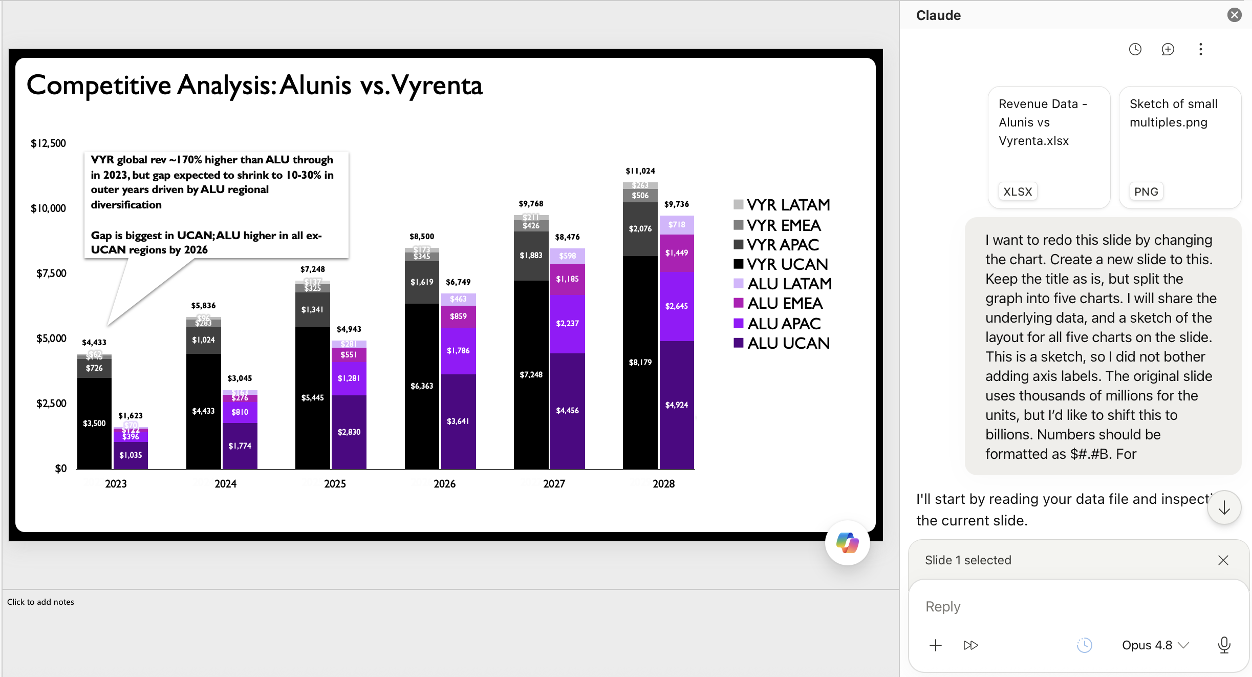
The Claude assistant is asked to rebuild the chart from the the uploaded data and hand-drawn layout sketch.
Here is the output from the above prompt. It’s decent. In fact, it’s better than that. This is a marked improvement from the original stacked bars.
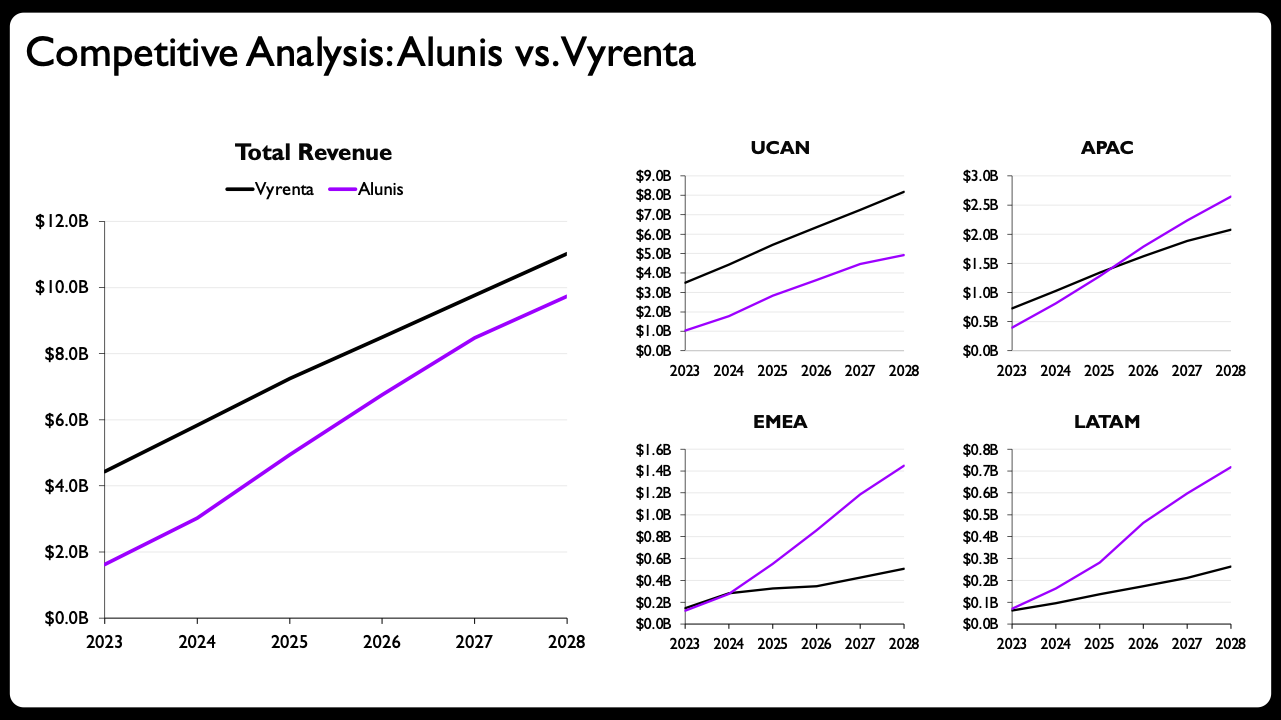
Claude rebuilt the sketch as fully editable native PowerPoint charts using the same small-multiples layout, real axes and labels.
Now, for most people, simply rewriting the slide title and adding additional descriptive language above the charts would be more than enough to call this makeover done.
The value that humans bring
For me, however, it’s not enough. There are a few easy tweaks that could take this to the next level. I’ll describe the top three.
Shade the areas: Since the comparison is between the two companies, I’ll make this more obvious by shading the space between the lines and adjusting the color to indicate the lead. At a glance you’ll see the purple overtaking the gray for three of the four regional charts—a design choice that reinforces the main takeaway.
Adjust axis ranges: Best practice states that you shouldn’t have multiple small charts near one another with different scales. When you deliberately break a best practice, it's worth understanding why the rule exists in the first place: to prevent someone from missing the scale difference and misreading the data. In an ideal world, I’d make all of the scales consistent, but if I do that here, it will be impossible to see the change at the regional level. To design around this constraint, I’ll make the ranges somewhat comparable by adjusting the maximum Claude chose, only label the minimum and maximum values, and add data labels for clarity and emphasis. I realize it’s not perfect.
Format the years: Space is limited on this slide so I want to preserve every bit of it that I can. For the year labels on the right, I’ll replace the four-digit years with two-digit abbreviations. I’ll also choose to only label the bottom charts.
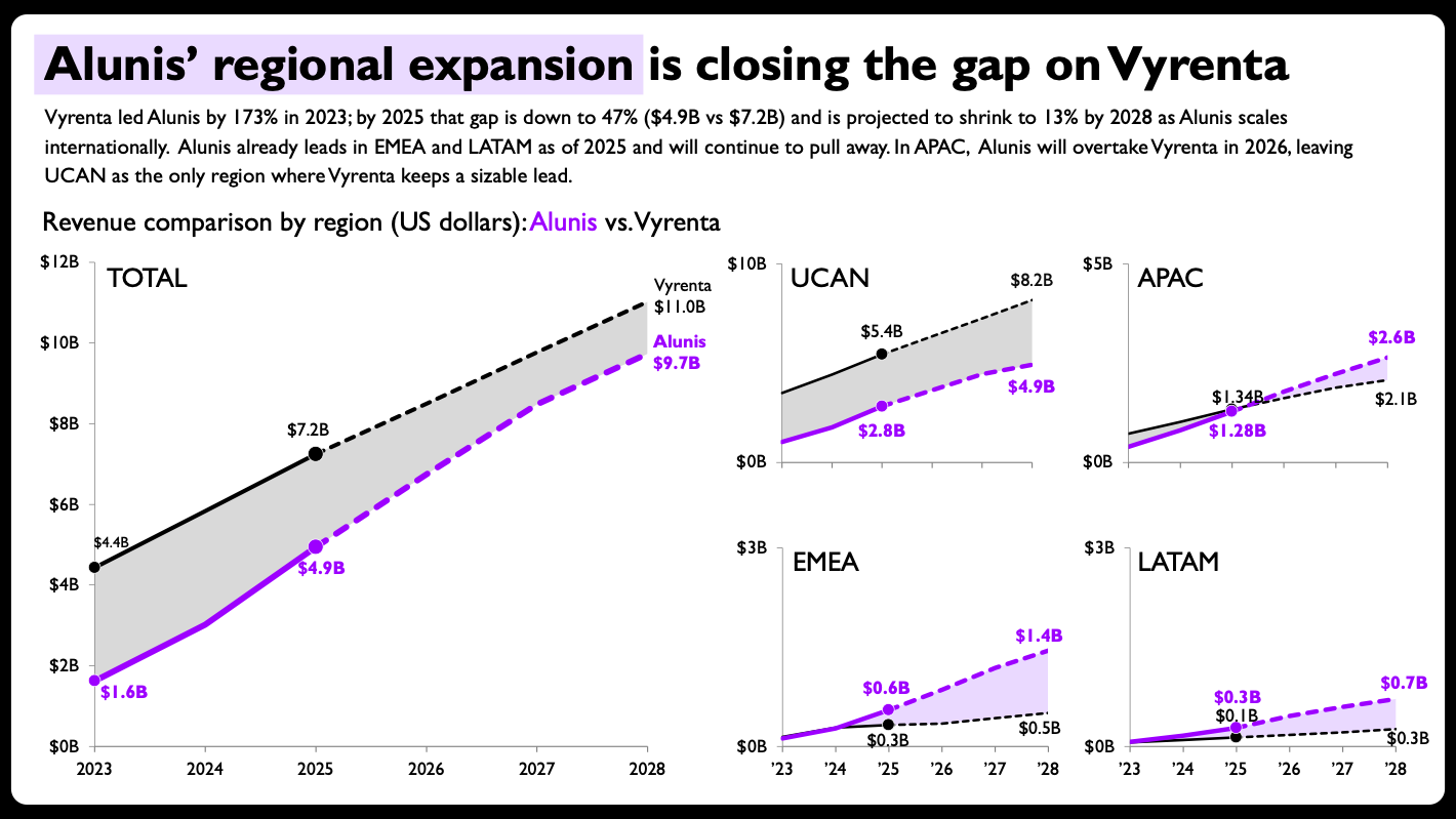
My final design looks like the following.
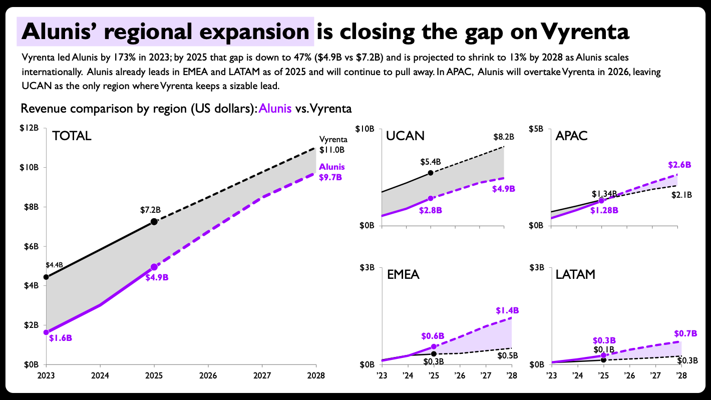
The same charts, now ready to share. Changes made: shaded areas between the two lines, direct end-of-line labels with values, per-panel axis ranges scaled to each region, solid-versus-dashed lines to split actuals from projections, and compact year formatting on the smaller panels. Sample data, not actual financials.
I’m quite pleased with the redesign, not just for the final outcome, but also for the impressive partnership between humans and AI throughout this makeover process. This result isn’t always the case in my many AI experiments, and it comes down to one thing: editable output.
My biggest takeaways
A big hurdle for many practitioners was that AI-generated charts were images, and for whatever reason some of the image processing lacked accuracy. That makes it critical for a data visualization designer to make adjustments to the final output. Now that AI tools can generate solid editable charts and slides, they're finally useful additions to an existing data storytelling workflow.
The implications extend beyond experienced practitioners. If you're new to data storytelling or aren’t sure how to build a particular chart in, AI can help you overcome that initial learning curve.
It doesn't eliminate the need to learn the foundational principles that guide the output. For this AI-generated makeover, I still had to know that a stacked bar chart wasn’t ideal, and why. I still had to determine a simple layout for five charts on one slide. And I still had to recognize that breaking the "consistent axis scales" convention wasn't a mistake, but a deliberate design decision worth reinforcing. I was fully in the driver’s seat.
That’s the value we continue to bring at the moment. We provide judgment and direction, while AI accelerates the execution. And if you ask me, that’s the most enjoyable part of data storytelling, anyway!
Want to learn more about how to partner with AI? Watch the recording of our live event. Cole Nussbaumer Knaflic, CEO & founder of SWD, and fellow data storyteller, Simon Rowe will share practical ways to maximize your data storytelling workflow with AI.