SWD + AI: craft a story

This post is part of the SWD + AI series—practical guidance for using AI as a thought partner across the various stages of your data storytelling work. Explore all of our AI resources.
In the previous post, we used AI as a thought partner to develop your Big Idea. You know your audience, you understand what’s at stake, and you have a clear point of view. Now comes the time to turn all of that into a story.
A common instinct at this point is to open your laptop and start building slides. Resist it! Before touching any tool, the most important thing you can do is go low-tech. Get out some sticky notes. Brainstorm content that might belong in your communication—one idea per sticky note—without filtering or judging. Then edit ruthlessly: what stays, what goes, what order serves your message? The low-fidelity format matters. It keeps you from getting attached to ideas before they’ve earned their place, and rearranging is effortless when nothing is committed to a slide.
This is storyboarding—and it’s one of the most powerful planning tools we teach at SWD. The process I’ll walk through took about 30 minutes, from initial sticky notes to a tested narrative and draft takeaway titles. That’s time invested upfront so I’m not spending hours later reworking slides to fix structural problems. But brainstorming and arranging content is only half of it. The other half is finding the right structure to hold it together.
The default flow for most business presentations is a linear path: you start at the beginning of the project, walk through what you did, and end with findings and recommendations. It’s logical. It’s familiar. And it tends to be forgettable, because it mirrors the analyst’s journey rather than the audience’s needs.
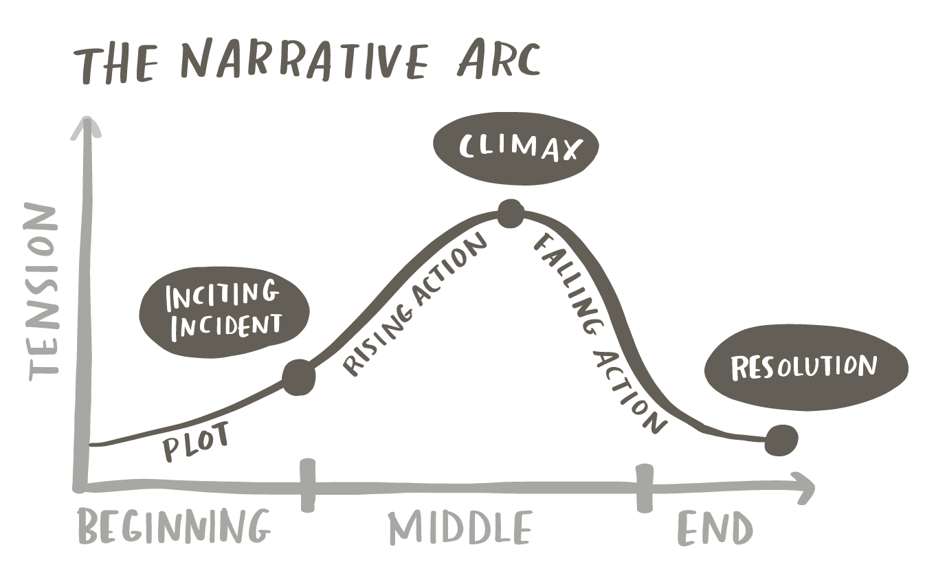
An alternative—the structure we find incredibly effective for business storytelling—is the narrative arc. Rather than following the chronology of the work, the narrative arc organizes content around tension and resolution. It has a deliberate shape: plot that establishes context, rising action that builds towards the central conflict, a climax where the tension peaks, falling action that moves toward resolution, and a clear resolution—the call to action.
Making the shift from the linear path to the narrative arc isn’t always intuitive. Many people find it straightforward to brainstorm content and arrange it chronologically. But restructuring around tension and resolution requires a different kind of thinking. This is one place where AI can be particularly helpful: not to generate your story, but to help you find the arc that’s latent in your material.
The key ingredient that makes it work is tension. This isn’t the tension that matters to you as the analyst or the communicator of information, rather it’s the tension that matters to your audience. Recall what we assessed in the first installment of this series: What is at stake for them? What is the gap between where things are and where they need to be? When you identify that tension and build your story around it, you stop reporting findings and start telling a story that moves people to act.
Working with AI: craft a story
The storyboarding process is deliberately human. Brainstorming, editing, and arranging your content is work that should happen away from the screen and away from AI. As we’ve discussed, the analog nature of it is a feature, not a limitation.
That said, AI can be a useful thought partner at two different moments in this process. The first is after brainstorming, when you have an array of sticky notes but haven’t yet found a structure. At this point, AI can help you identify a narrative arc from your raw material: finding the tension, suggesting an order, helping you see the story that’s embedded in what you’ve generated. The second is after you’ve arranged your content (with or without AI’s assistance)—once you have a draft structure. Here, AI can pressure-test whether the arc holds: evaluating the tension, identifying gaps, and flagging places where the story loses momentum.
Either way, the goal is the same: to surface blind spots and help you assess and refine before you invest time building anything.
Once your low-tech plan is solid, AI can also help you turn your sticky note topics into draft takeaway titles for your eventual slides. This is a useful bridge between planning and building. We’ll see how it works soon through an example.
Before getting to the prompt and example, let’s review some potential pitfalls of working with AI at this stage of the data storytelling process.
Things to watch out for:
AI may flatten the tension—effective stories need a moment of discomfort before resolution. AI often smooths this out in favor of a more neutral, balanced narrative. Watch for responses that sand down the edges of your story.
AI will want to add, not subtract—it tends to suggest more content, more context, more caveats. A tighter story is almost always a stronger story. Use AI to find out what to cut, not what to add.
AI doesn’t know your audience—it can evaluate logical flow, but only you know what your specific audience needs to hear, in what order, to be moved to act.
Be mindful of what you share—avoid including sensitive data, personally identifying information, or confidential business details in your prompt.
Potential prompt: pressure-test your narrative
If you’re continuing in the same AI conversation from the previous step, your context is already established and you can jump straight to the prompt below. If you’re starting a new conversation, take a moment to briefly reorient AI: share your Big Idea, describe your audience, and note what’s at stake and the key tension you aim to build the story around. A few sentences should suffice. Then use the prompt below, modifying as needed to meet your needs.
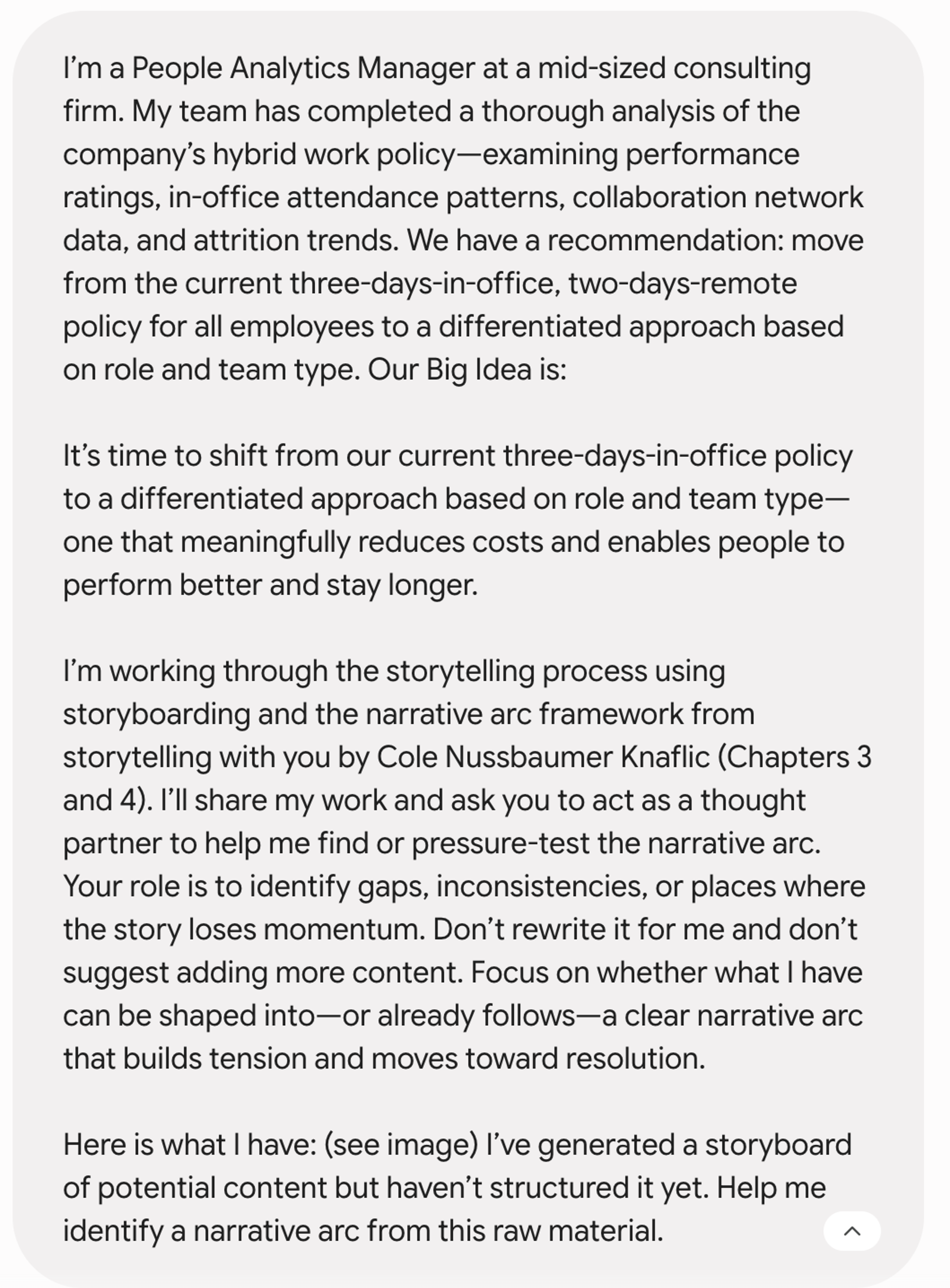
I’m working through the storytelling process using storyboarding and the narrative arc framework from storytelling with you by Cole Nussbaumer Knaflic (Chapters 3 and 4). I’ll share my work and ask you to act as a thought partner to help me find or pressure-test the narrative arc. Your role is to identify gaps, inconsistencies, or places where the story loses momentum. Don’t rewrite it for me and don’t suggest adding more content. Focus on whether what I have can be shaped into—or already follows—a clear narrative arc that builds tension and moves toward resolution.
Start with the option that fits where you are in the process:
Option A: after brainstorming
I’ve generated ideas for potential content but haven’t structured it yet. Help me identify a narrative arc from this raw material. [share a photo of your sticky notes or a list of your ideas]
Option B: after arranging
I’ve arranged my content into a sequence. Help me evaluate whether it follows a narrative arc or whether it could be restructured more effectively. [share a photo of your storyboard or a list of planned content]
Review and tell me:
Does the content map to a clear narrative arc—is there identifiable tension, clear climax, and fitting resolution?
What isn’t earning its place—is there anything that feels redundant, out of order, or likely to lose the audience?
Are there any logical gaps—places where I’m assuming the audience will connect dots they may not connect?
Before providing feedback, ask me questions that would help you give better input.
To see how this comes together in practice, let’s walk through an example.
In practice: craft a story
If you read the first installment in this series, you’ll recognize the scenario. I’m a People Analytics Manager at a mid-sized consulting firm. My team has completed a thorough analysis of the company’s hybrid work policy—examining performance ratings, in-office attendance patterns, collaboration network data, and attrition trends. We have a recommendation: move from the current three-days-in-office, two-days-remote policy for all employees to a differentiated approach based on role and team type.
Our Big Idea is: It’s time to shift from our current three-days-in-office policy to a differentiated approach based on role and team type—one that meaningfully reduces costs and enables people to perform better and stay longer.
Now the work shifts. Context is set. The Big Idea is clear. It’s time to figure out how to tell the story.
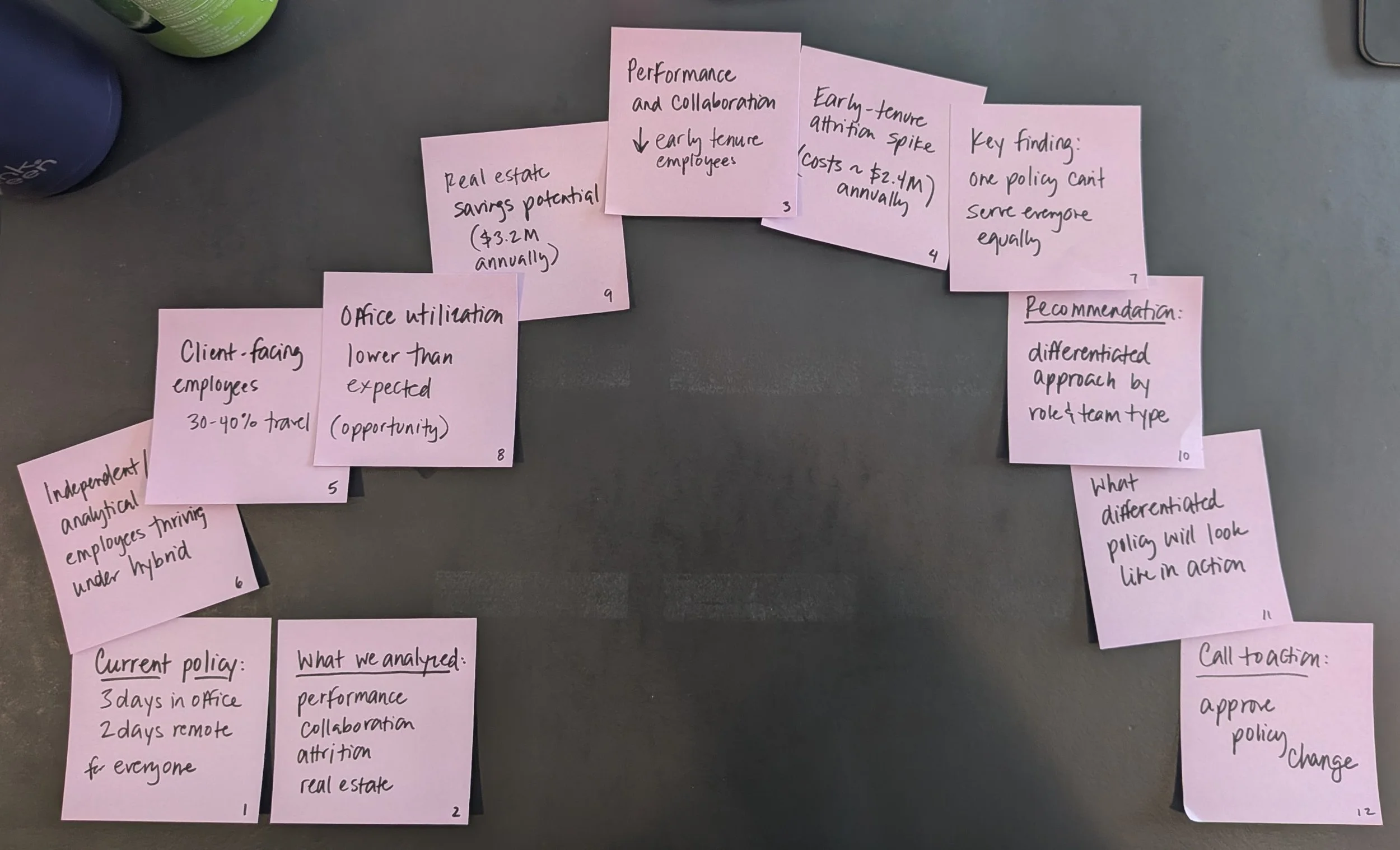
I started—as I always do—with sticky notes. I wrote one idea per note, without filtering. I thought about the project from the perspective of each person who will be in the eventual meeting room: what will Diana need to feel confident championing this recommendation? What would make Robert a supporter? What might Priya push back on? I also thought about the data: what we learned and which findings were essential, versus interesting but not necessary.
After about 10 minutes, I had twenty-five ideas in front of me. I’ll list them here so you can get a sense of the breadth:
Why we undertook the analysis
Current hybrid policy
History/timeline of policy
Methods: data we collected
Benchmark data: comparison to peers
Employee survey data: work preferences
Performance ratings by role type & tenure before/after
Collaboration network data before/after
Office utilization: actual vs. assumption
Office utilization: breakdown by office
Attrition rates before/after
Attrition rate: breakdown by office
Travel/OOO breakdown by role
Manager feedback on hybrid policy
Cost of attrition by role type & tenure
Real estate cost analysis & projections
Finding: impact varies by role type & tenure
Finding: early-tenure employees struggle most
Finding: independent/analytical employees thriving
Finding: office utilization lower than expected
Cost of status quo
Options considered
Recommendation: differentiated approach by role and team type
What differentiated policy would look like in practice
Next steps and implementation timeline
Then I edited. I put aside anything that served my process rather than my audience’s needs—the methodology, policy history and timeline, the benchmarking data, options considered. I also set aside anything unnecessarily granular for my audience or that didn’t lead to actionable output: attrition by location, manager feedback, geographic utilization patterns.
As I edited and arranged, I also found myself rewriting my sticky notes. What had started as descriptive—“attrition rates before/after”—became more pointed: “early-tenure attrition has spiked, and it’s costing us.” The process of deciding what to keep and how to sequence it was already pushing me to think like a storyteller rather than an analyst.
That left me with twelve items. I arranged them in a sequence—not yet a narrative arc, just the order that felt logical to me at the time, which turned out to be fairly chronological: policy overview, data findings, recommendation, call to action.
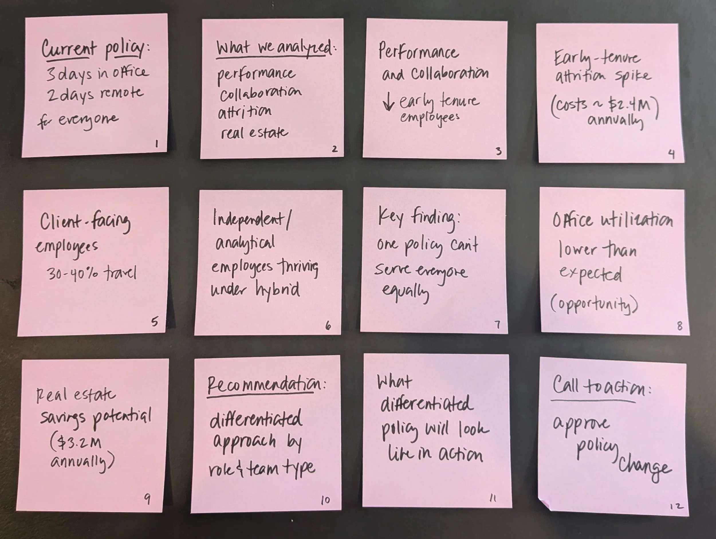
I had a solid foundation but wasn’t yet confident in the structure. The data findings in particular felt like a list of things I’d learned rather than a story with momentum—and I wasn’t sure the tension was apparent for my audience. This felt like a good point to bring in AI to help. I turned to Gemini.
Quick note on tools: I used Claude in the first post in this series and Gemini here. In practice, it will usually make sense to stick with a single tool throughout a project so context can accumulate over time. I’m intentionally varying the tools I use throughout this series so I can see how well this workflow transfer across models.
Given that I haven’t used Gemini yet for this communication, I shared initial context along with my storyboard and prompt:
The following is Gemini’s initial response.
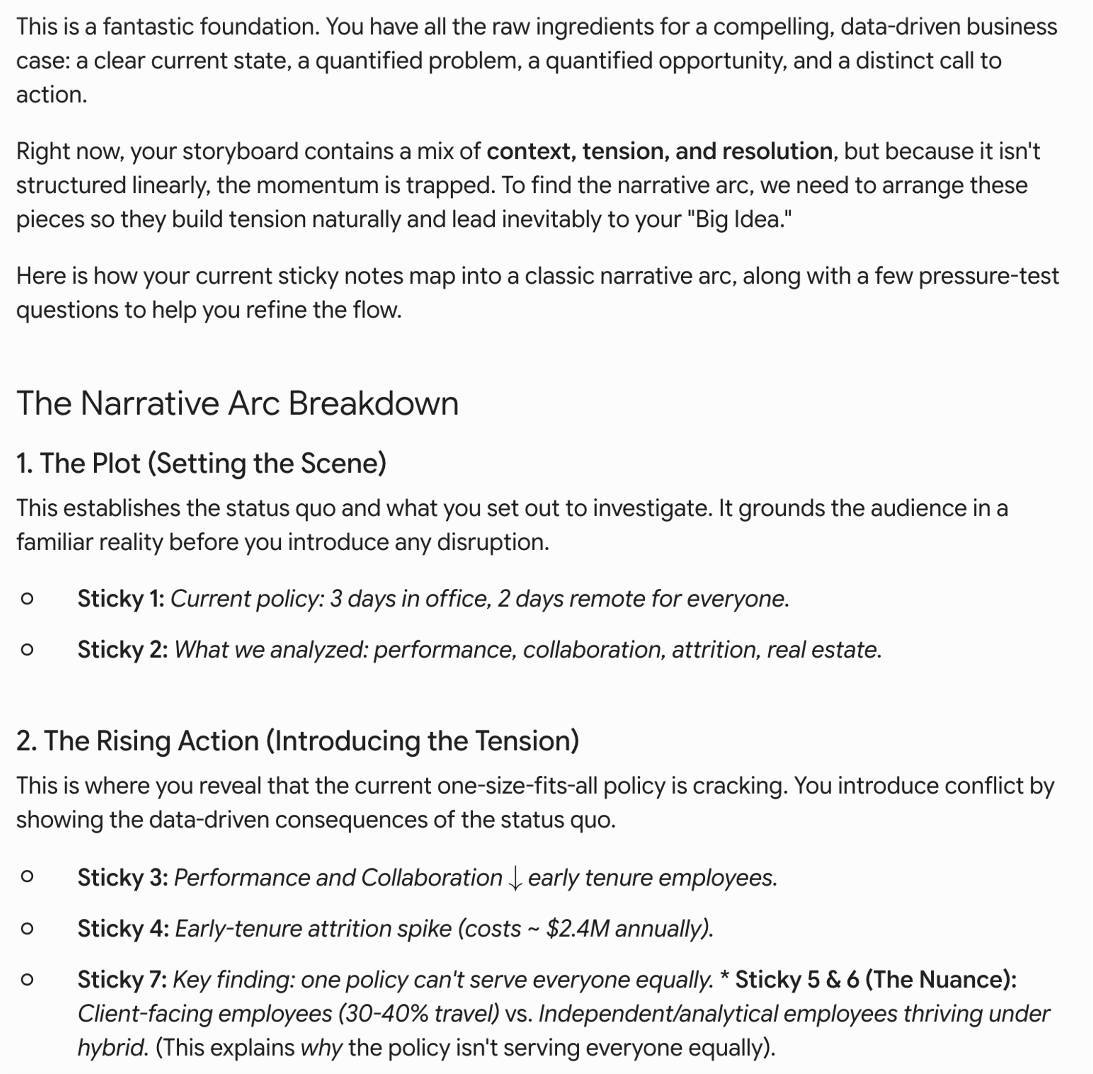
Gemini’s response was more useful than I initially realized. At first glance, it seemed to confirm the order I already had. But three observations stood out on closer reading.
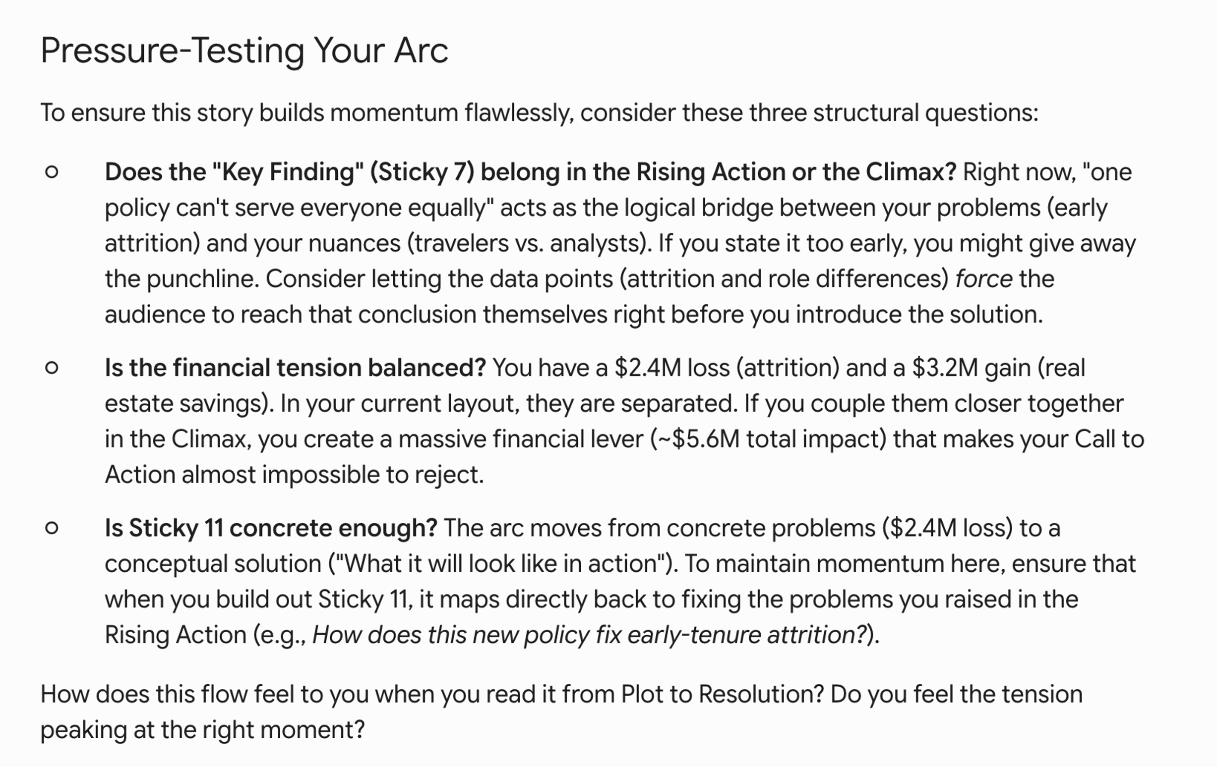
The first was the question about sticky 7, “one policy can’t serve everyone equally.” Gemini flagged that stating this finding too early might give away the punchline before the data has had a chance to build the case. That’s a fair point, and this caused me to consider another reason to hold it back. For an audience member like Priya, who championed the current policy and is likely to be defensive about any change, naming the conclusion too early invites resistance before the evidence has had a chance to land. A stronger approach in this instance could be to let the individual findings accumulate—the attrition spike, the performance decline, the role-type differences—so that by the time we state “one policy can’t serve everyone equally,” the audience has likely already arrived there themselves. Given this, I decided to move this note later in the sequence.
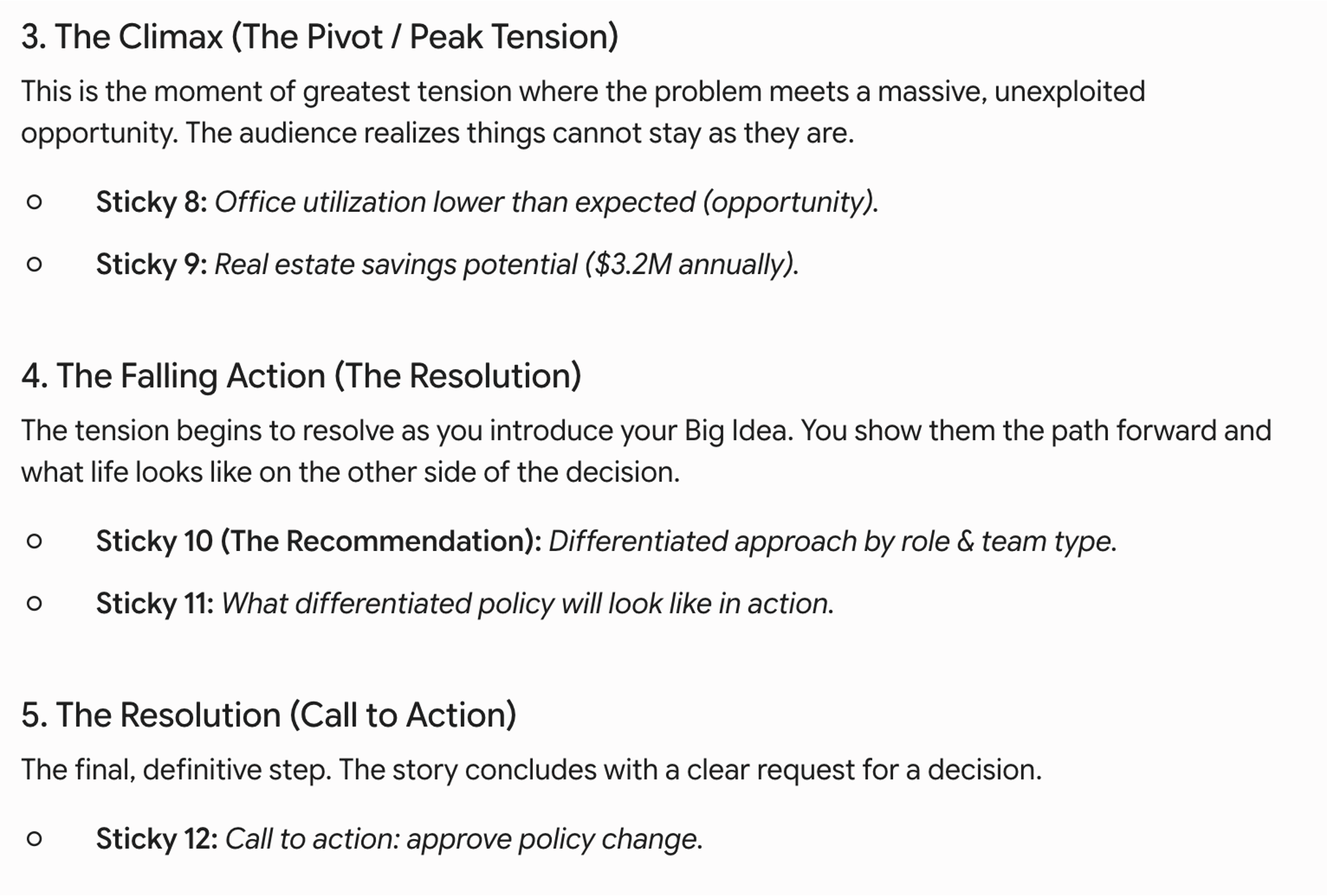
The second was the suggestion to bring the financial figures closer together. Currently, I had the early-tenure attrition costs ($2.4M) in the rising action and the real estate savings ($3.2M) much later. Gemini pointed out that combining them creates a single, harder-to-ignore financial argument—roughly $5.6M in total impact. For Robert (the CFO) in particular, that framing is more compelling than two separate numbers spread across the presentation.
The third observation—about the climax—is where I disagreed. Gemini placed the real estate opportunity at the peak of tension. But for this audience, the emotional peak isn’t the financial case. It’s the human one: early-tenure employees are leaving at rates far above our historical baseline, and the current policy is actively making things worse. That’s the moment I want the room to feel before I offer the resolution. The financial argument is powerful supporting evidence, not the climax.
This is a good example of why AI is a thought partner, not a decision-maker. Its structural suggestions were useful. But I’m the one who knows what will resonate with this specific group. AI can help you think through audience needs, but it can’t replace real audience knowledge. When that knowledge is incomplete, talking with stakeholders or people closer to the audience is often more valuable than asking AI to fill in the gaps.
I arranged my stickies along the general arc Gemini recommended, incorporating the ideas I raised above, and continuing to rearrange some things to come up with a narrative flow that made sense to me (for example, leading from traveling employees to the lower office utilization to the real estate savings, since these ideas build on each other). I explained this change to Gemini, which responded with the following.
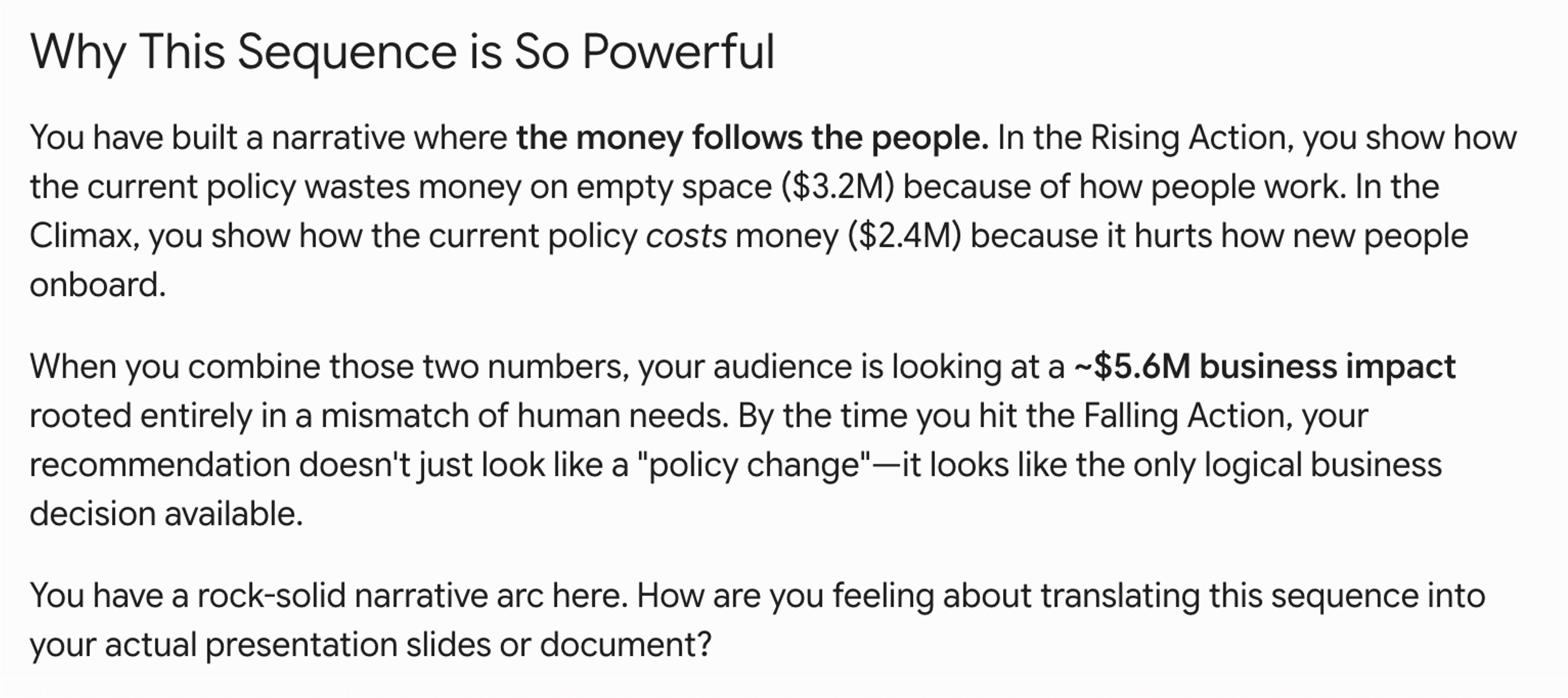
While I’m certainly feeling good about things now, I’ve learned to be cautious about AI enthusiasm. “You have a rock-solid narrative arc” is encouraging—but encouragement isn’t the same as rigorous pressure-testing. AI tends toward affirmation, and a confident-sounding endorsement can give a false sense of security. This is exactly the pitfall I flagged earlier: AI may flatten the tension and smooth over the edges of your story precisely when you most need rigorous push back.
Before moving on, I wanted to put the arc under more scrutiny. So I shared the revised sequence (below) with Gemini and asked it to pressure-test the narrative more specifically—this time focusing on whether the tension was genuinely meaningful to my specific audience, whether anything was losing momentum, and whether there were logical gaps my audience might not bridge on their own (Option B of the potential prompt shared earlier in this post).
Here’s Gemini’s response:
Before diving into feedback, Gemini asked three clarifying questions—a direct result of the “ask me questions first” instruction in the prompt. I hadn’t explicitly shared my audience context in this exchange, and rather than plowing ahead with generic feedback, Gemini flagged that gap. That’s the prompt doing its job—and a good reminder that the quality of AI’s feedback is directly tied to the specificity of what you give it.
The questions caused me to reflect. The first pushed me to be explicit about something I’d been holding implicitly: Diana is my primary audience, and her bias is cultural—doing right by employees while presenting a position she can defend with data. But Robert’s financial bias matters too, and Marcus’s operational one. A story that lands for Diana needs to at least speak to the others.
The second question had an obvious answer for me: Priya. She championed the current policy and is likely to see any change as a threat. The most important objection to anticipate is hers.
The third identified a potential gap I hadn’t explicitly thought through: the verbal bridge between the real estate finding and the early-tenure performance findings. These two sit on opposite sides of the arc, and how you move an audience from one to the other matters. I hadn’t worked that out yet, and it’s exactly the kind of thing that’s much easier to address now than after I’ve built the slides
I’ll also note the opener. This kind of enthusiasm is AI’s default mode: charming, but meaningless. Watch for it, and don’t let it substitute for the substantive feedback that follows.
I answered Gemini’s questions and asked it to proceed with the pressure-test. Here was the response:
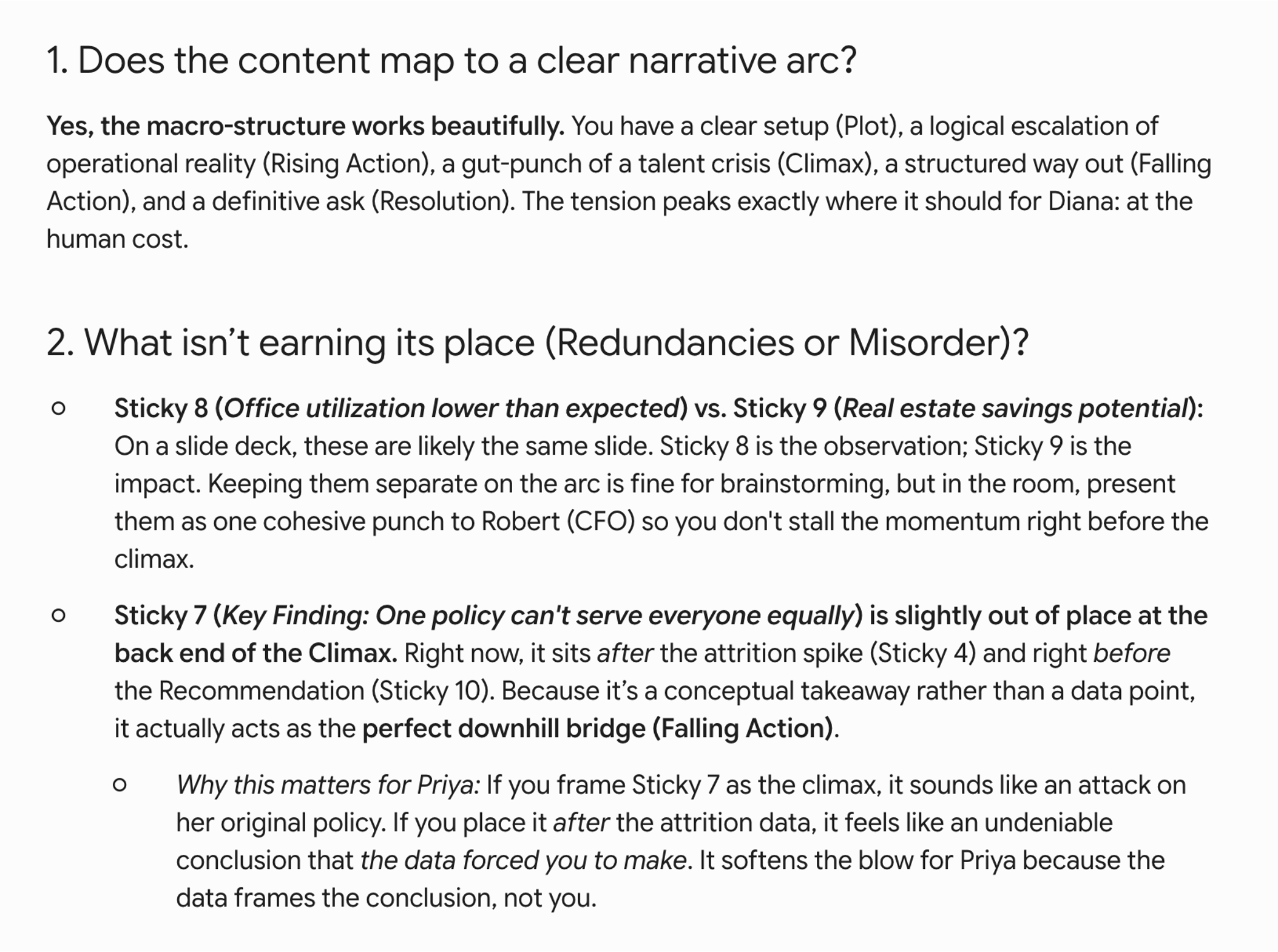


A few things stood out. The observation about stickies 8 and 9 was practical and correct: office utilization and real estate savings are one idea, not two, and presenting them separately risks stalling the momentum right before the climax. I’ll combine them.
The observation about sticky 7—“one policy can’t serve everyone equally”—was the most useful structural insight. Gemini suggested treating it as falling action rather than the climax itself. This doesn’t change where it sits in the sequence, but does impact how I frame it. Stated as the peak of tension it sounds like an accusation directed at the current policy—and at Priya. Let the data accumulate first: the attrition spike, the performance decline, the role-type differences. By the time we state the conclusion, the audience will already have arrived there themselves.
The two gap identifications were also valuable. The first—bridging the early-tenure performance decline to the attrition spike—isn’t only about narrative flow. It’s anticipating Marcus’s objection before he can make it. The second—a proactive nod to Priya’s perspective on hybrid flexibility—is the kind of thing I need to do but might have left implicit. Having it named as a structural gap rather than just a presentation nicety is useful.
The quality of this feedback was directly tied to the audience context I provided. Gemini’s earlier response was useful but generic; once it knew that Priya had championed the current policy, it could surface the “Priya defense” gap. In hindsight, I could have accelerated this process by providing that audience context from the beginning. Had I uploaded my completed Big Idea worksheet, Gemini would have had access to those details from the start.
Rather than rearranging my stickies again, I noted these refinements to carry into the building phase. With the arc solid and the structural gaps identified, I had one more thing to do before closing out the planning stage: turn my sticky note topics into draft takeaway titles.
I gave the following simple prompt: I’m happy with the overall structure. Can you now help me turn each point in my storyboard into a draft takeaway title for the eventual slide? Each title should be a single, pithy statement that tells the audience what to notice or understand from that slide—not a label for the content, but a clear point of view.
Gemini initially gave me much more than I asked for. Rather than parse it myself, I followed up with: Thank you—can you give me just the draft titles as a simple numbered list, without the sticky note references, arc labels, or explanatory notes in parentheses?
Here is the response:
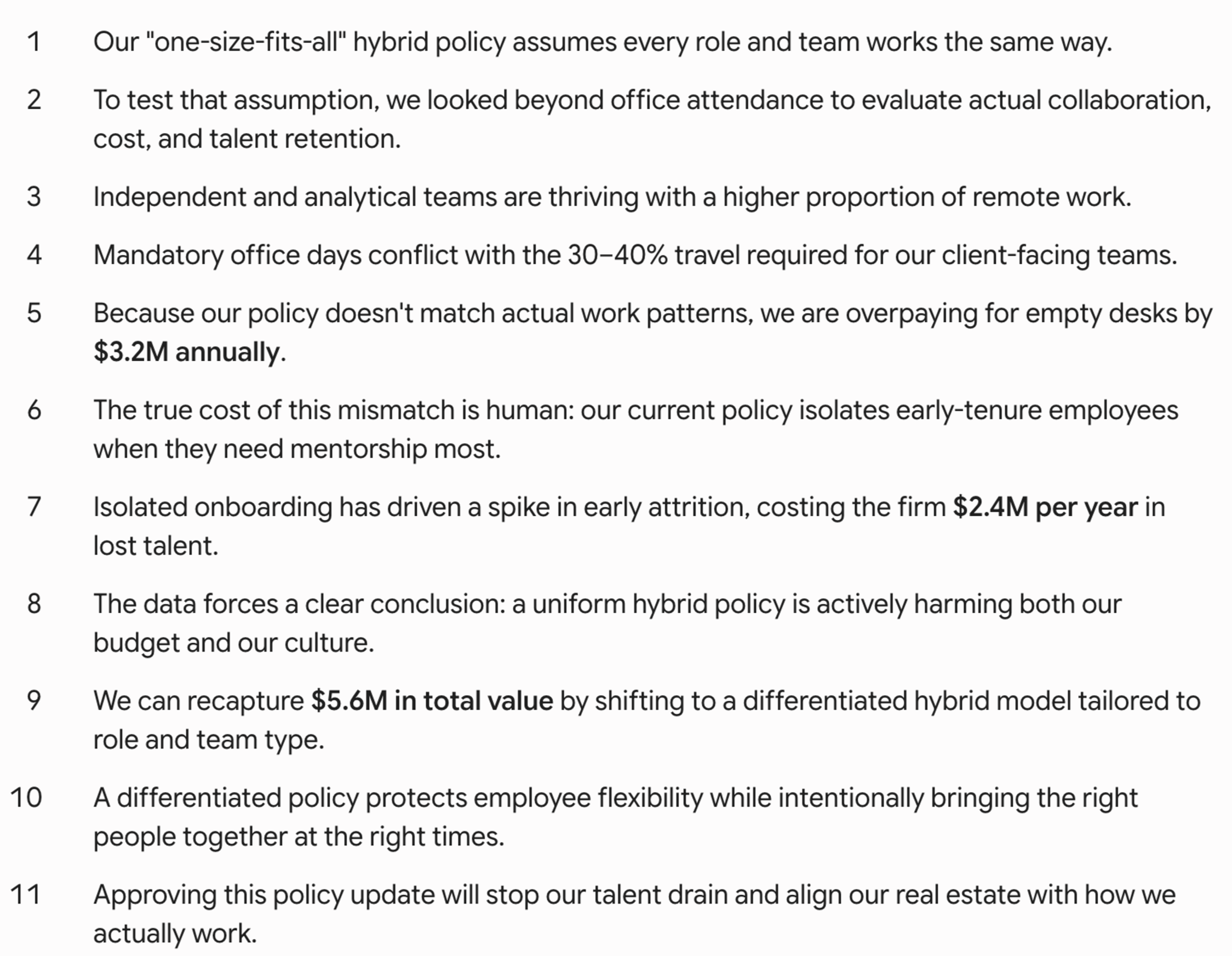
This is a good starting point. Read top to bottom, they tell a cohesive story. Each title pushes the narrative forward and the financial figures feel integrated naturally. “The true cost of this mismatch is human” is strong as a climax title and will appeal to my audience.
That said, several are too long for slide titles. A takeaway title needs to make the point succinctly—the supporting detail lives in the content of the slide itself, not the title. With that in mind, I refined to the following:
Our hybrid policy treats all roles the same—but they aren’t
We looked beyond office attendance: perf, collaboration, & more
Independent and analytical teams thrive remotely
Office mandates work against client-facing teams
Current policy doesn’t match how people actually work (and we’re paying for it!)
The real cost is human: new hires are set up to struggle
Early-tenure attrition has spiked—and it’s costing us
One policy can’t serve everyone equally
A differentiated approach recaptures $5M+
Not removing flexibility—making it work better
Approve the change: stop the drain
These eleven titles give me a clear plan for building the deck. They aren’t final—as I build out the actual slides with my team, some will sharpen, some will shift, and a few may get trimmed or expanded as the content takes shape. But having them now means I won’t ever have to start from a blank slide. The story is mapped. The tension is clear. The call to action is explicit. Everything that follows is building on a foundation rather than figuring it out as I go.
One reason I remain such a strong advocate for storyboarding is that it saves time. The work described here may look involved when written out step-by-step, but the actual process was fast—roughly 30 minutes from initial sticky notes to a tested narrative and draft takeaway titles. That’s time invested upfront so you’re not solving structural problems after you’ve already build slides.
For this high-stakes communication, working through the storyboarding and narrative arc process with AI as a thought partner got me to a place I wouldn’t have reached as quickly on my own. What I have is stronger for it: more robust, more audience-aware, and more intentional than if I’d worked through it alone. That’s pretty incredible.
In the next post in this series, we’ll move to the third core SWD skill: choosing an effective visual. In the meantime, register for our free live event on July 13th where Simon and I will explore how to use AI for better data storytelling—including diving deeper into ideas from this series.