can design be taught?
“I don’t have a design eye.”
Kaitlin says this matter-of-factly, as if it’s simply a fact about herself, like her height or hometown. Kaitlin, our education and outreach specialist at storytelling with data, is passionate, creative, and deeply committed to her work—particularly when it comes to raising awareness of our children’s book, Daphne Draws Data. She is also, by her own admission, not a designer.
I’ve been working with her on this. I’m seeing progress—more intentional use of color here, a cleaner font choice there, and a growing awareness of how the things she creates will actually be used. Which got me thinking about a question I find genuinely interesting: can design be taught?
My answer is yes. Unequivocally. With a caveat.
People come to design with different natural starting points. Some have an innate sensitivity to visual harmony—they notice when something is off before they can articulate why. Others have to work harder to develop that instinct. But here’s what I believe, and what I’ve seen borne out again and again in my work: everyone can improve. The gap between where you start and where you can get is largely a function of attention, practice, and knowing what to look for.
This mirrors something I feel strongly about when it comes to designing effective graphs. It’s not a talent you either have or you don’t. It’s a skill. Like any skill, it can be cultivated.
So for Kaitlin, and for anyone else who has ever said “I’m just not a design person”—and for those trying to help someone get there—here are ten things worth learning:
1. Start with your audience, not your content
This is the first question to ask before you open any tool or touch any layout: who will see this, and what do they need from it? It sounds obvious, but it’s remarkable how often we skip it. We start with what we have—the content, the existing template, the thing we made last time—and work forward from there. The result is design that serves the creator, not the audience.
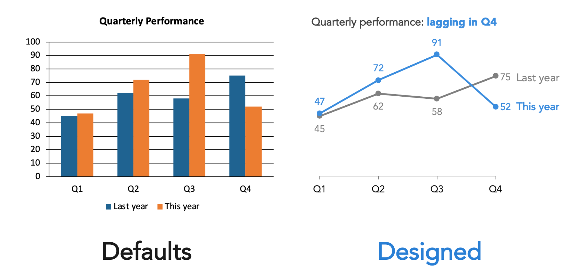
2. Don’t let the default be your design
Every tool you use—PowerPoint, Canva, Google Slides, your website platform—makes design choices on your behalf. Default fonts, default colors, default layouts. These aren’t neutral. They’re someone else’s decisions, made for a generic use case that probably isn’t yours.
Accepting defaults uncritically isn’t the same as making no design choice. It’s making an unconsidered one. The first step toward better design is simply noticing that these choices exist—and asking whether they are serving you.
3. Constrain your choices
More options are not more freedom. In design, it’s usually more noise. When everything is available to you—every font, every color, every layout—the result is often a visual cacophony where everything competes and nothing stands out.
Constraints help. A limited color palette. A single typeface. A layout you commit to. If your organization has existing templates or brand guidelines, lean into them—they’ve already done some of this work for you, and consistency across your materials builds recognition and trust. The goal isn’t creative restriction; it’s coherence. Within constraints, the real design decisions become clearer.
4. Create clear visual hierarchy
Your viewer’s eye will move through your design whether you direct it or not. The question is whether it moves the way you intend. Visual hierarchy is how you answer that question deliberately.
What should someone notice first? What’s the most important thing? Make it the most visually prominent. What comes second? Third? Design the sequence. This doesn’t require elaborate technique—size, weight, position, and spacing can all establish hierarchy simply and effectively. What it does require is that you think it through before you start placing elements, rather than after.
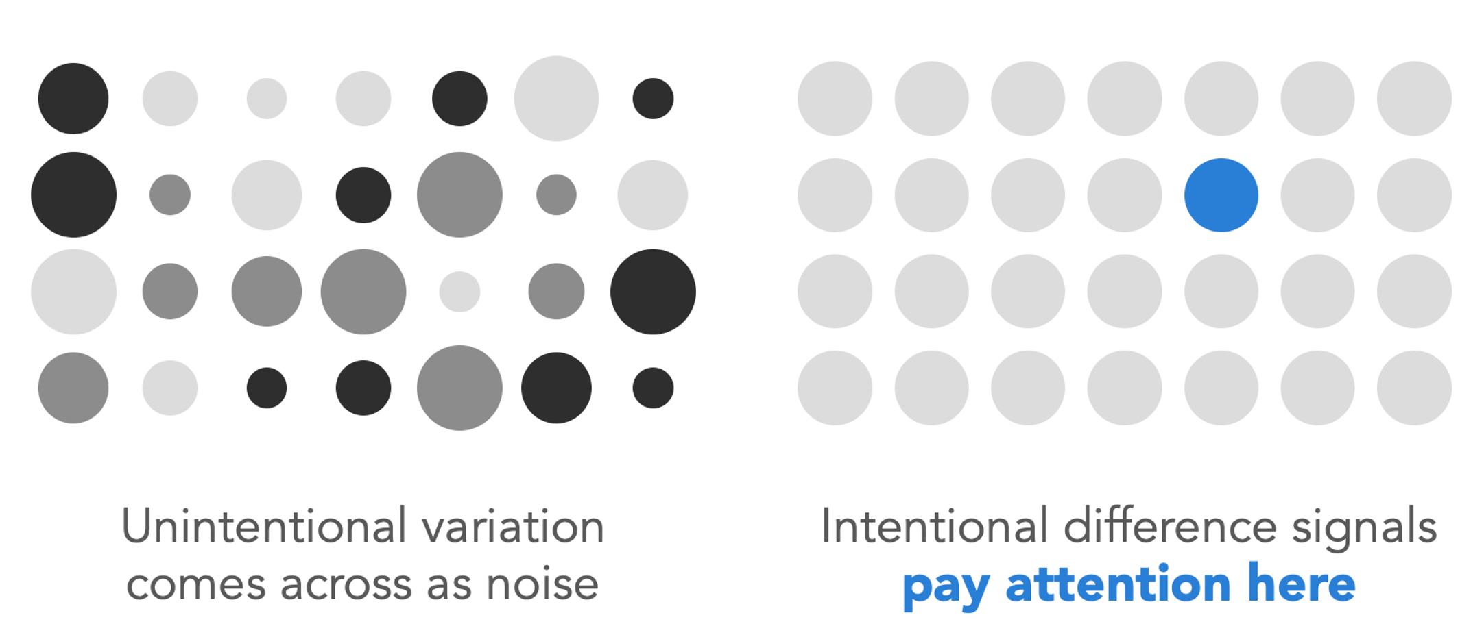
5. Understand that different signals meaning
This is one of the most important design principles I know, and one of the most commonly violated. When something in your design is different—bigger, bolder, a different color, a different font—viewers read that difference as meaningful. It signals: pay attention here, this matters more.
The corollary is that unintentional variation creates confusion. If three elements are slightly different sizes but you didn’t mean anything by it, your viewer will still try to interpret the difference. They’ll wonder what they’re missing. Inconsistency reads as noise, while intentional variation reads as signal. Before you finalize anything, ask yourself: does every difference in this design mean something? And does everything that should look the same actually look the same?
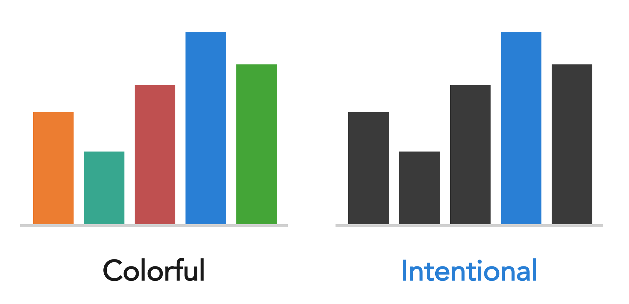
6. Use color with purpose
Color is one of the most powerful tools in design—and one that is often misused. The right approach depends entirely on what you’re trying to do.
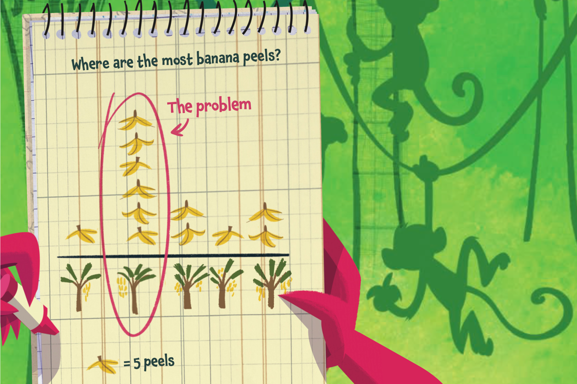
If you’re creating something expressive—an illustration, a poster, a book cover—color can be rich, playful, and abundant. In Daphne Draws Data, our children’s book, color is used exuberantly, because that’s what serves young readers and the spirit of the book.
But if you’re trying to direct attention in a graph or a slide, a different logic applies. A mostly neutral palette with one intentional color used sparingly is far more effective than many competing colors.
When it comes to this, the question to ask isn’t “what colors do I like?” It’s “what is color doing in this design, and is it doing that well?”
7. Align everything thoughtfully
Of all the things that make a design feel polished versus amateurish, alignment is one of the most telling. Misaligned elements—text that doesn’t quite line up, objects that are close to a grid but not on it—create a subtle but persistent visual unease. Viewers may not be able to name what’s wrong, but they feel it.
One particular pet peeve worth calling out: center-aligned text. It doesn’t align to anything, which leaves it floating unmoored on the page. When it runs to multiple lines, you end up with two jagged edges—one on the left and one on the right—that create visual tension rather than resolving it. Left-align your text and give it something to anchor.
The fix is straightforward: use your tool’s alignment functions, turn on gridlines, and be deliberate. Every element should be aligned to something—another element, a margin, a grid. “About here” is not a design decision. Alignment is one of those things that, once you train your eye to see it, you can’t unsee. Which is useful, because then you can fix it.
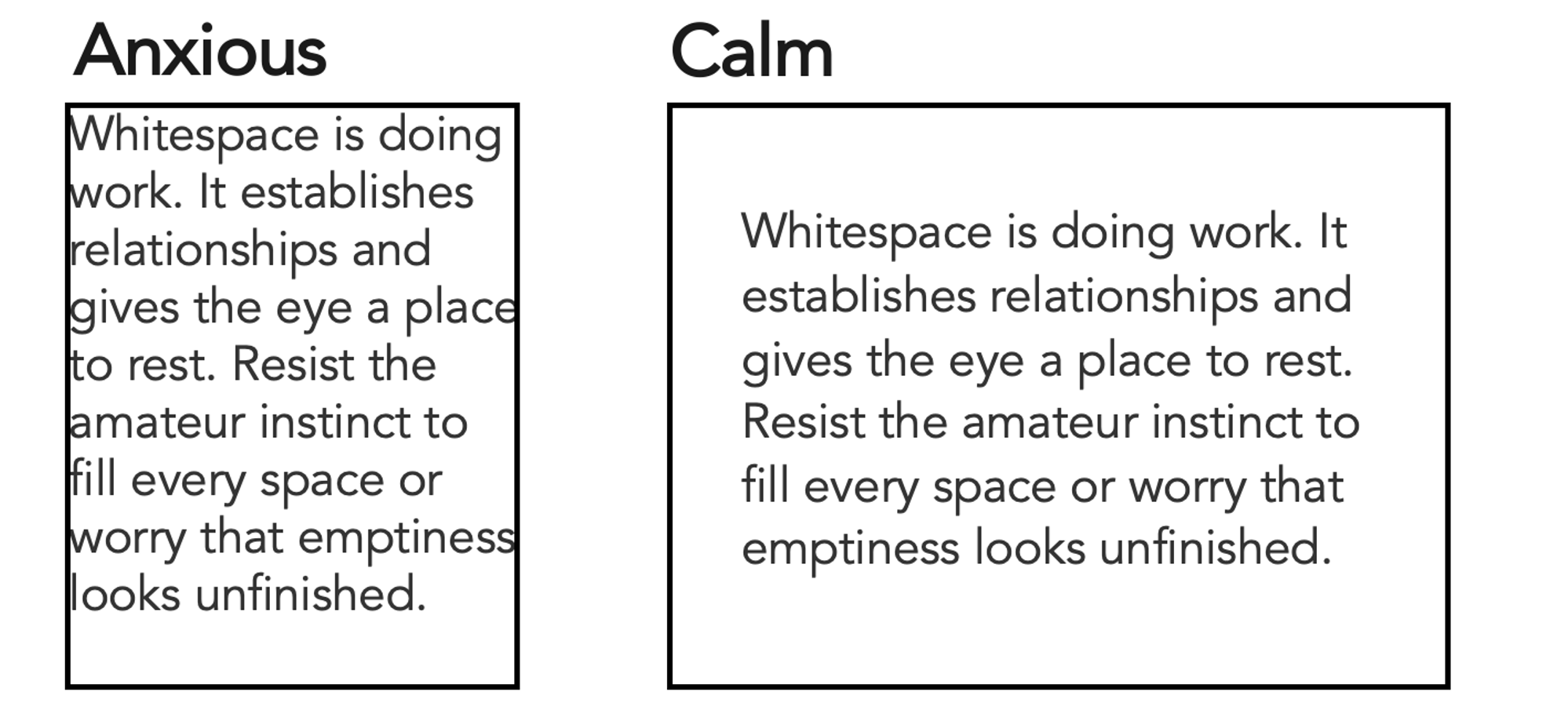
8. Give things room to breathe
Whitespace—the empty space in a design—is not wasted space. It is doing work. It creates separation, establishes relationships, and gives the eye somewhere to rest. Designs that crowd elements together feel anxious and hard to read. Designs with generous spacing feel calm, clear, and considered.
The instinct when you're new to design is often to fill space, perhaps due to worry that emptiness looks unfinished. Resist it. Some of the most effective designs are defined as much by what isn’t there as by what is.
9. Seek inspiration actively
Design literacy is built by looking. When something catches your eye—a beautiful book cover, a well-designed menu, a pleasing color combination, a graph that makes data suddenly clear—pause and ask why it works. What specifically is it doing? What could you learn from it or apply in your own work?
Do the same with bad design. Why is it ineffective? What would you change? This kind of active, analytical looking is a habit, and it compounds over time. The more you do it, the faster your eyes develop. Inspiration is everywhere—you just have to start noticing it.
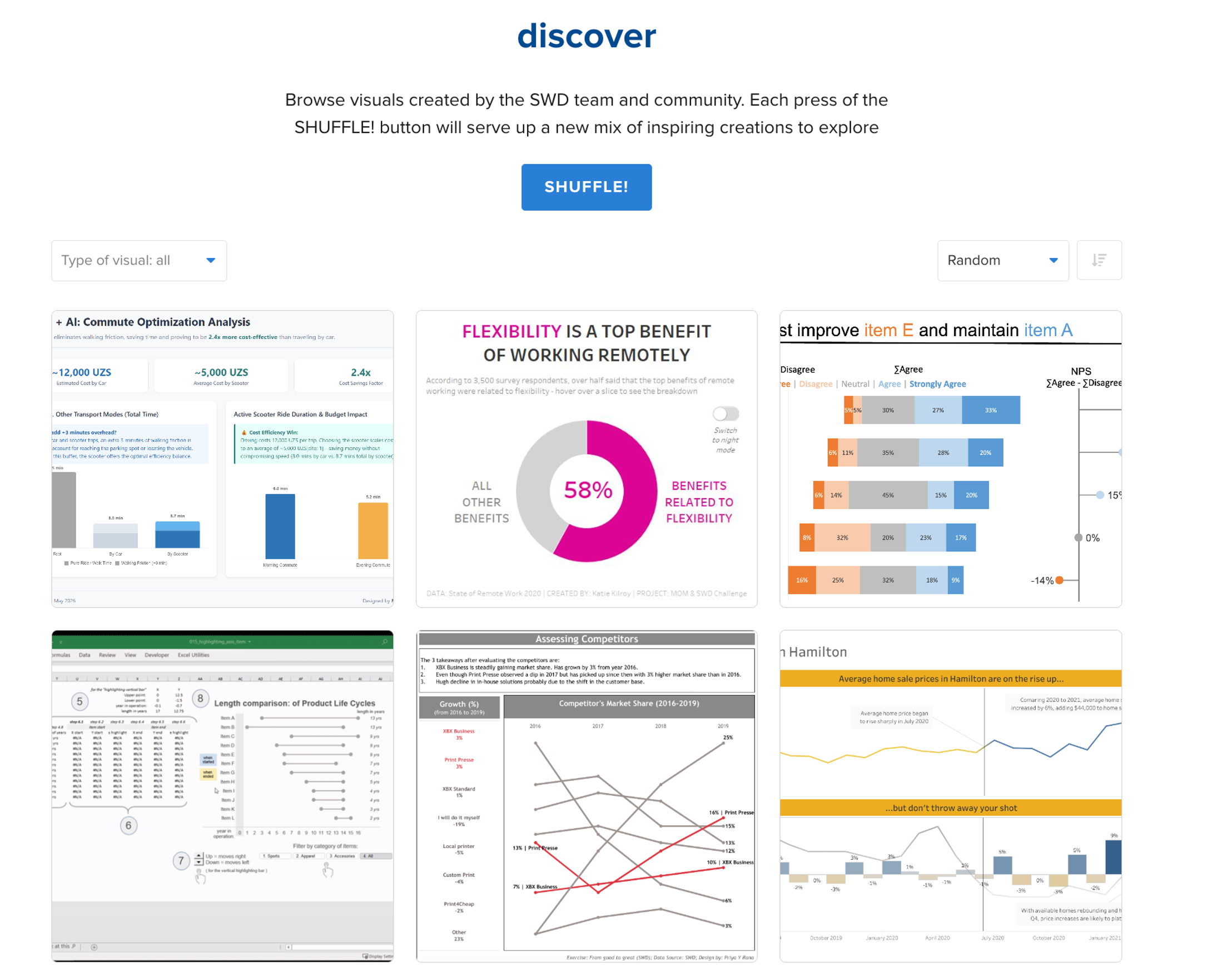
If you want to practice this specifically with data visualizations, the SWD community’s discover page is a great place to start. Thousands of visuals created by SWD team members and the broader community are there to browse—shuffle and see what catches your eye.
10. Trust your eyes, then train them
Here’s the thing about design instinct: most people have more of it than they realize. You know when something feels off, even when you can’t say why. That feeling is data. Trust it.
But instinct is a starting point, not a ceiling. It can be developed. The difference between someone who considers themselves “not a design person” and someone who does isn’t innate talent—it's mostly accumulated practice, awareness, and feedback. You train your eye the same way you train anything else: by using it, paying attention to what you notice, and being willing to iterate.
You don’t have to be a designer to think like one. You just have to start looking.