dashboards that deliver: a special #SWDchallenge
MIKE | For many years, we here at storytelling with data have been singing the praises of the wildly popular guide to designing business intelligence products, the Big Book of Dashboards. Traditionally, we think of dashboards as one of the best ways to explore your data, and at SWD, we focus most of our efforts toward helping folks improve the way they explain their data. That's why we've always found the Big Book of Dashboards and the books in the SWD library to be wonderful complements to each other. For the data analyst who wanted to upskill the full range of their abilities, this combination has served them well.
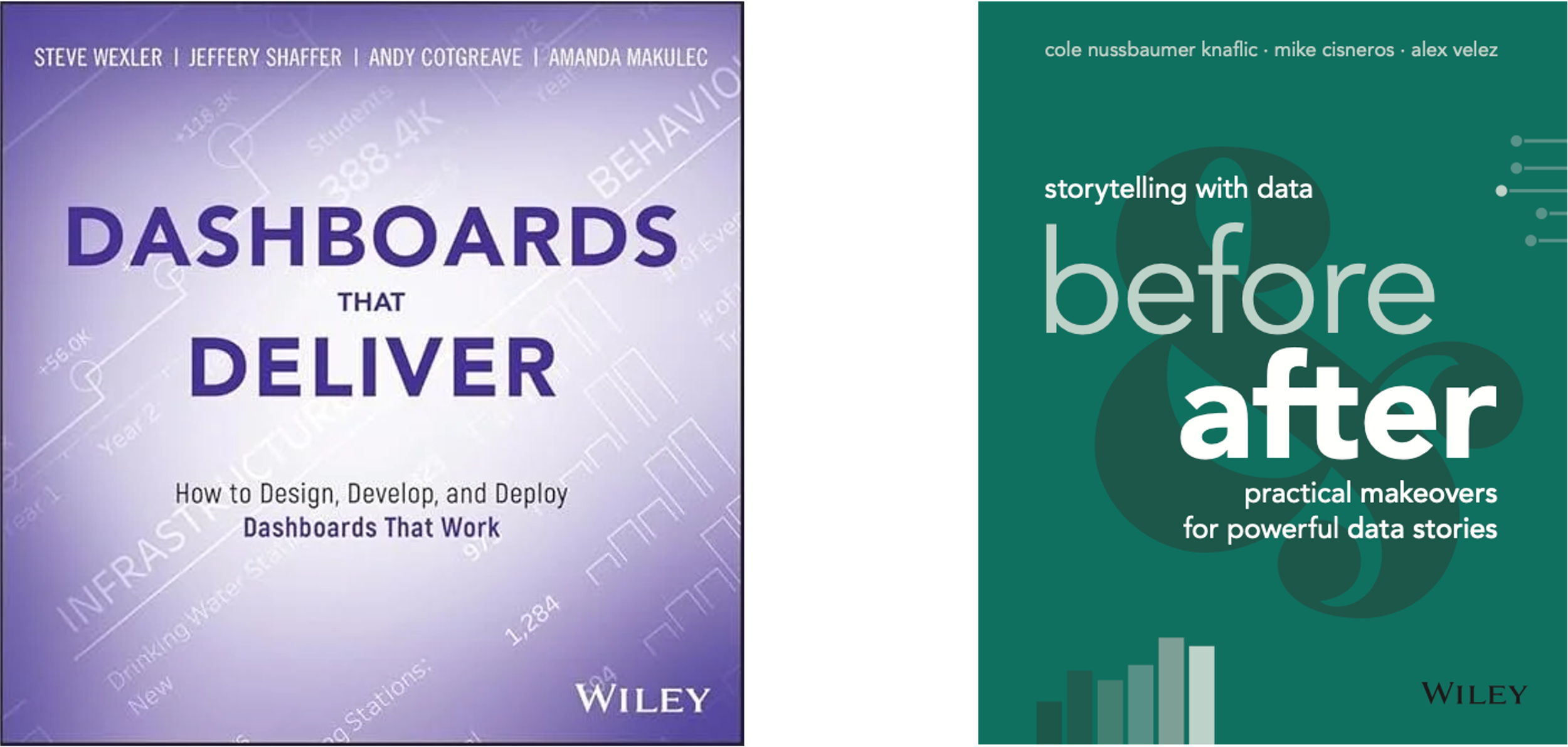
We were thrilled when we found out that our friends Andy Cotgreave, Amanda Makulec, Jeffrey Shaffer, and Steve Wexler were getting ready to publish the eagerly-awaited follow-up to this iconic work, entitled Dashboards That Deliver. It's slated to be released to the public on September 23, 2025—as it happens, the exact same day that we release our latest book, storytelling with data: before & after!
We decided that there was no better way to celebrate this happy coincidence than to bring the DTD and the SWD:B&A authors together for one mega-challenge here in September. We hope you enjoy it; we hope you participate; and we hope that on September 23, you're adding two great new books to your data visualization collection. And now, to introduce this month's challenge, here’s Amanda.
AMANDA | Dashboards evolve as user needs change, so revisions happen in the real world—and in this month’s SWD challenge! This challenge isn’t just about making a prettier design: it’s about creating a dashboard that serves a clear purpose. That goal is at the heart of our new book, Dashboards That Deliver, which teaches a user-centered, Agile framework for dashboard design that anyone can adapt in their work. Dashboards should have a clear spark (why they’re created), audience, and set of analytical goals, otherwise the most beautiful interfaces will spark more "ooh-ahh" than "ah-ha!"
Both Dashboards That Deliver and storytelling with data: before & after champion the value of iterative design, showcasing how prototyping, feedback, and seemingly simple revisions to charts and dashboards can reshape how people explore data and grasp key takeaways.
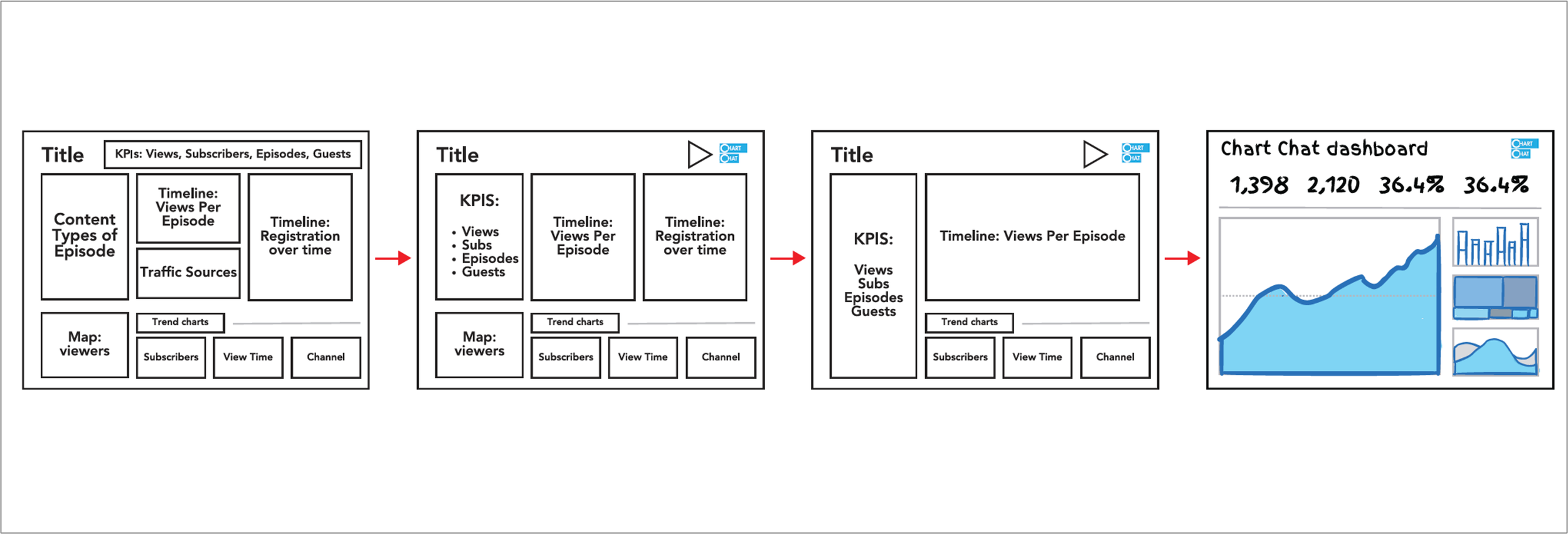
The challenge celebrates both books by focusing on a dashboard redesign.
The challenge
For the challenge, we invite you to revisit a dashboard that could use a refresh and refocus. You can choose one of your old dashboards, or pick a dashboard from the Big Book of Dashboards, many of which are available on the book website. Then, spend a few minutes mapping out your intended audience for the redesigned dashboard and their analytical needs, both of which should inform your redesign.
We celebrate the value of mockups for quick feedback on dashboard concepts, so the format of your submission can be images only (allowing you to use prototyping tools like Figma to mockup new designs) or a fully-built workbook (in which case, post images here, but include a link to the interactive dashboard on the web). Feel free to include annotations or comments to clarify your intended interactivity. In either case, your final submission should include the original dashboard, your redesign, and notes on who your intended audience, what design decisions you made, and what questions people will be able to answer with your new and improved version.
If you’re not using one of the dashboards from the Big Book of Dashboards, we recommend redesigning a dashboard that you have created in the past, where you have ownership of the content and insights around the dashboard use case, or a dashboard that is widely shared and public facing (for example, a COVID dashboard). Please do not select and redesign work by others without their permission! Feedback should be given kindly and by request only.
Share your refreshed dashboard in the SWD community by Sepember 30th at 5PM PT. (If you’re not yet a member of the community, sign up here. It’s totally free and takes about 30 seconds.) If there is any specific feedback or input that you would find helpful, include that detail in your commentary. The DTD and SWD teams will comment on the submissions throughout the course of the month. And finally, tune into the video podcast Chart Chat on October 30 at 11am ET, where the DTD and SWD teams will share and celebrate some of their favorite redesigns from the challenge.
Related resources
Here are some additional resources to help you redesign your dashboard:
Big Book of Dashboards website and sample dashboards - bigbookofdashboards.com
Dashboards That Deliver website - dashboardsthatdeliver.com
There will be a "Designing Dashboards That Deliver" webinar on Datacamp on Tuesday, September 23 (book release day!) at 11am ET. Registration is here: https://www.datacamp.com/webinars/dashboards-that-deliver-part-1-concepts