knowing is one thing, doing is another
Have you ever struggled to do something you know you want—or need—to do? For example, is it hard to get to the gym regularly, even though you know it's good for your health? Or perhaps you keep putting off practicing that second language, even though you know it's essential for your learning progress. You’re not alone! Knowing what we should do is one thing; actually doing it is another.
I was recently reminded of this challenge while reviewing some feedback about our on-demand course. (I read every single response!) The person said:
”The content was great and a good refresher of things I already knew
...even if I don't always remember to apply them.”
When you commit to doing something regularly, you transform a simple good intention into a lasting habit, and that’s where real growth and change begin. Still, building those habits can be difficult without support.
If you find yourself struggling to implement better data storytelling techniques and want to make practicing effective communication a goal, I invite you to join our upcoming 8-week online course. Our final cohort of the year is about to commence on September 15, making it the perfect next step to deepen your skills in a structured, guided, and practice-driven environment.
Over eight short weeks, my colleague Simon and I will teach you a practical, repeatable process to plan your data story, distill the critical components, create effective graphs, slides, and presentations, and communicate it all in a way that gets your audience’s attention, builds understanding, and drives action. We’ll guide you on this journey with live lectures (recordings will be available) that provide opportunities to practice, ask questions, and get feedback. We’ll also have two optional weekly office hours sessions to ensure you are supported.
The highlight of the course is the final project, which gives you a chance to apply the lessons to a dataset of your own choosing. This can be anything from a passion project to a work-related communication (appropriately anonymized). Each week, assignments build toward the final deliverable, allowing you to make steady progress with ongoing feedback—increasing the chances of success.
Take, for example, the following slide, which is representative of the sorts of projects attendees chose to work on throughout the course. (We’ve anonymized some of the details for confidentiality.) For context, the visual came from an analyst at a large organization that recently conducted an advertising test to drive incremental orders. This was what one of their team members had compiled to show the results.

This slide was not driving the intended action that the creator had hoped for. Below, I share how the process we teach in the course was used to improve the effectiveness of this communication.
WEEK 1: THE ART OF FEEDBACK
The first topic in our course is “feedback,” because of its vital role in learning and skill development. We spend time understanding who and how to ask for useful input, practice giving thoughtful feedback to others, and start to see the value of developing a critical eye to improve our own work. Giving and receiving feedback is a big part of participating in the course itself.
Considering the advertising example above, we could tell our colleague that we appreciate the text and red boxes that emphasize what they wanted to highlight. Then, we could ask them if they considered visualizing some of the data, rather than showing everything in a table.
WEEK 2: GRAPHS
While suggesting visualizing the data is a good idea, it can be a daunting task for some, because there are many different types of graphs. In the second week of the course, we explore visuals. We focus mainly on those that are popular in business settings, but also offer avenues to learn about others that are less prevalent.
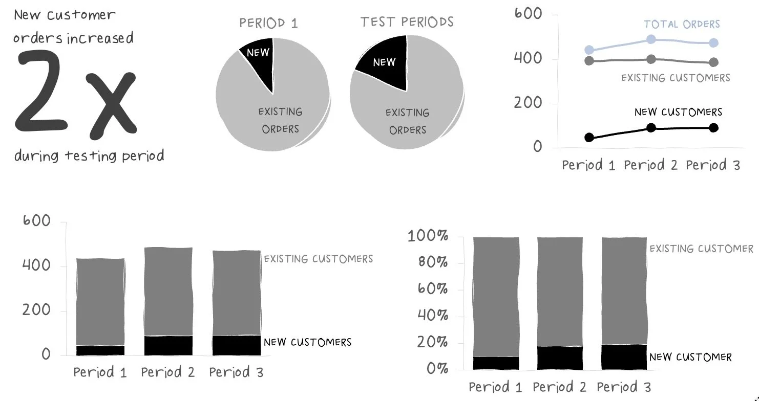
For example, below are several ways to highlight the increase in new customers during the advertising test.
WEEK 3: AUDIENCE & MESSAGE
We take a step back from graphs in the third week to assess the context of our communication. Specifically: who is our audience, and what do we need them to do? We learn about and practice identifying a specific audience, understanding their needs, and thoughtfully crafting our message.
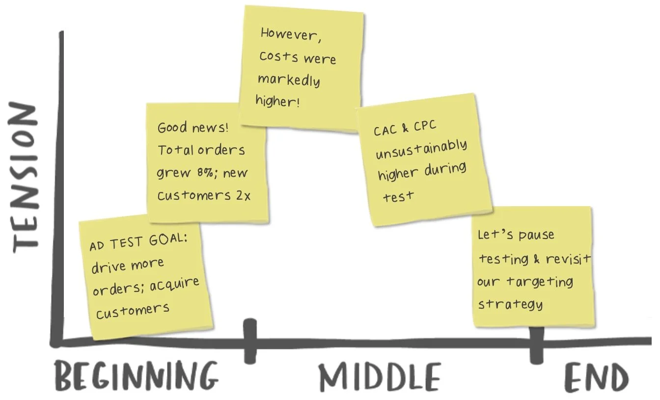
In the advertising test scenario, our audience is a single person: the marketing manager. The big idea we want to communicate is: The aggressive ad spend test increased orders but at a markedly higher customer acquisition cost, so we recommend pausing to refine our targeting strategy for more efficient growth before resuming investment.
WEEK 4: LOW-TECH PLANNING
Halfway through the course, we introduce one of our favorite low-tech planning processes: storyboarding. Students develop, share, and get feedback on their storyboard for their course project from classmates in a small group setting. In our previous cohorts, this has often been a favorite exercise—participants begin to crystallize their thinking and hear reactions from an unfamiliar audience.
With our audience and message in mind, an initial storyboard for the advertising example first explains the test design and results, then offers a recommended next step.

WEEK 5: VISUAL DESIGN
We turn our attention back to graphs in the fifth week of the course, in which we learn how to take our visuals to the next level with the simple—yet powerful—design tactics.
After applying declutter and focus techniques, the original busy data table for the ad spend test is transformed into something more straightforward, giving us the opportunity to indicate where we want our audience to look.
WEEK 6: STORY
In week 6, we explore how to use concepts of storytelling for communicating effectively with data. Participants get an opportunity to apply these concepts as they iterate and get feedback on their storyboards.
Reconsidering our audience and the tension in our ad spend story, the original storyboard is rearranged into a narrative arc (visually represented below) that prioritizes the needs and interests of the audience.
WEEK 7: PRESENTATION PLANNING
During our penultimate week, we focus on building out the overall structure of the final presentation—bringing the low-tech strategies we’ve explored during the course to life using slideware applications.
Sticking with the corporate brand template and applying active takeaway slide titles, a digital skeleton for the ad test presentation starts to take shape.
WEEK 8: PRESENTING DATA STORIES
In our final week of the course, our primary focus is on you. As the narrator, you play a critical role in ensuring that the data stories that you build are communicated effectively and persuasively.
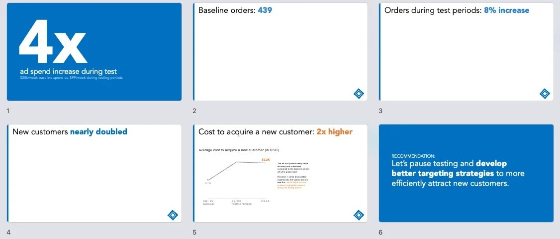
After refining the slide content and practicing the delivery, the final presentation for the ad spend results comes together. Here are the final slides and corresponding talking points:
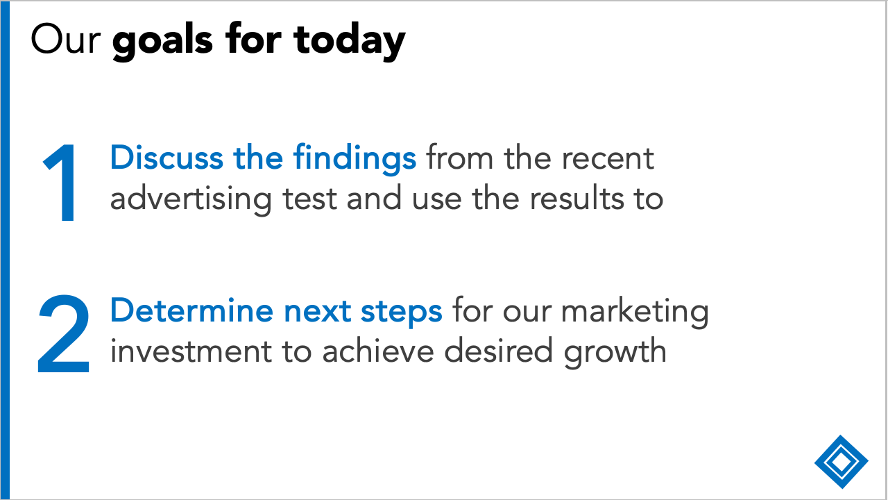
“Hi everyone. Thanks for joining me today. The goal of the call is to discuss the findings from our recent ad test and use the results to inform our marketing strategy going forward.”
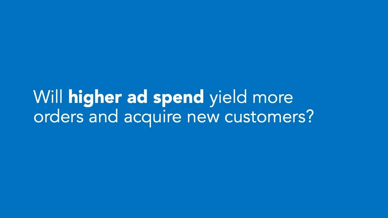
“Quick reminder: this is the question we set out to answer in the test: will higher ad spend yield more orders and acquire new customers?
The short answer is yes, we can get more orders, but this might not be our best approach to acquisition and growth. Let me explain…”
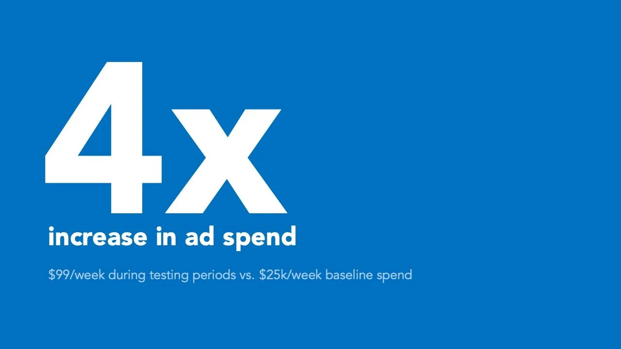
“Our test was aggressive—we spent 4x the baseline (pre-period) amount to assess the impact on orders compared to the prior period.”
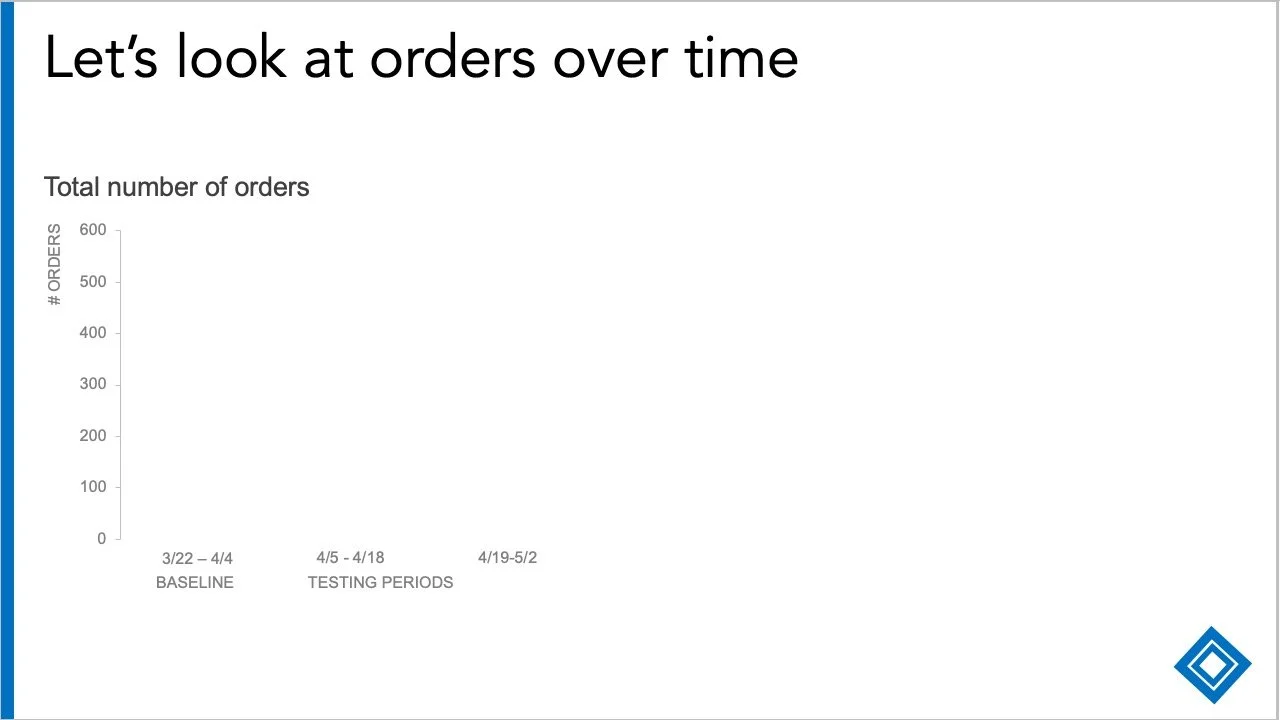
“Let’s look at the order impact now.
We’ll consider three two-week periods here on the horizontal x-axis—the baseline period from March 22 to April 4 before the spending increase, compared to two testing periods (two weeks each) which had the increased investment.”
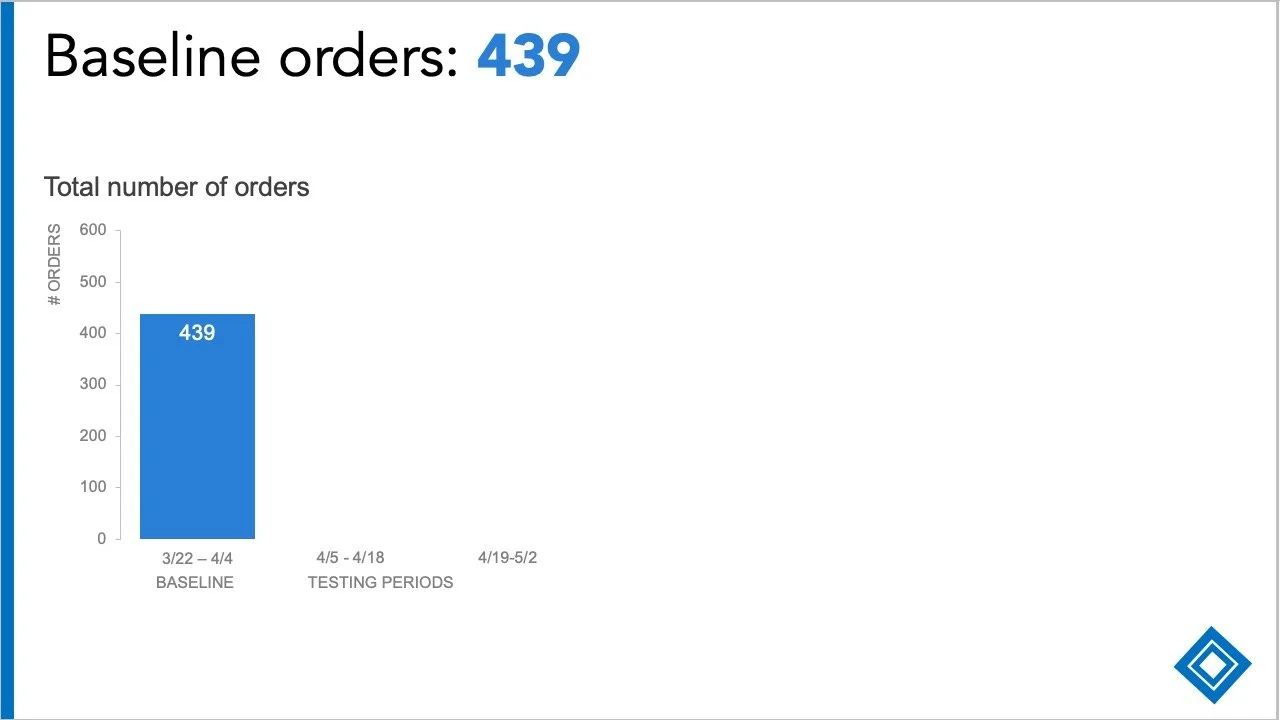
“For context, the baseline orders were 439. This is pretty consistent with prior weeks and the same period in prior years. For the test to be successful, we should see higher orders during the two testing periods…”

“...and we did see an 8% increase. This is a modest increase and lower than we hoped for, given the investment.
Despite this, there was an interesting finding when we looked at the type of customers. I’ll now break down each of these bars by new and existing customers.”

“To show this, I am going to switch to look at the percent of total orders in a 100% stacked bar chart.”
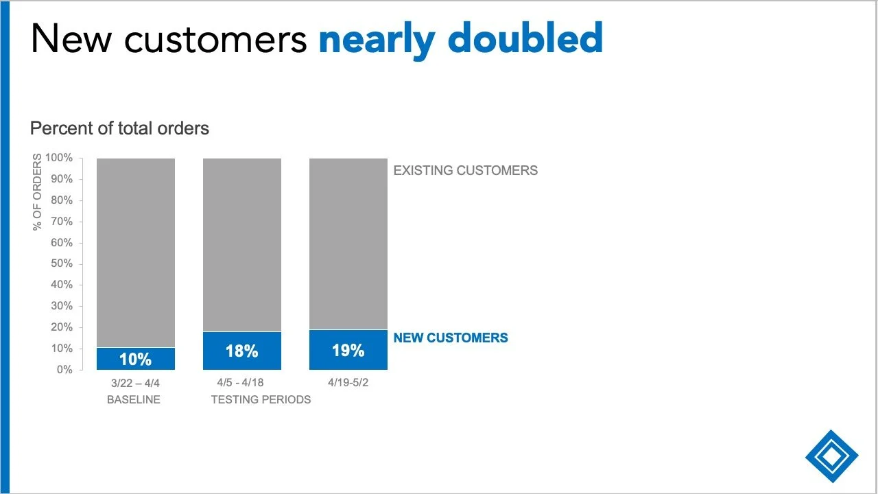
“As I layer on the data, we do see the mix of new customers was higher during the testing periods (almost double), which is great news!
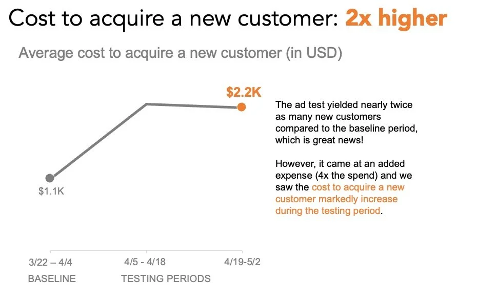
However, it came at an added expense, and we saw our customer acquisition cost, or CAC, markedly increase during the testing period.”

“For context, we went from a CAC of $1.1K in the prior period up to…”

“....$2.2K during the testing periods. More new customers are great, but at double the cost?”
“So, to answer the original question: yes, more spending drives orders and brings new customers, but it drives up the CAC substantially. Therefore, we don’t think it's an efficient use of our marketing dollars. Instead, we recommend...”
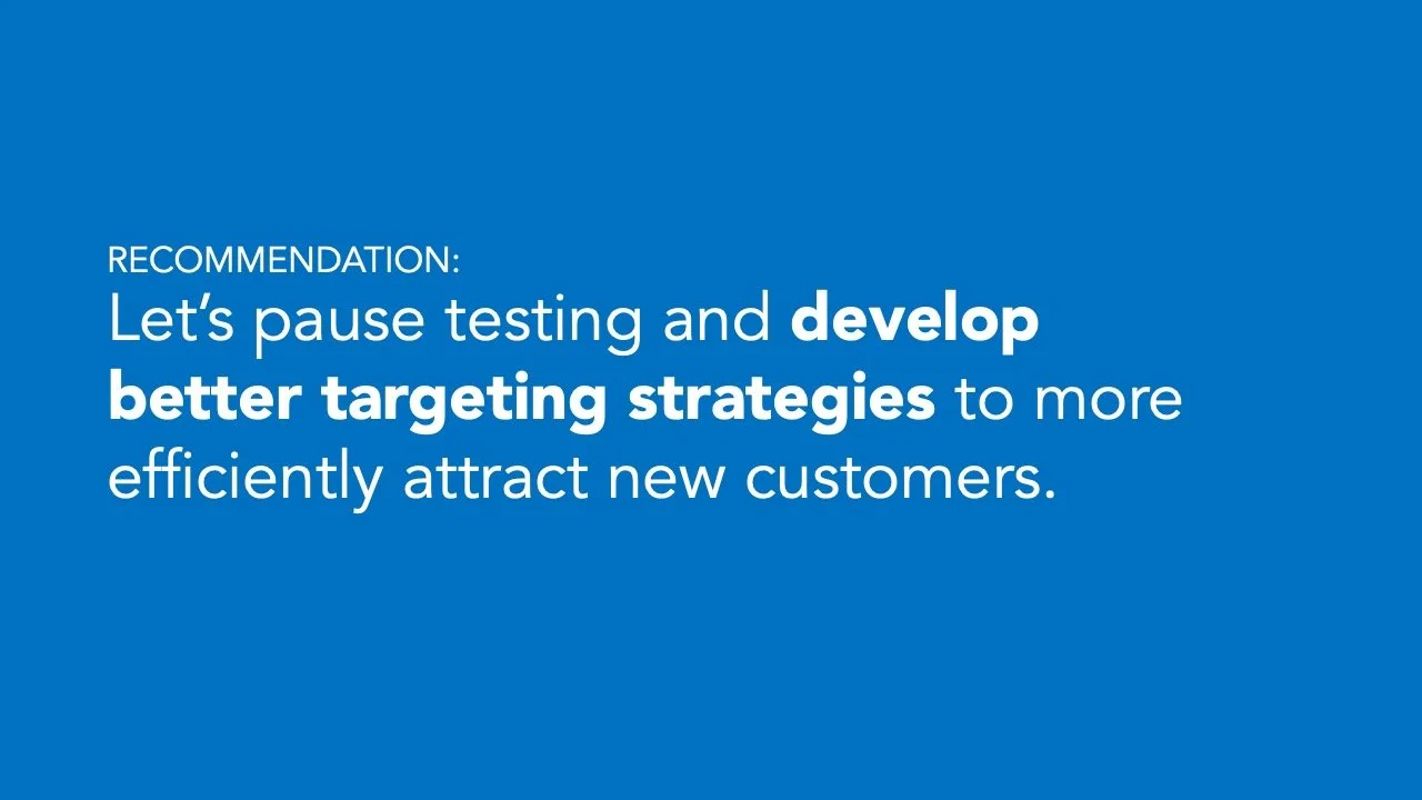
“Pausing tests for now and developing better targeting strategies to more efficiently attract new customers.
Let’s discuss.”
Below, on the right, is a send-around summary slide of the ad spend story—check out the difference from the original!

Would you like the satisfaction of your own presentation transformation? We have a few remaining spots in our final cohort of 2025—starting on September 15. This is your opportunity to give yourself the time and space to develop your skills further and put them into practice.
Special offer for our loyal blog readers!
Register for our upcoming 8-week online course by August 22, 2025 and enjoy an exclusive 25% discount. Spots are limited—secure your place today and don’t miss out!
