my favorite makeover (that didn’t make the book)
We’re now less than two months away from the release of our upcoming book storytelling with data: before & after, and the whole team is getting excited. We’ve already shared three sample chapters with you, which you can still download here if you haven’t had the chance yet.
As you might guess, putting together a book like this means sorting through dozens of potential examples to include. In some ways, you could think of the final set as our 20 favorites…but that’s not exactly how it worked. We had to be more strategic—showing a range of use cases, pulling examples from different industries, and making sure we featured a variety of graph types across the solutions. It wasn’t just a popularity contest.
If it had been a popularity contest, though, the makeover I’m about to share would’ve made the list for sure. It’s one of my all-time favorites from a client engagement a few years back. To share it here, I’ve anonymized the details—updated the years and made a few subtle changes to the specifics.
The goal: show how an unexpected event changed everything
In this case, our client was responsible for forecasting imports and exports from a specific country over a 15-year window. No small task—it involved a ton of variables. They often ran multiple models to account for different scenarios. But after they landed on a forecast, something big happened: regime change. A surprise election result put an unexpected leader in power.
That possibility hadn’t been factored into any of the original models, so they had to rerun them. The presentation we helped with was the one where they revealed the updated forecasts, and how they differed from their pre-election baseline (PEB) models.
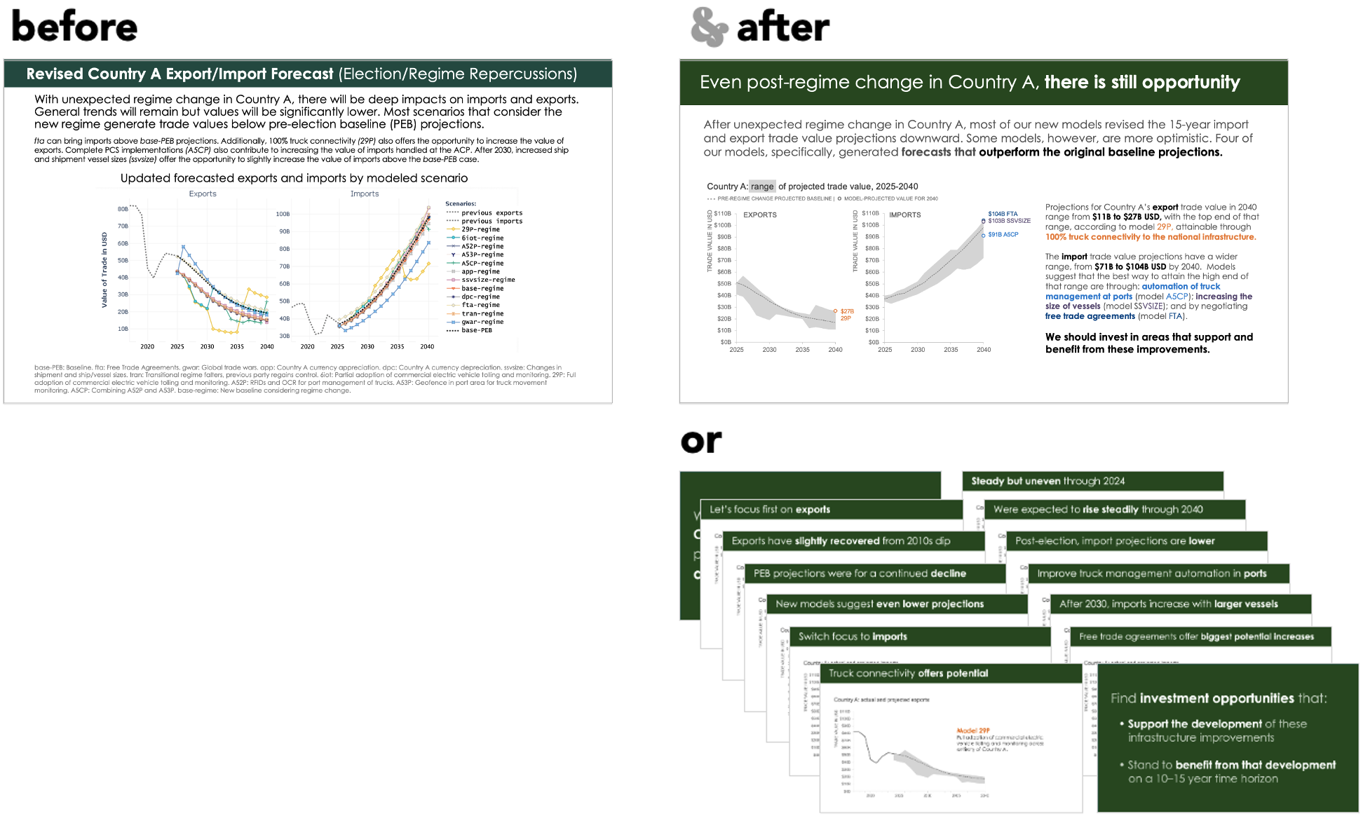
Here is the original slide that the client used to reveal these updated forecasts.

There’s a lot going on in this slide. It’s trying to cover lots of information all at once. As a viewer, I’m not sure where to look first, or where to find the key takeaways. There are a lot of words on the slide, which can be helpful if I’m reading it on my own, but not ideal when it’s being presented live (which this one was).
On top of the words, there are acronyms and abbreviations describing the various models. All of the 15 different data series (yes, I counted them) are labeled with a mix of colors, data markers, and hard-to-decipher labels.
Many of these data series overlap one another in the graph itself, making it even harder to tell them apart. The legend doesn’t help much—it’s just one long list, without even a clear separation between “export” models and “import” models.
The good news is that all of this is fixable. And each of the following changes—on its own or combined—would make the visual stronger:
Use fewer words, and do so more intentionally
Simplify the legend
Show fewer data series at one time
Add clear takeaways
Use color to direct focus
We can make all of these changes (and did; you’ll see that below). But the single biggest improvement is making sure we tell a strong, coherent story.
To tell a complex story, simplify the visuals
This visual is trying to communicate something dense and nuanced, but important. If it’s explained clearly and thoughtfully, people will follow along. The best way to do this is the same way you start a journey of 1000 miles: one step at a time.
One of the most common traps in data visualization is trying to show everything at once. Especially when presenting live, it’s much more effective to reveal one idea at a time. Let each visual carry one part of the story. Then, build on that idea with the next slide or graph. Layer by layer, you’ll add meaning and clarity. And by the end, your audience will walk away informed, confident, and ready to take action.
When planning out a narrative, we often use a story mountain structure, composed of three elements.
We begin with the plot, where we describe the context and what’s at stake; we follow up next with the twists, which are the interesting things we found during our exploratory analysis; and then conclude with the ending, which is our recommendation for what to do (or discuss doing) next. You can explore this idea more fully in the article linked above, or in any of the books in the SWD library (including before & after).
For this communication, here’s how I’d apply the story mountain:
The plot – Country A’s trade value is going to change in the next 15 years. Because of the unexpected regime change, we think it’ll be worse than we previously expected (and we can set that expectation for our audience, who may not take that as a given).
The twists – Although the new models are overall more pessimistic than the prior ones, some do offer a bit more optimism, and these are predicated on certain developmental outcomes or efforts.
The ending – If we invest with an eye towards helping Country A achieve these specific outcomes, while also investing in opportunities that will benefit from these developments, we will realize the most impact from our investments.
For the remainder of this article, imagine that I’m delivering this presentation in person to a live audience. I’ll show the slides along with the narration I would use for each one.

“Folks, thanks for joining me today. Post regime change, we’ve had to revise our 15-year export and import projections for Country A. I’m going to say right off the bat that most of our models have revised their forecasts downward…but not all. There’s always uncertainty in forecasting, and there’s a range of possible outcomes that our models have generated, and we think there are still investment opportunities here.
“I’m now going to walk you through what we’ve found, and highlight why there is some reason for optimism.”
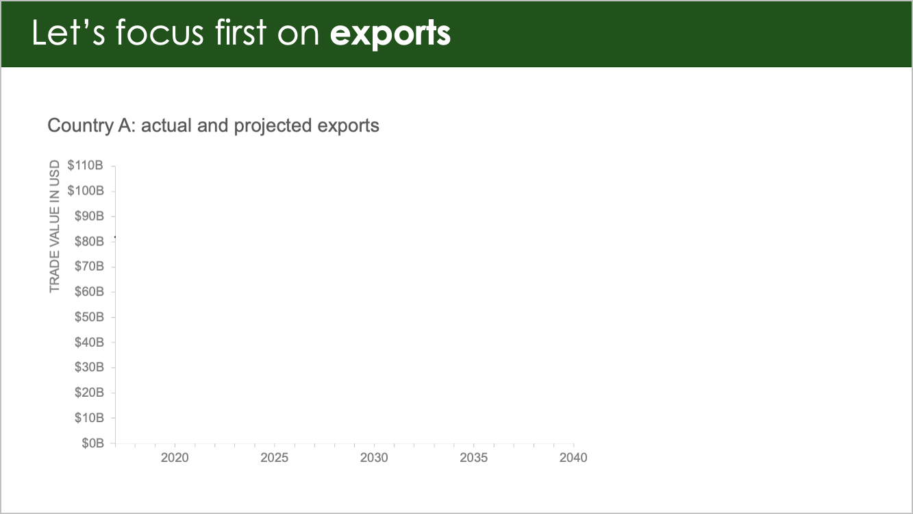
“Let’s start by looking at exports. For the latter half of the 2010s, exports were in decline.”
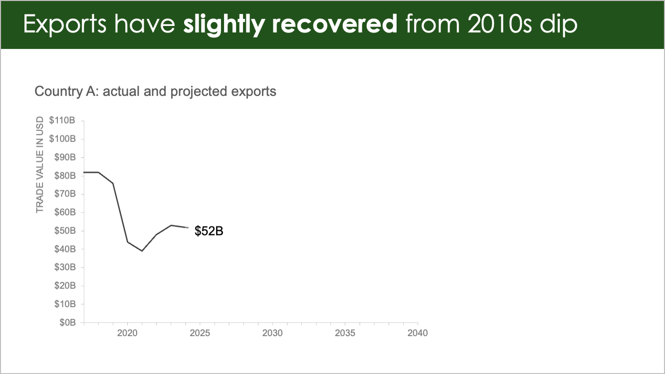
“They recovered slightly over the past four years, and last year sat at $52 billion US. “
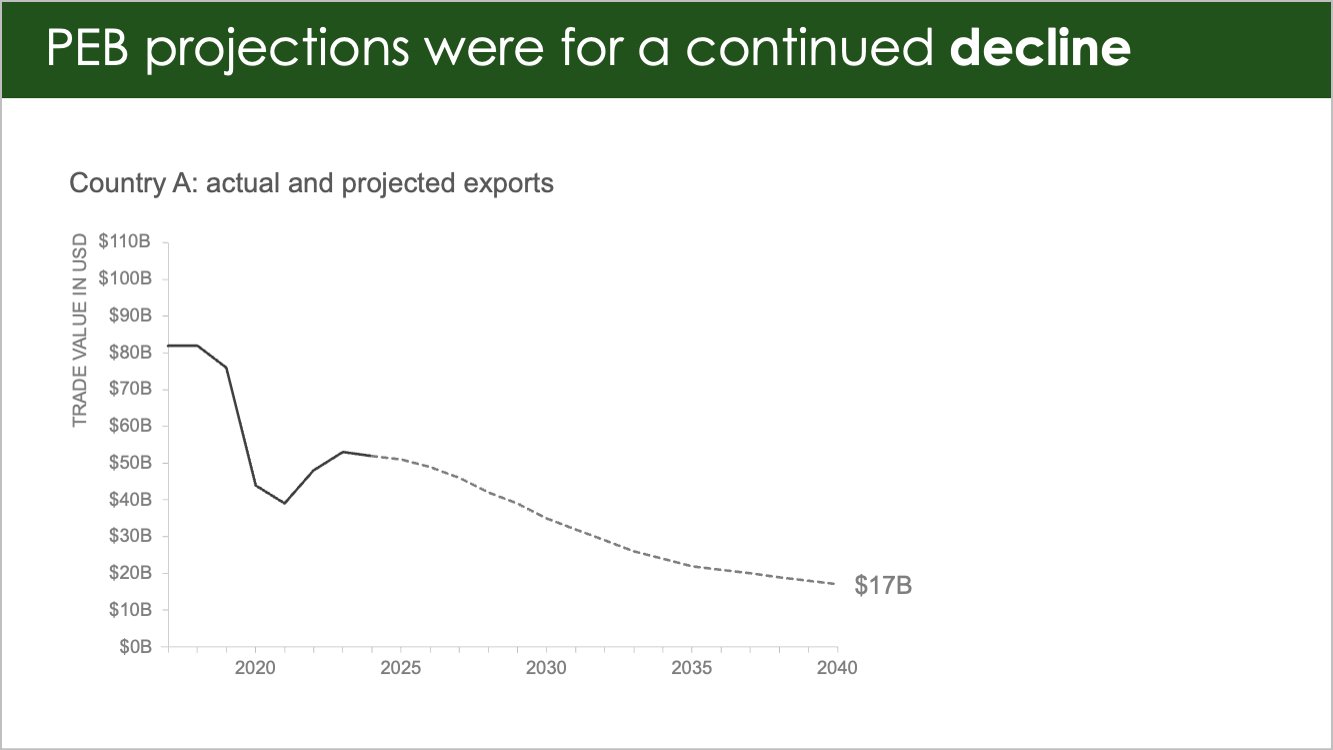
“Our pre-election baseline model, or PEB model, forecast slow, continual decline, with an aggregation across multiple models showing $17 billion in annual exports by 2040. Of course, when regime change caused us to re-evaluate, we got a range of new forecasts.”
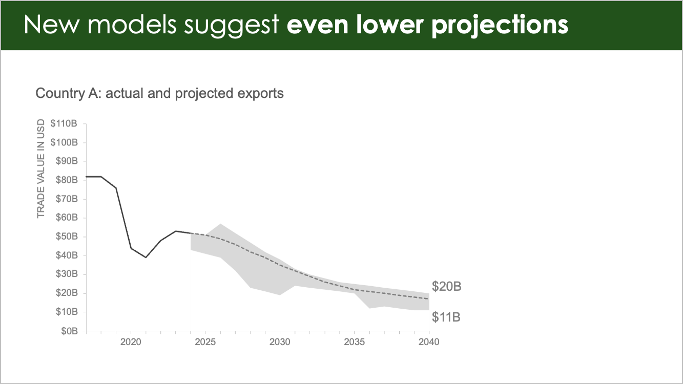
“This gray shaded region shows the range of our revised models, from most optimistic to most pessimistic. Leaving the PEB in as a reference, our new models are mostly lower than that base for the next 15 years. In 2040 the range of predictions is from $11 billion on the low end to $20 billion on the high end.
“That is, with one exception.
“We ran a model called 29P.”

“This model assumes 100% truck connectivity to the national IT infrastructure, electronic tolling, rolling high-speed weigh-ins, and so on. Now we don’t expect this to happen until…”
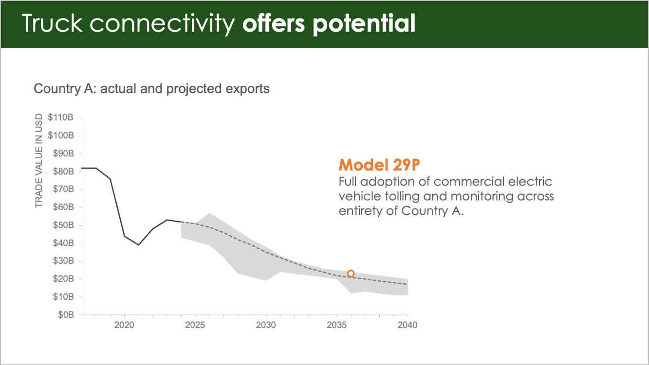
“...around 2035, but by 2036, that would already boost our expectations to above PEB projections. In fact, this one model expects such gains in exports, if we do achieve 100% connectivity, that…”

“...all on its own, it boosts the most optimistic models for 2040 by $7 billion, to a possible max of $27 billion in annual exports. No matter what else happens, this one development would make a substantial difference to Country A’s future export volume.”
“Now let’s switch our focus, and look at imports. We can see that even though…”
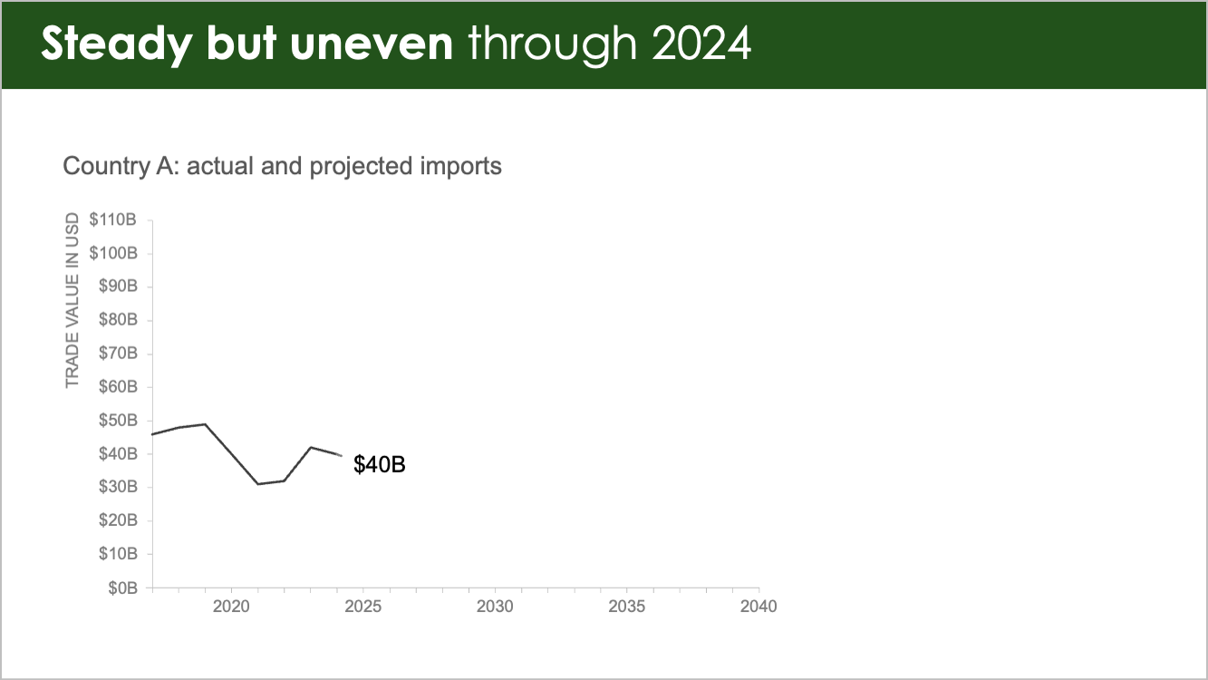
“...they were uneven through the last several years, sitting at $40 billion as of the end of ‘24, our PEB projections…”
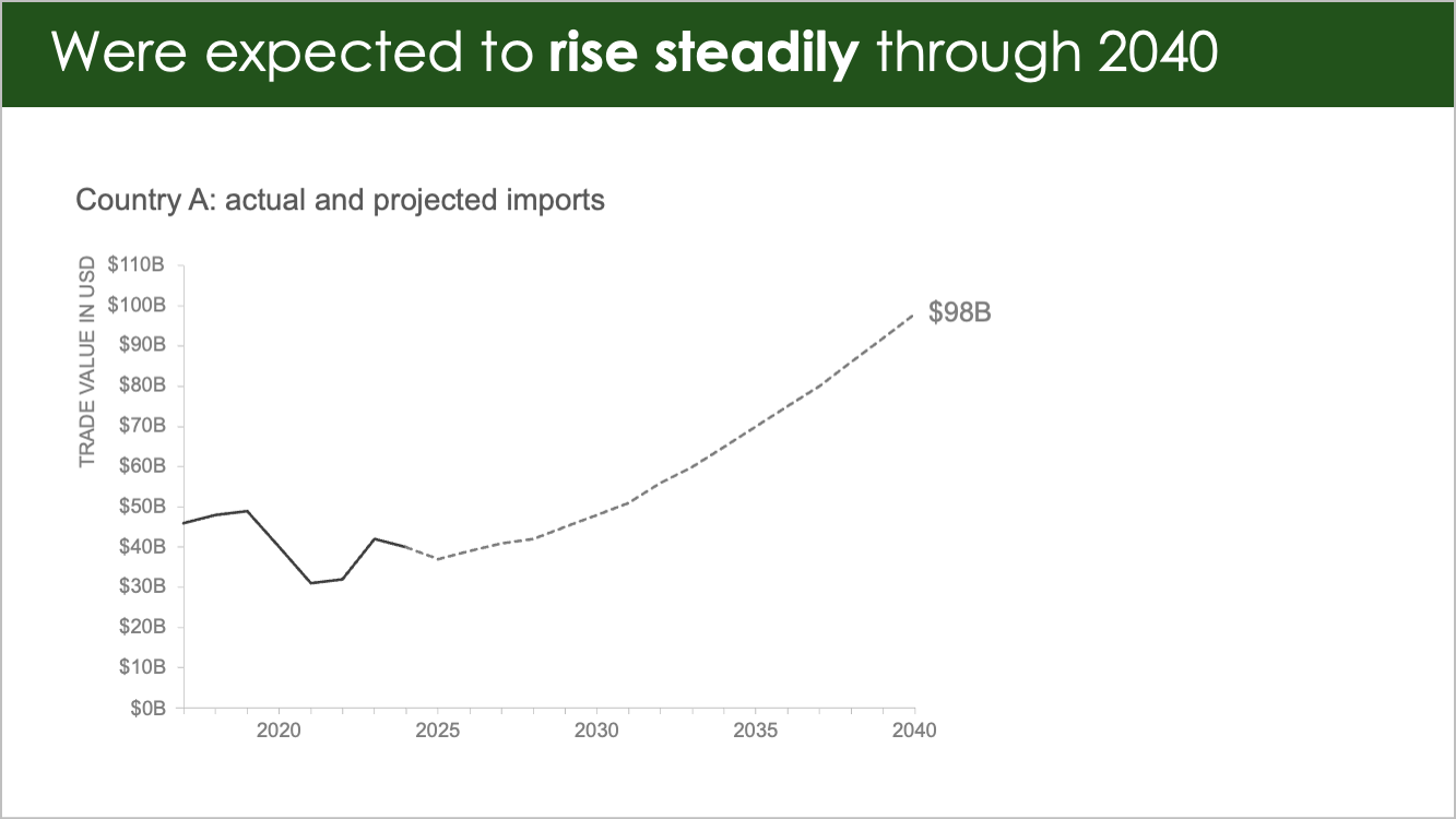
“...expected imports to rise steadily, and reach nearly $100 billion by 2040.”

“Perhaps unsurprisingly, our revised models are uncertain, but mostly lower than the PEB, with a $32 billion range opening up by 2040.
“However, three distinct models offer us some optimism for how actual imports by 2040 could wind up as close to the top of that range as possible.”
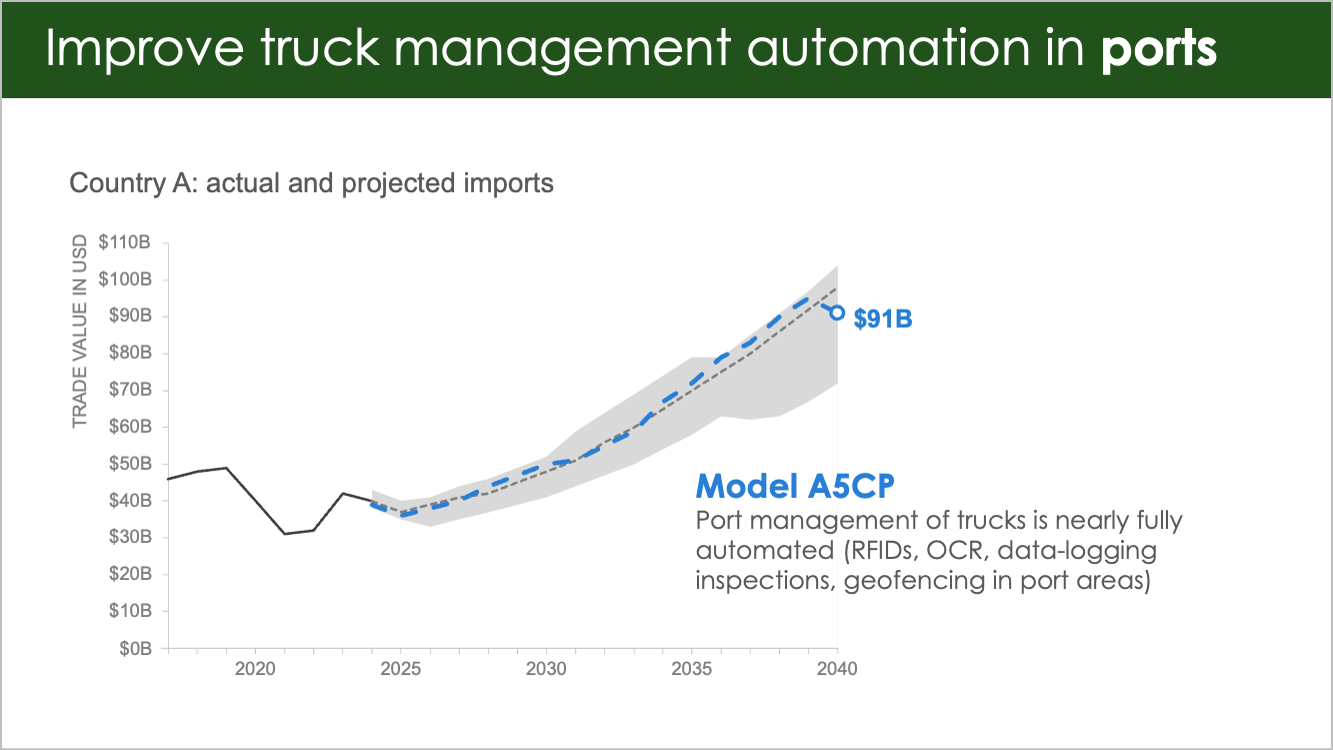
“The first model is called A5CP. It tells us that with automated management of trucks once they’re in ports (RFID tags, using optical scanners, and so on), we could mostly exceed our pre-regime change baseline. You’ll notice a bit of diminishing return 15 years out, but this would keep imports on the higher end of projections near-and medium term.”

“Let’s look at another model. This one, SSVSIZE, is all about vessel and shipment sizes. While larger vessels and larger shipment sizes will take a few years to implement, we can see the positive effects compared to the PEB case by the middle of next decade, and the projections are for an increase to more than $100 billion in imports annually by 2040 if this comes to pass.”

“One last one to consider here: free trade agreements. Negotiated agreements have the potential to drive the trade value of Country A imports to the height of our projection range.
“With those four critical projections in mind, you can see that there are investment opportunities despite the recent unexpected regime change.”

“Let’s discuss what specific opportunities we can pursue that support the development of these infrastructure improvements, as well as others that will benefit from that development in a 10–15 year time horizon.”
The narrative tells a much clearer story now, don’t you think? By walking through a complex idea one step at a time, we give people the chance to build their understanding gradually. Instead of feeling overwhelmed, they’re more likely to feel informed and inspired.
If you ever find yourself in a situation where you can’t present these findings live, we recommend not sending the full slide deck around (and definitely don’t just send that first slide). Instead, use the same principles you used to build the full story, but apply them to a one-page executive summary. Help your audience see the plot (the context and what’s at stake), the twists (what your analysis uncovered), and the ending (what should happen now) in a condensed but clear format.
The slide below shows one way to approach this:

If you look carefully, you’ll see how you can get all the pieces of the story mountain in there.
Start with your key takeaway as the slide title.
Follow that with the context (your plot) in the short paragraph right below.
Condense your visuals from several animated steps into two clear, focused charts that highlight your most important findings (the twists). Use direct text annotations to explain what the visuals show, and tie everything together with color to guide the eye.
Finally, close with a bold takeaway (the ending) at the bottom: here’s what we should do next.
Visual makeovers like this one are a core part of the workshops we deliver to clients. It’s always fun to watch something go from standard to stellar—especially when it’s a graph or a slide you work with every day. Most of the changes don’t even take a ton of effort. We focus on giving people simple tools and practical tactics to improve how they communicate, without needing to be a technical expert or have a design degree.
If you enjoyed this makeover—which, let me remind you, didn’t make it into the book—just imagine how much you’ll enjoy the ones that did. storytelling with data: before & after comes out in the U.S. on September 23rd. You can pre-order it now from your favorite bookseller, or download three free sample chapters right away.
And if you or your team are curious how this kind of visual transformation could apply to your own work, let’s talk about setting up a custom workshop.