different takeaway, different graph
I was facilitating a workshop recently when someone asked one of my favorite questions about a graph on the screen: “So… what are we supposed to take away from this?”
Such a simple—and useful—question.
One challenge was that the graph was attempting to show multiple comparisons at once, so it wasn’t clear what mattered most. To further complicate things, the data in question spanned very different magnitudes, with one category dwarfing the rest.
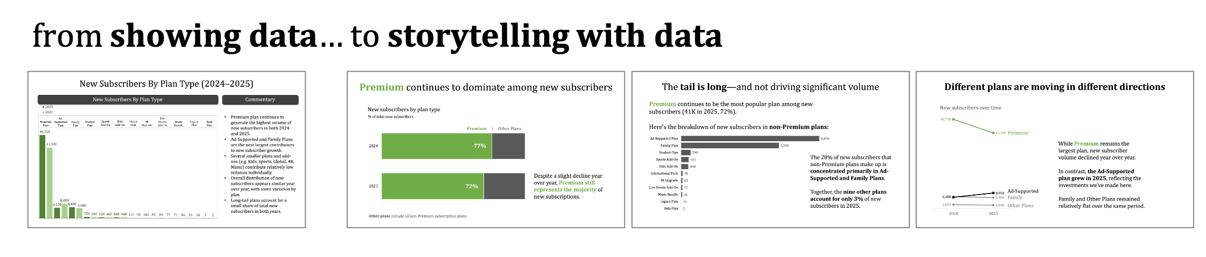
Here’s an anonymized version of the original slide, showing new subscribers to a streaming service by plan type across two years:
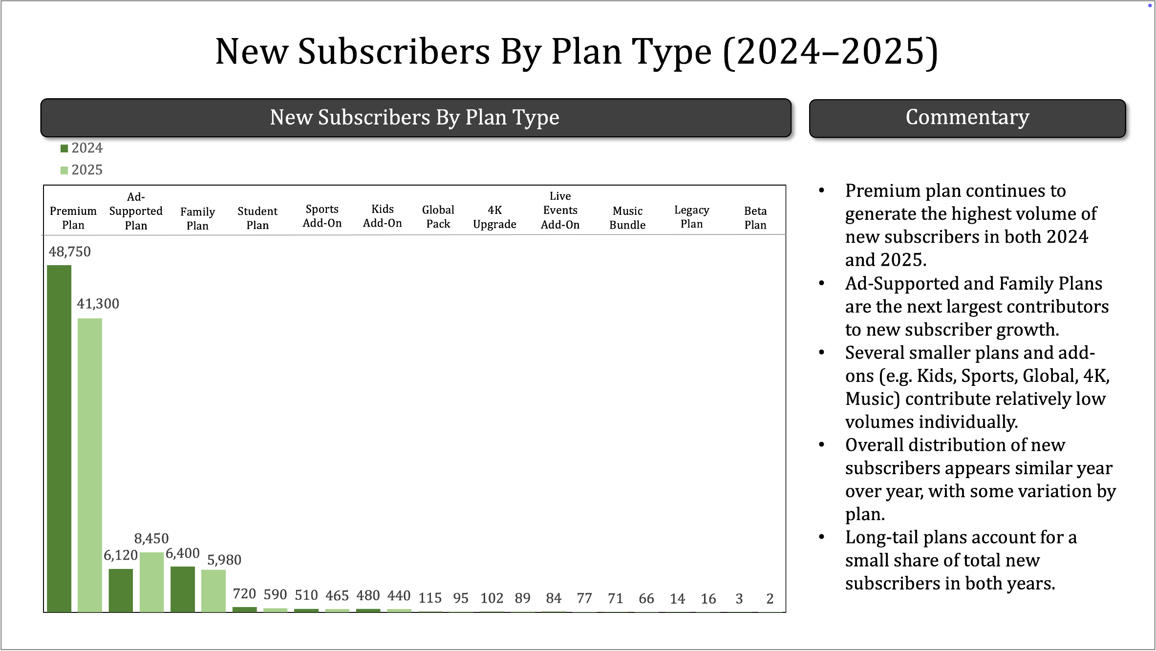
Let’s revisit the simple question that was raised: what are we supposed to take away from this?
The story could be about one plan dominating the rest. Alternatively, the long tail of niche plans might be worthy of review and discussion. Or perhaps there’s something interesting about the year-over-year shifts across plans.
Each of those takeaways can be found in the original slide, but it takes work to get there. If this is part of a routine report or update and no action is needed, it might be fine as is. However, if we want someone to understand one or more of the nuances at play and drive a discussion or decision, we can approach things more strategically. Part of doing this means choosing different visuals for different takeaways. Another aspect to consider is whether to aggregate and how to treat categories so that we can see important points—without overwhelming with detail.
Let’s tackle one specific takeaway at a time, intentionally choosing a visual that supports it.
Composition story: simplify and stack
If our goal is to clearly communicate that one plan accounts for the majority of new subscribers, instead of burying that insight in a crowded bar chart, we can make it explicit.
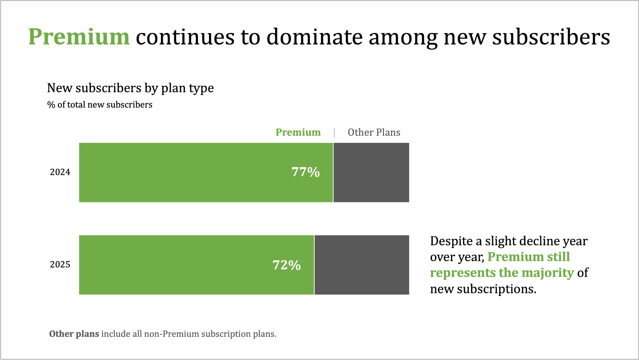
This view is useful to show concentration (alternatively, stacked vertical bars or even two pie charts could have worked here). By collapsing many categories into just two—Premium vs. everything else—we remove noise and make the dominant pattern unmistakeable. This kind of aggregation is most appropriate when the goal is orientation or framing (not detailed plan-level decisions). The audience no longer needs to scan bars, compare labels, or reconcile magnitudes. The message is immediate.
I’ve kept the words descriptive here, but you can imagine how we might use a view like this to prompt a specific discussion, for example, whether the business is overly dependent on a single plan, how resilient new subscriber growth would be if Premium performance changed, or to consider whether it makes sense to invest in Premium or elsewhere.
Speaking of elsewhere—if those non-Premium plans are key, we’ll want to approach things differently.
Focus on the tail: take out the big category
It can be challenging to effectively visualize numbers of very different magnitudes in a single graph. In the instance where one or a few categories are large, but the story is in the smaller ones, removing the large categories from the visual can sometimes make sense. Key is to retain the context of the omitted categories so things aren’t accidentally misinterpreted.
In this instance, we could use words to comment on the size of Premium, then focus the graph on the non-Premium plans. See below. (If you were still afraid it might be missed, you could even play with positioning a bar under the premium note that extends off the right side of the page.)
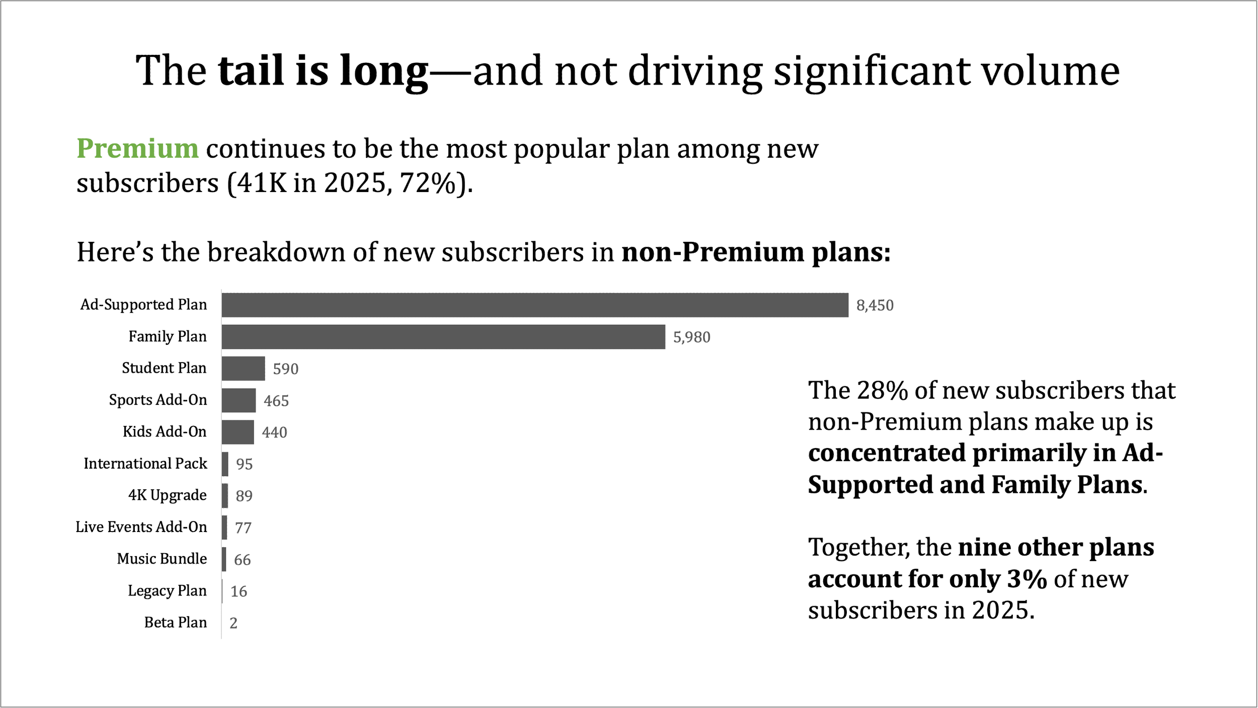
Treating Premium separately and removing it from the graph allows us to see what’s happening in the tail. Low volume doesn’t mean low value—but it does suggest a different set of strategic questions.
A view like this could be used to drive discussions about portfolio rationalization (are there too many low-impact offerings?), whether small plans are strategically important or operationally distracting, or where simplification might free up resources without materially impacting growth.
Over time comparison: slopegraph
A third—and entirely different—focus is change over time. Which plans are gaining momentum, and which are losing it? A slopegraph can make those changes easy and fast to see.
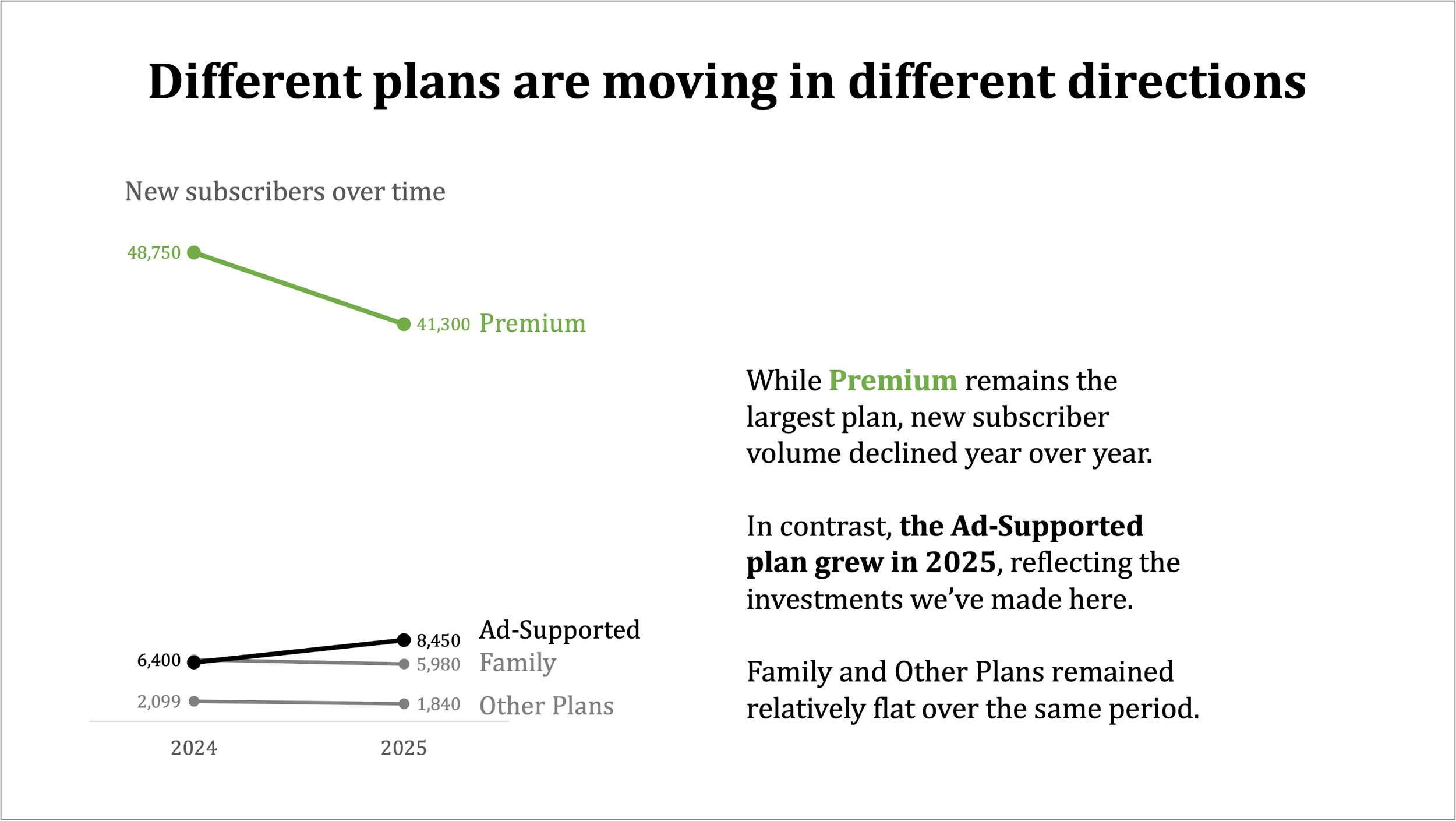
A view like this could help frame discussions about where recent investments are paying off (or not), which plans may need renewed attention or repositioning, or simply to better understand how subscriber preferences are shifting year over year.
Start with the takeaway, not the graph
None of these views is the correct one. Each highlights a distinct takeaway—and is useful to drive a different type of conversation. The mistake isn’t choosing the “wrong” chart; it’s asking one chart to answer every question at once.
By separating stories—dominance, the long tail, and change over time—we reduce cognitive load and increase clarity. We also give ourselves flexibility: the same data can support different discussions, depending on what is important and which decisions need to be made.
You could even imagine a progression through these three views, with an overarching narrative to tie it all together. One chart doesn’t have to do it all. A thoughtful set of charts can tell a more effective story.
Meta lesson: start with the question or takeaway. Then choose a visual (or combination of visuals) that will help you make it unmistakeable.
To learn more about various graph types, check out the SWD chart guide.