what is a choropleth map?
This article is part of our back-to-basics blog series called what is…?, where we’ll break down some common topics and questions posed to us. We’ve covered much of the content in previous posts, so this series allows us to bring together many disparate resources, creating a single source for your learning. We believe it’s important to take an occasional pulse on foundational knowledge, regardless of where you are in your learning journey. The success of many visualizations is dependent on a solid understanding of basic concepts. So whether you’re learning this for the first time, reading to reinforce core principles, or looking for resources to share with others—like our new comprehensive chart guide—please join us as we revisit and embrace the basics.
Most people are familiar with maps—from school, the news, and navigation apps—making them a natural option to explore when visualizing geographical data. In this article, we’ll explore one common map visual: the choropleth map. We will cover what it is, how to interpret it, when to use it, and common pitfalls to avoid when using one.
What is a choropleth map?
A choropleth map, sometimes called a filled map, is one way to display a numeric variable across a geographic area. They are often used to show population statistics, such as the Pew Research map below, which shows the importance of religion around the world.
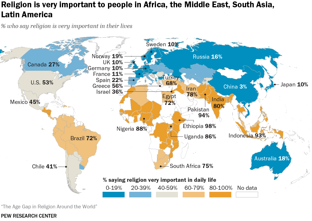
SOURCE: pewresearch.org/religion/2022/12/21/key-findings-from-the-global-religious-futures-project
The level of the geographic grouping sets the boundaries for the regions, and each defined area is shaded to signify the value for that location. The map above is grouped by country, and their shading is determined by the color scale in the legend at the bottom: blues represent lower values, while oranges indicate higher values.
How do you interpret a choropleth map?
In a choropleth map, color fill is applied to help compare values across geographic areas. Often, darker or more intense colors represent the extreme values, making it quicker to see patterns and compare data across locations. When interpreting a choropleth map, it helps to pay close attention to both how the data is defined and how the colors are applied. Choropleths work best for normalized values, such as rates, percentages, or per‑capita figures, rather than raw totals, which can unfairly favor large or populous areas.
The ability to glean insights from a choropleth map is heavily influenced by the color scale used. While more color gradients could make it more complex to interpret, too few can make it hard to see small differences. For example, in the Pew Research example above, India and Pakistan are both dark orange, yet their values are quite different: India at 80% and Pakistan at 94%. Understanding how color ranges are defined is essential, since small changes in these cutoffs can shift which category a region falls into and, in turn, what patterns your audience perceives first.
When are choropleth maps useful?
This type of map is most useful when the values being visualized are meaningfully tied to the geographic areas being displayed. For example, weather is specific to certain locations, so showing yearly rainfall by county in a given state could make sense if you want to display the differences across various locations.
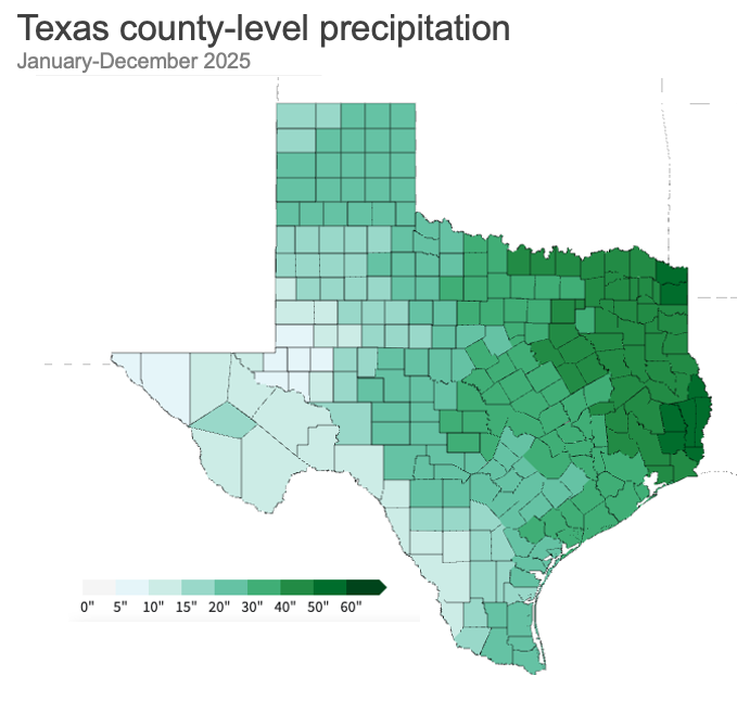
SOURCE: ncei.noaa.gov/access/monitoring/climate-at-a-glance/county/mapping
The choropleth map above shows the total county-level precipitation across Texas for January to December 2025, with darker green representing wetter areas and lighter green representing drier areas relative to other parts of the state. East Texas stands out as much wetter, with many counties in the darkest green shades, indicating 40-plus inches of rain during the year. The west and southwest counties appear drier, with very light green counties showing lower annual precipitation totals. County-level variation is substantial, so state averages could mask important local differences in water availability, drought risk, and flood potential.
What are some challenges of choropleth maps?
Although maps help visualize patterns and comparisons, they can be challenging to analyze and even misleading when large areas visually overpower smaller ones.

SOURCE: https://www.iihs.org/research-areas/fatality-statistics/detail/state-by-state
For instance, the graph above shows motor vehicle crash fatalities by state. At first glance, California and Texas jump out with the darkest shade of blue. However, these states are also among the largest in both population and land area, meaning there are more people and more roads where crashes can occur.
If you factor in population, the view normalized per 100,000 people would look like this.
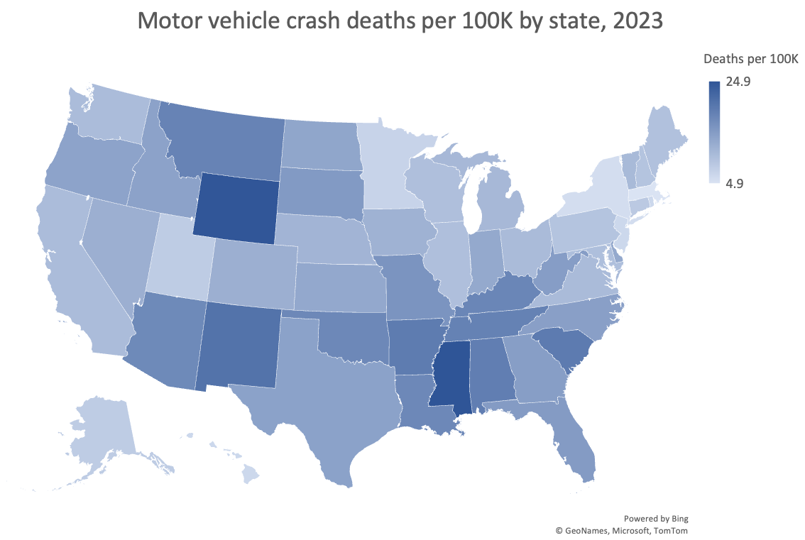
SOURCE: https://www.iihs.org/research-areas/fatality-statistics/detail/state-by-state
Normalizing the metric creates a very different view of the data. Here, Wyoming and Mississippi have the highest rates. Wyoming stands out a bit more, given that it is larger on the map than Mississippi.
Even when the metric is appropriate, differences in the physical size of geographic areas can still influence what appears most important. Large states can dominate visually, while smaller states risk getting lost. To account for variation in each state's geographical footprint, you might opt for an alternative display that uses a consistent hexagonal shape to represent each state.
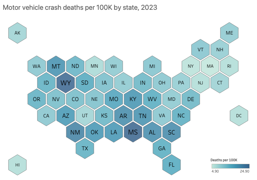
SOURCE: https://www.iihs.org/research-areas/fatality-statistics/detail/state-by-state
With a hex-tile map, you eliminate discrepancies in US state sizes, giving equal visual space to smaller states like Hawaii and larger states like Texas.
In addition to size, the way values are grouped into ranges (for example, equal intervals versus quantiles) and the choice of color scale also shape what patterns pop out first. Small changes in how you define the breaks between ranges can shift which group a place falls into, changing the visual story. Using a clear, ordered legend and an intuitive color progression from light (less) to dark (more) is important. And when missing data is present, make it visually distinct from true zeros so your audience does not confuse “no data” with “no phenomenon.”
Just because you have geographic data does not mean you must use a map. In some cases, not using a map may be a better option. For example, if you want your audience to more precisely compare the differences between each state and see how they rank, then an ordered horizontal bar chart could be worth exploring. Having a clear understanding of your message and how you want your audience to process the information will help you choose an appropriate view for the data.
Where can you practice and learn more about maps?
Cartography, the field of map design, is a deep topic, and we’ve only covered a small bit here. If you want to explore maps further, check out these resources:
Listen to our podcast with cartographer Kenneth Field and visit his site.
Tackle a map-related exercise in the SWD Community.
Watch our live event about maps to explore other types, such as symbol maps and cartograms (available to premium members only).
Learn how to create a map in Excel and Tableau, including hex maps.
To explore other charts, browse the full collection in the SWD Chart Guide, or for resources to teach younger audiences, check out DaphneDrawsData.com.