move beyond busy bullets
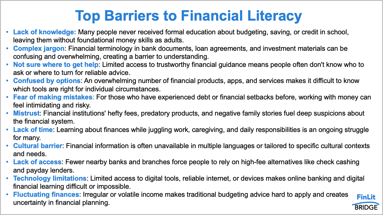
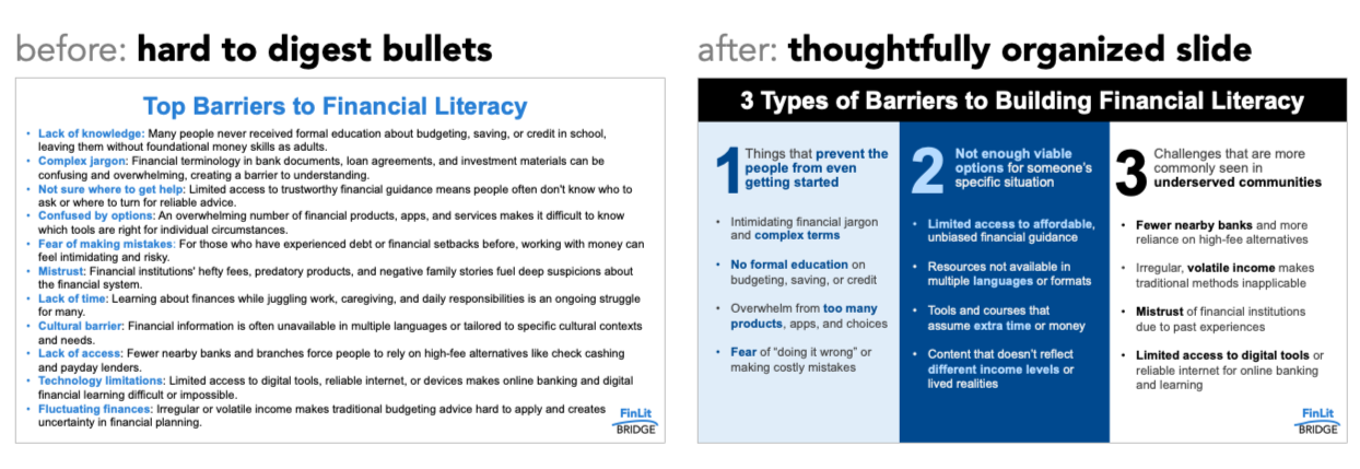
Sometimes the problem with a slide isn’t the content, rather the issues are the layout and structure. Recently, I worked with a client who had thoughtful content grounded in solid research, but the slide itself was a wall of text, making it impossible to digest and understand the message.
If you read the slide above carefully, you’ll notice it’s not wrong. The bullets are specific and describe real barriers. But imagine encountering this in a meeting or while checking your inbox. It’s hard to scan, and you’d likely give up reading after a couple of bullets. I’ll walk you through a simple transformation that reframes and reorganizes these same ideas so an audience can quickly grasp the information.
Employ whitespace
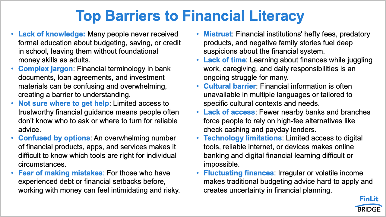
One challenge with the slide is that there is no breathing room. Allowing more space on the margins and between lines improves readability by reducing the overwhelming, cluttered feeling of the original view. One option is to reduce the font size to make more room, but that could make the resulting text hard to read. Another idea is to break the content into two columns and bump up the font size a bit.
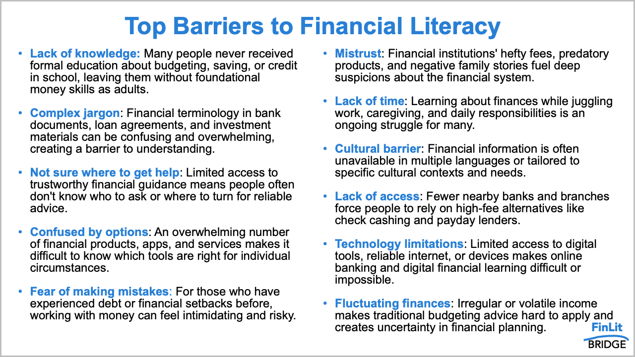
The added whitespace around the margins and between the columns makes it a little less intimidating, but still a lot to process. Let’s take things a step further and add more white space between the bullets.
That’s much easier to scan, yet it still feels crowded because it has the same number of words. Next, let’s consider how to group these barriers to create greater visual hierarchy, making it less challenging for our audience to understand.
Create visual order
One helpful way to tame an overstuffed slide is to look for ways to group information. Our brains are better at processing and remembering a smaller amount. By chunking the bullets into a smaller set of categories, the content becomes easier to comprehend.
Looking at the original list, each item falls into one of three broad themes:
Things that make it hard to get started with money
A lack of options that work for someone’s specific situation
Barriers that tend to show up more in underserved communities
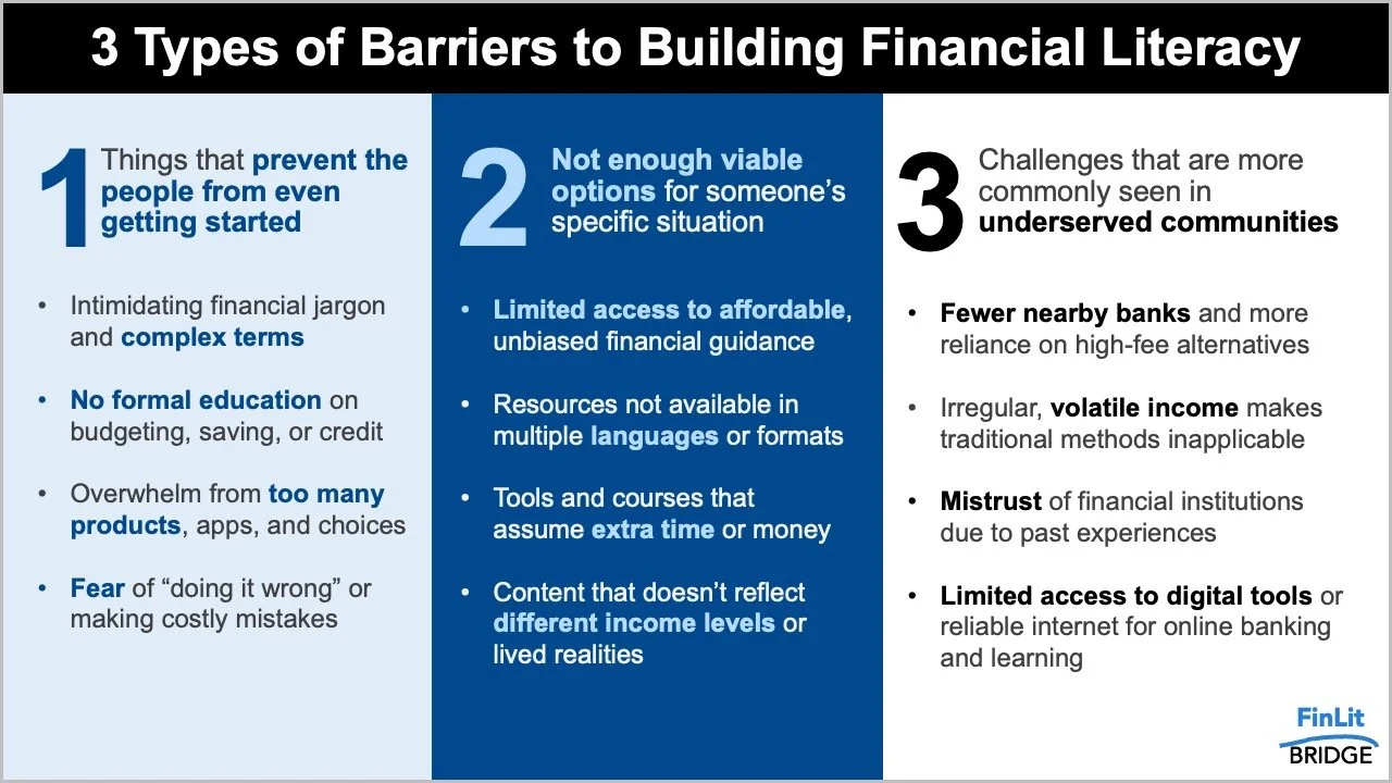
Instead of a single long list, we now have three categories we can use to organize the bulleted text. With defined groups, we can structure the slide around these themes to make it quick to scan.
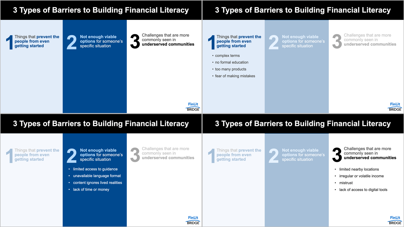
I opted for a three-column layout to provide visual hierarchy, with pithy, enumerated headings at the top and more detail below as people traverse the information. Within each block of text, keywords and phrases are bolded to make it easier to scan the information. Also note how, with this layout, even if someone only reads the headings, they still get the main points.
Use animation when presenting live
The slide above is an improvement from the original, but it still contains quite a bit of text, making it challenging to consume in a live setting when your audience is also trying to pay attention to what you are saying. When presenting in person, apply animation to slowly introduce the information bit by bit, helping the audience follow along and avoid being overwhelmed by too much at once.
Also, look for ways to reduce the amount of text. When speaking to the content, you can elaborate on each point verbally rather than have all the words on the slide, as the added details would be spoken in the delivery.
If we consider all of the above steps together, we have turned the eleven disconnected bullets into a more effective slide. The content didn’t change much—the organization did.
For more examples of visual transformations, check out the before-and-afters in our makeover gallery, including how to apply similar techniques to emails and reports. If you want to practice improving a text-heavy slide, tackle this related exercise.
