don't hide the crucial findings
When choosing a particular graph type, there are no hard and fast rules. With so many options available, it can be tempting to select a visual that you’ve used in the past or turn to what you believe is the correct chart to use. However, this can lead to critical elements in your data being difficult to find—or worse, completely hidden from view.
I came across this recently, as shown in the example:

This data is from a small company that is looking to get a sense of its sales pipeline across its four regions–North, South, East and West. The data is broken into five categories which relate to the progression of any given opportunity–Prospect, Conversation, Presentation, Agreement and Formal Offer.
The pipeline composition is expected to have minor variations between regions, but the proportion of opportunities at each stage should be consistent overall. Any notable discrepancies should be flagged to management immediately.
Does this set of pies make it easy to find these discrepancies? Likely not; if you were able to identify some elements of interest, it took some considerable time to do so.
Reading a single pie has its challenges by virtue of how you consume it using a combination of the respective slices area and arc length. The addition of multiple pies makes this task even more difficult as the elements you are looking to compare, the pipeline stages, are separated and located in different places on each pie.
And while you should look for alternative visualisations to avoid this complex comparison, on occasion you might find your audience demanding to see a pie. If that’s the case you can take steps to make that comparison slightly easier.

With minor formatting changes and logical sorting of the data (clockwise by natural pipeline progression, rather than alphabetically), you have a greater chance of finding pockets of inconsistencies within the regions. For example, if you were to look at the East region you might get a sense that the later stages, Formal Offer and Agreement do seem to be lower than the other regions.
While this view is better, you still have the challenge of comparing multiple pies. It’s at this stage that you might consider an alternative visual that allows more efficient comparison.

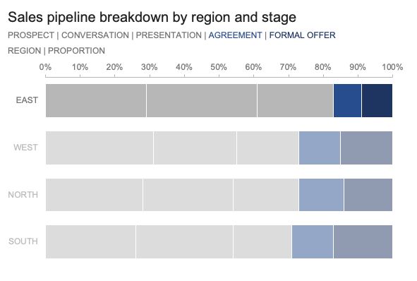
This 100% stacked bar view accomplishes the objective of showing the pipeline stages as a part of a whole. Evaluation of the pipeline across regions is a substantially easier task here than in the four pies. We can take advantage of two distinct baselines: the first from 0% looking to the right; the second, from 100% looking back to the left.
It’s the view from that second baseline that makes the problem facing the East region clear: the final two stages combined, Agreement and Formal Offer, represent barely 15% of their pipeline, compared with an average of nearly 30% across the other three regions. In addition, you can see that a notable amount of the East pipeline is in the Conversation and Presentation stages. This is alarming and shows that the short-term prospects in this region are bleak. Management needs to be informed.
By changing the graph, you have discovered a key finding. Now that you have a clear visual and accompanying message, you need to take steps to turn it into a communication that will make the focus unavoidable and the action to management clear.
For the explanatory visual, you’ll want to direct your audience’s attention to the final two pipeline stages, with an emphasis on the East region. You can reorder the bars so that East is at the top, where it will be most prominent. Then, visually fade out the other three regions (with slight transparency or with slightly less intense colours in the same hue).
To create an executive summary slide, include this version of the graph with some accompanying words articulating a clear takeaway title and call to action. In this case, you could call for a surge of sales support in the East to help tackle the backlog at the Conversation and Presentation stages; this would allow the pipeline to be pushed through at a quicker pace.

This critical information had been present in the graphs all along, but it was not easily retrievable to us, or our audience. By choosing a more appropriate visual and taking steps to call attention to this information, you’ve been able to highlight an important finding to your audience and propose actions to remedy the concern.

If you’d like to practice implementing these steps, browse the related Excel file to experiment with the datasets and created graphs.
For more examples of visual transformations, check out the before-and-afters in our makeover gallery. Then, practice honing your data storytelling skills by undertaking an exercise in the SWD community.