sketch then create
“You can’t do sketches enough. Sketch everything and keep your curiosity fresh.”
American painter John Singer Sargent intended this advice for artists working in traditional media like wood, paint, or charcoal. It also applies to data visualization practitioners. After all, we too are artists, simply working in a slightly different medium—information.
Whenever I’m unsure of how to display my data, I start sketching to generate ideas and gain clarity. I sit at my whiteboard or grab my tablet and draw a handful of charts that could work for my dataset—allowing myself to be curious and free from the constraints of my graphing tool.
Recently I needed to visualize a dataset of glucose observations from participants in an experimental trial. If the proposed treatment were causing any blood sugar-related side effects, they would be visible here.
Here’s the raw data for a particular cohort.

It’s important to note that there isn’t a particular finding or insight that needs to be emphasized here. Instead, the goal for this visual is to provide the data in a digestible format, which will be part of a regularly updated report. That way, physicians and researchers can easily monitor any changes in the observations.
I was unsure of the best way to approach this task, so I started sketching.
Sketch #1: a data table

My first idea was to use a table, but a simplified version. Compared to the original, it is free of repetitive and unnecessary information. As a format, the data table is intuitive and familiar to almost any audience. I can also foresee a scenario where someone would need to look up precise glucose measurements, which is easier to do with a table than a graph.
That said, tables do require a lot of cognitive effort to process. It’s challenging, for instance, to quickly see the trend in glucose levels. Also, this table shows observations from just one of many cohorts in the study—you can imagine that the need to include additional tables for the other cohorts would cause this approach to get out of hand quickly.
It was a solid first sketch, but I kept exploring—this time, using visuals.
Sketch #2: a box plot

Box plots are designed to show distributions well, and my dataset consists of distribution measures (like average and standard deviation). This should have been an ideal match—or at least that’s what I initially convinced myself.
The problems with this sketch started with the data for Day 3. There’s only one observation, and thus would lead to a box plot without a box. A closer look revealed that this would be the case for most of the days in my dataset. This was disappointing; a box plot should have boxes, right?
The lack of observations wasn’t the only challenge. The box plot isn’t a well-known chart type. If you’re a statistician, you probably see box plots (or their close cousin, the violin plot) on a regular basis. But for anyone outside of that world, they are a rarity, and unfamiliar readers face a steep learning curve when trying to make sense of them.
In this case, it’s likely that the researchers and physicians involved in the study have familiarity with the chart type, as they consume a lot of scientific information. Nevertheless, I still was not a huge fan of this view. I’d say this was worth sketching just to rule it out.
Sketch #3: a jitter plot

Jitter plots are essentially box plots that show all individual points while still giving a sense of the distribution. I personally find them to be a highly intuitive way to display the distribution of a dataset. I also felt better about the lack of observations from Days 3 to 19 in this version compared to the previous sketch.
The biggest downside to me was that it would be cumbersome to create in Excel—especially for cohorts with more observations. (This is a benefit to sketching first. I could experiment with novel approaches and decide if it’s worth the extra effort to learn how to build.)
I ultimately concluded that a jitter plot was a viable option, but I kept sketching to see if there was another suitable chart that was easier to create.
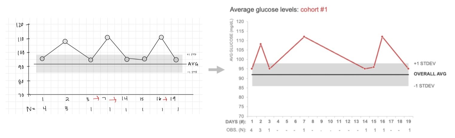
Sketch #4: a dot plot

Here, I drew one dot representing the average glucose reading across all observations for each day. This view was underwhelming for me. It worked, but the jitter plot seemed to offer more potential.
My evolution of thought continued as I easily converted the dot plot into a line chart.
Sketch #5: a line chart
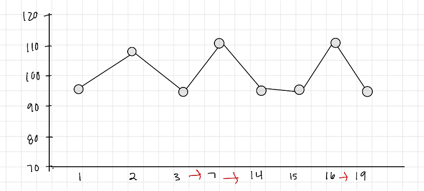
Seeing the time component along the horizontal axis prompted me to think about a continuous line chart. The challenge here, though, is that the observations in my dataset weren’t collected at regular intervals. If I remade this in my tool, I’d need to spread the days out to show equally-spaced intervals for each day, regardless of whether there were observations taken. Otherwise, I risked distorting the data—for instance, making the increase in average reading values between Day 3 and Day 7 seem much more extreme than it was. While sketching, I added red arrows to remind myself of this.
One benefit of only plotting the averages, rather than individual observations, is that I created a ton of space on the chart. I could use that space to add reference lines for the overall study average and standard deviation. I could even turn this line chart into a combination chart (line and data table), so that it was clear that the daily cohort averages have few observations behind them.
Here was the sketch of how that might look.
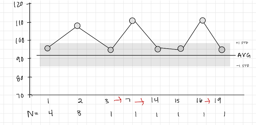
I liked this and proposed this line-table combination as the visualization for the report. Here’s the finished Excel version:

One thing that amazes me is how the same dataset can be visualized in so many different ways. Deciding which one to use in a particular circumstance is never straightforward. Many factors must be considered to ultimately decide which visualization works best in that scenario.
This is why sketching data is great. I can iterate relatively quickly and test ideas without the obstacle of having to learn how to do so in a specific graphing tool. I also appreciate that it forces me to slow down and be intentional about every element on my chart. Rarely do I draw unnecessary clutter, so it’s also a subtle reminder not to add things like borders and gridlines. Most importantly, it offers a chance to get feedback from others early in the process.
If you enjoyed iterating through charts and exploring the pros and cons, practice in the community with this related sketching exercise.