from touchdowns to takeaways: a Super Bowl commercials makeover
More than 100 million people tuned in to watch the Kansas City Chiefs defeat the San Francisco 49ers in last weekend’s Super Bowl, which has evolved beyond a mere sporting match to something more like an unofficial American holiday. Historically, while many tune in for the football itself, a significant number of viewers are equally interested in the commercials. The team at SWD tracks along with both the football and the advertisements, but also a third aspect: any data visualizations associated with the game.
As a case in point, our friend and former colleague Elizabeth shared a graph with us that she discovered in an article published in the run-up to the game. We’ve recreated it below; it illustrates the most common Super Bowl commercials by industry over the last five years, providing a glimpse into a tradition that spans even further.
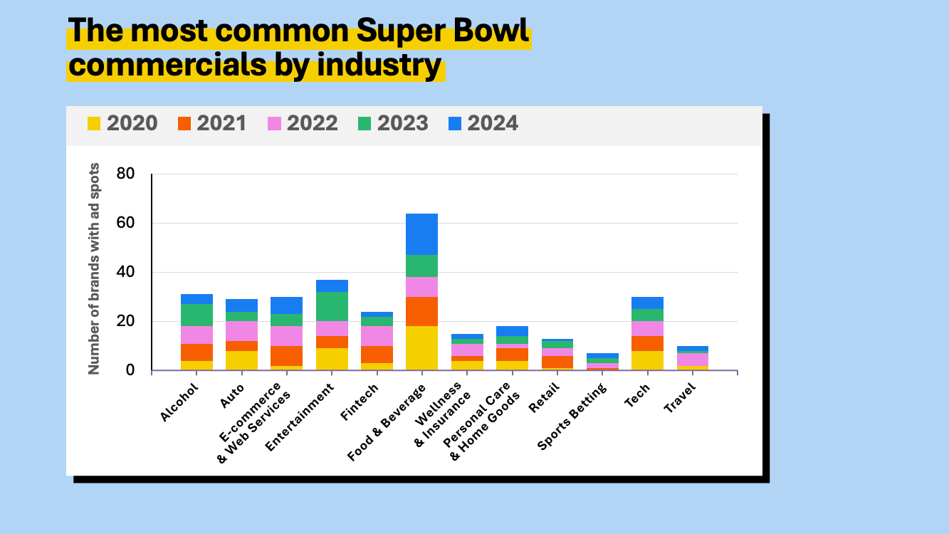
The bold palette of this graph is certainly a scroll-stopper, which is a necessity when competing for attention in a week saturated with Super Bowl content. This rainbow color scheme does an excellent job of catching the eye.
However, as I scrutinize this chart through the lens of a data storyteller, I naturally start to think about the intent behind its creation. What are we meant to discern from this visualization?
A useful principle to remember is that the most straightforward comparison—that is to say, the easiest comparison to make visually—often reflects the creator's intended focus. In this instance, each year is represented by a different color in a stacked bar, and each commercial category has its own bar.
Since the easiest thing to do here, visually, is to scan across the tops of each stack of bars and compare their heights against each other, my assumption is that the graph was created primarily so we could see which categories had the most advertisers over the past five Super Bowls.
The categories are sorted alphabetically (with Wellness & Insurance as the notable exception…if I had to guess, I’d suggest that the category was originally called Insurance & Wellness but was re-named at some point in the process without also being re-sorted). This arrangement is useful for long lists of categories, if the goal is to make it easy for someone to find a specific category quickly. However, if the aim is to highlight which categories are most and least prevalent, a more logical approach would be to sort them from most to least.

While the categories are now sorted meaningfully, the visual is still harder to interpret than it needs to be, owing to the diagonally placed category labels. Rotating this vertical bar chart to a horizontal bar orientation would allow the labels to be written in a single, easily readable line.

This adjustment makes the graph more navigable and the category names clearer, yet the vibrant color scheme still dominates the view. Now I have to wonder if the rainbow palette has gone past “attention grabbing” and into “overly distracting.”
Let’s think back to answering the question of the purpose of the visual.
If the goal is to observe the fluctuation of commercials across categories over the five years, we could better achieve that by iterating to a different graph type. (Foreshadowing!)
On the other hand, if we’re meant simply to compare the overall category trends, toning down the color usage might be beneficial.
I may start by making every year an identical gray color…

…and then perhaps bring some color back in, just to highlight selected aspects of the data. Maybe we could color in only the year with the highest number of commercials in each category?

Ugh, no. This results in a visually chaotic and demanding graph. If you can stand to look at it long enough, this view reveals some interesting trends, like the predominance of entertainment and alcohol commercials in 2023 and the beginnings of sports betting ads in 2022. More importantly, though, it underscores the need for a clearer visualization method for depicting changes over time.
Whenever I hear the phrase “over time” in my head in relation to data visualization, it’s a cue for me to at least try a line graph. For showing continuous data such as we have here, it seemed a promising alternative.

Unfortunately, as is painfully obvious here, a standard line graph quickly proved unsuitable with this data set. It wound up looking like a "spaghetti graph"—an overly complex visualization with numerous overlapping data series.
There are alternatives, however, when faced with this situation. Small multiple charts, which break down the data into individual series for easier comparison, offer a cleaner, more comprehensible format.

This visualization type allows us to create a grid of smaller, identically-scaled versions of the same axes for each data series independently. Scanning across all of them makes it easier to pick out variations in trends, peaks, valleys, and other anomalies. While they could be sorted alphabetically, here they are sorted from left to right, top to bottom, in order of total number of commercials across all five years of data.
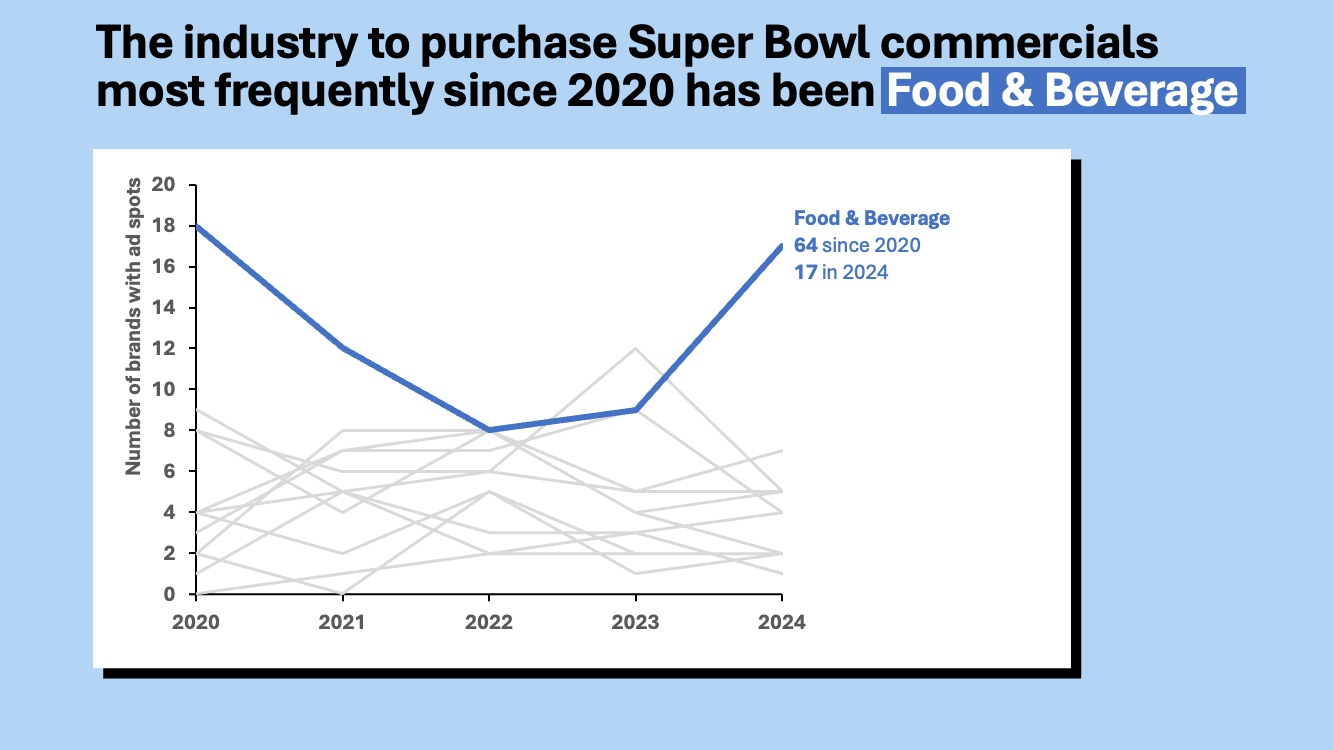
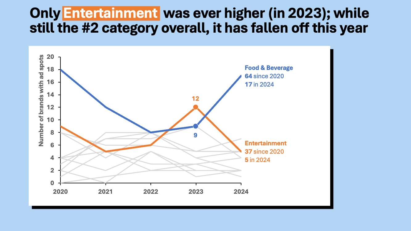
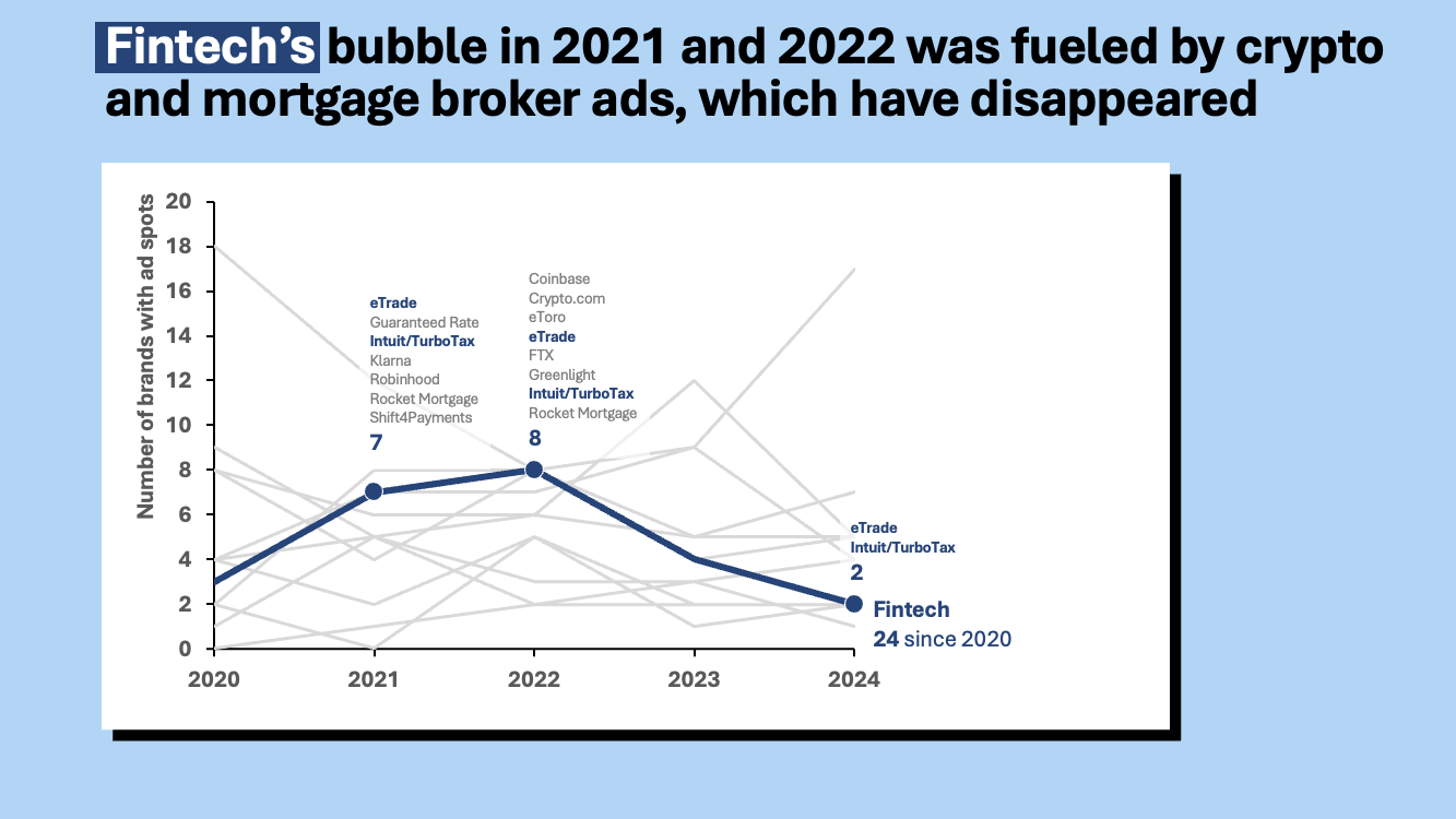
Adopting small multiple charts for line graphs clarified the trends—we can see the dominance of Food & Beverage, the one-year peak of Entertainment in 2023, the rise and fall of Fintech—but makes it more challenging to see the volume of advertisements.
More so than line graphs, bar charts imply that the data they represent can be counted, or measured. Line graphs are excellent choices for showing rates, ratios, position on an arbitrary scale (like temperature)—anything where there’s not necessarily a meaningful relationship to zero. Bar charts, on the other hand, by their visual nature, imply that there is an amount of something. If one bar is twice as big as the next one, we think that there’s twice as much of whatever it is we’re graphing. Conversely, 100 degrees isn’t “twice as hot” as 50 degrees.
The number of commercial advertisers in each category, in each year, is a countable, measurable value. If we use bar charts instead of line graphs, we can intentionally emphasize that aspect of our data.

This bar chart version of a small multiple graph presents a more intuitive representation of volume, but now the trend is more challenging to see, since there’s now a "stair-step" effect to the change over time.
At this point, I’m torn. I appreciate aspects of both line graphs and bar charts here, but each one seems to be a little bit lacking. Ultimately, I found myself drawn to a graph I rarely reach for: the area graph. In most cases I find them too easy to misinterpret, and often overly complex. However, in a small multiple format, this approach effectively balances the visualization of trends over time with the representation of volume, fulfilling both objectives without overwhelming the viewer.

If tasked with sharing a visualization of this on social media, I would likely opt for the area graph small multiple chart. It maintains visual interest while facilitating more straightforward comparisons across categories over several years. Although the colors used do not carry inherent meaning, this compromise is often necessary when engaging a general audience, as opposed to the more focused use of color in business communications.
As we’ve iterated through various visual formats, we’ve also explored our data from a few different perspectives. This has yielded insightful observations, particularly regarding the dominance of the Food & Beverage category in Super Bowl commercials, with notable fluctuations over the years and a brief overtaking by the entertainment category in 2023. We also noted that the Fintech category also displayed interesting peaks in 2021 and 2022, particularly influenced by cryptocurrency and mortgage broker ads, which vanished by 2024.
In a business context, with a captive audience more interested in key takeaways, I would likely discard the small multiple view entirely. Instead, I’d employ a combination of line graphs with descriptive captions to convey these insights more clearly.
Ultimately, there is no singularly correct approach to data visualization. The key is to consider the audience's needs, the context of the presentation, and the intended message. Visualizing data is as much an art as it is a science, requiring experimentation, iteration, and feedback, rather than adherence to a strict set of rules.
Just as teams like the Kansas City Chiefs demonstrate through their repeated victories and strategic gameplay, excellence in data storytelling also requires continuous practice, experimentation, and adaptation. Each attempt at visualizing data—whether through bar graphs, line charts, or small multiples—serves as a learning opportunity, guiding us towards clearer, more impactful communication.