how to create a line chart in Excel
A line chart is a simple graph that is familiar to most audiences. Lines are great for showing continuous data, such as plotting how the value of something changes over time. In this post, we will cover how to create a line chart in Excel, using a sample dataset from a community exercise: table takeaways. The information is about an annual corporate fundraiser to provide meals to those in need. You can download the file here to follow along as we build the line chart.

The dataset includes two columns—a column for the campaign year and a column for the number of meals served in a given year. Let’s assume we want to make a line chart with the years going along the x-axis and the meals served along the y-axis.
Creating a single line graph in Excel is a relatively straightforward process, as it is a default chart type.
Insert a line chart
To begin, highlight the data table, including the column headers. To do this, click cell B7 and drag your cursor to C18. Next, navigate to the Insert ribbon and select the line chart icon. (Note that you can also use the Insert menu at the very top, then choose Chart -> Line to achieve a similar result.)

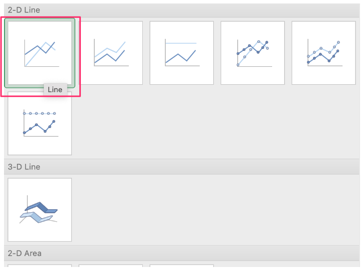
Excel offers several different variations of the line graph. For our purpose, we will go with the first option available—a 2-D line chart without markers.
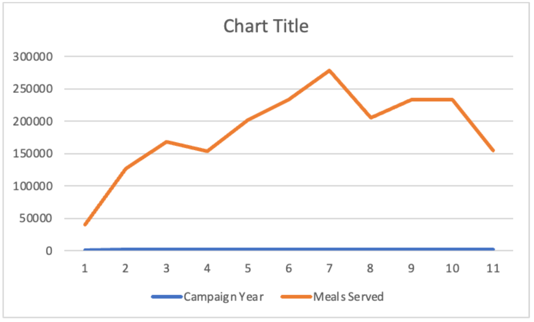
Now, we have a simple line chart, but it is not exactly what we had imagined. Excel made the Campaign Year data points a series instead of the x-axis labels that we wanted.
To adjust the x-axis to show the years, right-click on the chart and go to Select Data… in the pop-up menu. Campaign Year and Meals Served are in the list in the series box in the middle. Pick Campaign Year and then click the minus (-) sign box below the list to remove Campaign Year as a series.
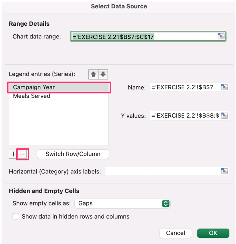
Next, add the Campaign Year as the horizontal axis labels by clicking the cell selector icon to the right of the box and then highlighting the data cells with the Campaign Year (cells B8:B17). Finally, click the OK button.

With this adjustment, we have our desired line chart with the years going along the x-axis and the meals served along the y-axis. Excel has automatically provided a ‘Meals Served’ title for us. We can improve upon this title, and some of the other formatting decisions Excel has made for us. We'll cover these steps in detail in an upcoming post. In the meantime, check out other Excel how-to articles below.

More Excel how-to’s
For more tactical Excel instructions, check out these other resources:
To create a frame of reference, embed a vertical line
To depict a range of values, add a shaded band
To show a distribution of data, create a dotplot
To fine-tune your formatting, adjust bar width
To have cleaner alignment, put graph elements directly in cells
To have more control over data label formatting, embed labels into your graphs