it's okay to use multiple graphs
A tip I regularly share when providing data visualization feedback is to use multiple graphs instead of packing several series into a single chart. Although it is important to be concise, people are often surprised to hear that when it comes to the number of graphs we share, fewer isn't always better.
Let's consider an example.
A project manager is overseeing the final stages of an effort to implement a large number of feature requests for their software. The team aims to tackle the backlog of request tickets by the end of the year. They update their progress at a bi-monthly meeting, starting with an overview of ticket volumes. Once they've shared the big-picture figures, they update meeting attendees on the backlog workflow, which is divided into three stages: In Queue, In Progress, and Documentation. Below is the slide they updated and shared at the December 14th meeting.
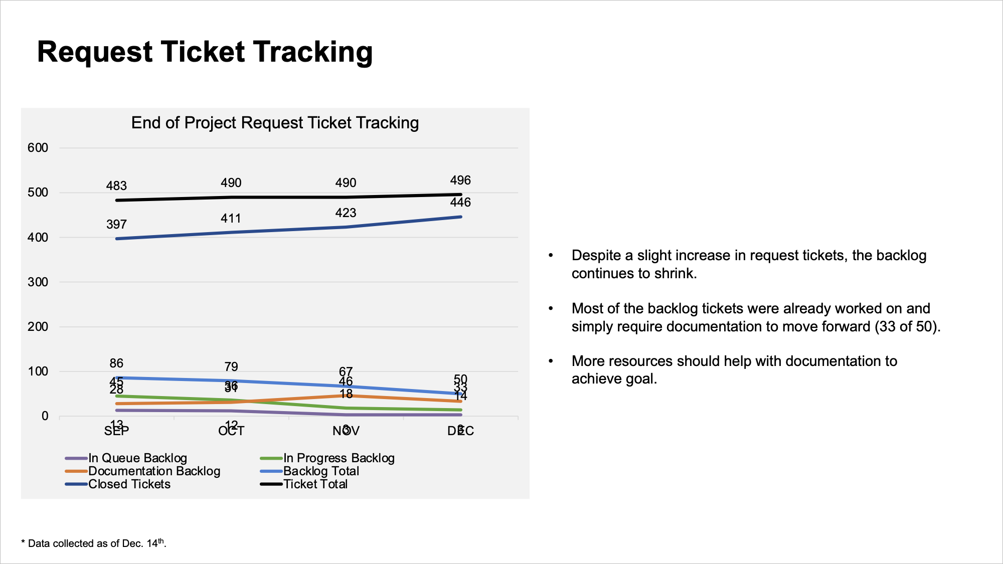
I have some immediate thoughts on how to improve this data communication. For example, the graph is busy. It would benefit from removing visual clutter like the multiple colors, data labels, legends, gridlines, and lack of alignment. The text on the right could be better integrated into the communication so that it doesn’t feel like a separate entity.
While these suggestions could help improve the effectiveness of this communication, my biggest concern is that a single-line chart doesn’t support the two-part narrative shared above.
This is an instance where we’d be better served with two graphs—one for totals, and one for the backlog—instead of one that tries to cover everything all at once.
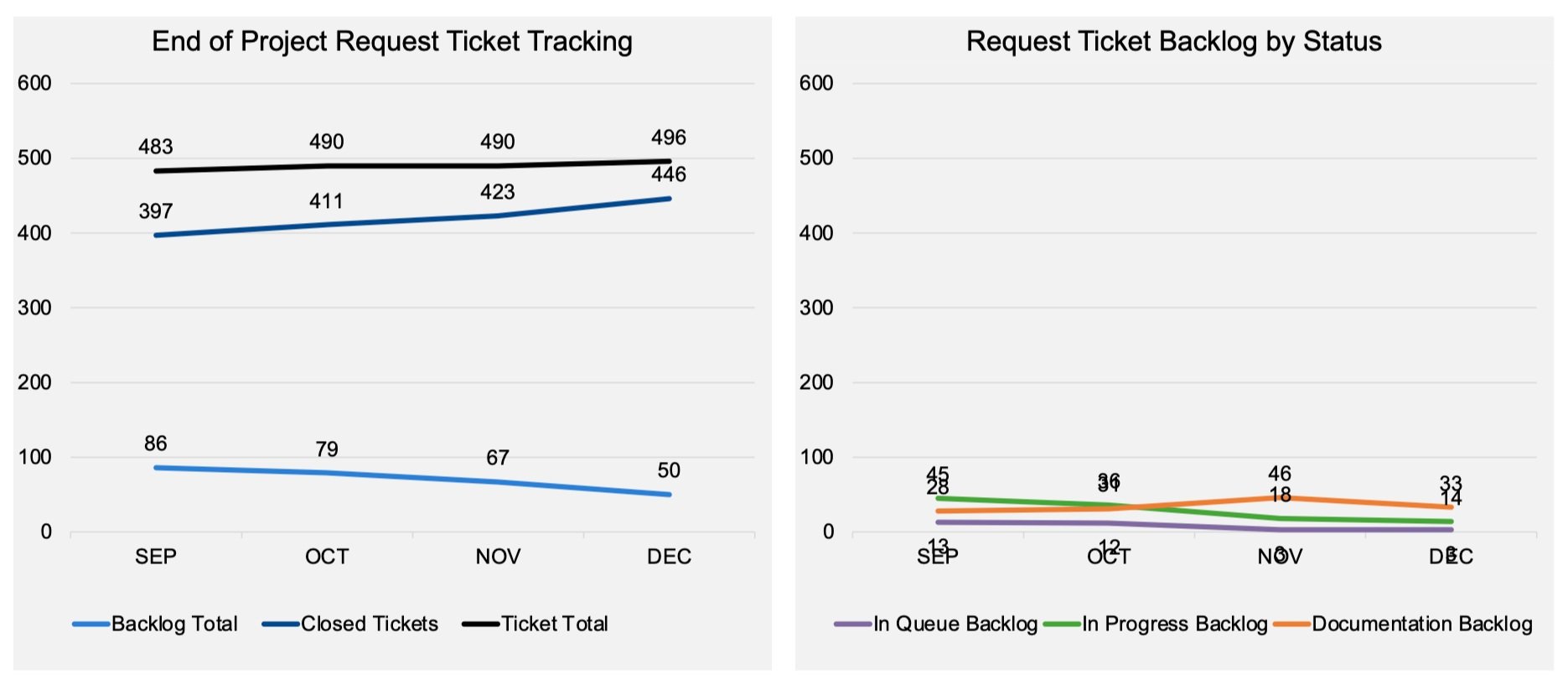
I already appreciate the benefits of having multiple charts.
For one, it’s easier to process. Having fewer series makes each graph simpler to understand. I can also more easily see how the series relate to one another. The backlog total and closed tickets sum to the ticket total. The series in the right-hand-side graph sum to the backlog total shown on the left. While someone with the patience to do math could arrive at a similar understanding using the original view, why make them do extra work?
I’ll also point out that the project manager’s update typically starts with a big-picture discussion on how the total volume of tickets has changed, and then moves into the backlog details. Having a graph for each part of the narrative makes it easier for the audience to focus on the data being discussed.
Second, there is more flexibility in design. Within a single graph, each line has to be formatted similarly. However, with two graphs, I have more flexibility in designing each narrative component separately.
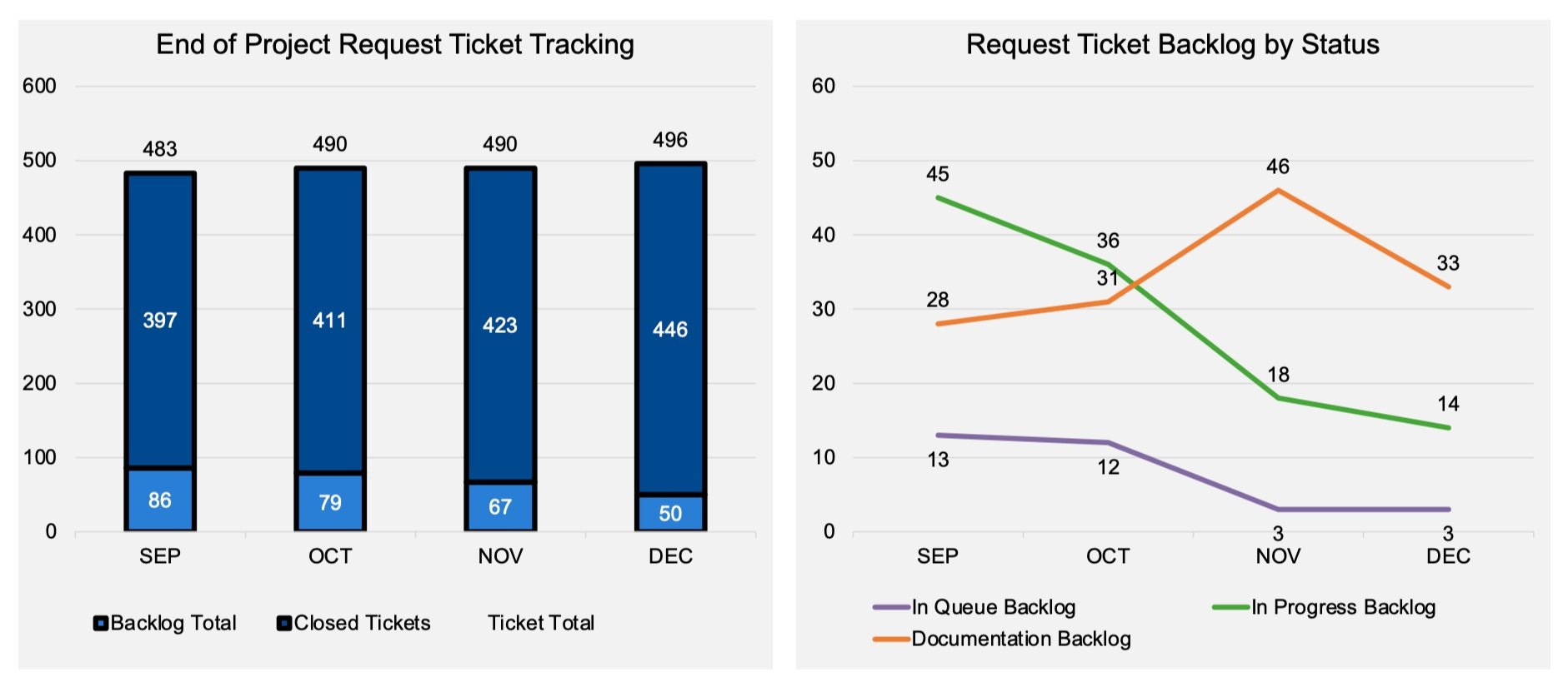
For example, the vertical axis range of 0-600 is too broad to see the smaller volumes of the backlog trends, which range from a minimum of three to a maximum of 46. Pulling these lines into their own view allows me to adjust the range to something more appropriate, like 0 to 60.

Also, I have the freedom to use different chart types. I might want to emphasize the underlying part-to-whole relationship between the closed and backlog series aggregating to the total. I can do that with a stacked bar chart.
Neither of these changes would have been possible when using just one graph.
An important consideration when multiple graphs are shown together is to visually connect them so the reader understands how they relate. In this case, I’ll do so by using a single color (bright blue) for all of the backlog series. I’ll also take the opportunity to reduce the visual clutter mentioned at the start of this critique and add the descriptive text from the original.
My final redesign looks like the following.

While this redesign incorporates changes beyond using more than one graph, many of these improvements wouldn’t have been possible if I had not first decided to use multiple graphs.
The next time you visualize several series with different levels of detail or varying magnitudes, consider whether your communication would be better served by breaking it into two or more views. As fellow data storyteller, Mike, often says, pixels are free!
No rule says we have to limit ourselves to a single visual. It might seem like a more efficient use of space and time to create less, but efficiency should not sacrifice the ability to communicate clearly.