mike cisneros, data storyteller

Specific focus areas: writing and editing SWD articles and books; developing new content for workshops and live events, podcasting
Promotional materials
Need an official bio or photo of Mike to help promote your session? Feel free to use the text and images linked below.
Official bio: click here (or scroll down)
Photos for web/mobile: 750 x 750px | 900 x 1600px
Photos for print: 3288 x 5845px | 3249 x 5776px
Social media: LinkedIn | Instagram | Tableau Public
In their own words…
Where are you from?
I grew up in Massachusetts, spent most of my adult life in the Washington, D.C. area, and now live in Saint Paul, Minnesota with my wife and two cats.
Do you have a favorite chart type?
I love the versatility of a dot plot, as it allows readers to make both big-picture and granular comparisons in a compact and easy-to-understand format.
What inspired your interest in visualization?
As a child, I was always fascinated by maps of lands both real and imaginary, and how they helped to make abstract places and stories more tangible. Later, in my adult life, I found great satisfaction and value in being able to use tools like Tableau, Gephi, D3, and Illustrator to do something similar. I found I could use a combination of words, graphs, images, and visual metaphors to create interesting, meaningful, and layered stories for a broad audience—bringing together abstract ideas and discrete datasets to create clear and engaging narratives.
How do you spend your time outside of work?
I’ve finally hung up my gloves after a long career of goalkeeping in recreational soccer leagues; now, I spend my free time cooking, writing, hosting music trivia, and acceeding to the demands of my needy feline companions.
Videos
Mike is a featured speaker at multiple conferences, user groups, and data meetups, and creates webinars and special events for the storytelling with data community. In addition, he develops videos for the SWD YouTube channel, a selection of which you can find below.
Articles
Mike is a prolific author, regularly contributing articles for the storytelling with data blog on a wide variety of topics—data viz makeovers, step-by-step instructional pieces, in-depth analyses of visualization types, communication challenges, workshop attendee questions, and more. Here is a small sample of Mike’s work.
when simple charts are surprisingly confusing
In this insightful article, Mike explains how to transform a seemingly straightforward bar chart into a clear and impactful communication tool. By improving both the text and visual elements, you'll learn how to make your data more accessible and meaningful, ensuring your message resonates effectively with your audience.

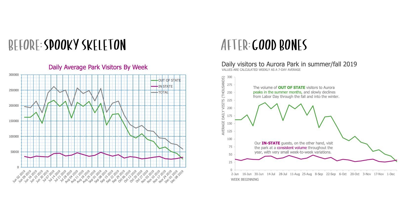
your graph skeleton shouldn’t be spooky
With practical examples and step-by-step improvements, this articles demonstrates how to transform a distracting and cluttered chart into one with a well-organized structure that supports your data presentation. Don't let your graphs be scary; instead, master the art of creating visuals with good bones.
better than a big bar chart
This article covers strategies to effectively visualize and compare data series across multiple categories, moving away from confusing bar charts to more intuitive and visually appealing options. Whether you choose to "Fill the thermometer" or "Connect the dots," these practical strategies will help you present your data in a clear and impactful way, ensuring your audience can easily grasp key insights.


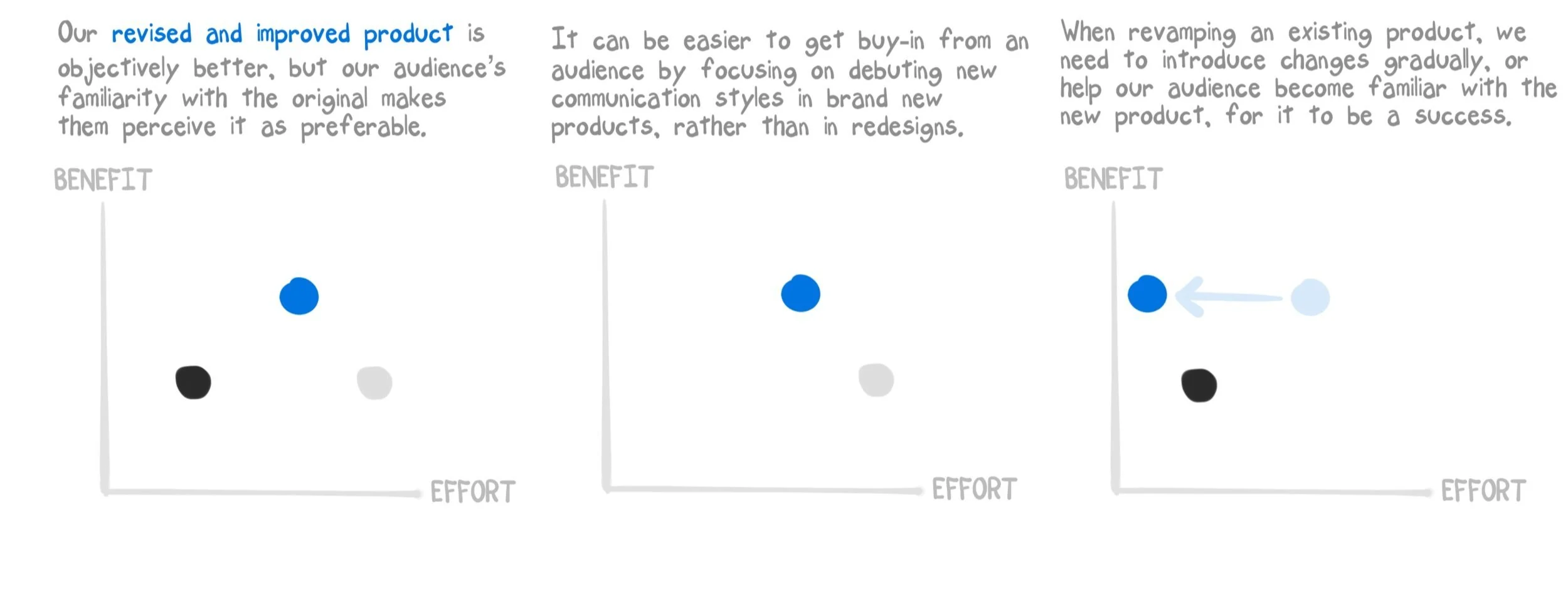
“the old way is better”
You may have experienced the common frustration of encountering resistance when trying to introduce new and improved methods to your audience. In this article, Mike explores the psychology of familiarity, and explains why people often perceive the old ways as better before he reveals some practical strategies for overcoming this resistance.

a multi-level makeover:
simplifying a shrinkage report
Sometimes, visualizations can be improved on mutiple levels. With this step-by-step makeover, you’ll discover effective strategies for enhancing the readability and visual impact of weekly shrinkage reports in the retail industry. From simplifying graph structures to creating a more scannable and organized report layout, these practical recommendations will help managers and owners gain a clearer understanding of their shrinkage data, leading to more informed decision-making.
Podcasts
From time to time, Mike hosts the popular storytelling with data podcast. Below are a few of his favorite episodes.
episode 72
Alberto Cairo and the art of insight
Alberto Cairo drops by to talk about his new book The Art of Insight, which offers a unique take on data visualization. In conversation with data storyteller Mike, Cairo shares his Camus-inspired belief that life's meaning comes from community and work, and how that conviction shapes his own interests and endeavors. They discuss the impact of artificial intelligence on journalism, how seemingly frivolous pursuits can actually be essential, and where to find personal and professional connection amidst ever-changing online communities. Eschewing the mantle of “thought leader,” Cairo reveals why he is reluctant to wield the "soft power" he holds in the data visualization community. Tune in for a fascinating exploration of responsibility, the political nature of work, and the human aspects behind visualization.
episode 66
designing in light and dark
Mike and Alex discuss the advantages and drawbacks of designing visualizations with light and dark backgrounds, using examples from SWD community members to highlight where each approach can be preferable. Then, they dive into history and discuss the staying power of some famous graphs. What makes them memorable—and how we might be able to elevate them, using modern tools and perspectives?
Data storyteller Mike Cisneros sat down with Iron Viz champion, Tableau Visionary, and self-described “data jackalope” Joshua Smith to talk about how folklore—the study of how information is communicated, primarily through informal means—provides us a fascinating lens through which to examine how data visualization has evolved and continues to develop, both as a discipline and as a community of practitioners. You’ll learn how “best practices” emerge, transform and persist (or are discarded) over time, how informal communication and culture can have unexpected effects on how our work is received, the inextricable links between belief and “objective” data, and how a storyteller can position themselves to be most effective.
Official bio
Feel free to use or share this bio in any printed or promotional materials in support of your event.
Mike is an award-winning data visualization specialist, a two-time Tableau Visionary, and the co-author of storytelling with data: before & after (Wiley, 2025. His work has appeared in Makeover Monday: Improving How We Visualize and Analyze Data, One Chart at a Time (Wiley, 2018) as well as a variety of media outlets, including the Washington Post, Forbes, and Fast Company. With Jenny Schumi, Mike has written several books in the data-focused Ruby Marks Adventures series for young readers. Prior to joining SWD, he spent more than 20 years working for companies great and small, across industries ranging from music and publishing to energy retailing and the federal government. In his roles as a data storyteller for SWD and highly regarded speaker across the US and Europe, he teaches individuals and organizations how to transform complex analyses into compelling, clear visual messages that are both understood and impactful.