what happened when my dad picked up “before & after”
My dad doesn’t read.
I mean, he can read. He was a public school teacher for 45 years. He just chooses not to read for pleasure. You know how when you’re at a loss for what to get a middle-aged man for his birthday or for Fathers’ Day, and you default to, like, a coffee table book about golf courses or a thoroughly researched history of World War II? That never worked for my dad. In our family’s weekly Sunday phone calls, it’s my mom who asks if I’ve read any good books lately.
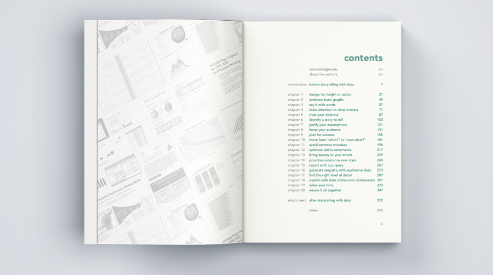
That’s why, when she texted me on Saturday to say that her copy of storytelling with data: before & after had arrived early, she said, “I’ll read at least some of your chapters before we talk tomorrow.” Not, “Your father and I are excited to read your book.”
Imagine my surprise when my mom answered the phone on Sunday and said, “I haven’t read any of your book yet…your father took it when it arrived and he hasn’t given it back yet.”
Odd, I thought. But what was even odder was what happened when my dad came into the room and joined the conversation.
“Mike,” he said, “I picked up your book and I couldn’t stop reading it!”
“Really?” I replied, with a fair bit of skepticism—not only for the reasons enumerated above, but also because my dad is very much the stereotypical curmudgeon: hard to please, and even harder to impress. (He might feel positively about something, but that doesn’t mean anyone else is allowed to know about it.)
“Honest to God,” he said in his Boston accent, “I never really understood what your job was before. I knew it had something to do with data, but reading this…
“I totally get it now. It’s just amazing how much you can do to make things, not just graphs, but everything—reports, emails, everything—look so much better.”
“Well, yeah,” I replied, “it’s meant to give people an idea of the thought process that we go through when we’re trying to improve their communications. That’s what we teach to other people in our workshops, so that they can learn to do it for themselves.”
“Yes! Exactly! And the writing is just so easy to understand.
“I thought this stuff would be confusing or hard to get, but the way you all talk about it, it just makes perfect sense.”
I started to respond, but he kept going: “And there are so many things you can do to these graphs that I never would have thought of…it’s so interesting to see!”
Now, dear reader, at this point you yourself are likely feeling a fair bit of the same skepticism towards me, your narrator, as I felt towards my father at the beginning of our conversation. I get it! Of course my own father is going to have a positive review of the book his son co-authored.
But there was an energy and an excitement in his voice that, in all candor, I rarely hear from my dad these days. The specific things he was referencing as the conversation continued—he identified specific chapter numbers and examples that particularly caught his attention—convinced me that this exuberance was genuine.
When we set out to write this book, we knew that the visual transformations would be appealing, particularly to an audience of people who work with data and graphs on a regular basis. We also knew that clear and accessible writing is essential to successful storytelling, which is why we strive to demonstrate it not only in this book, but throughout everything we do as a company.
What I personally did not realize, until I heard it from my own father, is how enjoyable, satisfying, and motivational it can be for anyone to see these before-and-after makeovers, regardless of their personal or professional connection to data visualization.
Beyond that, I certainly didn’t expect this to be the means by which my parents would finally get a clear understanding of just what I do at work all day. I’ve tried to explain it before, but it seems that this particular combination of words and pictures, supporting a clear narrative, did the trick.
Which, I suppose, shouldn’t be a surprise at all.
There are many ways to measure the success of a book: the number of people it reaches; the number of units sold; the recognition it receives; its longevity in the public’s awareness; the effect it has on the world. This week, I found a new way to measure the success of a book: the joy it can bring to an unexpected audience.
storytelling with data: before & after is available on shelves and online as of this week. And while it was written with data people in mind, it turns out it might just be for anyone who's ever looked at a graph and thought, I don’t get it—and would be delighted to discover that they actually do.
And if it can turn a lifelong non-reader into a surprise fan? For me, personally, that’s as big a success as I could ever have hoped for.


