the audience will tell you
What do dog training and data storytelling have in common? A lot, as it turns out.
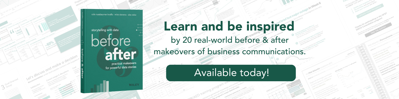
For those who are hardcore SWD fans, you’ve probably seen me reference dogs before. I shared my dog Nemo’s progress in this makeover article, and I also share a dog-themed makeover in our new book, storytelling with data: before and after, which includes 20 examples of how we’ve helped our clients overcome common data communication challenges.

What you may not know is that dogs occupy most of my time when my brain is not focused on data. I’ve recently started an apprentice program on the weekends to become a dog trainer. This past week, while working on a particular skill, I asked my teacher if I was doing it right.
His response? “The dog will tell you!”
At first, I didn’t quite understand. But then I realized how powerful that answer was! Dog training, like data storytelling, is all about clear communication. If I want to know if I’m communicating clearly, I have to pay attention to the dog to see if they understood.
If you want to know if your graph, slides, or story is clear, the audience will let you know. They decide what works, not you.
This is a hard truth to swallow. In the exploration stage of analyzing data, it’s all about you and what you understand. However, as you shift to communicating data, your preferences and beliefs should take a back seat to those of your audience.
Even as someone who shares this lesson with others regularly, I fall victim from time to time—most recently while working on Chapter 14 in before & after.
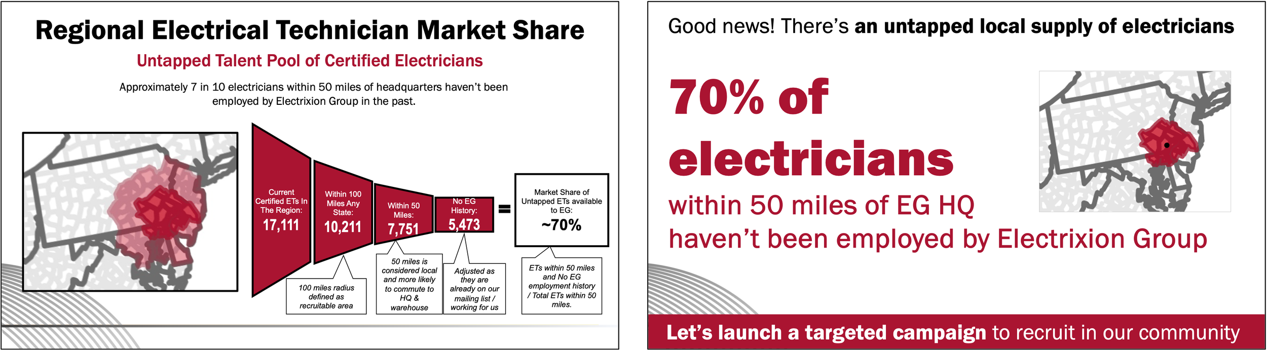
Here’s the background information and original slide, taken directly from the book:
Electrixion Group, a local electricity company, recently expanded and is now facing a shortage of certified electricians. Employees believe the expansion was a mistake, arguing that they can’t support such a large regional area because there isn’t enough local talent to hire. The head of talent acquisition wants to challenge these ideas by showing that there are plenty of certified electricians eager to work in their main off and warehouse—the real issue is the need for better advertising and recruitment. To make their case, the director planned to present the slide below.
Knaflic, Cisneros, Velez. storytelling with data: before & after, Wiley, © 2025
At first glance, I was impressed. There’s something captivating about the funnel diagram, unique map, and bold crimson color. However, it took me a while to fully understand it. Without the back story, I’m not sure I’d walk away with the right takeaway.
Further reflection made me realize that there’s a lot going on among the funnel diagram, callout boxes, and map. A simple improvement would be to select either the funnel diagram or the map as the primary visual on the slide. This communication would further benefit from a strong takeaway title and better layout.
My immediate preference was to stick with the funnel diagram. I couldn’t pass up the opportunity to turn this diagram into a square area chart!
Below is my first remake.

Is it easier to grasp the point? I thought so.
But it’s not about me. When I considered the scenario and the audience (busy electricians eager to head to their appointments for the day), the slide felt overly complex for the message. The employees don’t really care about this level of detail.
After soliciting feedback and paying close attention to facial expressions and follow-up questions, I realized that I was designing for me and not the audience. Remember, if you want to know if your communication is clear, the audience will let you know.
Instead of leaning into the funnel diagram, I settled on the map. It provided a nice understanding of where the talent resided in proximity to the warehouse, supporting the key point that with thoughtful marketing, recruiting local talent is possible. I also decided to prominently display a key takeaway and do the math for my audience. Approximately 70% of the electricians within 50 miles of the headquarters haven’t previously worked at the company, and therefore should be who we target (5.5K divided by 7.8K). This is the final makeover that made it into the book.
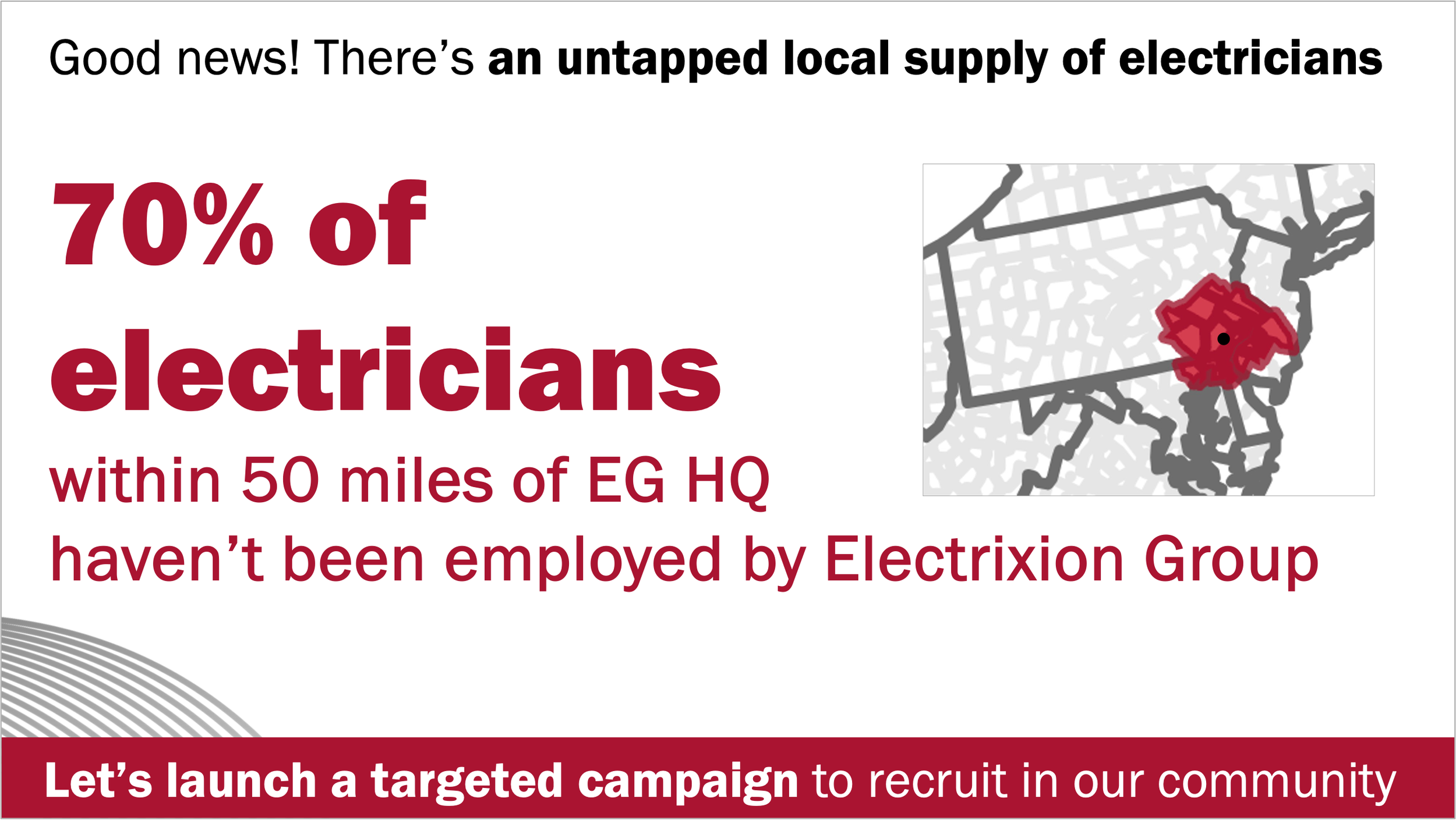
Knaflic, Cisneros, Velez. storytelling with data: before & after, Wiley, © 2025
Simple, to the point, and exactly what this particular audience wanted.
If you want to learn more about how I transformed this makeover step-by-step or if you love learning via example, order our new book, storytelling with data: before & after. It’s available this week at all places where books are sold (Amazon, Barnes & Noble, BAM, and Wiley). For those outside the U.S. who want to use Wiley, pick your location here. If you’ve already snagged a copy and have a free moment, we’d greatly appreaciate if you’d share your review.