my pre-publication checklist for an effective graph
This is a guest post written by SWD community member Lucia Stefanuto. She was a recent Member Spotlight nominee—you can read more about her and her work here—and in our conversation with her, we discovered that she had developed a pre-publication process for her communications, in order to make sure she never left out a step that might strengthen the message of her visualizations. We invited her to share her process here. Enjoy!
It’s no secret that, in order to tell a good story, we can’t just rely on the default graph styles that our tools generate. But sometimes, when we need to prepare a presentation quickly, it can be a challenge to remember all the adjustments that we might like to make in order to improve our visualizations.
In my experience, I’ve found it helpful to have a checklist of some of my most common chart changes handy. That way, even when time is tight, I can quickly run down my list and make sure that I haven’t forgotten to apply some simple change that could elevate my graph from “passable” to “amazing.”
Now, I realize that many of these steps may seem quite obvious, but it is always useful to double-check. Not long ago I prepared a dashboard that I considered beautiful, and only after it was published did I realize that there were a number of simple things I could have done to make it so much more effective! That’s why I appreciate this list, as a quick double-check before publishing.
What to do in ten minutes or less
Only a few minutes left to revise your visual? Focus on these two questions. Getting these right can make a major difference in the effectiveness of your communication:
Is the message as clear as possible for your audience?
Highlight the insights you’ve found in the data, and include an obvious key takeaway. Be explicit about what action you think should be taken or changed as a result of this analysis. You can do this quickly simply by writing these insights, takeaways, and recommendations in text near your graph.

Are you using color effectively? If the color in the graph is not helping a viewer understand the important elements of our analysis, we should use it differently, or remove it entirely. It is useful to use gray in general, and then reserve the use of color for highlighting a specific value, series, or data point. It’s also important to make sure that the colors you’re using are accessible to people who are color blind—this means no green and red combinations!
If your audience is likely to have existing associations with certain colors, then take advantage of those associations; for instance, many Western audiences associate the color red with “danger” or “warning.” Similarly, if we are visualizing data that has an inherent color we identify with it—e.g., foods (strawberries are red, bananas are yellow) or brands (Coca-Cola is red, McDonald’s is yellow)—we should match that color in our graphs.

What to do in more than ten minutes
Surprise! The meeting was rescheduled, and now you have more time to improve your visual. Consider the following formatting changes for maximum impact.
Is there anything that you can delete? Our goal is to create a simple and clean design, and that requires us to remove any unnecessary elements. If something doesn’t add value to the presentation—gridlines, axis lines, borders, and/or any other redundant information—get rid of it. Anything that gets into the final version of your graph must have a purpose and be focused on the story.
Are your data labels and legends placed in the best possible locations? Instead of relying on legends that, by default, might be far away from the plot area of our chart, we can instead consider directly labeling the information.

If there isn’t enough space to label the data directly, we can still place the legend closer to our data, in a layout that makes it easier for viewers to see what label goes with what data series.

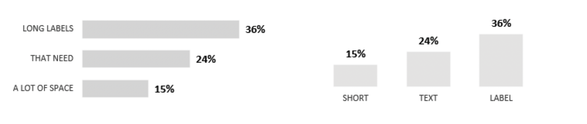
Is there a better way to orient your graph, or sort the categories in it? A bar graph is a bar graph, whether it’s vertical or horizontal; but you can use either one, depending on a few different considerations. For instance, most of the time horizontal bars are better for long labels whereas it is more comfortable to read timelines from left to right. Try each orientation and see which one feels better to you and fits better in the available space.
In terms of sort order, we tend to arrange our data series from biggest to smallest, as we move from left to right or from top to bottom. However, if there is a timeline or some sort of inherent precedence in our data series, the natural order of that timeline or precedence should flow from left to right.

Is your color palette visually appealing? A great tool to generate themes is https://color.adobe.com/ You can search for inspiration or upload any image or logo and it will generate a whole palette. It’s also a good tool to confirm that your chosen color combinations are accessible, in terms of contrast and color-blind friendliness.
Did you leave enough white space? Our eyes need places to rest, and our information needs room to breathe. Crowded visuals are harder for audiences to read effectively. Blank spaces help people see the content clearly, instead of getting lost in a sea of information.

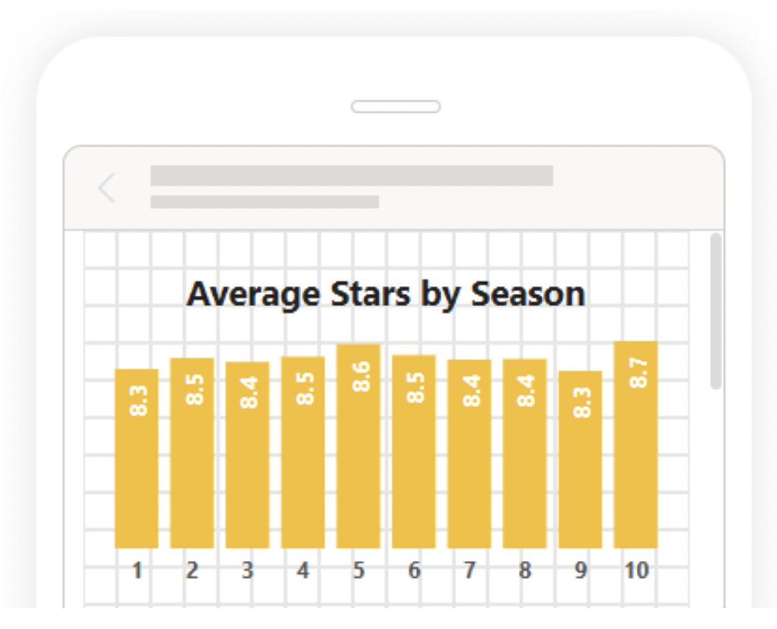
Will your visualization work on a mobile device? The font size should be visible on various screen types, and any interactivity (clickable buttons, for instance) should be usable via a mobile user’s viewport. Power BI, Tableau, and other BI tools have the functionality to check how our dashboard would look like in mobile, and to customize it appropriately.
Do you have your own checklist, or at least some steps you always revise? Share your thoughts in the member spotlight conversation in the SWD community. I look forward to hearing from you, and adding more items to this list!