bar charts and dot plots and line graphs, oh my!
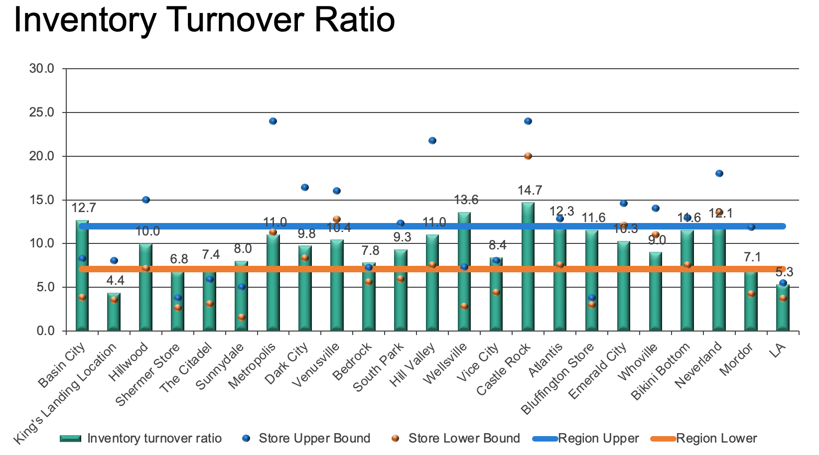
A client in one of our recent custom workshops was looking for ways to improve upon a very busy chart. The original graphic combined bar charts and dot plots and line graphs, oh my!
Here is what it looked like, with the details and numbers modified to preserve confidentiality:
Take time to understand the context
When faced with any unfamiliar but complicated graph, it can be helpful to think about it piece by piece to gain a better understanding of what’s being communicated. That way, we’ll have a better handle on how we can improve the overall visual.
The goal of this chart is to allow managers to compare their store’s performance against its forecasted range and the actual performance of other stores in the region.
Each of the green bars represents the “inventory turnover ratio” for one of several retail store locations—this is a measure of the number of times inventory is sold and replaced in a year. A lower turnover implies weak sales and possibly excess inventory, while a higher ratio implies either strong sales or insufficient stock. We know this metric was important to the person who made this visual, because “Inventory Turnover Ratio” is the title of the entire chart.
There are two lines in the chart—a blue one and an orange one—representing the upper and lower range for the forecasted turnover ratio across all locations in the region.
The dots, also colored blue and orange, depict the predicted range of the turnover ratio for a given store.
With this background, let’s now consider how we can communicate all this information while making it easier for the intended audience to understand it.
Reduce the effort required by the audience
Now that we know what the chart is displaying and the goal of the visual, we can consider the best way to present the information. There is a lot to take in with the number of metrics being displayed. Removing any elements that take up space but do not add to the understanding of the data will reduce the amount of work required to decipher the graph.
Asking yourself what you can eliminate is always a good first step to improving a visual. We will remove some clutter by deleting the gridlines, taking away the data labels, getting rid of the 3D effects, formatting the axis to not have trailing zeroes, and cleaning up the store names to be more consistent.
Remember the blue and orange lines that were used to show the range of turnover ratios across all locations? To simplify this visual, we’ll get rid of those lines; instead, we’ll include a category called “REGION AVERAGE” in our series of bars. That makes the chart less busy while still providing an overall reference point.

The decluttered chart reduces cognitive burden, but we can further improve readability. Any time we have vertical bars with diagonal text, iterating to a horizontal bar chart makes the category labels easier to read (assuming the data still fits in the space with which you are working). So, let's switch the orientation.

We’ve made progress: it takes less effort to read the horizontal text, and the data stands a little more since we stripped away some non-essential elements. However, there is still quite a lot of information to take in.
Arrange the information intuitively
There should be logic in the order in which information is displayed. It is not clear if the order of the locations in the original graph is intentional. Instead, let’s arrange the categories to make it easier to see how each store’s inventory turnover ratio compares to other locations. For instance, we could sort the stores by their individual ratios:

The ordered data makes it possible to quickly see the highest and lowest turnover ratios. However, visually speaking, the heaviness of the bars overwhelms the lightness of the dots, which makes it difficult for a viewer to compare a store’s actual ratio to its range of projected ratios. Moreover, the three different colors that we’re using aren’t playing nicely together: notice how challenging it is to see orange dots against the teal background of the bars.
What could we do to make it easier to see where the turnover ratio fell within the forecasted range? One possibility would be a change of chart type: show the range between upper and lower bounds as a connected dot plot in a muted gray color, and then plot the actual inventory turnover ratios as points within that range.
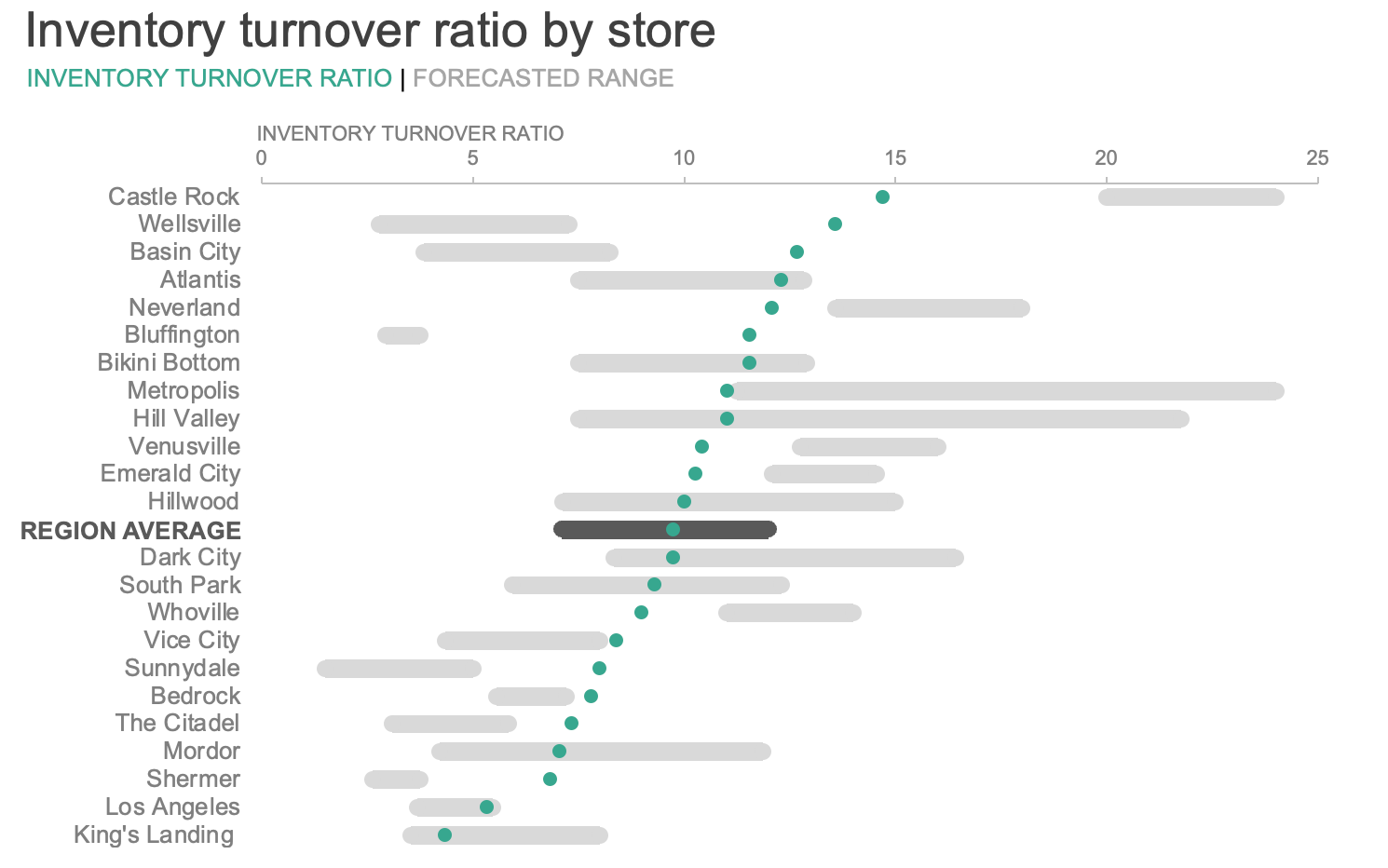
What a difference! By reconsidering the way we chose to plot our data, we reduced the cognitive burden for the audience by presenting the information in a more intuitive manner. For the series that included a specific, calculated value—a measured ratio—we chose to visualize it with a single point rather than a bar; and for the portion of the graph in which we were reporting the minimum and maximum boundaries of a range, we chose to present that range with one continuous bar, rather than as two discrete points.
Emphasize the data thoughtfully
The design of this visual makes the data easier to interpret, but if we showed this graph to five different people, we will probably get five different interpretations of what the most critical message is. For instance, one person might say that Castle Rock is underperforming since its actual inventory turnover ratio was far below the projected range. However, another person might think that Castle Rock is a success story since it had the highest turnover ratio in the region.
One final consideration in strengthening any visual is to focus attention on what we think is important so that the main takeaways we hope to communicate are clear. Two effective ways to do this are: to use color sparingly to highlight the key points; and to incorporate words to provide context around the data.
We could tell a number of different stories and focus on several different aspects of this chart. For example, we could strategically use color and words to call attention to the stores with turnover ratios that are lower than their forecasted range.
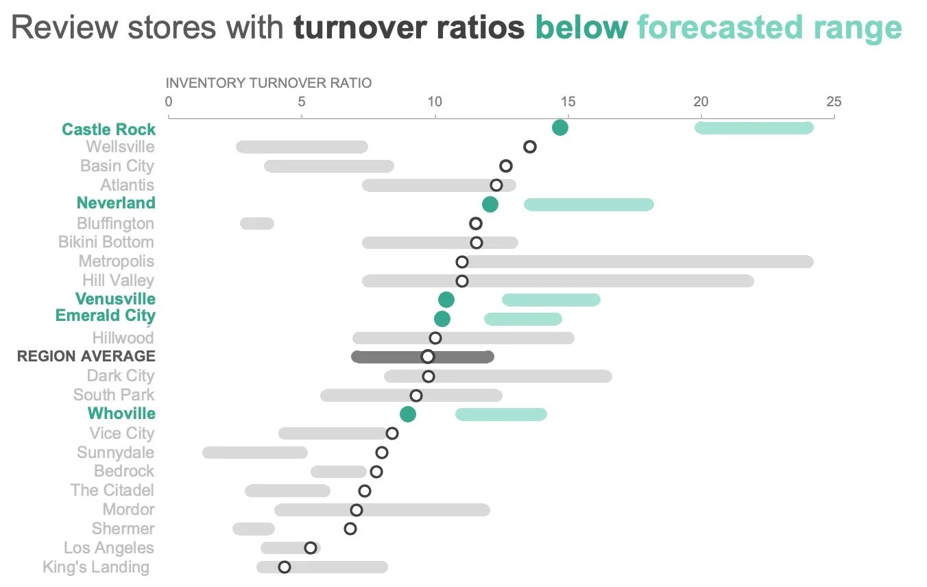
Check out the impact of simplifying, arranging, and emphasizing the information. These adjustments reduce the effort needed by the audience to interpret the chart and understand the key takeaway.

For more examples of visual transformations, check out the before-and-afters in our makeover gallery. To see a step-by-step guide to making a value in range visual in Excel, watch this short video.