thoughtful transitions for smoother delivery
Have you ever sat through a presentation that just felt disjointed, where the presenter jumped from one idea to the next without warning, leaving you wondering how everything fit together? Even the most interesting insights can be overshadowed by a delivery where the content feels unrelated.
Everybody knows that it’s important to plan out what’s on your slides. What often gets overlooked is how critical it is to plan out what’s between the slides as well. Your transitions are the bridges that connect one idea to the next in a presentation, ensuring the message flows logically and cohesively, making it easier for the audience to follow along and stay engaged, rather than confused and overwhelmed.
In this article, I’ll share some practical ways to polish both your verbal delivery and your slide content to ensure your next presentation is smooth and engaging.
Guide your audience with verbal transitions
When presenting live, your spoken words play a critical role in shifting between slides. Are you about to dive deeper into the details, zoom out for a broader view, or change topics entirely? Use specific language to let your audience know where you’re headed next, so it’s easy to follow along.
If you’re about to introduce a new concept, it’s important to make the transition feel logical, rather than abrupt. Use words that connect the dots between ideas. Phrases like “let’s shift gears and discuss…” and “now that we’ve covered [X], let’s move on to [Y]…” expressly tell your audience something different is coming.
When expanding on a point or diving into more detailed information, use something like “let’s take a closer look at…” and “to illustrate this point further…” to help guide them from a high-level concept to more granular details.
When it’s time to summarize or offer recommendations, consider language that explains to your audience that you are wrapping up. “To summarize what we’ve covered so far…” and “let’s revisit the main takeaways…” are some ways to do this.
Simply by weaving these verbal phrases into your delivery, you can create a thoughtful flow that feels more like a conversation and less like a lecture.
Use visual cues to support seamless transitions
Transitions aren’t just about what you say—they’re also about what your audience sees. Your visual content and your verbal delivery should be connected in a manner that enhances understanding and engagement.
Here are some easy ways to make your slides visually support transitions between ideas.
Craft clear, active takeaway slide titles that align with your verbal transitions. For example, if you’re shifting topics, ensure the new slide title reflects the change. This reinforces the narrative and helps your audience stay oriented. When scanning through the slide sorter view of your presentation, the titles should serve as a roadmap of your presentation. If you’ve done this well, then with every new slide you put in front of your audience, its title will be a perfect signpost for the idea that is coming next.
Incorporate focusing techniques and visual cues, like sparing color and thoughtful annotations, to support your talking points and signal transitions visually. You can also add subtle animations for emphasis without overwhelming the audience. Not only does this direct attention to where you think it should be paid, but it will help remind you of the points you intended to make, and in what order.
Ensure a consistent design throughout your presentation, keeping fonts, colors, and layouts orderly and intentional. This tactic is less about making sure you’re emphasizing your transition and more about de-emphasizing the things that aren’t meant to change. If each successive slide had new layouts, colors, and fonts, it would be overwhelming for a viewer to deal with. By reining that in and calming down the design, you’ll provide a sense of continuity that supports smoother transitions between slides, because any visible change will now be pertinent to the new topic or level of focus.
Let’s consider an example. Recently, I was working with an online education provider who collected negative feedback from students about various aspects of their digital learning experience across four different courses. Below are two sequenced slides included in the original presentation.
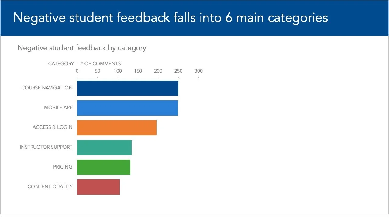
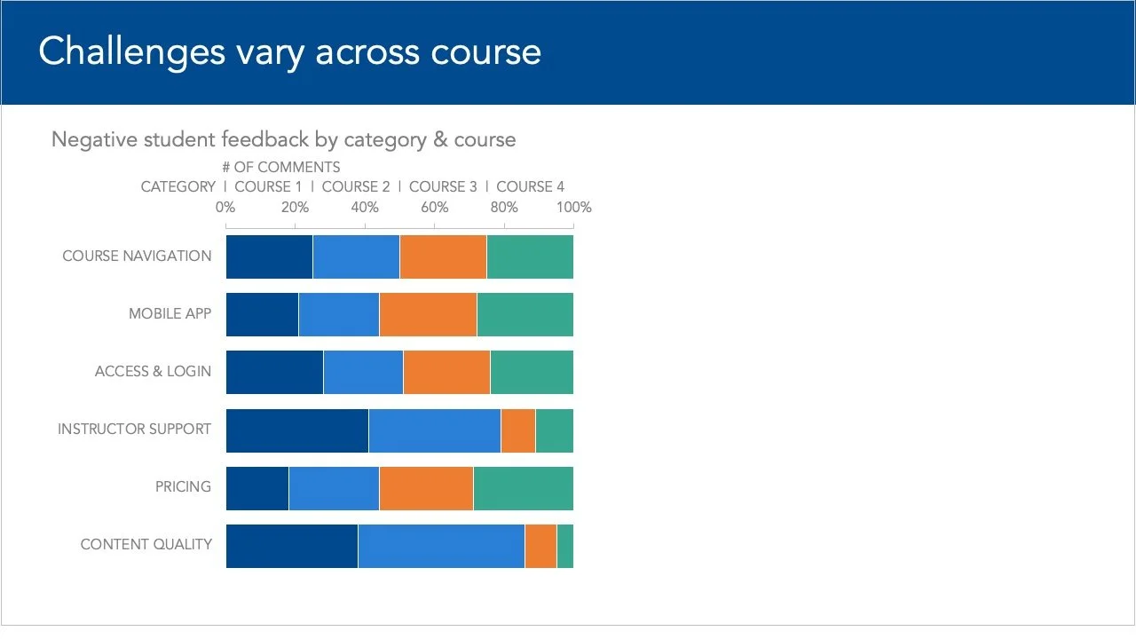
The slide on the left shows the negative feedback by category for all four courses, while the slide on the right presents the student responses broken by both category and the associated course. This switch to a different view was jarring in the original deck, and confusing since there wasn’t consistency in how color was being applied.
To make the shift between these slides easier and more straightforward, we reworked things using the transition tips outlined above. The following verbal and visual transitions were added to guide the audience.
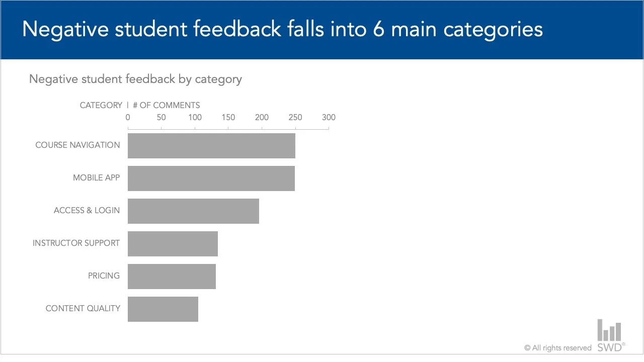
Here, we are looking at the negative feedback categories from recent students' responses. You can see the volume varies across each category.
Transition (focusing attention): There are some aspects that stand out as having more negative feedback.
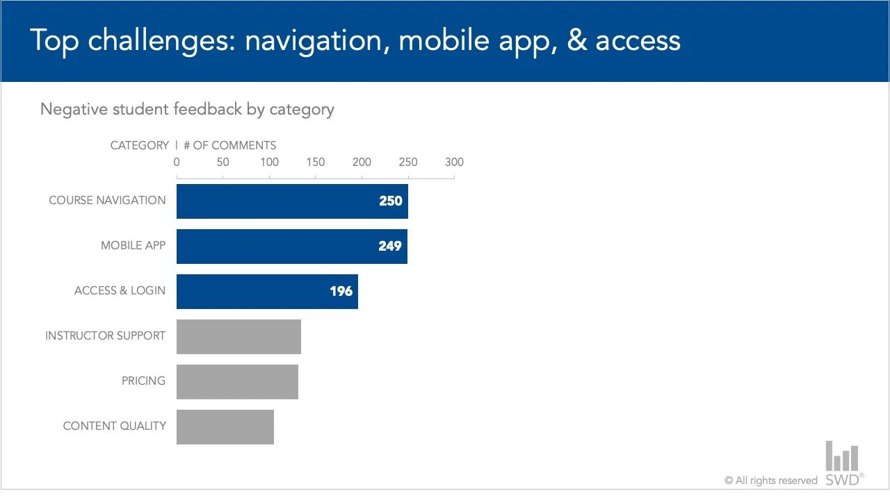
Specifically, the three largest bars at the top are related to course navigation, the mobile app, and access and login challenges. These account for 65% of the negative feedback we received.
Transition (we’re going to dive deeper): This is an aggregated view of the overall feedback, but when we look at the course level, we start to see some differences. Let me add that information now.
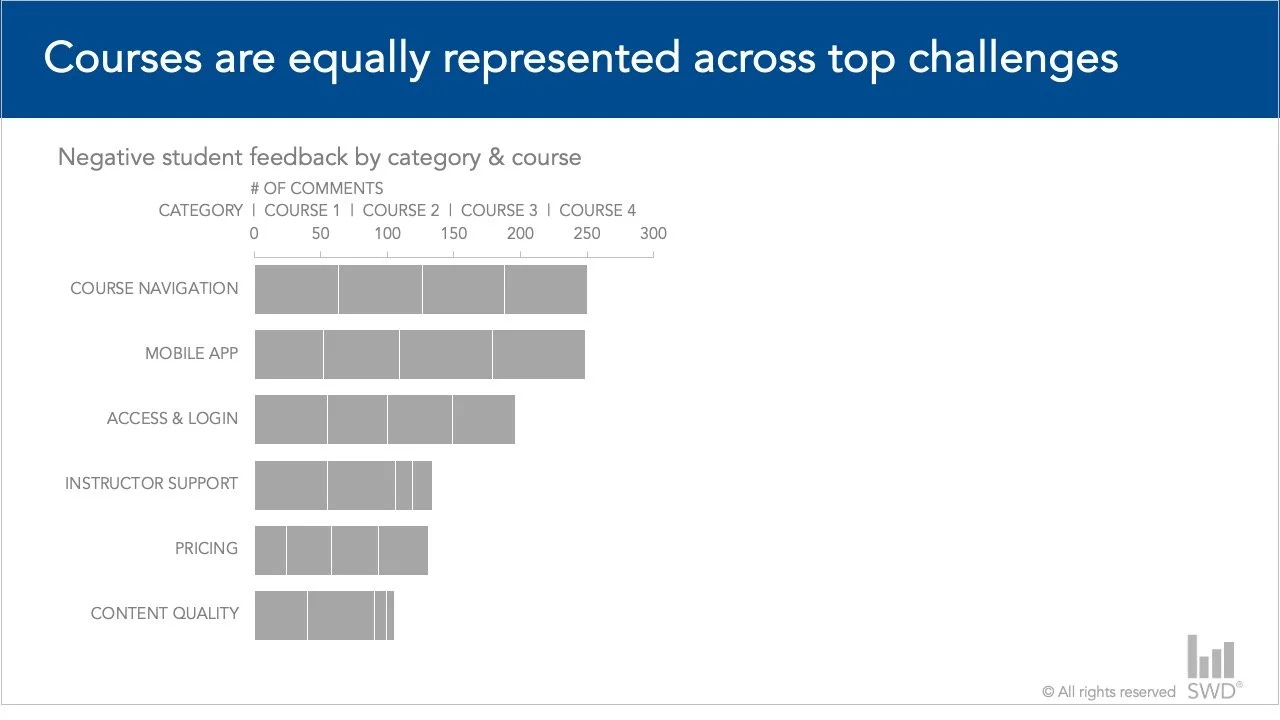
Here, the bars are broken down across the four courses reviewed. The view is a little busy and hard to compare across categories, given the differing amounts of feedback received.
Transition (expanding on a point): Let’s switch views to look at the percent of total across categories to make comparisons easier.
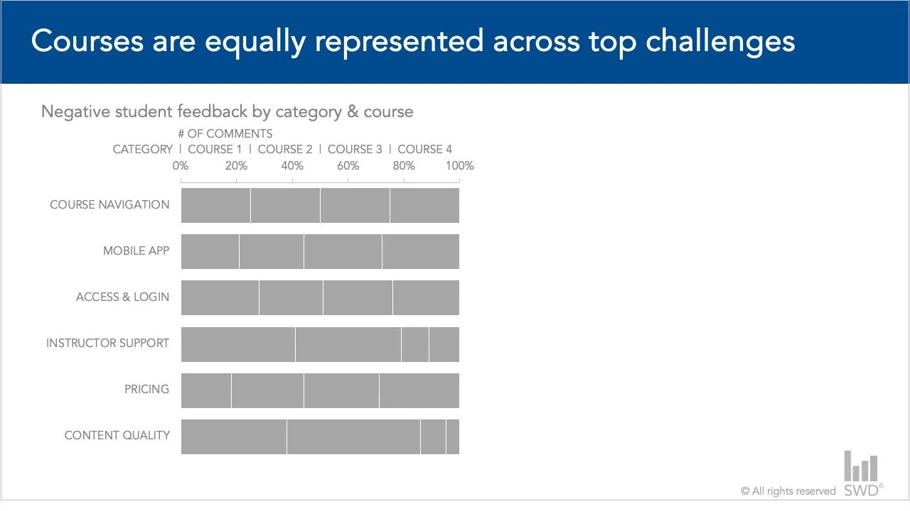
I’ve stretched the bars out to a 100% horizontal stacked bar chart, while keeping the order the same, so the categories on the top represent the largest volume.
Transition (focusing attention): Looking at the top three categories, the percentages are roughly the same for each course.
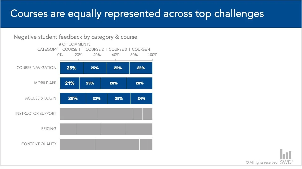
This tells us that these are global issues we need to address for all courses.
Transition (focusing attention): However, when we consider other categories, this is not true. For example, if you look at instructor support and content quality, two courses stand out.
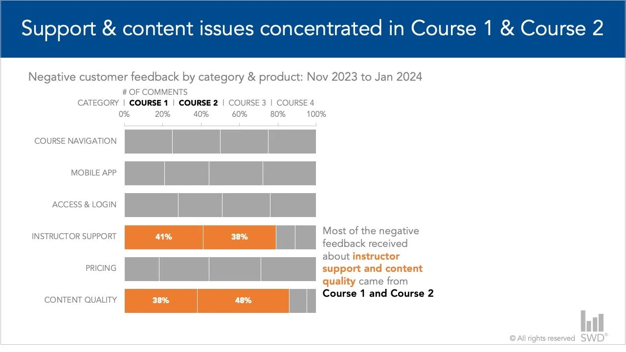
Most of the negative feedback received for instructor support and content quality came from Course 1 and Course 2.
Transition (offering recommendations): This means that targeted improvements to content and instructor support for these two specific courses should improve student feedback.
Adding slides provided a smoother change between the two aspects of the story. The visual changes, coupled with verbal phrases, connect the information to make what was previously an abrupt change into a more fluid sequence.
Thoughtful transitions are essential for delivering an engaging and professional presentation. When you plan ahead—incorporating both verbal cues and visual elements—you ensure that your ideas flow seamlessly from one point to the next. With practice and preparation, these techniques will not only enhance clarity but also leave a lasting impression of confidence and credibility.