when bars win—and when lines do
Bringing clarity to your data storytelling doesn’t usually mean you need to learn and use more chart types. It does mean choosing visuals that are appropriate for your data and what you’re trying to communicate. Two of the most useful tools in our graphing toolkit—bar charts and line graphs—often do the heavy lifting. Knowing when to use which (and when to switch) can make all the difference.
This lesson came up recently as I revisited our new book, storytelling with data: before & after. I’ll share two scenarios where the choice between bars and lines matters. They are both from Chapter 2, which is titled “embrace basic graphs.”
When bars beat lines
Let’s start with the client-inspired example. Spend a moment reviewing the following. This slide (created by an external consulting company, Alpha Omega Group), was part of an annual business review for our client, a luxury cosmetic brand called Rapture. (Names and details have been modified to preserve confidentiality.)

Though the slide and graph appear reasonably professional at first glance, a closer look reveals opportunities for improvement. Let’s first recount some of the positives. The slide features a clear takeaway articulated at the top. Specific data points that relate to the takeaway title are encircled. The graph is mostly free of clutter. The data is plotted in a simple line graph—one of our preferred types.
But does a line graph make sense here?
When opting for a line graph, you want the lines themselves to mean something. In this instance, the lines reflect the relative difference between categories, which isn’t particularly useful. That’s not to say a line graph won’t work here, but this isn’t the one I’d recommend for categorical data. We’ll look at a variation soon. First, let’s see what this looks like in a graph made for this type of data: a bar chart.
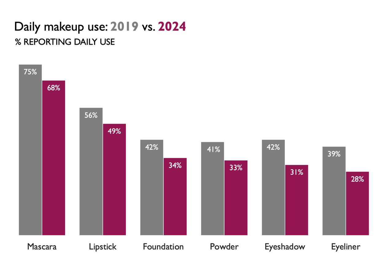
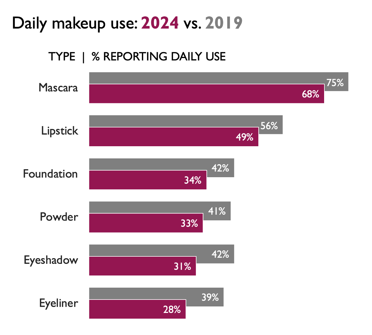
Bar charts are almost always a reasonable option. I’ve been known to joke that if I were stranded on a desert island with only one type of graph to use forevermore, it would be a bar chart. In our collaboration with clients, bar charts often become the hero when faced with unclear or overly complicated visuals. In this instance, I started with a standard vertical bar chart, also known as a column chart. We could also plot this data in a horizontal bar chart.
I played a little here, overlapping the bars so that the latest point in time is in the forefront, with enough of the historical data showing to still make the comparison. (If this bothers you, an unoverlapping version would also work.)
While I do love a good bar chart, bars aren’t our only option. I’m going to continue to iterate. Each version reveals something new about the data, highlighting how useful it can be to explore multiple perspectives before settling on the final view. Let’s look at the data in a slopegraph.
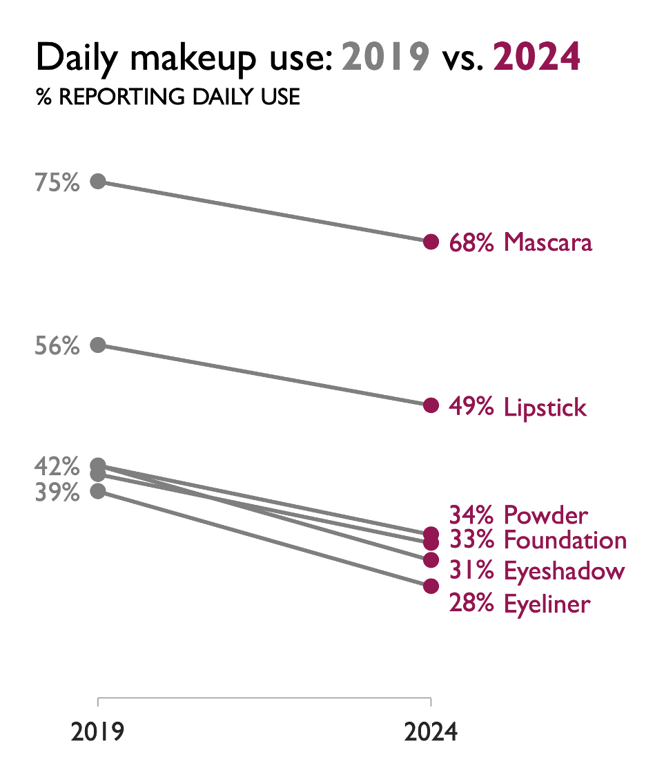
Whereas bar charts place emphasis on absolute values (the height or length of the bars), slopegraphs and dot plots draw attention to the difference or change (via the lines or distance between the points). With the slopegraph, I more quickly see the declines in daily use across all six products.
Let’s try looking at this data in a dot plot.
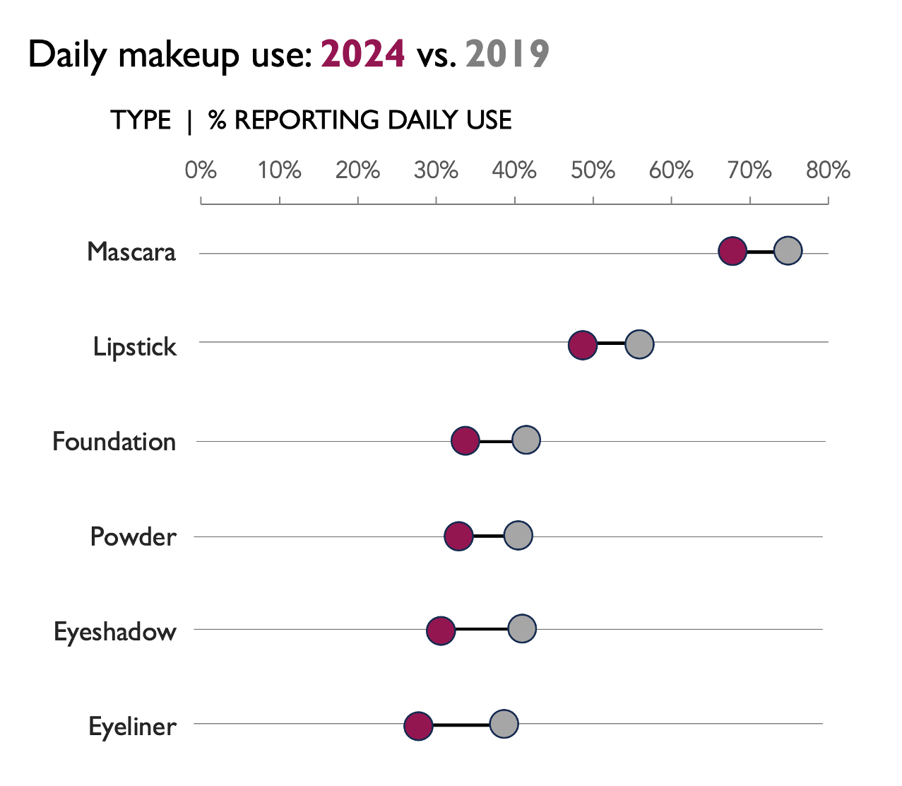
Something else stands out to me in the slopegraph and dot plot that didn’t in the bar chart views: how much more mascara and lipstick are used compared to the other products. Going back to the original takeaway, it’s true that eyeshadow and eyeliner decreased the most during COVID. But is that where we want our audience to focus?
As it turns out, no. Several slides later in the client’s original deck, it became clear that the key recommendation was to focus on restoring mascara and lipstick to pre-COVID daily use, with the expectation that the other products would follow.
Now knowing what I want my audience to see when they look at my graph, I can revisit the options I’ve considered and choose one that will facilitate this.

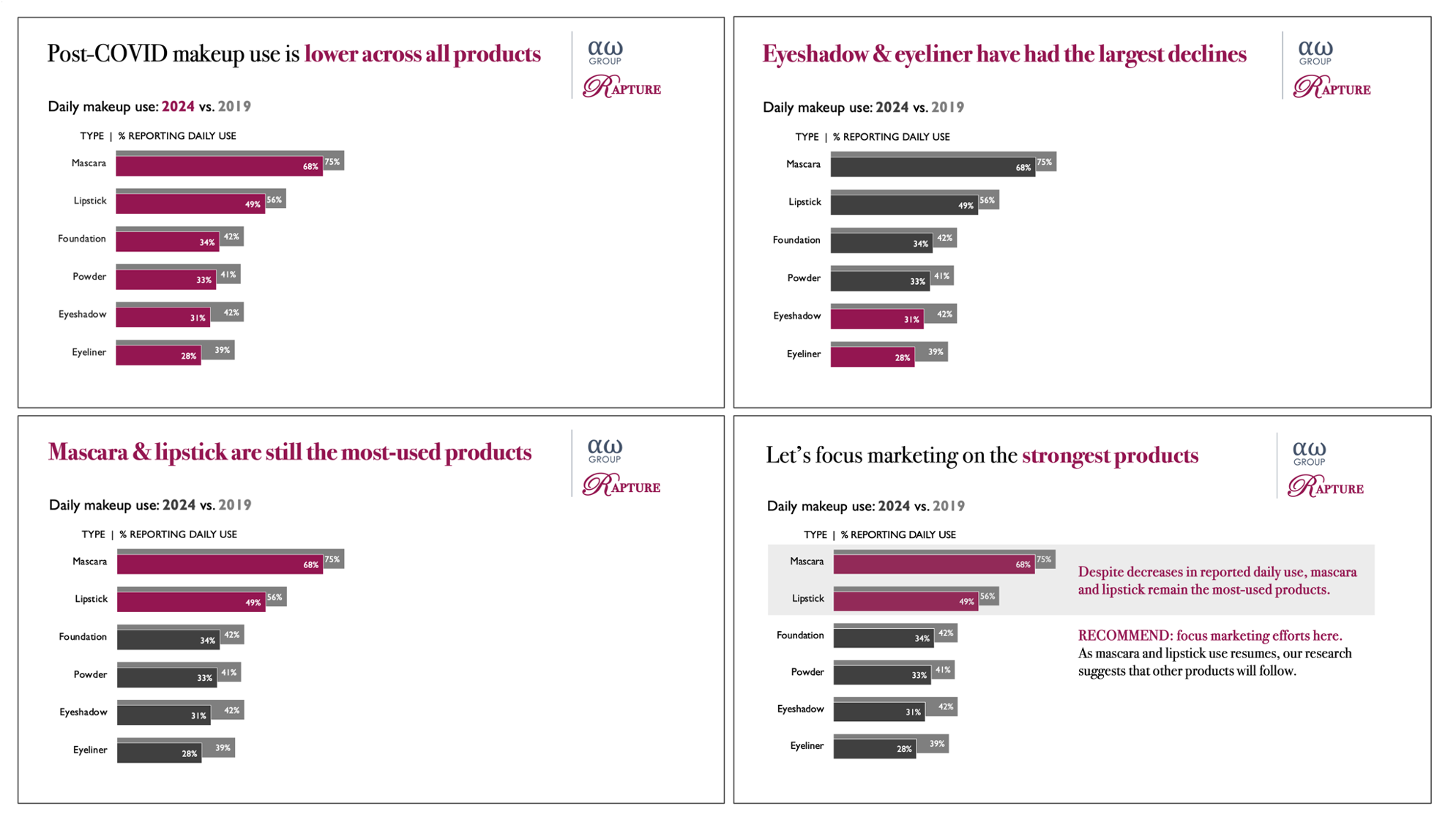
Any of the above options could work, with the right focus and words. I find myself drawn to the horizontal bar chart. You might choose a different option, and that’s fine. The following is my redesign, assuming that I’m constrained to a single slide.

If I were going to present this information live, I’d weave together a narrative by showing multiple iterations of the same graph. I could start by making the overall point that post-COVID makeup use is lower across all products. From there, I could highlight the largest decreases in eyeshadow and eyeliner use. Then, I could shift attention to mascara and lipstick as the consistently most-used products. Finally, I can conclude with the recommendation to prioritize strengthening marketing efforts on those products, with the expectation that others will follow. See the following slides.
When lines lead the way
In the appendix of the same original client deck, there was a prime candidate for a line graph that wasn’t initially presented as one. See below.

Perhaps because it was an appendix slide, no supporting context was provided. Even in absence of that, I believe a line graph works better here. In the following iteration, in addition to transitioning to a line graph, I redesigned the visual to incorporate the client’s font and colors.

Recall the line graph at the beginning of this post, where the lines connecting categorical data didn’t make sense. Here, the lines effectively plot data over time. Each line segment conveys the relative change from one year to the next through its rise or fall.
For example, if you focus on the lower gray line in the graph above, you can see that it is relatively flat from 2020 to 2023. Then, there is a marked increase in slope between 2023 and 2024—and an even bigger increase from 2024 to 2025. Something clearly happened here that drove up minimum production (interestingly, the increase in minimum production seems to have lagged behind the increase in average production).
Now that you’re aware of this, you can go back to the bar chart and find the information. However, it would have been much harder to see without this new perspective. One benefit of using a line graph to plot data over time is that it mimics the way we intuitively follow a timeline, drawing our attention to fluctuations and trends.
As a slight twist, we could show the range from minimum to peak as a shaded area. You can see this below. I’ve also added some example text annotations. Given the lack of context, I used these to demonstrate where they might be placed and how to format them, rather than providing meaningful content.

Simple, not simplistic
I’m a long-time advocate of embracing basic graphs. Bars and lines have stood the test of time because they do their job exceptionally well. (The cousins we explored here, slopegraphs and dot plots, are variations of these.)
One thing that has evolved for me—and that you can see play out through the examples shared here—is understanding the nuance behind these simple forms. It’s not just what you show, but why and how you show it that sets effective data storytelling apart. The magic happens when you know which to use, when to switch, and why that choice helps your audience see what matters most.
If you enjoyed the before-to-after progression of this example, you’ll love our new book, storytelling with data: before & after. It features 20 inspiring makeovers, sharing a multitude of practical lessons along the way.