when decluttering isn’t enough
Reducing redundant elements in our visuals and moving beyond our tools' default settings almost always makes insights faster to retrieve. It’s such a critical part of clear communication that we dedicate an entire section of our workshops to it.
However, we close that very same lesson with an important truth: decluttering alone isn’t enough. If a sub-optimal chart type is used or the critical message remains hidden, the audience may still walk away confused.
Today, let’s take a look at how much better a graph can look when it’s been decluttered—and then, how much stronger it can be when we prioritize our main message.

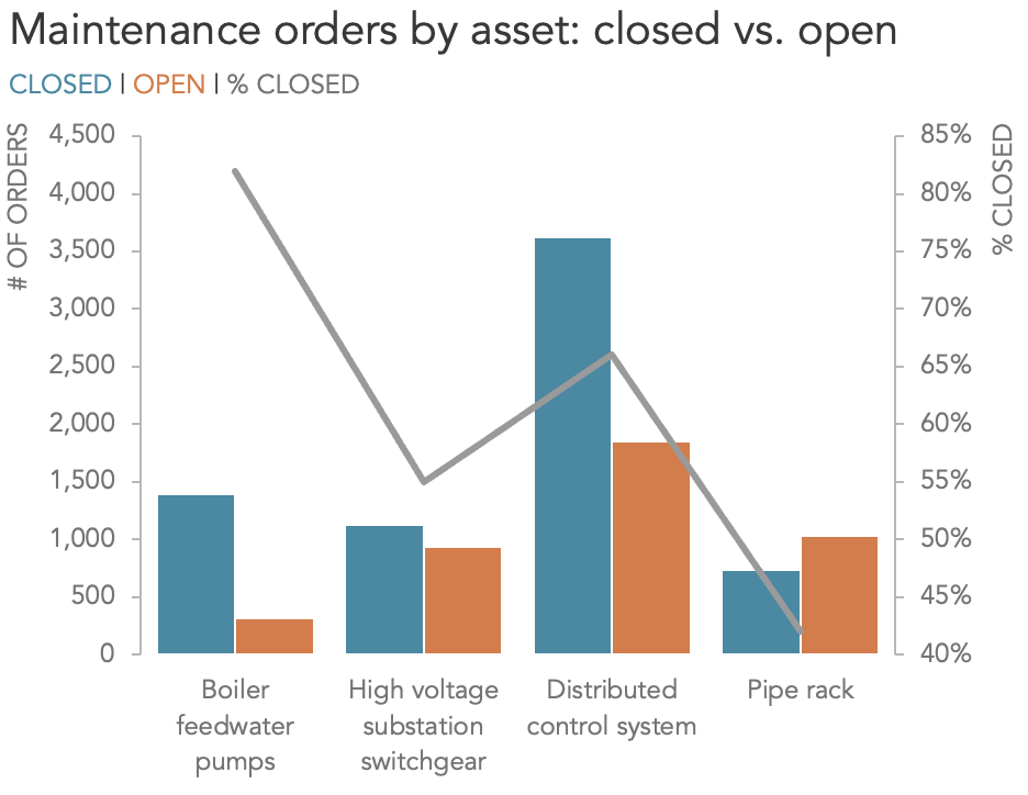
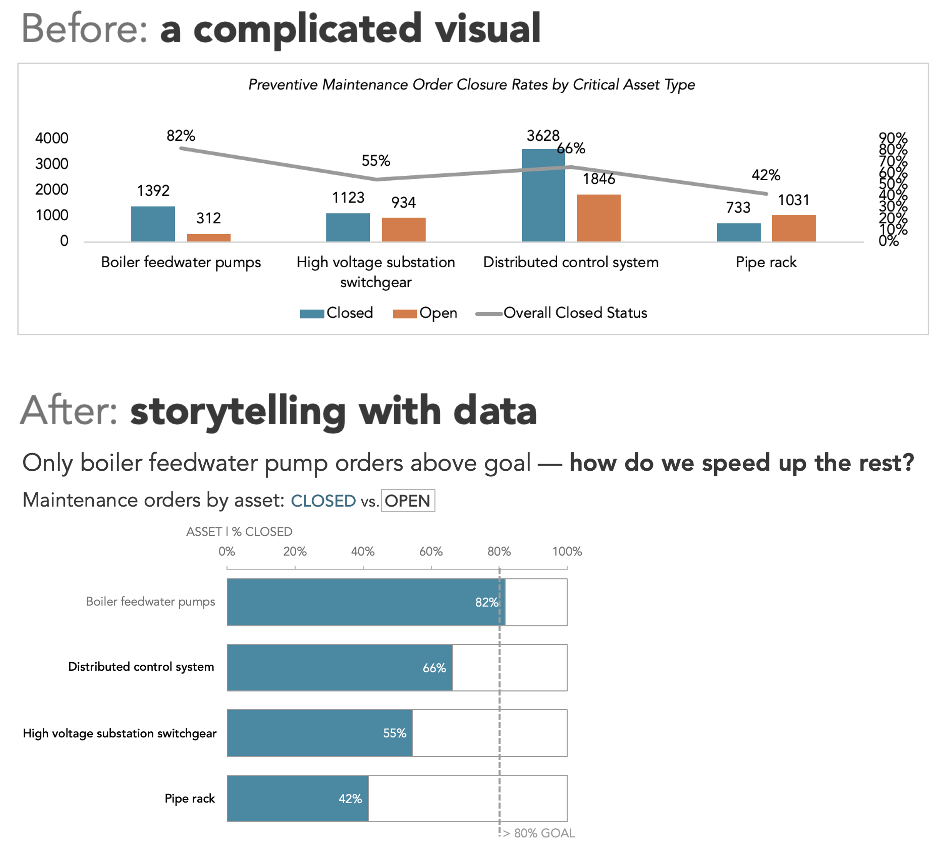
This visual shows the status of work orders across four critical asset types within an engineering company.
Along the horizontal axis, we see each of the four asset types: boiler feedwater pumps, high voltage substation switchgear, distributed control system, and pipe rack.
The primary (left) vertical axis of this dual-axis chart plots the absolute number of orders within an asset type, broken down by closed (blue bars) and open (orange).
The secondary vertical axis tracks the percentage of orders closed per asset type. The goal of this view is to help leadership see which asset areas are meeting order closure expectations and which require additional focus.
Everything our audience might want to know is present. But that’s part of the problem: there’s too much happening at once, and the dual axis makes it difficult to know what to focus on. Is the takeaway supposed to be the number of orders? Or the closure rate? Or both?
Decluttering is a common and advisable first step
As with most graphs that use primarily the default settings of a graphing tool, this one can be improved with some common decluttering techniques. Let’s do this now by taking the following steps (with some useful links to previous articles on these topics included):
Removing the chart border;
Adjusting the graph proportions;
Decreasing the white space between the bars;
Removing the data labels;
Formatting the axes: providing titles, using lighter formatting and adding axis lines and tick marks;
Moving the legend from the bottom of the view to the top, acting as a subtitle;
Rewriting and aligning the chart title
The combination of these changes helps to lighten the visual load and make it easier to focus on the data. Applying a similar combination of the steps referenced above works well in most situations and will almost always lead to an improvement. And if you’re short on time, even a quick round of decluttering can make a meaningful difference.
Make the message obvious by refining the graph
Even with these changes, it’s still challenging to make immediate observations about the information. At this point, we should think critically about the message we want to deliver and whether our graph types and design choices support that communication effectively.
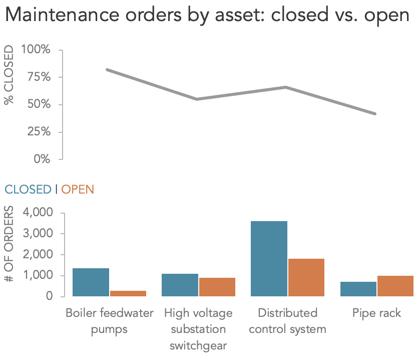
Dual axes place a heavy burden on your audience
We’ve done our best to tidy the view, but any graph that incorporates dual axes requires an audience to expend a lot of mental energy, keeping track of the multiple metrics in the plot.
Instead, consider exploring different ways to present this information. One way we can transition away from the combined axes is to pull the graphs apart vertically, leveraging the same horizontal axis across both views, but with each getting its own independent vertical y-axis.
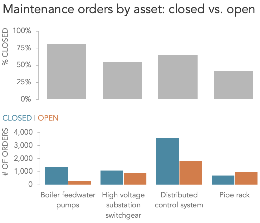
Line graphs and categorical data rarely mix
Having made this change, I’ve noticed something off. Lines work well for continuous data over time, but here we’re dealing with categorical data—the asset types. In this instance, joining the closure rates for each asset creates a relationship that doesn’t exist. To correct this, I’ll convert the line to individual bars, which will better represent this distinct, discrete data.
Finding the right level of detail can reveal the appropriate display type
Technically, that’s better, but something still feels off. Maybe we’re still trying to show too much all at once. Do we need all this information? In those cases where we feel obliged to show all of the data we collected or analyzed, we sometimes wind up talking ourselves into creating needlessly busy visuals. Often, a subset or aggregation of that data would lead to a much clearer final product.
Continuing to iterate, I’m going to drop the closure rate information. Then, I’ll switch from positioning the closed and open bars next to each other to stacking them on top of one another.

The stacked bar chart allows us to see total orders per asset while allowing for straightforward comparison of the closed orders for each asset type. Now that the order closed rate has been removed, we can be clear about the intention of this visual, and displaying only the relevant data reduces the cognitive effort required to understand the information.
Decide on one key takeaway that your graph will emphasize
In conversation with colleagues, we determined that the one thing our audience cares about the most is the closure rate within each individual asset type. Is this visual helping articulate the primary takeaway of that metric, which is that most maintenance orders for pumps have been closed (82%), while fewer than half of those for pipe racks have (42%)? We can see this at an absolute level, yes, but with teams monitoring these assets of markedly different sizes, showing the number of orders is likely not the right approach.
With the original visual and closure rate line in mind, I’m inclined to explore a different view.
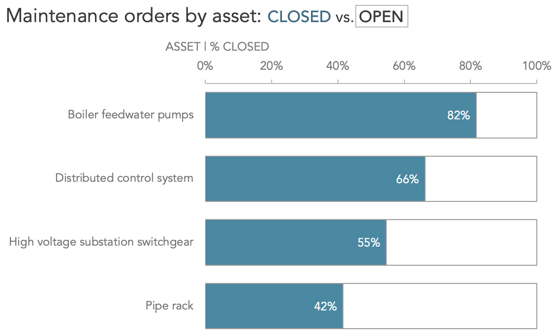
Switching to a 100% stacked bar chart now clearly shows the proportion of orders that have closed. At this stage, I also took the opportunity to switch to a horizontal orientation to ensure the category labels—which in the previous iterations were distracting and fell across a combination of one, two or three lines—sit neatly on a single line. Finally, I chose to order the data series in decreasing order of performance.
Use words and context to make your message unmistakable
The final view allows for immediate and accurate comparisons to be made. Now that I’ve landed on an appropriate chart type, the final step is to add elements that help frame and explain the data: a goal line of 80%, an observational takeaway to prime our audience with the key message behind the visual, and an open question to prompt discussion.
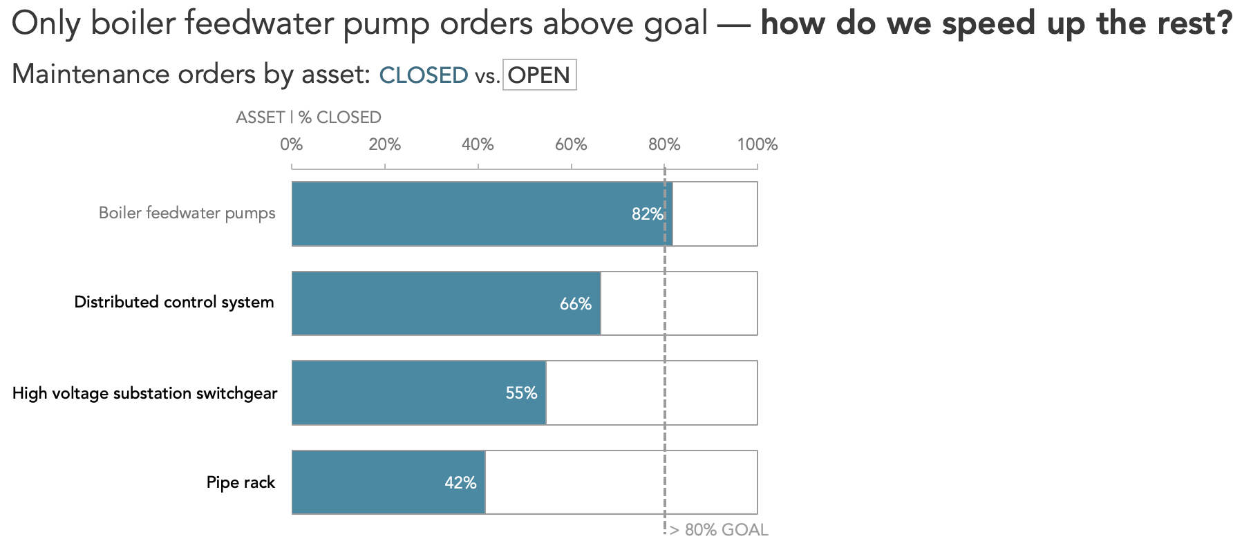
Unlike the original, the story is obvious: only the boiler feedwater pumps order closures are at an acceptable level, while the other asset types fall below appetite. Conversation can now turn to remedial efforts to expedite order closures in these areas.
Declutter in general, refine for your specific message and audience
Decluttering our visuals is always a great first step, and one in which a similar approach can safely be applied to most visuals. For the strongest communication, however, decluttering alone isn’t enough. Removing redundant elements might help us see the data, but if the chart type itself isn’t aligned with the story; the ability to retrieve the insights quickly is compromised. Real success comes not just from sharpening up the original chart, but from rethinking how best to present the data, ensuring the main message you are looking to share is clearly accessible.
If you enjoy seeing how we help real teams improve their business communications via example, order our latest book: storytelling with data: before & after. Drawing on more than a decade of helping organizations and professionals transform their communications, the book features twenty powerful makeovers that turn ineffective charts into engaging visuals that captivate, inform, and drive smarter decisions.