eight simple ways to edit a legend in Excel
Elevate your skills with our on-demand learning course
Are you looking to create outstanding graphs and slides? Check out our new on-demand video course behind the slides: good to great PowerPoint presentations. In this comprehensive course, you'll gain lifetime access to 5 engaging learning modules featuring 30+ detailed lessons with over 75 minutes of high-quality video content. Learn at your own pace and master the skills you need to take your PowerPoint presentations to the next level. Enroll today!

One essential element of our charts and graphs rarely gets the attention it deserves: the legend.
Without a clear and thoughtfully-incorporated legend, viewers of our data communications will struggle to understand exactly what we’re presenting to them. Any additional effort an audience needs to devote to solving the mystery of “which data series is green?” or “what’s the difference between square data markers and circles?” is energy they won’t have to put towards grasping your visual’s important insights. A well-designed legend will remove that cognitive burden.
With every graph you create, plan to spend some time crafting a legend that supports and clarifies the data you’re presenting.
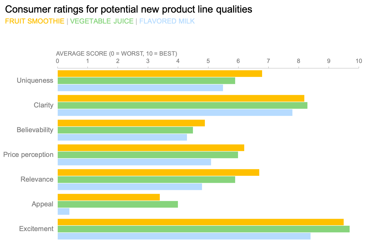
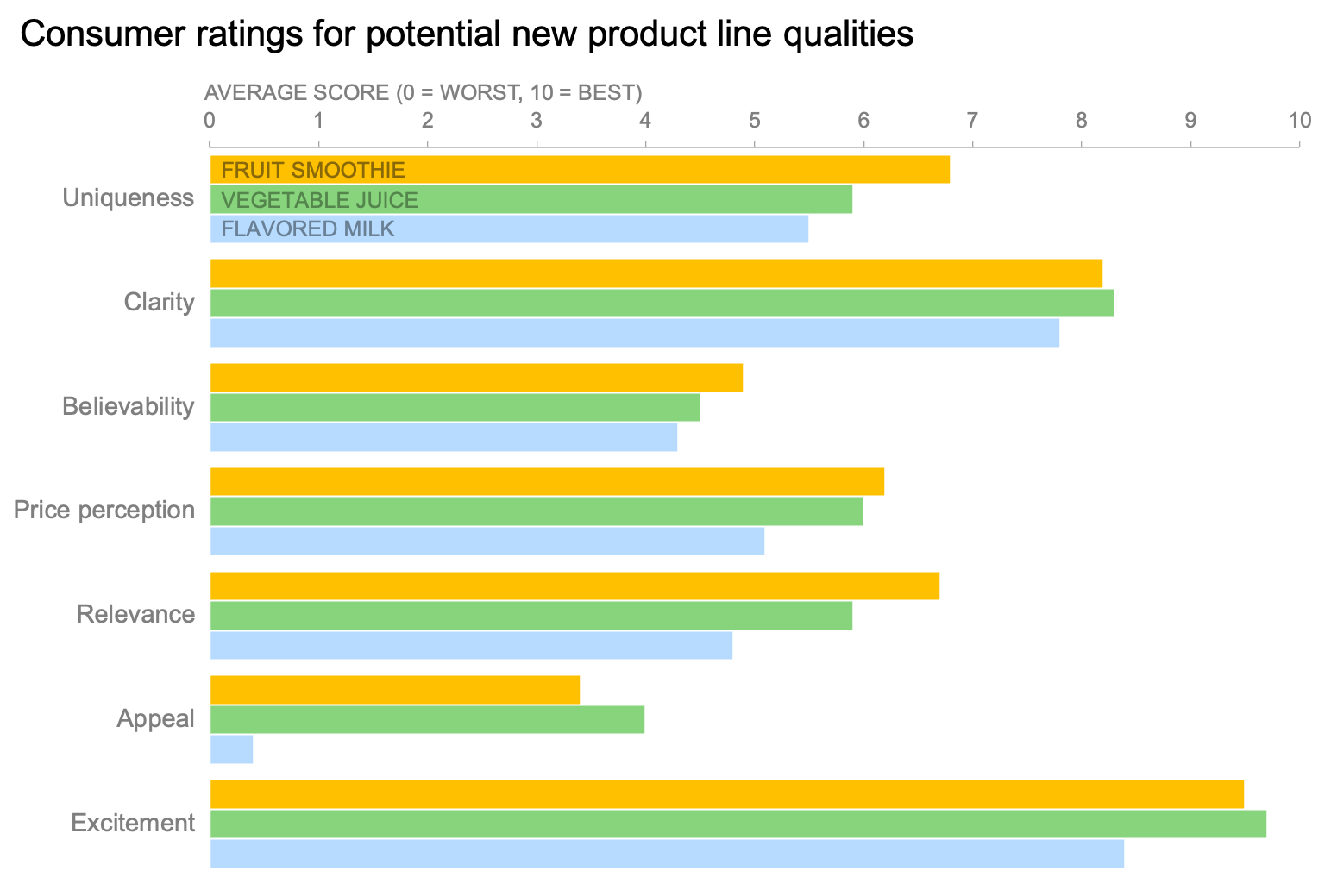
Almost every chart template in Excel will place a legend into a new graph by default. For bar charts, it’s usually set off to the right:

Did you know, however, that you can edit your legends? In fact, there are many things that you can do directly in Excel (or directly in PowerPoint) to customize this essential element of your communication.
But first, here are a couple of things you CAN’T do to your legend in Excel.
Reorder the elements in your legend. In some visualization tools, you can drag entries in the legend to change the way the series are sorted, but in Excel the order is determined in the data source itself by the series order.
Modify the text of the entries. Unlike data labels, into which you can re-type or add new text, legend entries are also fully determined by the data source. If you wanted this graph’s legend to be Title Case or ALL CAPS, you’d have to change that in the underlying worksheet.
Here are eight simple ways to customize your Excel legend.
1. Place it somewhere else.
As long as you haven’t resized your graph’s plot area (the space reserved for the data itself), you can use the “Format Legend” pane in Excel to move your legend to the top, left, bottom, or top right corner of your chart area. When you do this, your plot area will resize to make room for the relocated legend.

In this graph, the legend position is set to "Top" rather than "Right." Notice that the plot area automatically gets shorter and wider to make room for the legend.
How to do it in Excel:
Click on your chart, and then click the “Format” tab in your Excel ribbon at the top of the window. From the very right of the ribbon, click “Format Pane.” Once that pane is open, click on the legend itself within your chart. In your Format Pane, the options will then look something like this:
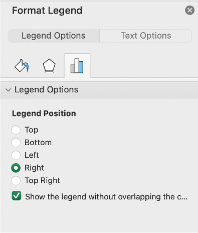
Then, set that legend position to be whichever location you want. My tendency is to put the legend at the top, because of people’s tendency to scan any new visual from top-to-bottom; that way, a reader will know what dataset corresponds to each color or marker type before they start to evaluate the information in the graph.
2. Overlay the legend atop your data.
Excel prefers not to have the legend and the plot area use the same physical space…but if you want them to overlap each other, you can make that happen.
How to do it in Excel:
That bottom option in the Format Legend pane above—the one that reads “Show the legend without overlapping the c…”—is the key item here.
If that box is checked, the legend will not overlap the plot area at all. By unchecking it, the legend will then float on top of the plot area (and any data series that happen to be there).
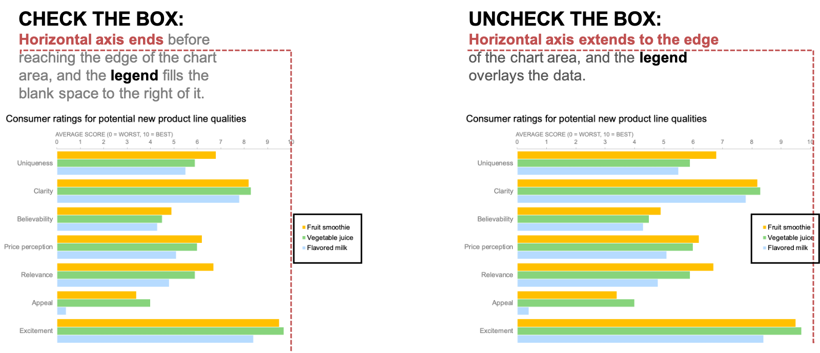
By default, the available plot area for a graph stops short of the space that Excel reserves for the legend. Unchecking one box in the “Format Legend” pane will extend your graph’s plot area all the way to the edge of your available space, and will place the legend such that it overlaps with the visual.
3. Hand-drag it to a precise location of your choice.
You’re not limited just to the options Excel’s Format Pane provides by default. You can actually put your legend anywhere you want in your chart area. For instance, I put mine slightly closer to the bars in this example:

For this view, I hand-dragged the legend as far to the left, within the available plot area, as I could without it overlapping actual data bars or feeling too crowded.
How to do it in Excel:
If you click on your legend, you’ll see it highlighted with squares at each corner and at the midpoint of each line.

Clicking on the legend directly will select it, and make these little squares (called “handles”) visible.
Once the legend is highlighted like this, click and hold your cursor down in the middle of the outlined legend (make sure your cursor looks like a plus sign with arrows on the ends—that means you’ll be able to move the legend without distorting it). Then, drag-and-drop it anywhere you want in your chart area.
4. If, for some reason, you insist on doing so: add outlines, shading, or other visual effects.
99 times out of 100, you won’t need to do this. Decorative effects such as these primarily serve only to clutter up a visual. However, since it’s impossible to predict every possible scenario in which you’ll be creating a chart, there may be a time when you’ll want to visually set off your legend from surrounding elements. In that unlikely event, it’s worth knowing that Excel offers you the ability to add fills, borders, and more to your legend.
I made mine super pretty! Look at my beautiful shaded, outlined, and glowing legend:

Just because you can put a gray background, a thick dotted border, and a purple glow around your legend, doesn’t mean you should. In fact, you probably shouldn’t…but it’s important to know how to make these kinds of changes on the VERY rare occasion that it becomes necessary to do so.
How to do it in Excel:
To reiterate: I am not encouraging you to bling out your legends on a regular basis. But if for some reason you find it’s necessary to do so…you can click on the legend in your graph, and then change the Fill, Stroke, and other options from the Format Pane:
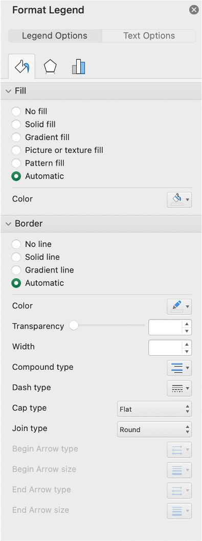
From the “Format Legend” pane, you can change the fill, border, and other appearance traits of your legend.
Please apply this knowledge with the utmost restraint. With great power comes great responsibility.
5. Resize the dimensions of the legend and the text inside it.
You can make your legend taller, wider or both. At the same time, you can increase or decrease the font size for your legend without changing the font size of the rest of the graph.

This legend is manually resized to be taller.

This legend’s font size has been increased.
How to do it in Excel:
To resize the dimensions of the legend, highlight it so that you get this outline again:
Then, click on any one of the squares (they’re called “handles”) to make the legend larger in that direction. The corner handles let you change width and height at the same time; the handles in the middle of straight lines only let you change one or the other.
Resizing the fonts in the legend is pretty straightforward: you click on your legend, then click the “Home” tab in your Excel ribbon, and change the font size, family, weight, or anything else you want just the way you’d change any other text.
6. Use the legend to change the look of a data series.
It’s not surprising that when you change the color of a data series in your chart, your legend updates to show the correct new color. What’s less well-known is that you can do this operation in reverse as well. For instance, I used the legend to reset my “Fruit smoothie” color to red.
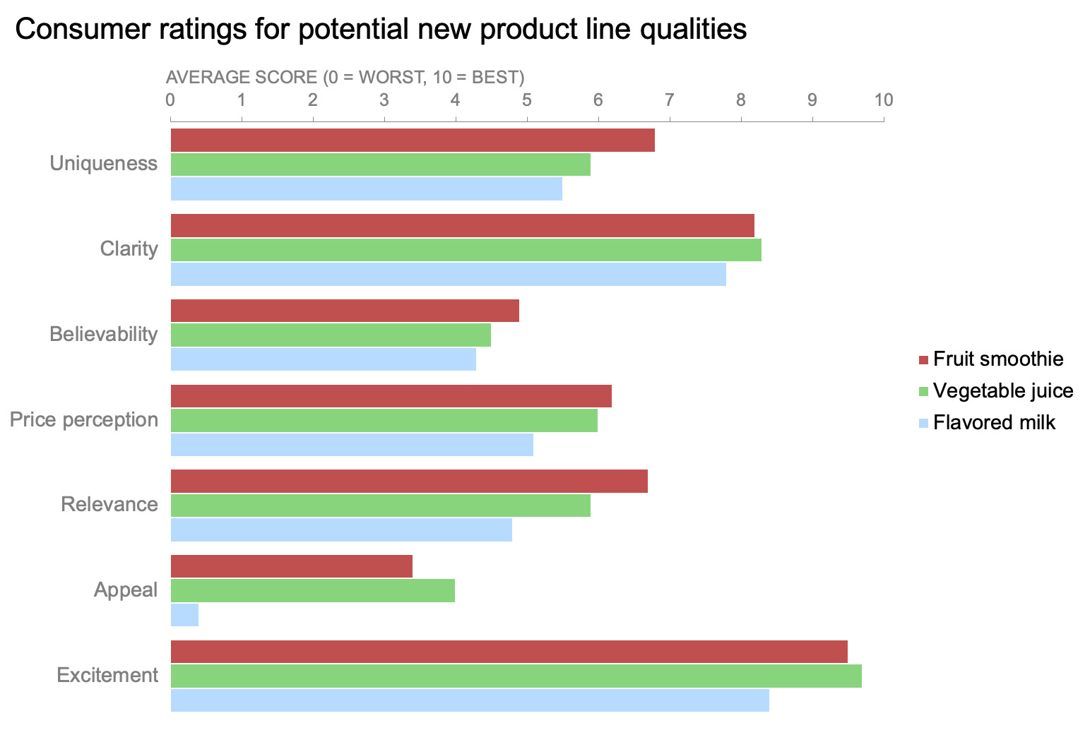
You can use the legend itself to change the color of any or all data series in your view.
How to do it in Excel:
Click once on the legend (to get the “handles” to show up around the whole thing), and then click a second time on one specific item in the legend itself. I clicked on “Fruit smoothie,” and it looked like this:

Click on the legend once, and then again on a specific entry, to select just one part of the legend (and its related data series.)
Then, I changed the fill color of that item to red in the Format Pane, which had changed to show the header “Format Legend Entry:”

The “Format Legend Entry” pane will appear if you only select a single element within your legend.
That’s a handy thing to remember: “Format Legend” refers to everything in the entire legend, but “Format Legend Entry” refers only to the item in the legend that describes a particular data series.
7. Remove unwanted legend entries.
This would be favorable when you’re doing some creative Excel brute-forcing—perhaps there are some series you need on the back end but don’t want displayed in the legend itself. You can actively delete entries from your legend directly, without removing the data from the chart itself. As you can see here, “Flavored milk” is gone from the legend, but the data still persists in the view.

Even though “Flavored milk” has been removed from the legend, the data series it referred to is still present in the view.
How to do it in Excel:
Click once in the legend and then click a second time on the specific legend entry you’d like to remove, and then just press the “Delete” key.
8. Remove the legend entirely, and do it yourself!
This, of all the techniques we’ve covered here, is my preferred option. Although you can use Excel settings and menus to create quick-and-dirty legends, and even customize them somewhat, your communications will benefit from a bit more thoughtfulness and polish. Either delete or hide the Excel legend, and instead add some text in useful places.
You could incorporate your legend as a subheader, so your readers see it right away and know which data series goes with which color.
Using appropriately colored text as a subheader can be an elegant approach to incoporating a legend into the graph view.
How to do it in Excel:
Click on your graph, and then in your Excel ribbon, select the “Format” tab next to the “Chart Design” tab. Towards the left hand side of your ribbon, click on the icon of a text box. That will place a blank text box in your Chart Area, which you can move, edit, and format just like a regular text box.

Type out the names of your data series, format them as you see fit, and place the subheader you’ve created just below the title of your graph.
Or, you could directly label the first instance of each of your data series, either at the ends of the bars or inside the base of them:

Label the first instance of each series at the ends…
…or at the bases of the bars as another legend option.
How to do it in Excel:
You can use the same technique for this as for adding a subheader, or you could use Excel’s ability to add data labels by interacting with the bars themselves. Either of these approaches also would work for line graphs, or most any other chart type you’d use on a regular basis.
Whichever approach you choose, let your decision be based on what will best serve your audience, rather than on what your graphing tool offers you as a default setting.
More Excel how-to’s:
For better bar charts, adjust the gap width
To emphasize a specific point, add data labels
To depict a range of values, add a shaded band
To create a frame of reference, embed a vertical line
To show a distribution of data, create a dotplot
For cleaner alignment, put graph elements directly in cells
To have more control over data label formatting, embed labels into your graphs
To make a stellar line graph, add thoughtful design elements (available to premium subscribers)