how to do it in Excel: adding data labels
Elevate your skills with our on-demand learning course
Are you looking to create outstanding graphs and slides? Check out our new on-demand video course behind the slides: good to great PowerPoint presentations. In this comprehensive course, you'll gain lifetime access to 5 engaging learning modules featuring 30+ detailed lessons with over 75 minutes of high-quality video content. Learn at your own pace and master the skills you need to take your PowerPoint presentations to the next level. Enroll today!

Today’s post is a tactical one for folks creating visuals in Excel: how to embed labels for your data series in your graphs, instead of relying on default Excel legends.
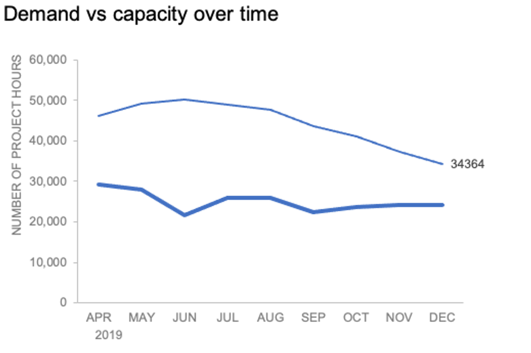
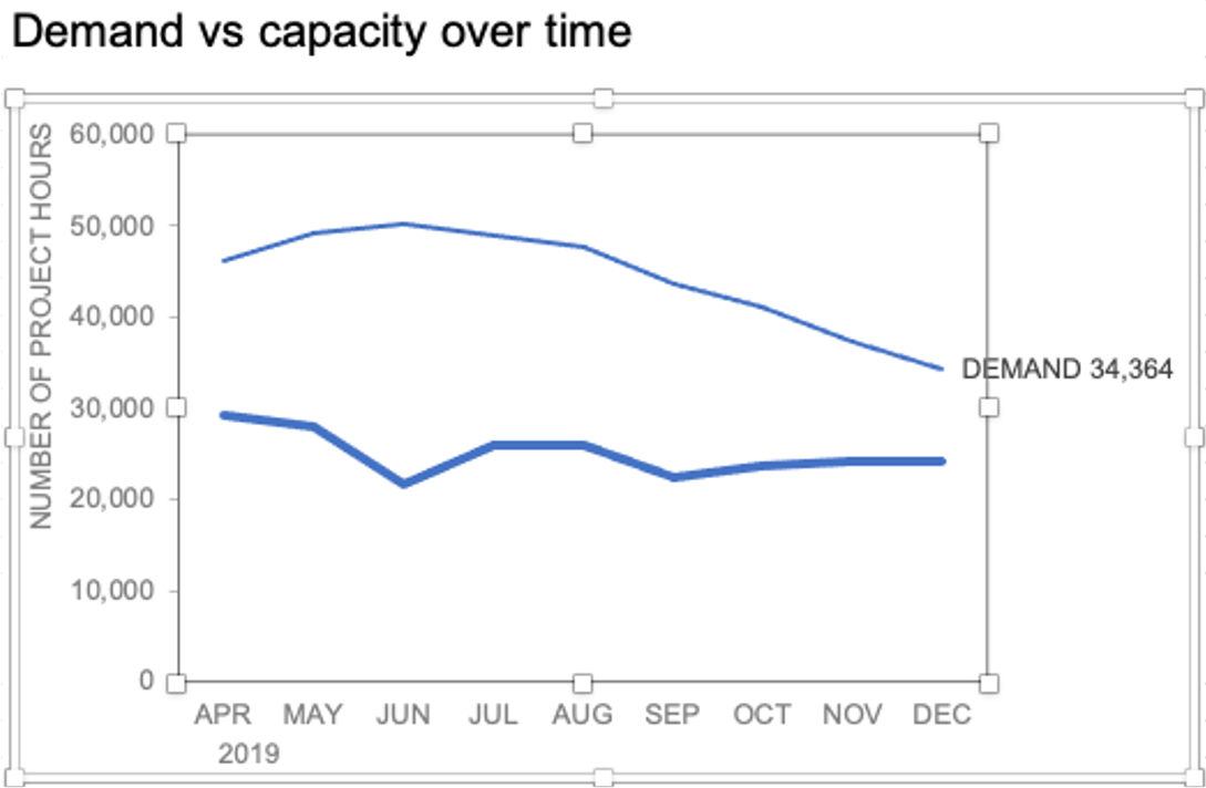
To illustrate, let’s look at an example from storytelling with data: Let’s Practice!. The graph below shows demand and capacity (in project hours) over time.

There are a few different techniques we could use to create labels that look like this.
Option 1: The “brute force” technique
The data labels for the two lines are not, technically, “data labels” at all. A text box was added to this graph, and then the numbers and category labels were simply typed in manually. This is what we affectionately refer to as “brute-forcing” your tool to make it look the way you want it to, regardless of its defaults. Remember: your audience only sees the end result of your work, even if the behind-the-scenes steps aren’t exactly elegant.

One benefit of this approach is that I have greater control over the formatting: size, position, and color of the labels. I can easily make them appear how I want them to appear by simply adjusting the formatting, which is much easier to do with a text box than with a genuine data label. The downside is that this method may not scale easily with many graphs, or those that will be frequently updated with new data—as the data changes, the text labels won’t move with them.
Option 2: Embedding labels directly
Let’s look now at an alternative approach: embedding the labels directly. You can download the corresponding Excel file to follow along with these steps:
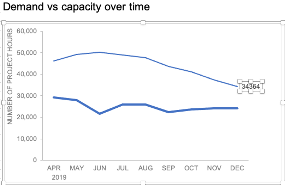
Right-click on a point and choose Add Data Label. You can choose any point to add a label—I’m strategically choosing the endpoint because that’s where a label would best align with my design.

Excel defaults to labeling the numeric value, as shown below.
Now let’s adjust the formatting. Click the label (not the data point, but the label itself) twice, so that these white boxes appear around it:
Right-click and choose Format Data Label:
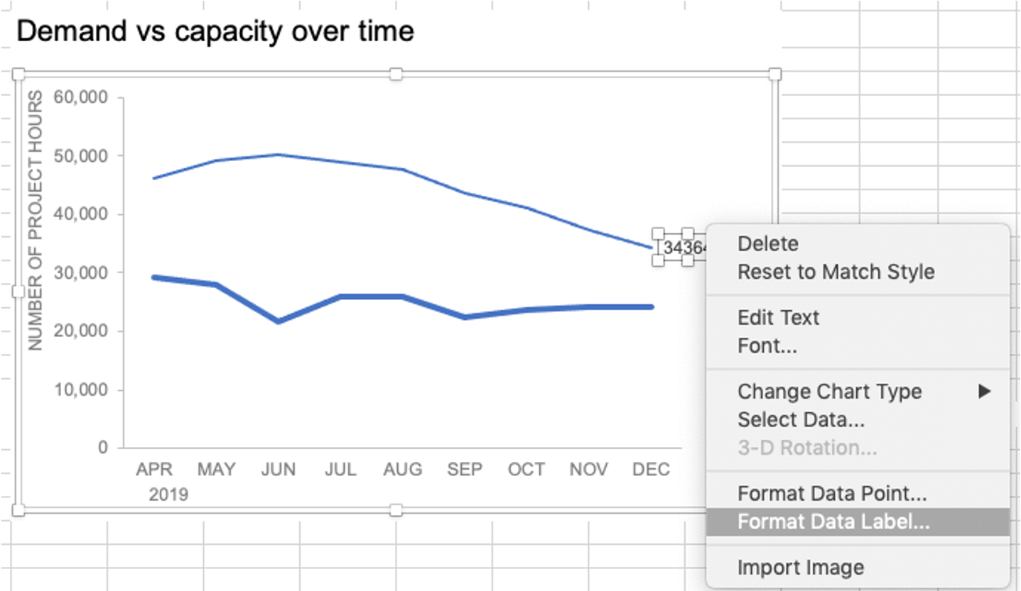
In the Label Options menu that appears, you can choose to add or remove fields by checking (or unchecking) the corresponding box under Label Contains. To add the word “Demand”, I’ll check the Series Name box.

The result is this:
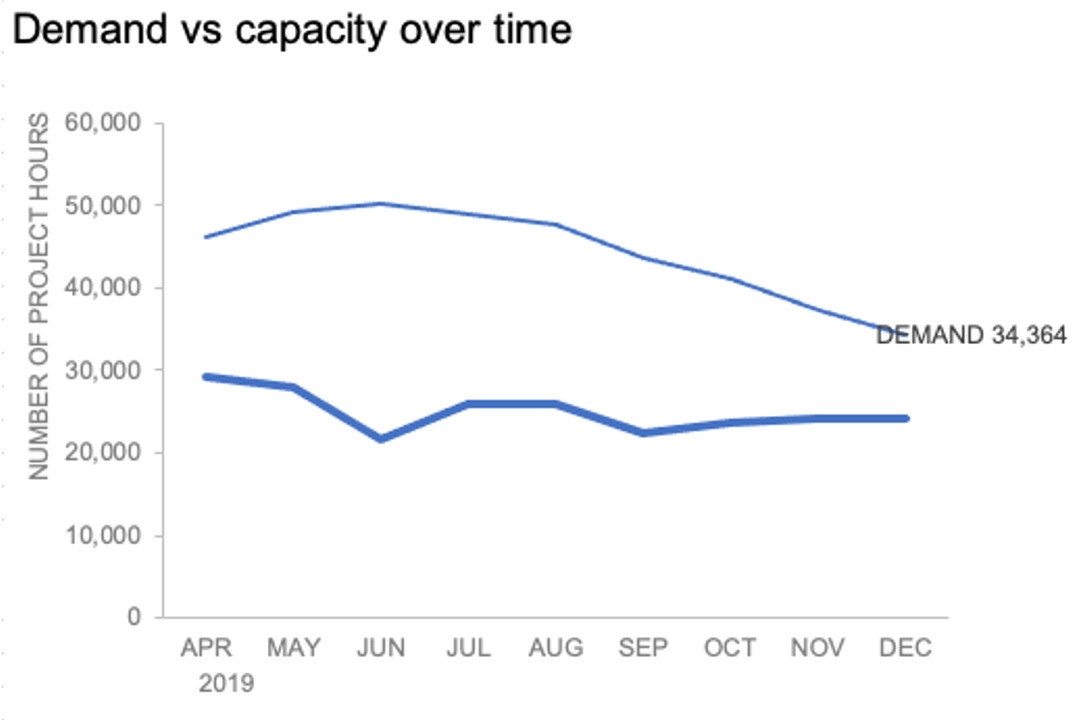
The label appeared in all-caps (“DEMAND”) because it’s referencing the underlying data—I could adjust the header in Column M to “Demand” if I didn’t want the entire word capitalized (this is a stylistic choice).

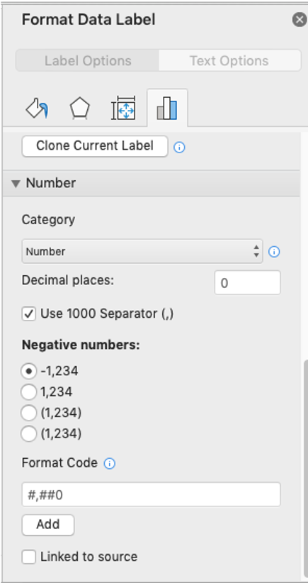
To adjust the number formatting, navigate back to the Format Data Label menu and scroll to the Number section at the bottom. I’ll choose Number in the Category drop-down and change Decimal places to 0 (side note: checking the Linked to source box is a good option if you want the labels to reformat when the formatting of the underlying source data changes).
My resulting visual looks like this:

From here, I can manually adjust the label alignment by highlighting the graph and making the Plot area smaller so that the label doesn’t overlap the line:
I’ll repeat the same steps to add the Capacity label:

The final thing I’ll do is clean up the formatting of those labels—move the numbers in front of the words, change the number format to be rounded to the thousands place, switch the colors of the labels to match the lines they refer to, and make the font for “24K Capacity” bold.

The benefit of this embedded approach is that as my underlying source data changes, the labels will update accordingly. For graphs that will be refreshed frequently, setting up these steps once will save you the headache of searching for and manually manipulating text boxes.
More Excel how-to’s
For more tactical instructions, check out these previous posts (and let us know in the comments if there’s something you’d like to see):
To depict a range of values: add a shaded band
To create a frame of reference: embed a vertical line
For better virtual presentations, animate text boxes to control what your audience sees
For cleaner visual alignment: put elements directly in cells
No more excuses for messy graphs: here’s a clean slate template and from data table to story
This post was inspired by a recent conversation during our bi-weekly office hour sessions. Do you ever need quick input on a graph or slide, or wish you could pick the SWD team’s brain on a project? Subscribe to premium membership for personalized support and get your questions answered. Our team has enjoyed getting to know many of you during these fun and interactive sessions!