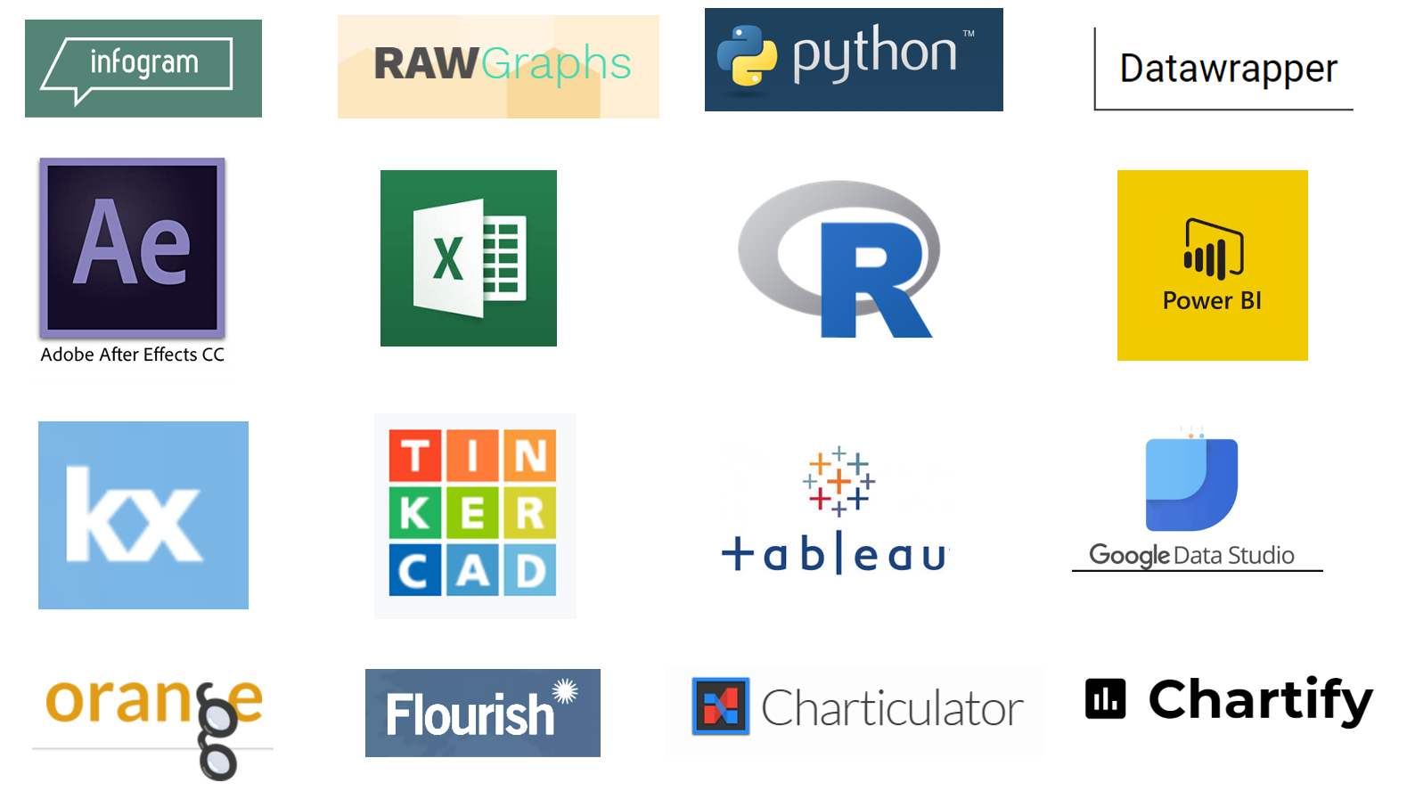
new year, new tools!
We saw a wide variety of tools used in the first challenge of 2019: from the familiar to new players on the market and from drag & drop GUI solutions to programming languages. Read on to see the wide array of instruments available for visualizing data and learn from others as they attempt these tools for the first time.

September #SWDchallenge recap: MAKEOVER edition
We had a record participation in September with 96 people sharing their makeovers of the dual pie chart visual. Submissions ranged from slopegraphs to bar charts to dot plots and beyond. Click the link below to see the full recap post, including each submission and related commentary.

plots with dots!
More than 50 dot plots were shared in August, with many depicting point in time and group comparisons for topics in sports, pop culture, and a number of real world work examples. See a ton of varied design approaches and a deluge of dots!

May #SWDchallenge recap: the waterfall chart
45 people shared their waterfall creations in May, with huge variety of tools and more business-related topics than recent challenges. Click the link to see the full recap post, including each submission and related commentary.
introducing the 2018 #SWDchallenge
The inaugural challenge was an annotated line graph. Lines are most often used with continuous data: days, months, quarters, years. Click the link below to see the full details, including an example and submission instructions.